Nordburger

Name: Nordburger
Location: Adelaide, South Australia
Design:Peter Jay Deering


Nordburger takes America's favorite concept of burgers and fries, and combines it with a clean aesthetic fitting of the quality food being served. 


 Gone are the primary colors and plastic seats so commonly found in quick service spaces. Utilizing a minimal aesthetic and simple materials keeps the space bright, inviting, and warm. Limited seating encourages quick bites and a grab and go mentality. The use of concrete bases insures the seats they do have stay in place ensuring room for guests to pass. 


All images © Vogue Living AU

Rozzi's Italian Canteen

name: Rozzi's Italian Canteen
Location: Melbourne, Australia
Design: mim


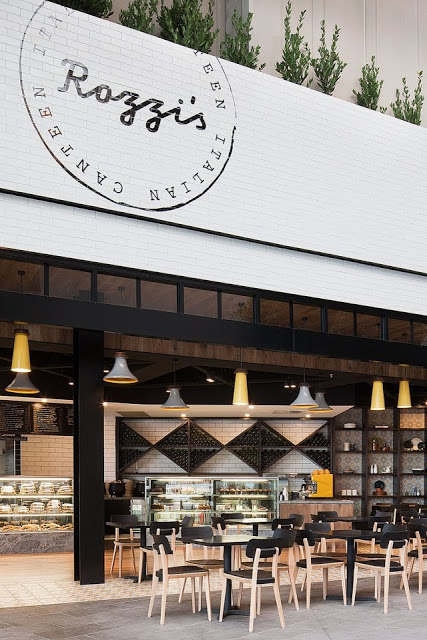
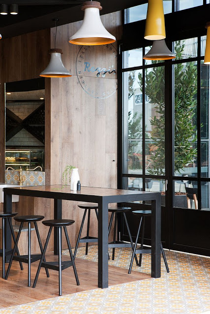
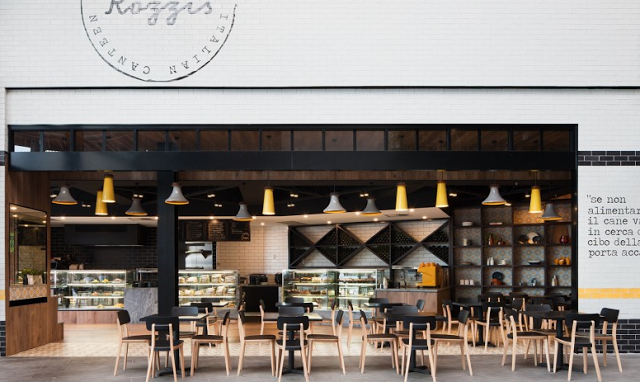
Rozzi's is an italian eatery with a focus on fresh, modern cuisine. The interior of the space reflects the menu and features a modern, and vibrant interior. 


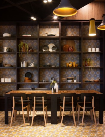
Utilizing a limited color and material palate allows the space to come together easily while the added typography and wording adds an additional creative element.
I love the use of concrete tiles to tie the yellow and grey through the space while the addition of bookcases adds a homey element emphasizing the desire for diners to feel at ease within the space. 


The use of subway tiles and wood all keeps the space on trend and hip but I love that they added a few new elements to make the space truly unique and fresh.


All images via mim design & yellowtrace

Fonda

Name: Fonda Mexican
Location: Melbourne, Australia
Design: Techne Architects


Fonda Mexican's second location showcases a great example of a modern, vibrant interior utilizing texture and a minimalist color palate.


The modern and clean lines of the existing structure translate well to the the rest of the space and add an element of vibrancy and excitement. Juxtaposed with just a few rustic touches throughout *wood countertops and bar front primarily) adds just enough balance to warm up the primarily white space. 

All images © Weheart

Wee Jeanie

Name: Wee Jeanie
Location: Melbourne, Australia
Photos: Erika Hildegard Photography


Located close to the Yarraville train station, Wee Jeanie is a great spot to grab your morning coffee. 


The interior is bright and classic with minimal details and allows you to feel as if you are sitting in your own kitchen, sunshine streaming through the windows. 


The exposed, worn brick adds a touch of warmth to the otherwise white space while the stacked bond tile add a slight modern touch.


I love the bright back patio and how they bridged the interior and exterior with a leaning edge on both sides. The acrylic table top and wood truss base also point the subtle modern/rustic mix happening throughout the space.


Lady M Confections

Name: Lady M Confections
Location: New York, NY
Design: Sam Trimble


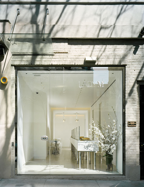
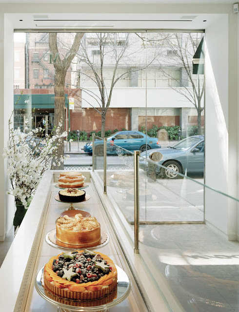
Lady M Confections signature space treats their cakes and pastures, very appropriately, as the star of the show. 
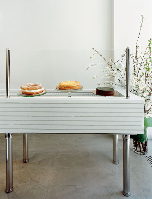
With clean lines, a neural color palate and minimalist details, all eyes are directed towards the 20+ foot refrigerated display case where the colors and textures of the beautiful pastries is on full display. 


Using clean and simple sneeze guards paired with the open leg base and stone front, there is very little to distract the eye and treats the items within as jewelry on display for passing admirers. 


Photos 1-4 © Lady M Confections

Parlour Coffee

Name: Parlour Coffee
Location: Winnipeg, Canada
Design: Nils Vik


Although located in middle of bustling Winnipeg, the interior style of Parlour Coffee is pure european minimalist.

Using touches of industrial (i.e. the metal pipe made furniture and steel Tolix stools) paired with the clean lines, simple material palate and minimalist color palate, the space feel bright and inviting.


The coffee bar is made from reclaimed oak flooring to save cost and the ornate light fixture adds just enough movement and texture as to not keep the minimalist space feeling cold.


Image 1,3 © Cool Entrepreneurs
Image 2,4,5 © Kinfolk Magazine

Knrdy

Name: Knrdy
Location: Budapest, Hungary
Design: Suto Interior Architects


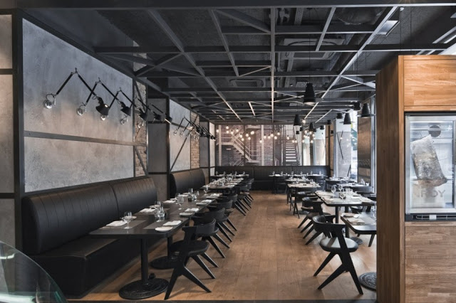
Knrdy is an American steakhouse in Budapest that showcases clean, modern design. 
The interior uses a monochromatic color scheme, clean lines and eye catching pieces to create a modern  space.


Upon entering, guests are walked past the cases displaying the selections of the days. These clean, cold displays are contrasted with warm wood shelves and a large graphic image of the New York skyline.


The open ceiling also showcases a modern, geometric patterns driving home the clean, straightforward lines used throughout the space. 


Images 1-3, 5,7 © Awesomearchitecture
Images 4,6,8 © Welovebudapest

Matchstick Coffee

Name: Matchstick Coffee
Location: Vancouver, BC


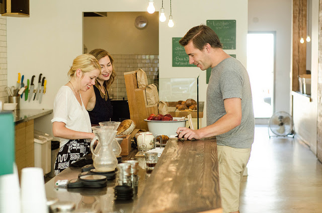
Matchstick, located in Vancouver, is a great example of a well thought through concept on a small budget. 


Matchstick's branding and logo evoke the warmth and playfulness of their owners while also drawing connection to the handcrafted quality of their product.


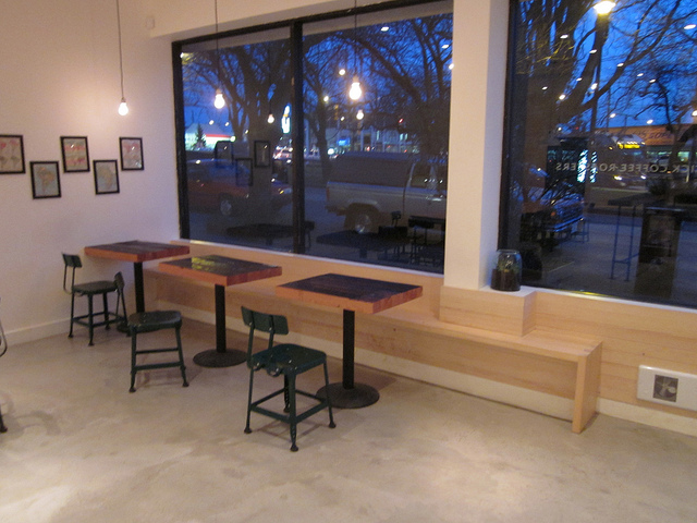
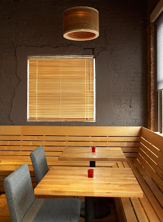
Matchstick did a great job understanding their concept and core identity and portraying it to the public through their use of simple, raw materials and clean color palate. 


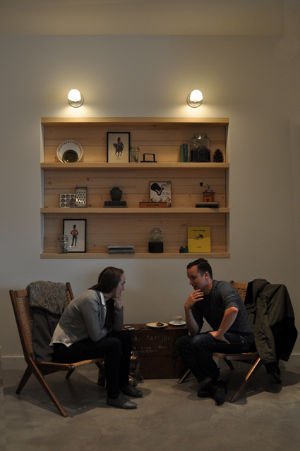
The minimalism created inside of the space not only helps with small budgets, but also keeps the interior unfussy and uncluttered. This direction thoughtfulness of objects and space speaks to the owners clear vision of their brand and product. 


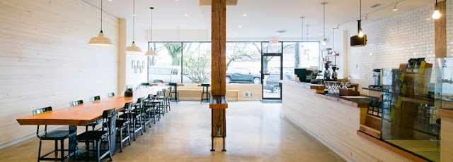
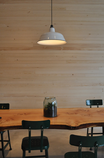
The large, live edge community table is one of the largest visual components of the space (other than the long service bar on the opposite wall) and emphasizes Matchsticks desire to be a community gathering space. This long table can transform to meet multiple needs through the day in a variety of situations and brings people together.


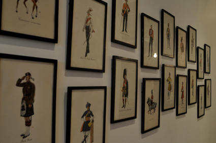
Large groupings of the same artists work create a much bigger visual effect than their initial cost.


Images 2,3 © Matchstick Facebook
Image 4 © Raul P Flickr
Image 5-7 © Cleanhotdry

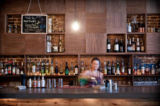
The Sound Table

Name: The Sound Table
Location: Atlanta, GA

The Sound Table merges music, food, and cocktails into a modern package filled with local artists.


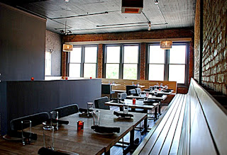
Using locally sourced Ambrosia Maple along with reclaimed timbers and locally crafted lighting, the space feels local, modern and clean.


The slat benches located throughout the space contact the exposed brick walls and add a touch of scandinavian simplicity and lightness.


Image 1 © SpoonFed Atlanda
Image 3 © Eater Atlanta


Sportello

Name: Sportello
Location: Boston, MA


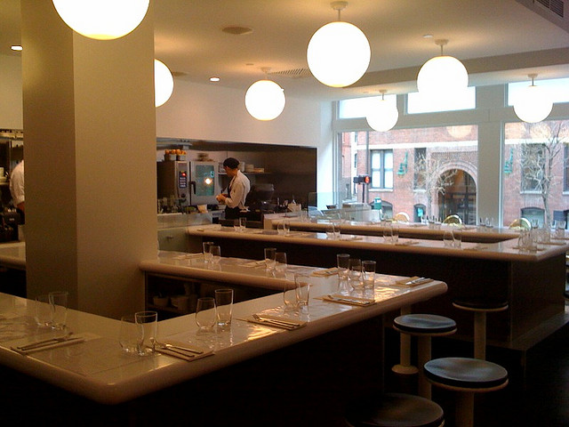
Designed as a modern diner concept, this counter service restaurant serves up fresh italian dishes in a modern and vibrant interior. 


The restaurant features a minimalist design and color palate. The single long bar that wraps through the space allows guests to view and focus on the food being created in front of them.
What's even better than this simple and sleek space is it's sister space, located just downstairs. Check back Monday to see the differences between the two spaces!


Image 1 © Travel & Leisure
Image 2,4 © Visual Dialogue
Image 3© LMGoBlue Flickr