Osteria Oggi Adelaide

Name: Osteria Oggi Adelaide
Location:Adelaide, South Australia
Design: Studio Gram


Utilizing the natural light and architecture of their space, Osteria Oggie is a bright, light-filled space with a focus on repetition and simple materiality. 


Balancing traditional Italian design with the very on-trend pastel color story, the interior feels both fresh and light but also rooted in history and simplicity. The minimalist and pure material palate helps balance the geometric floors and repetition of curves. Attention to detail within such a simplified space elevates the interior and creates a sense of richness and depth.


All images © Yellow Trace via Studio Gram

The Potting Shed

Name: The Potting Shed (at the Grounds of Alexandria)
Location: Melbourne, Australia
Design: Acme & Co


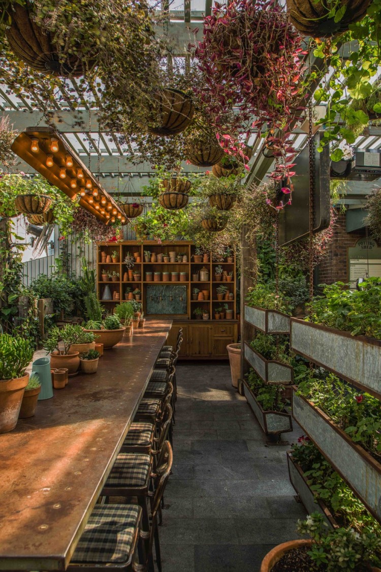
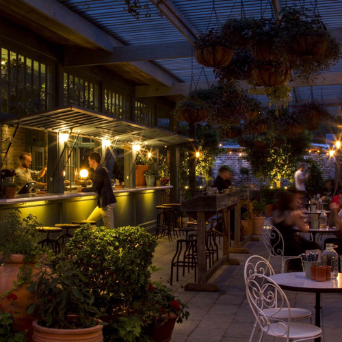
It looks like The Grounds of Alexandria has been growing; both literally & figuratively. One of the newest additions to their already beautiful space (Check out photos of their roaster and cafe, here.) is The Potting Shed. This patio addition does a great job blending into the grounds and creates a welcoming retreat.


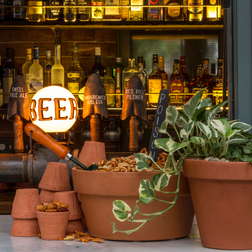
Check out the custom draft tower and more images after the jump-


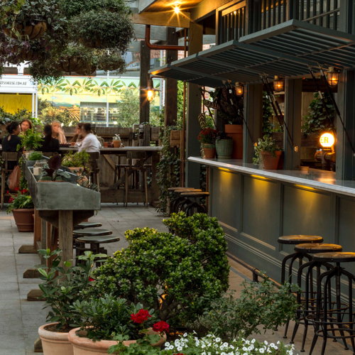
As the name implies, The Potting Shed was designed to resemble just that. Warm shades of green, mismatched patio chairs, and potting tables all help tie the theme together and give you the impression you truly are enjoying your beverage in their garden.


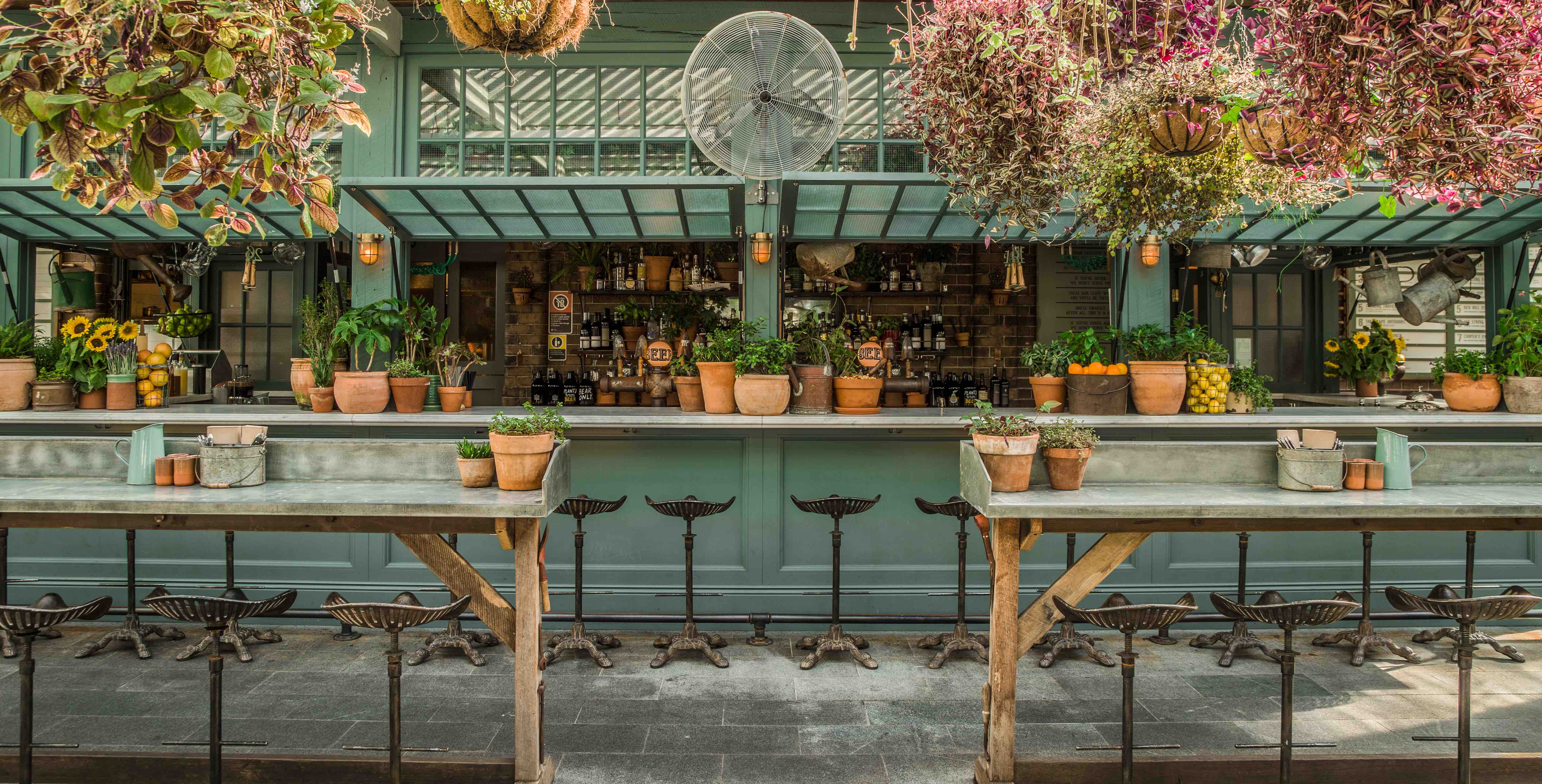
We love the shed itself, with it's operable windows opening up to become the bar and custom draft tower. The brick backdrop and tractor stools add one more layer of warmth to this local watering hole. 


Images 2, 3, 5 © The Daily Addict


Bowery to Williamsburg

Name: Bowery to Williamsburg
Location: Melbourne, Australia
Design: Di & Will Keser (Owners)


With the opening of its second location, Bowery to Williamsburg brings even more Bowery subway station-inspired, Americana sandwich shop goodness to Melbourne. This second location found its home directly across the street from their other spot, Hardware Society, in the original Beetroot space.


I love the initiate, shotgun style space. Given the space restrictions, it make sense Bowery to Williamsburg is reusing the communal layout used with previous tenant Brothl. The working kitchen and prep space interact with the dining space and encourage an engaged and interactive dining experience. 

 All images via Broadsheet.com

Top Paddock Cafe


Name: Top Paddock Cafe
Location: Richmond, Melbourne
Design: Unkown


Light filled and welcoming, Top Paddock uses it's industrial home in Richmond's warehouse district to create multiple spaces and experience.  With a large open kitchen and two bars, one specifically for to-go orders, the space feels thoughtful and exciting. 


White on white geometric moulding, subway tile, and beautiful lights fill the space with warmth and character. The interior also features multiple seating groups splashed throughout the space guaranteeing everyone is likely to find their favorite spot.


Images 1, 2, 4 © Melbourne is Design
Images 3, 5 © Breakfast Out

Auction Rooms Cafe

Name: Auction Rooms Cafe
Location: North Melbourne, Australia
Photography: Erika Hildegard Photography


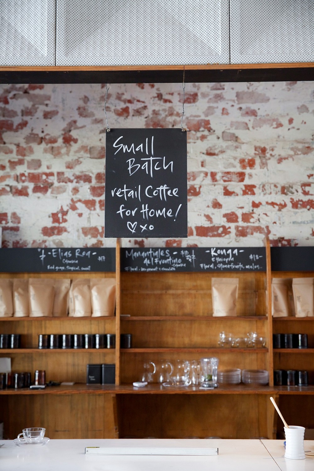
It's always a good day when I get to click through recent images captured by Erika Hildegard. Auction Rooms Cafe is a specialty coffee roaster and cafe located in the former WB Ellis Auction House. With exposed brick, lofty ceilings, and wood supports the architecture sets a pretty great stage.


Given the original space, I find that the reclaimed and reused feel of  fixtures inside to be appropriate and welcoming. 


The vintage and reclaimed touches contrast well with the urban and industrial space while the use of architectural beams help divide the space. These allow the light filled space to remain airy and open. 


Nordburger

Name: Nordburger
Location: Adelaide, South Australia
Design:Peter Jay Deering


Nordburger takes America's favorite concept of burgers and fries, and combines it with a clean aesthetic fitting of the quality food being served. 


 Gone are the primary colors and plastic seats so commonly found in quick service spaces. Utilizing a minimal aesthetic and simple materials keeps the space bright, inviting, and warm. Limited seating encourages quick bites and a grab and go mentality. The use of concrete bases insures the seats they do have stay in place ensuring room for guests to pass. 


All images © Vogue Living AU

Oli & Levi

Name: Oli & Levi
Location: Melbourne, Australia
Design: Unkown
Photography: Erika Hildegard Photography


With the long, dark winter most of the states are currently experiencing, it's always a welcomed sight to have the beautiful work of my favorite Aussie/American photographer pop up in my inbox. Oli & Levi is a cafe in Melbourne that offers a bright and cheerful escape. 


** I just heard Erika will be back in the States this fall. If you are looking for wedding, engagement, family, or interior photos- reach out now before she fills up!**


I love the vibrancy of the space. Filled with bold patterns and a punch of yellow the space feels bright and welcoming.


Built in shelving and displays allows for the small space to utilize every square inch and allows them ample room for storage and retail.


Wallace & Ed


Name: Wallace & Ed
Location: Melbourne, Australia
Architecture: Woods Bagot


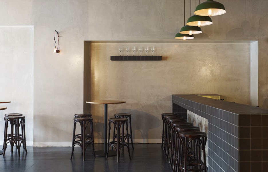
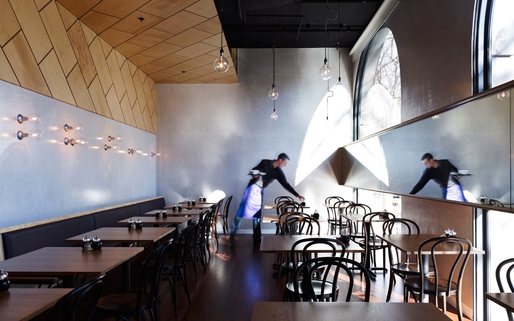
Trends have funny way of always coming back. Wallace & Ed, located in a former Hard Rock Cafe, showcases this phenomenon perfectly with the updated use of wood panels, wrought iron, and simplicity.


Keeping the material palate simple and lines clean allows the play of geometric pattern to take center stage. 


By limiting the use of the panels and incorporating exposed concrete and warm wood floors, the space remains industrial and modern.


All images © The MP Report

Earl Canteen

Name: Earl Canteen
Location: Melbourne, Australia
Design: Unknown


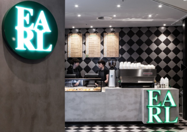
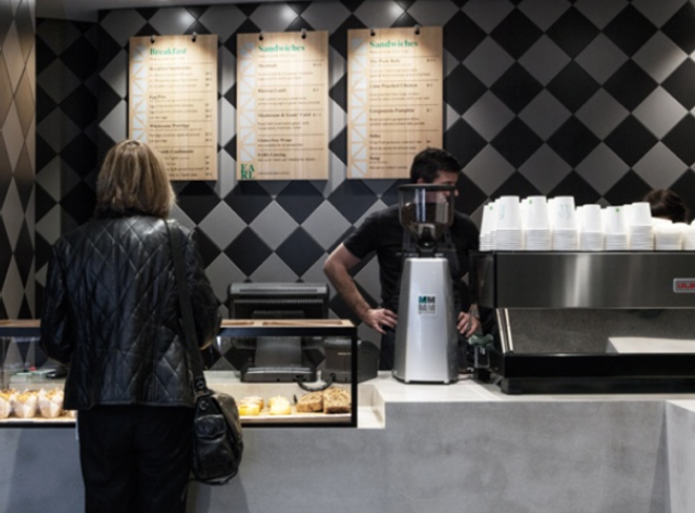
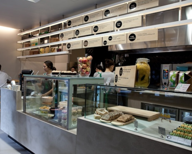
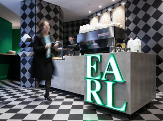
With it's second location now open in Collin's Place, Earl Canteen is proving to be a new direction for grab and go eateries. Their newest location uses their existing color and material palate but introduces  their graphic pattern on a larger scale. 


Utilizing the minimalist color palate with pops of emerald allows the space to remain harmonious while adding excitement. The modern and geometric pattern used liberally throughout helps distinguish the location and brand. 


All images © Broadsheet


Urban Coffee Farm & Brew Bar

Name: Urban Coffee farm & Brew Bar
Location: Melbourne, Australia
Design: Hassell


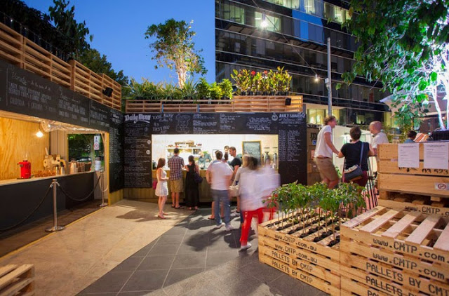
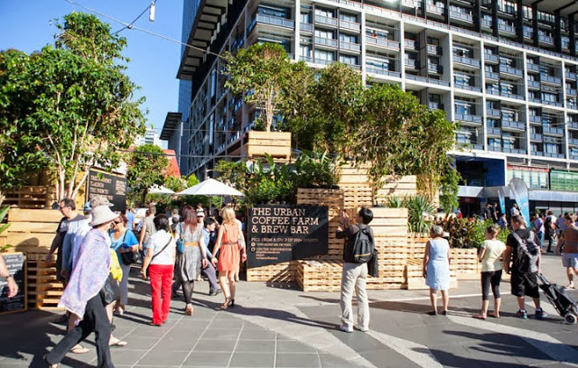
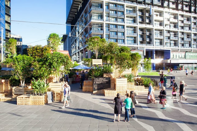
Designed for Melbourne's Food and Wine festival, the Urban Coffee Farm & Brew Bar dissects the coffee beans travel. Utilizing the materials used for transportation, the pop up allows guests to interact and engage with the coffee making process. 


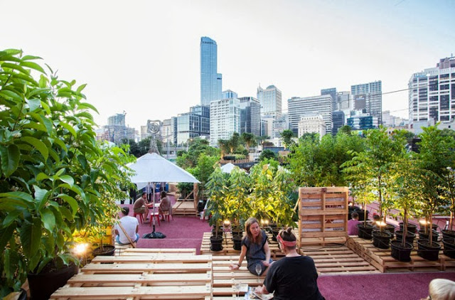
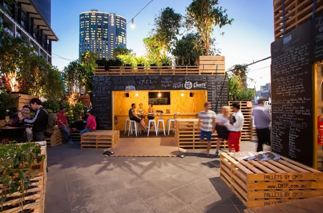
Utilizing shipping containers and pallets; two items used continuously in the shipping of coffee, along with approximately 120 coffee trees transformed the public plaza into an urban jungle.


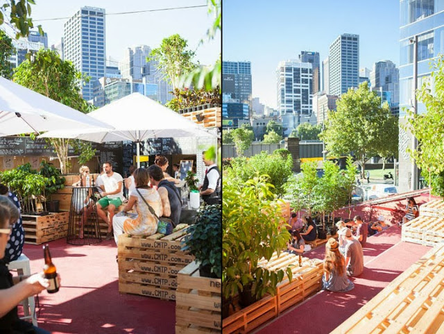
By stacking the pallets and utilizing the existing red steps, they were able to create an oasis in the middle of the city. Thinking of the pallets as both furniture and architectural components allows visitors to define their own needs and use the space accordingly. Pallets can be sat on, used as tables, items to lean against, etc.


I love that they showcased what is possible with limited materials and creative thinking. They were able to open up a discussion and engage visitors on the entire process of growing coffee beans, showcasing the process it takes to get the bean to your cup.  


All photos  © Retail Design Blog