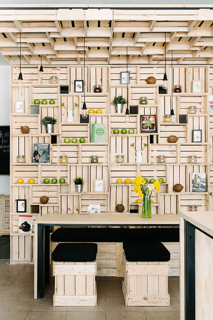
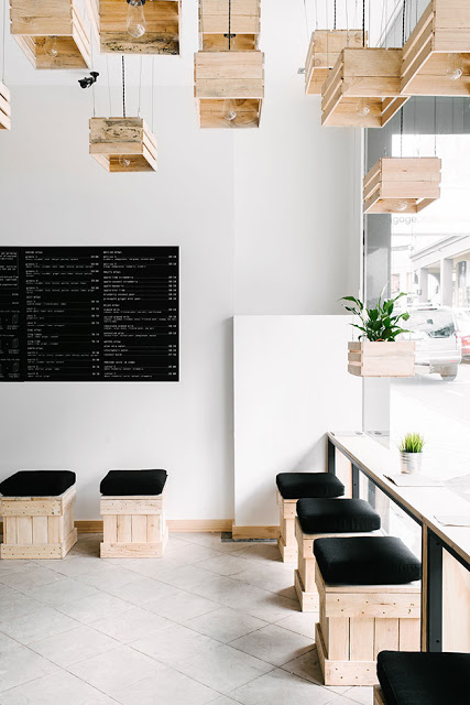
Wallace & Ed


Name: Wallace & Ed
Location: Melbourne, Australia
Architecture: Woods Bagot


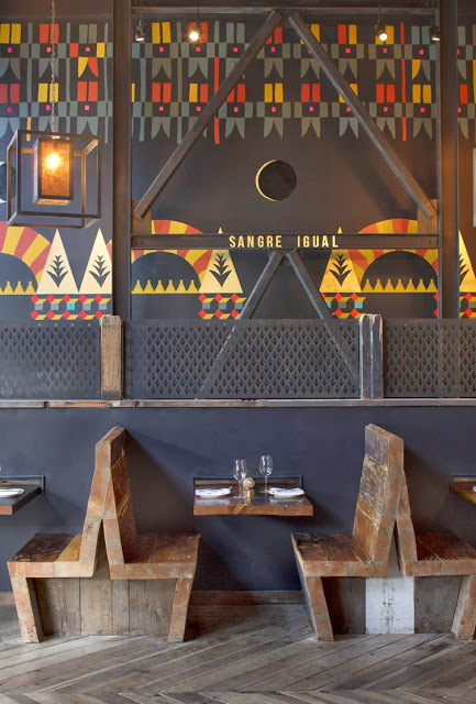
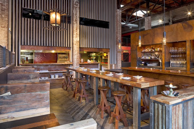
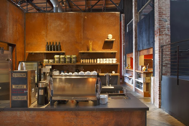
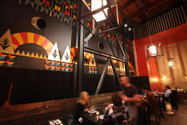
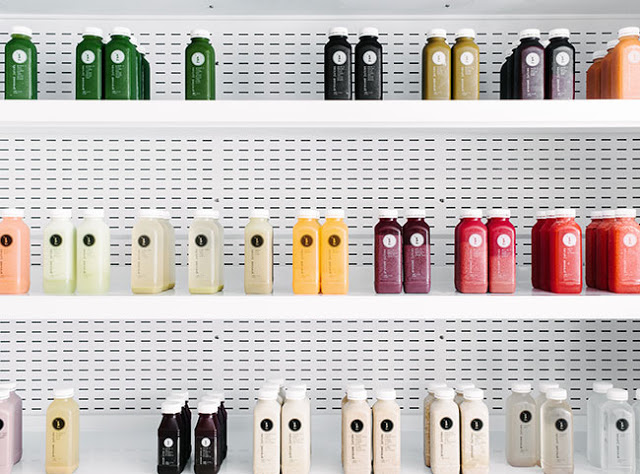
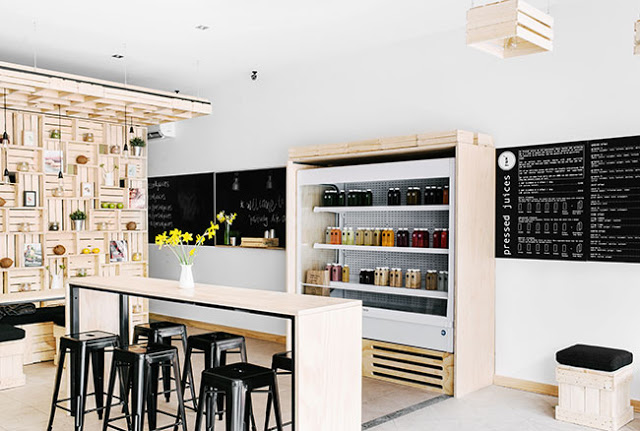
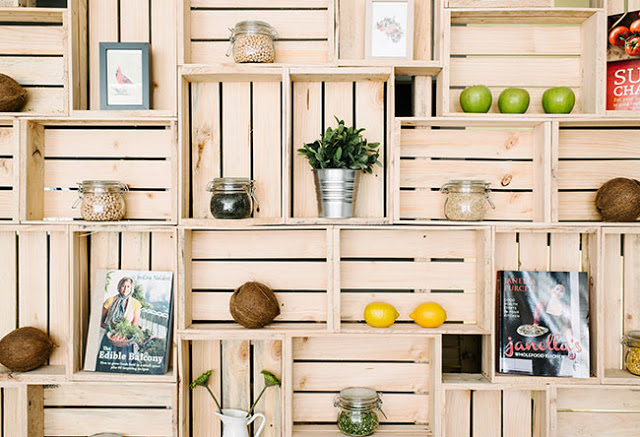
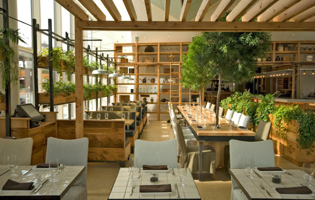
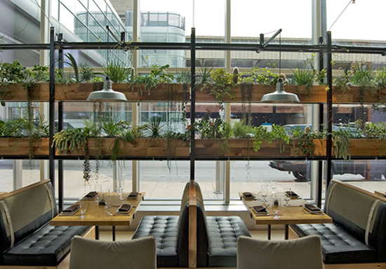
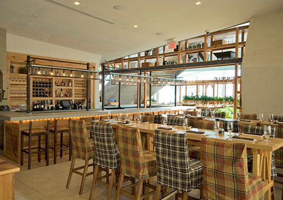
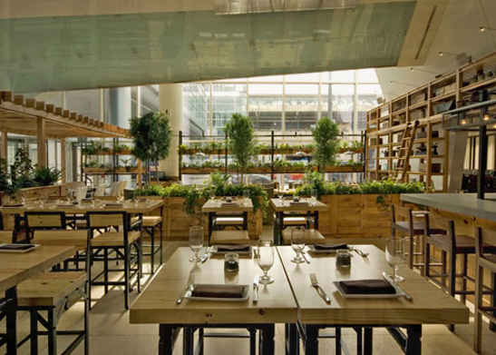
Trends have funny way of always coming back. Wallace & Ed, located in a former Hard Rock Cafe, showcases this phenomenon perfectly with the updated use of wood panels, wrought iron, and simplicity.


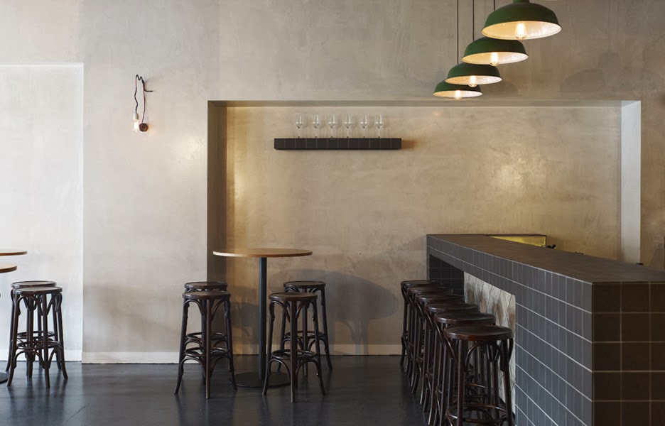
Keeping the material palate simple and lines clean allows the play of geometric pattern to take center stage. 


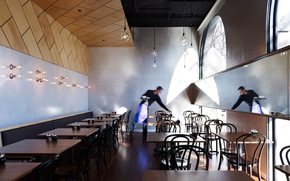
By limiting the use of the panels and incorporating exposed concrete and warm wood floors, the space remains industrial and modern.


All images © The MP Report

Saint Frank Coffe

Name: Saint Frank Coffee
Location: San Francisco, CA
Design: Unkown

Saint Frank Coffee has given me another reason to get back to San Francisco. Located in the Russian Hill neighborhood, with a pop-up cafe at the Public Bike shop in South Park, the cafe is modern, warm, and thoughtful. 


I love the simplicity of the space and cohesion of wood tones and materials. Creating a perfect transition from the dark wood trends currently, and the light wood trends that are slowly creeping their way back in, it balances warmth with light. 


Integrating the technology and brewing into the main bar allows for minimal separations between the customer and barista while also adding to the clean lines of the space.


And how could we not mention those hex tiles- perfection.


IMIG's

Name: IMIG's
Location: San Diego, CA
Design: All the bells & whistles


Located within the Lafayette Hotel in San Diego, IMIG's has it's own distinctive style making it a great dining experience even for locals. 


I love the reclaimed and salvaged window partition that divides the space. Using tone on tone woods and the moulding below helps it feel more like a built-in and architectural detail that a divider. The simple color palate and Thonet-esq lines to the chairs adds a historical touch while remaining updated and slightly trendy. 


ilili Box

Name: Ilili Box
Location: New York, NY
Design: Unkown


Every once in a while a concept will come along that is all together refreshing. ilili Box's take on modular construction and pop-up shop lunches is just the breath of fresh air their trends needed. 


I love the updated and refined twist on the shipping container as well as the mixed material use that breaks up the structure.  Keeping the color palate simple keeps the concept fresh and modern while simultaneously playing with current trend and classic lines. 


Image 1 c Old Brand New
Image 2 c New York Times

Ranger Station

Name: Ranger Station
Location: Snowmass, CO
Design: Scout Regalia


As quickly as winter has appeared, so too have the thoughts of a snowy mountain getaway. New Belgium's Ranger Station, located near lifts at Snowmass Village, has the rustic yet contemporary vibe that is the perfect aesthetic for it's mountain local. 


Balancing a utilitarian and rustic interior creates a modern take on the traditional ski lodge. 


I love the simple but bright color palate and blonde wood; a true 180 to the ski lodges commonly found.
By not only designing the interior but also crafting some of the furniture within, the designers were able to create a fully cohesive space. 


All images © Scout Regalia

Essex

Name: Essex
Location: Seattle, WA
Design: tbD


Essex, located near the Ballard area of Seattle, is a bright and inviting space that has quickly made it on my 'I need to get there' list. Playing with contrast to create balance created a welcoming space.


While utilitarian in nature, playing with geometrics and warm colors woods helps the interior come alive. 


The contrast between the warm woods and bright whites of the back bar and countertops helps to maintain the brightness within the space while also creating a balanced and cohesive interior. 


Duende

Name: Duende
Location: Oakland, CA
Design: Arcsine Architecture in collaboration with multiple local artisans.


With today's highly competitive restaurant scene, restaurant owners know that the need to offer more than just a great plate of food in order to attract and keep guests. Duende, located in Oakland, California was crated with this in mind and offers a bit for everyone. 


Located in a historic Art Deco building, the interior utilizes graphics and patterns to bridge the deco exterior and industrial nature of the space. 

The large interior utilizes large amounts of worn wood and exposed brick to balance out the saturated and geometric murals.

I love that while the space is large in scale, the warmth and amount of detail keep it warm and unimposing.

All Images via Weheart

Pressed Juices

Name: Pressed Juices
Location: South Yarra, Melbourne VIC
Design: Unknown


As the juice trend continues to expand throughout the world, I love seeing these shops & cafes step up their interior. Creating an environment that matches the product being sold is critical in the food industry today and Pressed Juices created a space fitting with their brand. 


The minimal color and material palate creates a calming and cohesive space. This use of simplicity allows the vibrant colors of their product to be front and center. 


The creative use of materials provides a large visual impact, adds extra storage and display space, and drives home the hand crafted and organic feel of their company. 


Photos © Booke Holm for Share Design

J.G. Domestic

Name: J.G. Domestic
Location: Philadelphia, PA
Design: Unknown


J.G. Domestic, another space from well known chef and restauranteur Jose Garces, is the definition of modern farmhouse. Rustic timber sits alongside lush foliage and modern lines to create an updated take on tradition. 


Plaid fabric covers, reclaimed wood, and steel all work together giving the traditional farmhouse/rustic feeling. 


While the openness, clean lines, and simplicity all add the touch of modern that takes the concept toward trendy and now. 


Photos © J.G. Domestic & Ahra Lee


Lowbrau Bierhalle

Name: Lowbrau Bierhalle
Location: Sacramento, CA
Graphic Design: Band

Lowbrau bierhalle is a modern interpretation of the traditional German Beer Hall. I love that they took a traditional concept, reinterpreted it for their local, and created a space that refreshingly different while still playing homage to the original. 


The rustic interior features hits of reflective gold, elevating the rustic and causal interior. Utilizing graphic design and their pig and crown logo helps tie in the gold accents while still paying tribute to the traditional concept. 


By understanding the importance of the interior and branding within their space, Lowbrau was able to create a upbeat and fun execution of a historical concept. 


All photos © Band


Get 10% Off sitewide when you shop at "http://www.thelashop.com/">TheLAShop.com
Valid until December 2013.