Oli & Levi

Name: Oli & Levi
Location: Melbourne, Australia
Design: Unkown
Photography: Erika Hildegard Photography


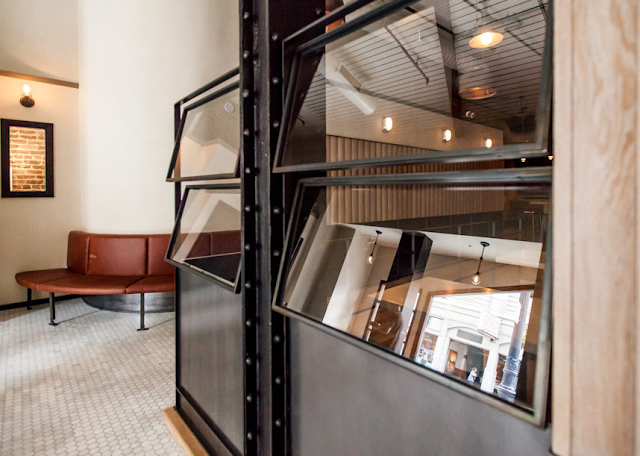
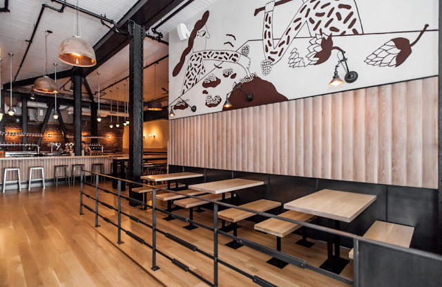
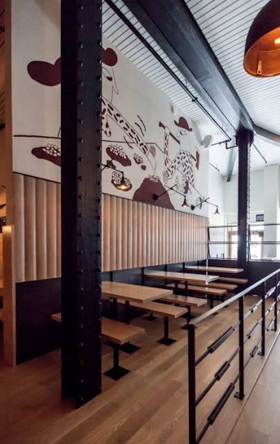
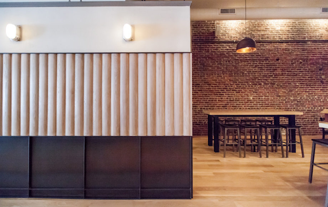
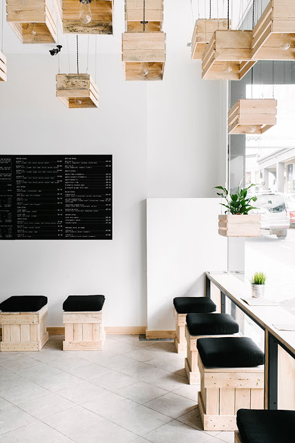
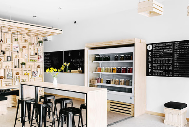
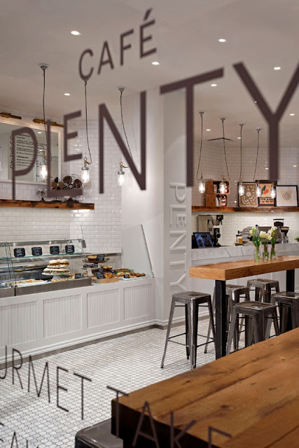
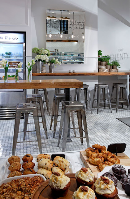
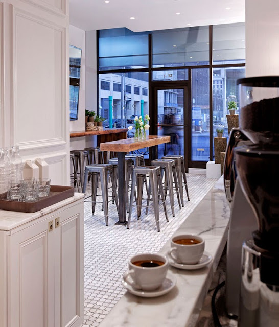
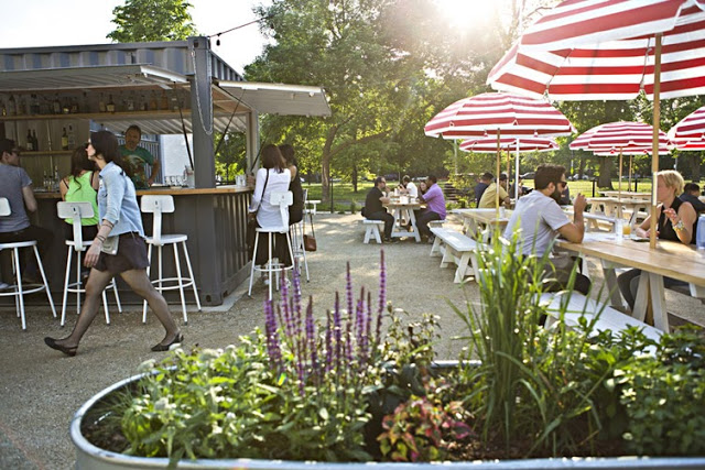
With the long, dark winter most of the states are currently experiencing, it's always a welcomed sight to have the beautiful work of my favorite Aussie/American photographer pop up in my inbox. Oli & Levi is a cafe in Melbourne that offers a bright and cheerful escape. 


** I just heard Erika will be back in the States this fall. If you are looking for wedding, engagement, family, or interior photos- reach out now before she fills up!**


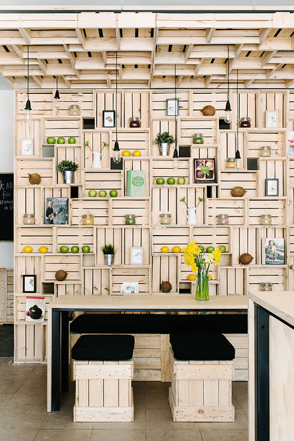
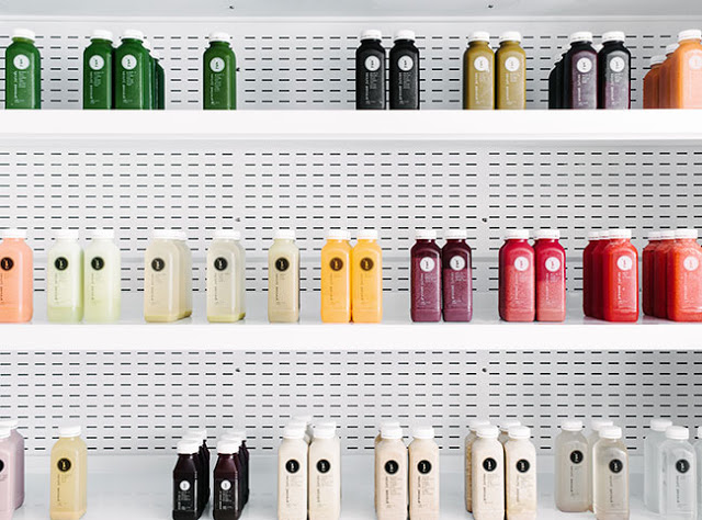
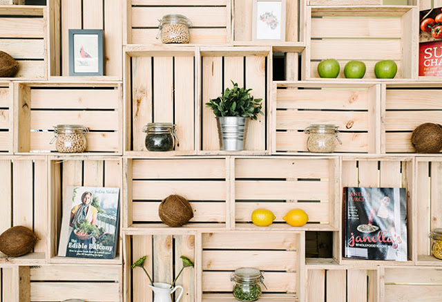
I love the vibrancy of the space. Filled with bold patterns and a punch of yellow the space feels bright and welcoming.


Built in shelving and displays allows for the small space to utilize every square inch and allows them ample room for storage and retail.


Saint Frank Coffe

Name: Saint Frank Coffee
Location: San Francisco, CA
Design: Unkown

Saint Frank Coffee has given me another reason to get back to San Francisco. Located in the Russian Hill neighborhood, with a pop-up cafe at the Public Bike shop in South Park, the cafe is modern, warm, and thoughtful. 


I love the simplicity of the space and cohesion of wood tones and materials. Creating a perfect transition from the dark wood trends currently, and the light wood trends that are slowly creeping their way back in, it balances warmth with light. 


Integrating the technology and brewing into the main bar allows for minimal separations between the customer and barista while also adding to the clean lines of the space.


And how could we not mention those hex tiles- perfection.


Clive Burger

Name: Clive Burger
Location: Calgary, Canada
Design: Unknown

Clive Burger is a wonderful example of a fast casual space with a modern and fun interior. Utilizing cartoon-esq graphics paired with a restrained material and color palate, allows the space to feel whimsy while establishing a clean and modern space. 


The use of custom furnishings allowed the seating and space to be maximized while keeping a harmonious overall feel.


Images © Scout Flickr

Mikkeller Bar

Name: Mikkeller Bar
Location: San Francisco, CA
Design: Martin heid design/build


An American take on a Copenhagen brewery, Mikkeller is as much a standout for it's location as it is for the design. 


With blond woods, exposed brick, and industrial charm the space perfectly blends the Scandinavian lightness with the gritty and raw location.  Many of the design components remind me of Torst beer bar, located in Brooklyn.


 Teaming up with The Trappist of Oakland and Mikkel Borg, who opened the original Mikkeller Bar in  Copenhagen, the bar has high standards to be the best beer bar in the US.


The large scale of the two story space is accentuated with large scale graphics, heavy steel posts and an all encompassing bar surrounded by minimalist bar stools.


All images © Eater SF

Elbow Room

Name: Elbow Room
Location: Brooklyn, NY
Graphic Design: mgmt. design
Interior: Greg Yang Design


I love it when the graphic design, identity, and interior all come together to form a cohesive space and presentation. The Elbow Room restaurants are a great example of this cohesive and thought through design. 


Using simple materials, the very trendy pixilated graphics, and typography that ties back to the noodles being served, the entire space comes together to create a minimalist but warm space. 


Once again, using a restricted color palate; this time yellow, black, and white, creates instant cohesion while tying into the iconic cheesy color so many of us recognize and love. 


All images © Behance

Pressed Juices

Name: Pressed Juices
Location: South Yarra, Melbourne VIC
Design: Unknown


As the juice trend continues to expand throughout the world, I love seeing these shops & cafes step up their interior. Creating an environment that matches the product being sold is critical in the food industry today and Pressed Juices created a space fitting with their brand. 


The minimal color and material palate creates a calming and cohesive space. This use of simplicity allows the vibrant colors of their product to be front and center. 


The creative use of materials provides a large visual impact, adds extra storage and display space, and drives home the hand crafted and organic feel of their company. 


Photos © Booke Holm for Share Design

Rawduck

Name: Rawduck
Location: Hackney, London
Design: Unknown

Rawduck, the sister restaurant to London's widely known Ducksoup, is delightfully raw and simple. The wonderful use of concrete and metal come together to create a space that is open and fresh.  


With a clean and fresh interior, Rawduck has created a slight spin on the very popular industrial interior. Simple materials, clean lines, and unpretentious execution all foster a fresh, raw space. 


I love the poured concrete bar and tables, as it is a material I believe too often overlooked. It's versatility  and rich texture add a wonderful feel to the space, while the scalloped/crimped edge along the bar is a great example of the level of detail you can easily achieve. 


Photos © We heart Co

Cafe Plenty

Name: Cafe Plenty
Location: Toronto, ON
Design: II BY IV DESIGN


Cafe Plenty uses a neutral color palate, natural materials, and graphic design to create a memorable and fresh cafe interior. 


While limited in color, there are no shortage of rich details and textures that add warmth and depth to the interior. 


Layering beveled edge tile, breadboard, rustic wood, and metal creates a welcoming environment that remains fresh, open, and bright. 


Utilizing creative graphic design and signage, the windows keep views into the space open while clearly telling those passing what lies behind the glass. 


Utilizing natural materials highlights the natural food and beverage offerings while custom bar height counters keeps the narrow space open and traffic flowing through. 


All photos © A.R.E Design Awards


Maison

Name: Maison
Location: South Africa
Design:


I love the simplicity and openness that is shown throughout Maison. A winery with a tasting room, deli, and restaurant; all spaces work in harmony but still give a large graphic punch. 


The use of blonde wood, stark acrylic chairs, and polished white creates an airiness throughout the space. Paired with the worn barn wood, stacked logs, and wine bottle chandelier, each spaces still exuded warmth and remains inviting. 


The use of furniture and fixtures that are also light and airy in appearance helps extend the open feeling of the space. 


 Images © Weheartco & Maison


Local Favorite; Parson's Chicken & Fish

Name: Parson's Chicken & Fish
Location: Chicago, IL
Design: Land & Sea Dept


As a modern take on the classic neighborhood joint, Parson's created a vibrant and fun space that utilizes color, geometric shapes, and clean lines. 


Located in a classic 70's era building, Parson's plays up the vintage vibe using a minimalist color palate of red, white, and blonde wood. Utilizing the red geometric pattern throughout the space (from the warfront to the packaging) crates cohesion within the space. Both color and pattern create a big visual impact for a small investment. 


The 283 person patio is outfitted with picnic tables and striped umbrellas and easily makes up for the large U-shaped community booths inside which while maximizing seating, minimize options for the smaller sized groups. 

Head over and experience the patio and fried chicken on the next warm summer day in Chicago.


All photos © Clayton Hauck via Weheart