James Beard Awards 2013


Just like many others in the food industry, May 6th was spent live streaming & refreshing every social media outlet to get the play by play of the annual James Beard Awards!

While many were awarded, we are always more interested in those that deliver the full package;  great chef, great food, and well designed spaces. Take a look at a few of our favorite winners, after the jump.


*For additional photos, click the photos below.

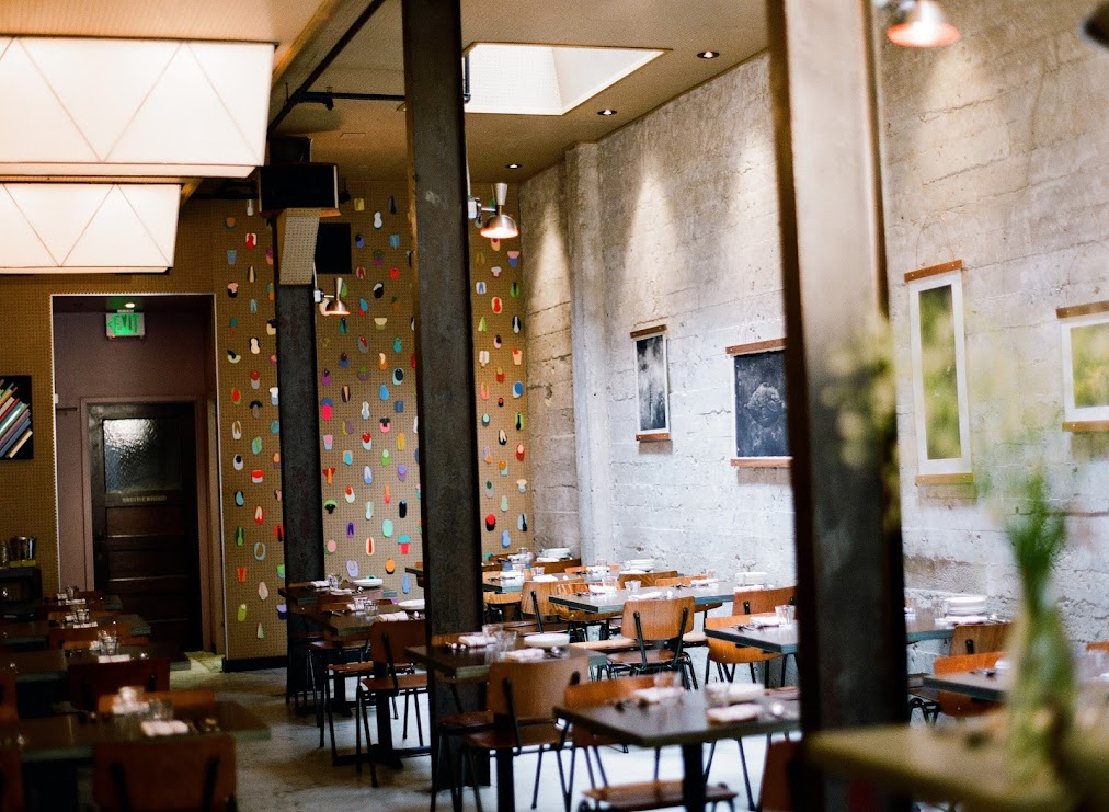
Best Restaurant Design- under 75 seats
Name: Isa
Location: New York
Design: Taavo Somer


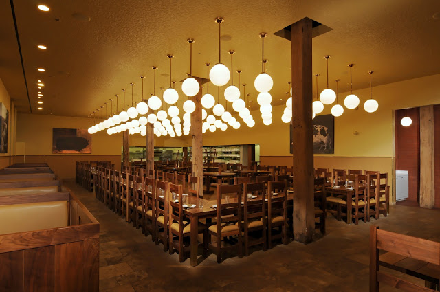
Best Chef in America; Midwest
Name: Stephanie Izard
Restaurant: Girl & the Goat/ Little Goat Bread


Best New Restaurant
Name: State Bird Provisions
Location: San Francisco, CA


Outstanding Chef
Name: Paul Kahan
Restaurants: Blackbird/ Avec/ Publican/ PQM


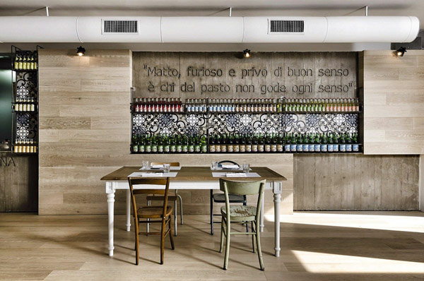
Kook Restaurant & Pizzeria

Name: Kook Restaurant & pizzeria
Location: Rome
Design: Noses Architects


Upon first look at Kook, you'd have a difficult time determining if the space was a restaurant or just a great home.


Using concrete, steel and glass as the main design materials the space has an urban, industrial feel which is surprising for the classic space it is housed in. 


Using wood and reclaimed pieces, the added warmth into the space and balanced the raw materials.


One of my favorite features in the space is their use of traditional concrete tiles as both backslashes and flooring to break up the space, add warmth and pattern and add a small splash of color.


All images © Fresh Home

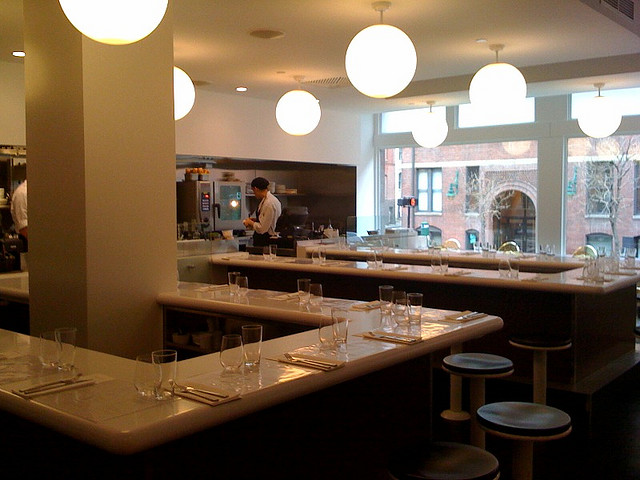
Sportello

Name: Sportello
Location: Boston, MA


Designed as a modern diner concept, this counter service restaurant serves up fresh italian dishes in a modern and vibrant interior. 


The restaurant features a minimalist design and color palate. The single long bar that wraps through the space allows guests to view and focus on the food being created in front of them.
What's even better than this simple and sleek space is it's sister space, located just downstairs. Check back Monday to see the differences between the two spaces!


Image 1 © Travel & Leisure
Image 2,4 © Visual Dialogue
Image 3© LMGoBlue Flickr

Dogmatic

Name: Dogmatic
Location: New York, NY
Design: EFGH


Dogmatic is a sight to be seen. What started as a simple hot dog cart, now has a brick and mortar home to call it's own. The truly impressive part of Dogmatic is what lies just inside of the sleek, industrial exterior. A simple interior with nothing more than a communal table and bench seating at first glance opens itself up (almost literally!) to accommodate diners. the butcher block communal table that runs through the center features individual wood seats that can be slid out from under the table and pushed back in when not in use to truly maximize the small size of the space. Even the waste basket is blended into the wall. All of these space saving solutions allow the space itself to feel sleek, modern, and clean and allow efficiency to be the center of attention. 


All photos © EFGH

Tiny Cafe

Name: Tiny Cafe
Location: Australia
Design: Foolscap Studio


At under 150SF, this cafe packs everything in while managing to keep the space clean, cohesive, and fun.  With a kitchen, coffee machine and seating for 12 all located under a set of stairs ins hat used to be an old laundry cupboard, Tiny used space saving solutions like folding down tables and a simple color palate to keep the space focused and efficient.


Tiny Cafe Sections

All images © Foolscap

Architectural Digest's Best New Restaurant Design

Recently, Architectural Digest released their top 12 list of innovative restaurant interiors. Here is a recap of our top three favorites off their list. Follow the links for even more information and photos about the design and spaces.


Name: Tori Tori 


Name: Isa


Name: Radio Restaurant


Check back next week for a few that didn't make the list, but probably should have.