Nordburger

Name: Nordburger
Location: Adelaide, South Australia
Design:Peter Jay Deering


Nordburger takes America's favorite concept of burgers and fries, and combines it with a clean aesthetic fitting of the quality food being served. 


 Gone are the primary colors and plastic seats so commonly found in quick service spaces. Utilizing a minimal aesthetic and simple materials keeps the space bright, inviting, and warm. Limited seating encourages quick bites and a grab and go mentality. The use of concrete bases insures the seats they do have stay in place ensuring room for guests to pass. 


All images © Vogue Living AU

Our Work: Foursided

Name: Foursided
Location: Chicago, IL
Design: Kaper Design, LLC
Photography: Kyle McKenna


Kaper Design is excited to share our latest work in Chicago! Located in the heart of East Lakeview (Just a few blocks down from Dryhop, too.), Foursided is a neighborhood staple for those looking to get the best framing or unique gift. Being the original location, it came time for a facelift and we were happy to jump on board. Follow the jump below for a look at their new space.


In order to bridge functionality with aesthetic, we created zones and divided the space into a private back workroom and public front of space retail section. Dividing the two areas allows works to spread out and get creative while creating a determined area for customers to meander. Custom steel and metal shelving units were fabricated to add vertical storage. These pieces add warmth while remaining light, allowing your eye to focus on the good placed on them. 

On of my favorite components of the space is the large, sliding panels which now display the extensive frame sample collection. Utilizing a custom designed steel track system (Similar to a school house blackboard), allows us to minimize the amount of square footage needed to display the frames while still keeping them easily accessible for employees and guests.


Custom designed and built shelving in the center of the space adds display and retail space while also keeping customer traffic flowing through the space. The counters were custom designed and fabricated by Fourth lake Carpentry Inc. and grant us lots of extra storage space for frame samples and prints. 


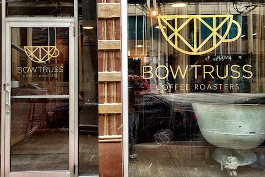
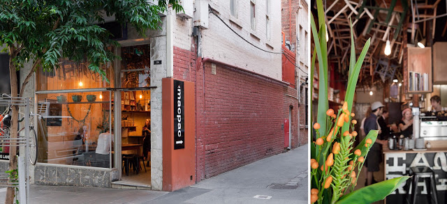
The front of the store received a brand new facade, tile entry way, and raised displays. Paired with the removal of the awnings the space is now clearly visible to all passing by.


Nights and Weekends

Name: Nights and Weekends
Location: Brooklyn, NY

 Nights and Weekends is a small cuban spot with the classic 'Brooklyn' feel. Warm, inviting, and comfortable are all words that come to mind when thinking about this local spot. 


I love the patina and texture on the walls as it gives the entire space a vintage/ lived in atmosphere.  The industrial back bar allows for ample storage while enhancing the casual atmosphere. 


The simple, industrial furnishings give it just a touch of attitude, establishing the perfect laid back and welcoming atmosphere. 


The triangular footprint of the space means most of the seating can be found along the walls, leaving the interior largely open; a great benefit for late night bar crowds. The space also features large windows opening up to the outside. Vintage stools attached to the exterior allow guests to sit outside while minting the connection to the interior and bar. 


Local Favorite: Bow Truss

Name: Bow Truss
Location: Chicago, IL


With NeoCon just around the corner, I wanted to give all those headed into town a look at one of my favorite coffee shops near the Mart.

Bow Truss is a local, small batch roaster with two locations in Chicago. While both serve amazing coffee, their newest location in River North is the stand out in terms of design. 


A smaller space than their original, the River North location still maintains the rustic, reclaimed, and hip nature the original East Lakeview location is known for but does it a more thoughtful and concentrated manor. 


Images © Zagat, Doejo

Moustache Milk + Cookie Bar

Name: Moustache Milk + Cookie Bar
Location: Auckland, NZ


 While literal, the milk bottle light fixture sums up and drives home the concept. Keeping all of the interior fittings and furnishings very modular helps create untidy within the small space while still allowing a small amount of seating.


A fun break from the normal, Moustache Milk & Cookie Bar has created a playful interior filled with colorful notes.


Images © Architecturenow


Brother baba Budan

Name: Brother Baba Budan
Location: Melbourne, Australia
Photography: Erika Hildegard


Located along the tiny alley of Little Bourke Street, Brother Baba Budan is a small cafe with a big personality.  


Having a small footprint, creativity is shown through the use of common materials, in this case; chairs, used in uncommon ways. By placing the chairs on the ceiling, it creates a texture and pattern and draws the eye up, emphasizing the spaces height. 


Placing shelving and displays at a higher vantage point also frees up the floor space they do have to allow for quick grab and go coffee and a small community table in the center of the space.


Using wood as the primary build-out material and leaving the walls relatively raw, they were able to create a hip and urban space that keeps the focus on the coffee.


 All photos © Erika Hildegard

Mosto Tequila + Botanas Bar

Name: Mosto Tequila + Botanas Bar
Location: San Francisco, CA


Tacolicious, a San Francisco favorite, created it's fourth locations recently in the Mission. Located at the back of the Tacolicious space is tequila bar, Mosto. The narrow bar maximized it's small footprint with minimal seating and eye catching details.


Using over 3,000 Mason jars, the bar created a texture and pattern along the ceiling, drawing your eye up towards their display of extensive Mexican liquors. 

Utilizing the bar height banquette and backless stools allows for minimal interruptions along the narrow space while maximizing seating.


Image 1 © Inside scoop SF
Image 2 © Bon Appetit
Image 3 © Sosh
Image 4 © Scout

Patricia Coffee

Name: Patricia Coffee
Location: Melbourne, Australia
Design: Foolscap
Photography: Erika Hildegard


One of the greatest components of being a part of a creative community is the creative collaborations we get to facilitate and participate in. Our friend Erika, is an extremely talented photographer and just relocated to Melbourne, Australia. We couldn't wait to see the adventure through her lens, and decided to team up to bring our readers a few intimate looks inside some of Melbourne favorite spots.


Patricia coffee is a small cafe located on the corner Little Bourke & Little Williams and focuses on providing great coffee with little distraction.


Patricia's small space allows for 'standing room only' in order to focus on simplicity and producing a great cup of coffee.


The space merges traditional with new just as the coffee served bridges the traditional coffee experience with the bustling new coffee scene in Melbourne.


Simple details, a restrained color palate, and modern touches create a rich space that still feels open and inviting. 


I love the creative use of simple tile to create a more detailed pattern which acts as a simple backdrop to the coffee production. 


Oyster House

Name: Oyster House
Location: Philadelphia, PA

,
Oyster House, located in Philadelphia, is a great example of a small space that doesn't sacrifice on style.
Blending nautical, traditional, and industrial design components they have created a balanced and inviting local spot.

I love that the oyster bar is on full display and allows for enough room to properly display the beautiful catch, and craft of preparation.


The classic white subway tile creates a texture to the walls that contrasts the rich table and Thonet-style barstools.


The industrial pendants and light fixtures are balanced by the intricate moldings and traditional furnishings.


All photos © Oyster House


Kiosk

Name: Kiosk
Location: Strasbourg, France


Kiosk was created based on the idea that everyone has a favorite little diner. One that is small and comfortable and makes you want to return time after time. 
With touches of mid century modern, Kiosk puts a fresh spin on the classic concept.


The use of butcher block and blond wood helps balance the small space While the globe pendants and curved lines evoke the classic mid century modern appeal.


All photos © behance