Nomad Coffee

Name:

Nomad Coffee

Location: Barcelona

Design: Unknown

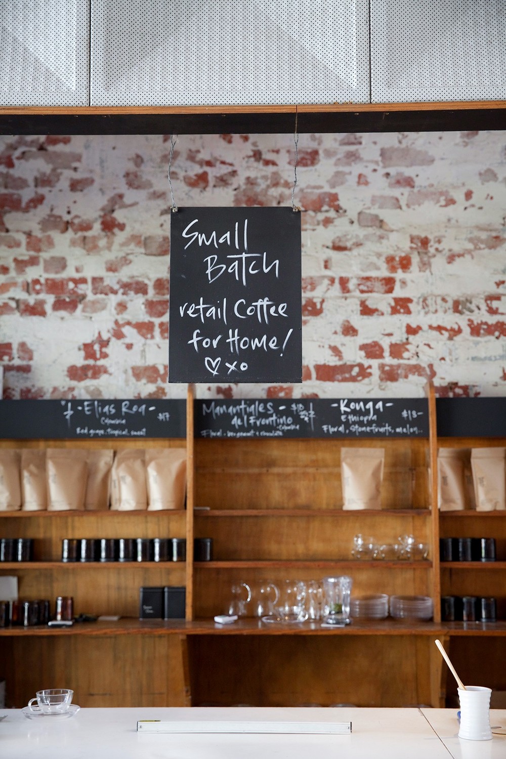
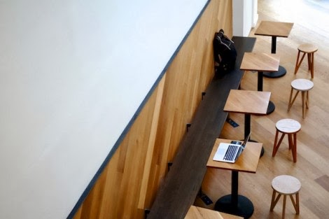
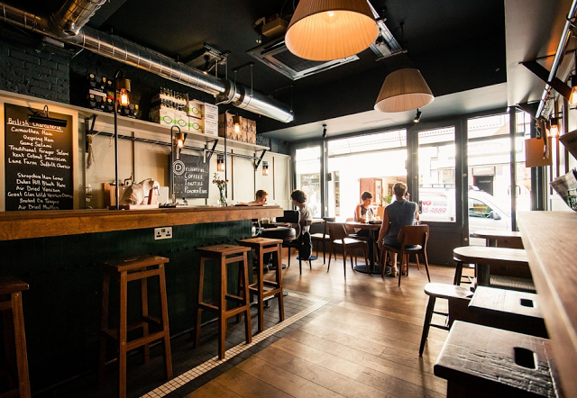
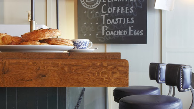
There is something great about the simplicity and unfussy nature of Nomad Coffee. Located in Barcelona, Nomad started out as a small cart and has since transitioned to a brick and mortar space, their name speaking to their roots. 

The unimposing and warm facade welcomes you into a communal space with a utilitarian aesthetic that emphasizes the craft and connection.

Image 1, 2 ©

Fuet Magazine

Image 3 ©

The Soup Spoon

Alfred Coffee

Name: Alfred Coffee
Location: Los Angeles, CA (Multiple)
Design: Joshua Zad


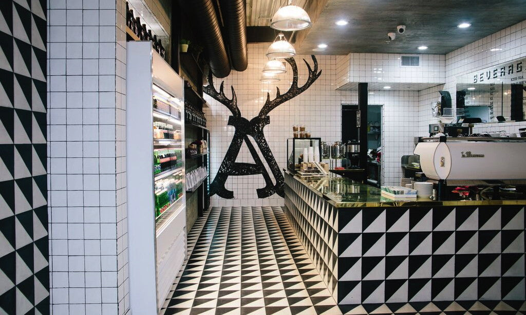
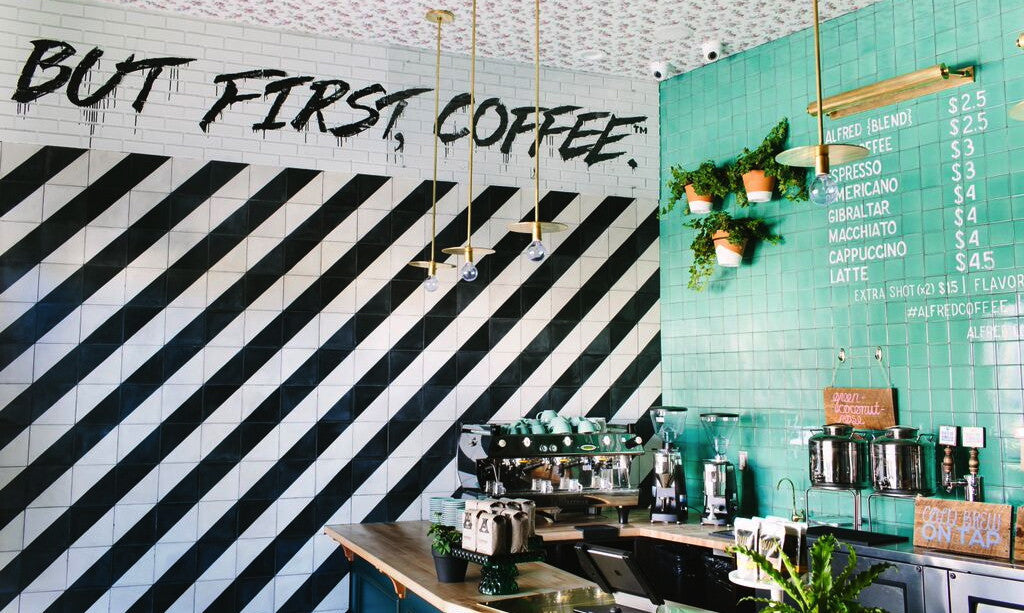
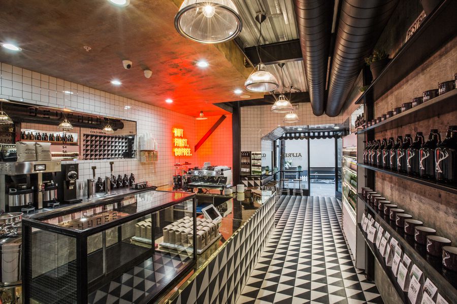
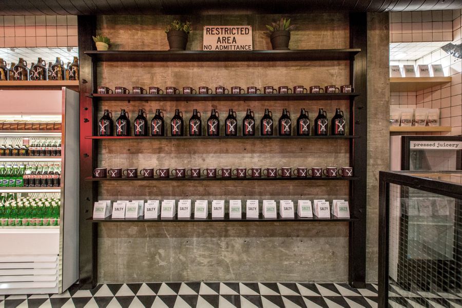
One look around the Alfred Coffee in the Alley location and you'll realize this is not your typical coffee shop. Bolder than what we are used to, it creates a great buzz of energy that is refreshing from a design stand point. 


Keeping it simple with black and white, the play with contrast and shape help create a dynamic interior that is anything but traditional. 


Personally, I love the use of the red neon and the gold counters. They elevate the otherwise simple materials and create a great energy within the space. The addition of aqua in the Brentwood location act in the same manner, keeping the space bold but still approachable and refreshing. 


Photos 1-3 © Alfred Coffee
Image 4- 6© Eater LA


Auction Rooms Cafe

Name: Auction Rooms Cafe
Location: North Melbourne, Australia
Photography: Erika Hildegard Photography


It's always a good day when I get to click through recent images captured by Erika Hildegard. Auction Rooms Cafe is a specialty coffee roaster and cafe located in the former WB Ellis Auction House. With exposed brick, lofty ceilings, and wood supports the architecture sets a pretty great stage.


Given the original space, I find that the reclaimed and reused feel of  fixtures inside to be appropriate and welcoming. 


The vintage and reclaimed touches contrast well with the urban and industrial space while the use of architectural beams help divide the space. These allow the light filled space to remain airy and open. 


Oli & Levi

Name: Oli & Levi
Location: Melbourne, Australia
Design: Unkown
Photography: Erika Hildegard Photography


With the long, dark winter most of the states are currently experiencing, it's always a welcomed sight to have the beautiful work of my favorite Aussie/American photographer pop up in my inbox. Oli & Levi is a cafe in Melbourne that offers a bright and cheerful escape. 


** I just heard Erika will be back in the States this fall. If you are looking for wedding, engagement, family, or interior photos- reach out now before she fills up!**


I love the vibrancy of the space. Filled with bold patterns and a punch of yellow the space feels bright and welcoming.


Built in shelving and displays allows for the small space to utilize every square inch and allows them ample room for storage and retail.


Saint Frank Coffe

Name: Saint Frank Coffee
Location: San Francisco, CA
Design: Unkown

Saint Frank Coffee has given me another reason to get back to San Francisco. Located in the Russian Hill neighborhood, with a pop-up cafe at the Public Bike shop in South Park, the cafe is modern, warm, and thoughtful. 


I love the simplicity of the space and cohesion of wood tones and materials. Creating a perfect transition from the dark wood trends currently, and the light wood trends that are slowly creeping their way back in, it balances warmth with light. 


Integrating the technology and brewing into the main bar allows for minimal separations between the customer and barista while also adding to the clean lines of the space.


And how could we not mention those hex tiles- perfection.


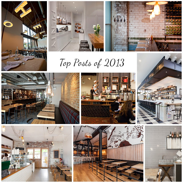
A Look Back: Top Posts from 2013

Here is a look back on some of our top posts from 2013!

Thank you to all of our readers for making this year such a great year. We can't wait to share even more great restaurant design in 2014.


Clockwise from top left;

The Whale Wins, Seattle
Hardware Society, Melbourne
Mikkeller Bar, San Francisco
Wee Jeanie, Melbourne
Dryhop Brewers, Chicago
Chez Dré, Melbourne


Are there spaces you would like to see or a photographer looking to collaborate? Send us a message, we'd love to chat!

Truth Coffee Shop

Name: Truth Coffee Shop
Location: Cape Town, South Africa
Design: Haldane Martin


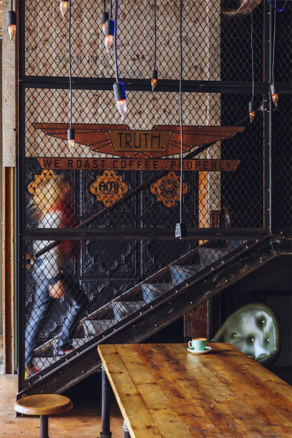
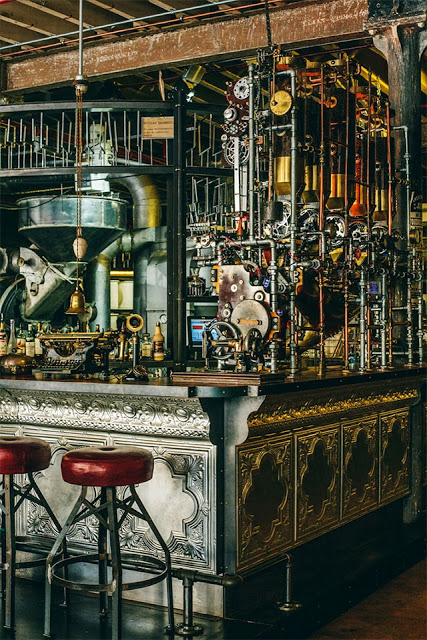
One of the most noticeable trends throughout the world currently is the influx of industrial. With a raw nature, truth of materials, and authenticity it is easy to see how so many have grown to love this aesthetic. As with any trend, there grows the group of people who yearn to be different and to expand past what is 'trendy'. One of the most common trends I see coming into favor is Steampunk. While I can see direct link from industrial to steampunk, I feel the need to stress that these two styles are by no means the same. Truth Coffee Shop is a great example of what steampunk represents and showcases the differences between the two styles flawlessly. 


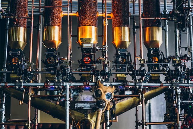
The steampunk style relies heavily on the mixture science fiction and steam powered machinery. Blurring the line between industry and decoration, steampunk can incorporate a varying degree of components and characteristics. 


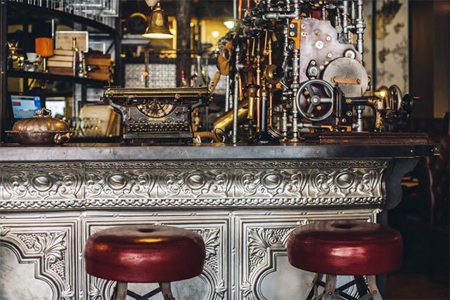
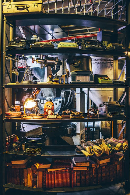
While both styles showcase natural woods and metals, steampunk does so in a mechanical way. Touches of Victorian and Art Nouveau can be witnessed through the rich hues, ornate details, and elaborate curves. 


What I love about the Truth Coffee space is that they took the machinery and components of coffee roasting and brewing and used them as inspiration for their steampunk interior. By imagining these machines as both form and function, they crafted a space that perfectly blends the machinery with the art of coffee. 


All images © This is colossal

Damson & Co

Name: Damson & Co
Location: London
Design: Central Design Studio


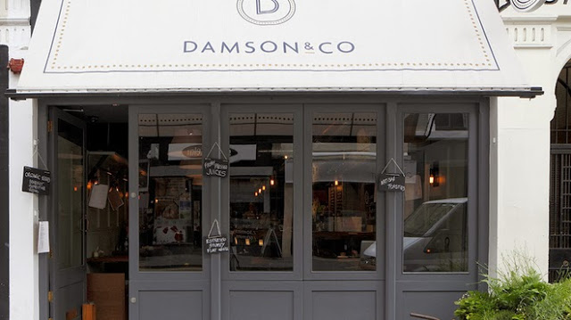
Damson & Co has done a great job layering multiple styles together to create a warm and classic space. 
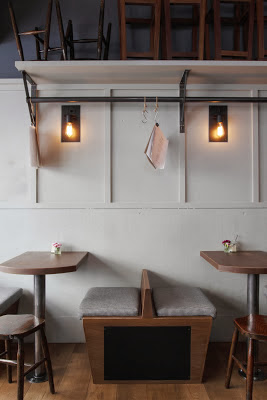
Industrial and classic touches add depth and visual interest to the otherwise utilitarian interior.


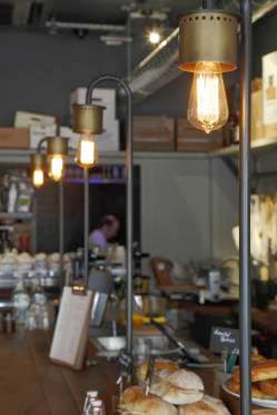
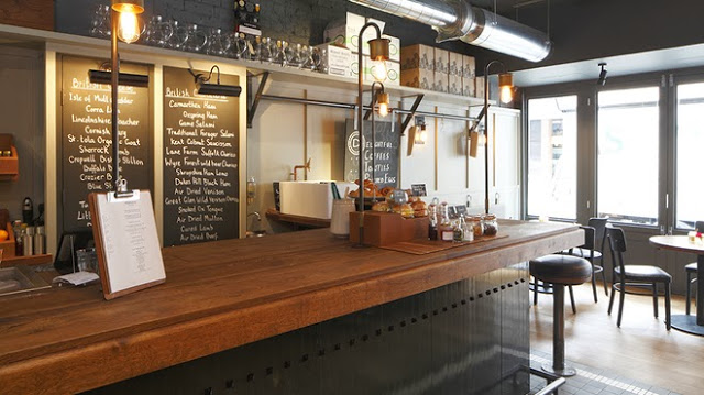
The millwork details located at the bar are one of my favorite parts of this space. They are traditional in most aspects but make a slight nod towards industrial. Paired with the custom light fixtures at the bar top you get a space that feels familiar but on trend. 


The tile detail located at the foot of the bar adds definition to the space while remaining simple and clean lined, much like the remainder of the utilitarian interior. 


Images 1-4,6 © Timeout Magazine
Image 5 © Indigo Memoirs
Images 3, 5,7 © Central Design Studio

Urban Coffee Farm & Brew Bar

Name: Urban Coffee farm & Brew Bar
Location: Melbourne, Australia
Design: Hassell


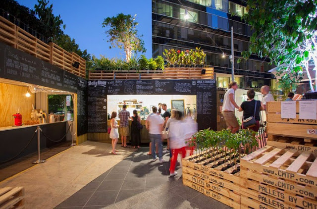
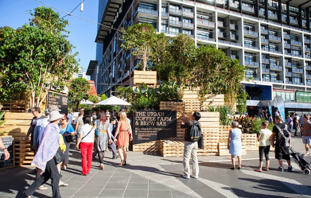
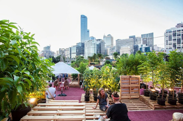
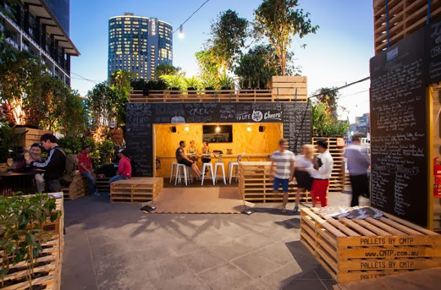
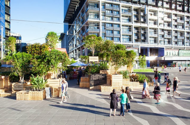
Designed for Melbourne's Food and Wine festival, the Urban Coffee Farm & Brew Bar dissects the coffee beans travel. Utilizing the materials used for transportation, the pop up allows guests to interact and engage with the coffee making process. 


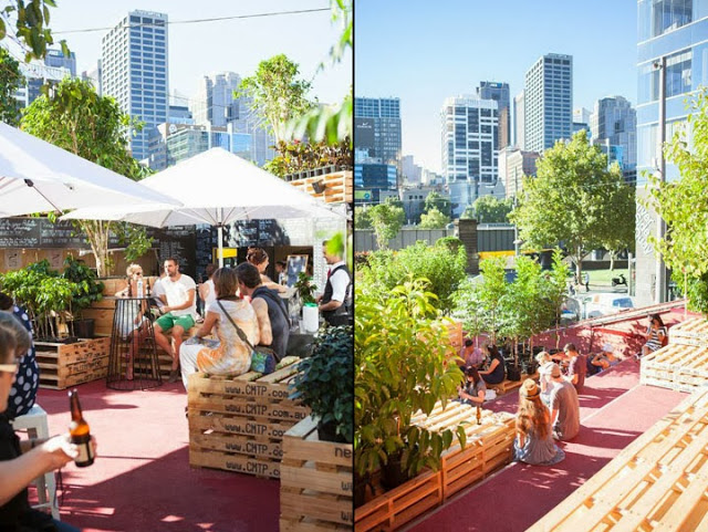
Utilizing shipping containers and pallets; two items used continuously in the shipping of coffee, along with approximately 120 coffee trees transformed the public plaza into an urban jungle.


By stacking the pallets and utilizing the existing red steps, they were able to create an oasis in the middle of the city. Thinking of the pallets as both furniture and architectural components allows visitors to define their own needs and use the space accordingly. Pallets can be sat on, used as tables, items to lean against, etc.


I love that they showcased what is possible with limited materials and creative thinking. They were able to open up a discussion and engage visitors on the entire process of growing coffee beans, showcasing the process it takes to get the bean to your cup.  


All photos  © Retail Design Blog

Code Black Coffee

Name: Code Black Coffee
Location: Brunkswick, VIC, Australia
Design: Zwei Interiors Architecture 


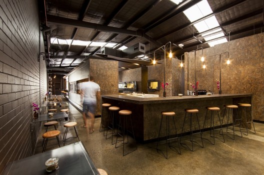
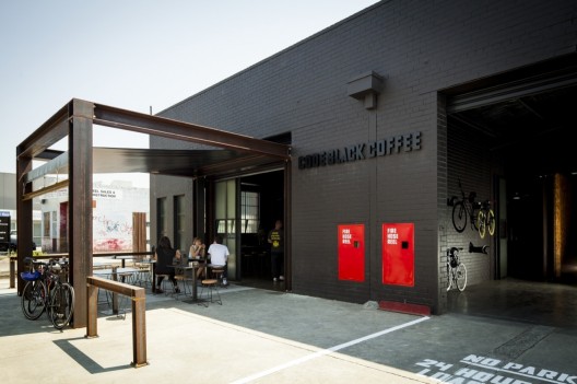
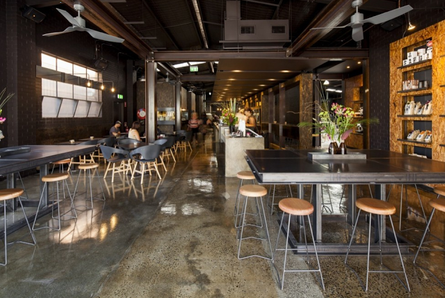
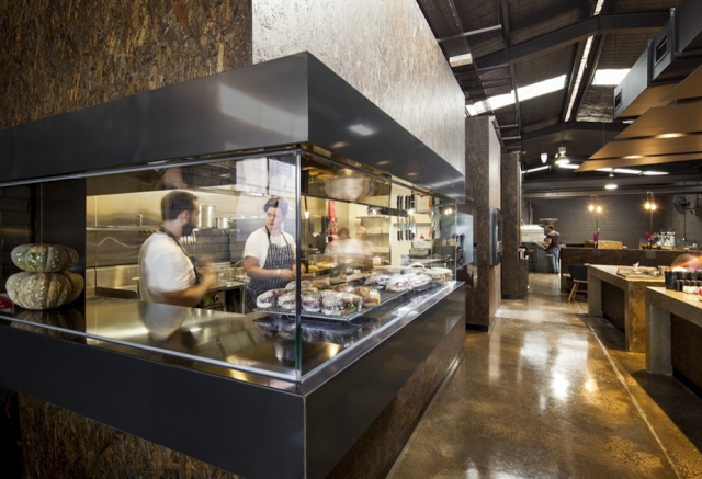
Utilizing an industrial warehouse shell, Code Black Coffee has created a raw, lab-like space that clearly demonstrates their passion for the bean. 


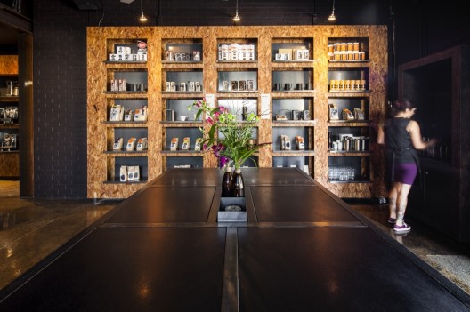
Utilizing concrete, fiberboard, steel, and brick creates an industrial and urban feel throughout the space. 


Each element within the facility, from the food preparation, coffee roasting, and serving are all clearly defined and remain open allowing guests a level of transparency into their operation. 


Utilizing exposed bulbs and pipes, the lighting display over the metal wall-hung tables is a great reinterpretation of the ever popular exposed bulb and pip trends. 


All photos © Michael Kai for Archdaily