The Potting Shed

Name: The Potting Shed (at the Grounds of Alexandria)
Location: Melbourne, Australia
Design: Acme & Co
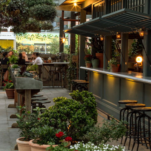


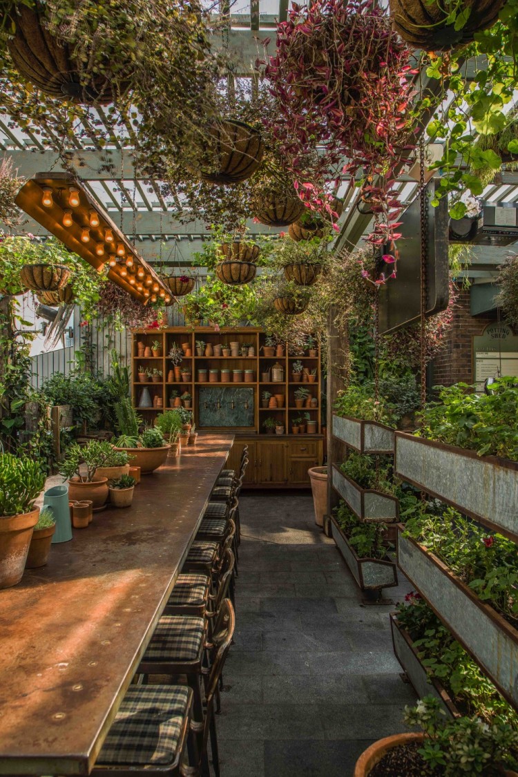
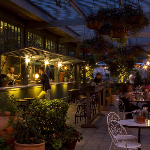
It looks like The Grounds of Alexandria has been growing; both literally & figuratively. One of the newest additions to their already beautiful space (Check out photos of their roaster and cafe, here.) is The Potting Shed. This patio addition does a great job blending into the grounds and creates a welcoming retreat.


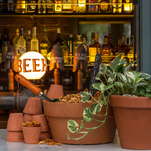
Check out the custom draft tower and more images after the jump-


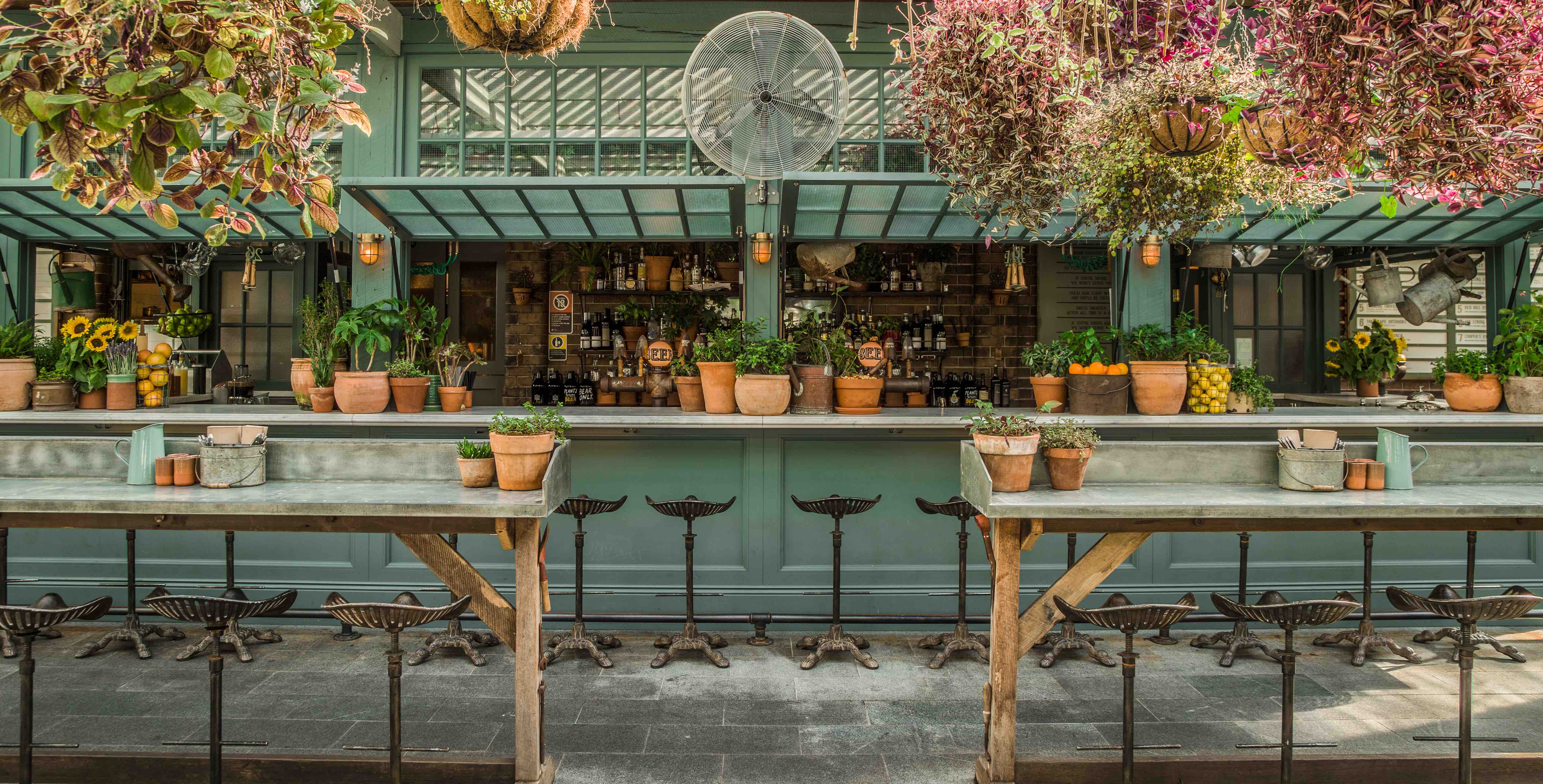
As the name implies, The Potting Shed was designed to resemble just that. Warm shades of green, mismatched patio chairs, and potting tables all help tie the theme together and give you the impression you truly are enjoying your beverage in their garden.


We love the shed itself, with it's operable windows opening up to become the bar and custom draft tower. The brick backdrop and tractor stools add one more layer of warmth to this local watering hole. 


Images 2, 3, 5 © The Daily Addict


Bowery to Williamsburg

Name: Bowery to Williamsburg
Location: Melbourne, Australia
Design: Di & Will Keser (Owners)


With the opening of its second location, Bowery to Williamsburg brings even more Bowery subway station-inspired, Americana sandwich shop goodness to Melbourne. This second location found its home directly across the street from their other spot, Hardware Society, in the original Beetroot space.


I love the initiate, shotgun style space. Given the space restrictions, it make sense Bowery to Williamsburg is reusing the communal layout used with previous tenant Brothl. The working kitchen and prep space interact with the dining space and encourage an engaged and interactive dining experience. 

 All images via Broadsheet.com

Nude Coffee & Wine Bar

Name: Nude Coffee & Wine Bar
Location: Moscow
Design: FORM Bureau

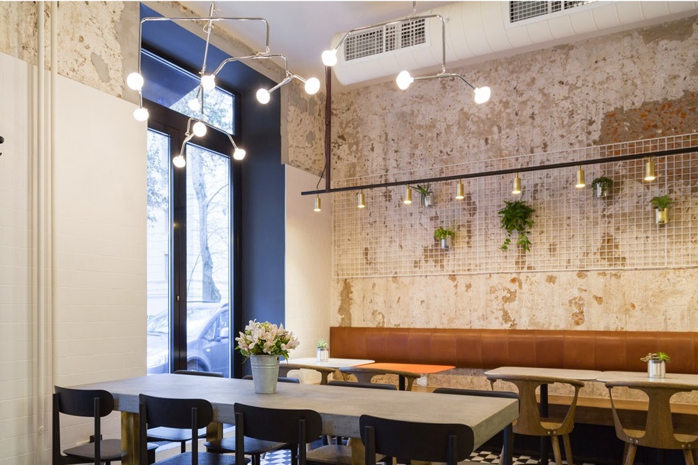
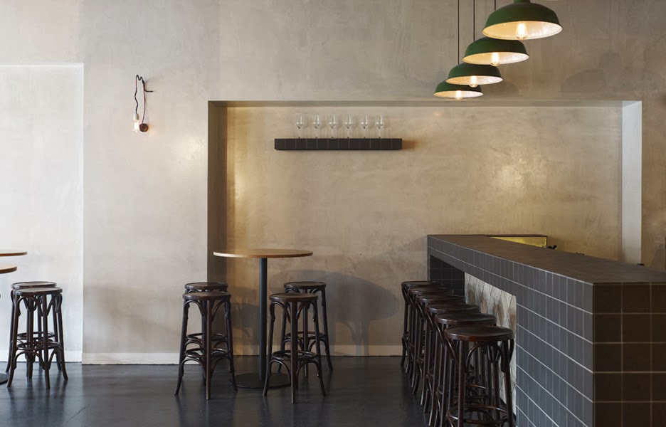
Located in the heart of Moscow, Nude Coffee & Wine Bar sits within a vintage residential building. Keeping the palate simple and understated with subtle pops of brass creates a balanced and cohesive interior fitting of its name. 


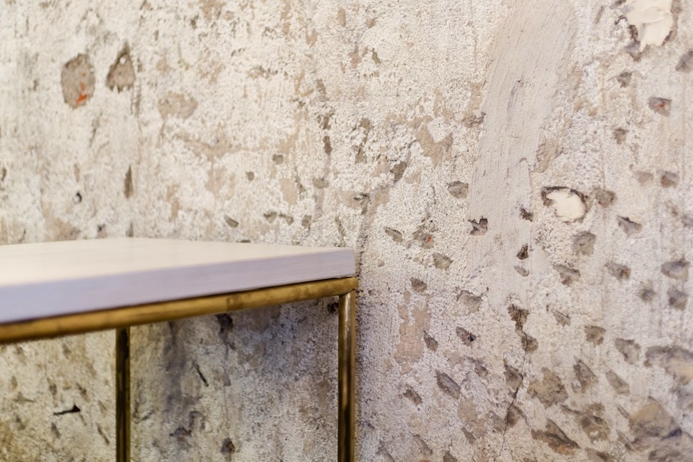
Layers of plaster were roughly stripped away to reveal the original brick beyond. The rough textures allows for a contrast to the more polished and clean fixtures and furnishings. 


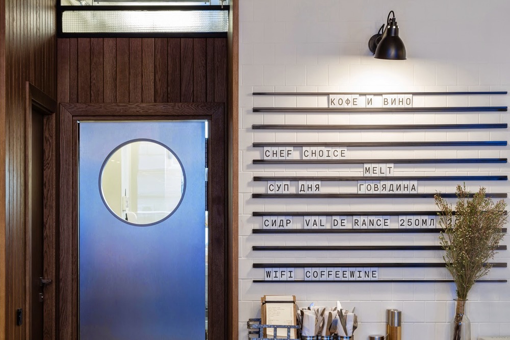
 Another great detail within the space is the linear menu board, allowing offerings to be slid in and out as needed. The scrabble-esq feeling adds a touch of playfulness and informalness.

All photos via Domusweb via FORM Bureau

Top Paddock Cafe


Name: Top Paddock Cafe
Location: Richmond, Melbourne
Design: Unkown


Light filled and welcoming, Top Paddock uses it's industrial home in Richmond's warehouse district to create multiple spaces and experience.  With a large open kitchen and two bars, one specifically for to-go orders, the space feels thoughtful and exciting. 


White on white geometric moulding, subway tile, and beautiful lights fill the space with warmth and character. The interior also features multiple seating groups splashed throughout the space guaranteeing everyone is likely to find their favorite spot.


Images 1, 2, 4 © Melbourne is Design
Images 3, 5 © Breakfast Out

Auction Rooms Cafe

Name: Auction Rooms Cafe
Location: North Melbourne, Australia
Photography: Erika Hildegard Photography


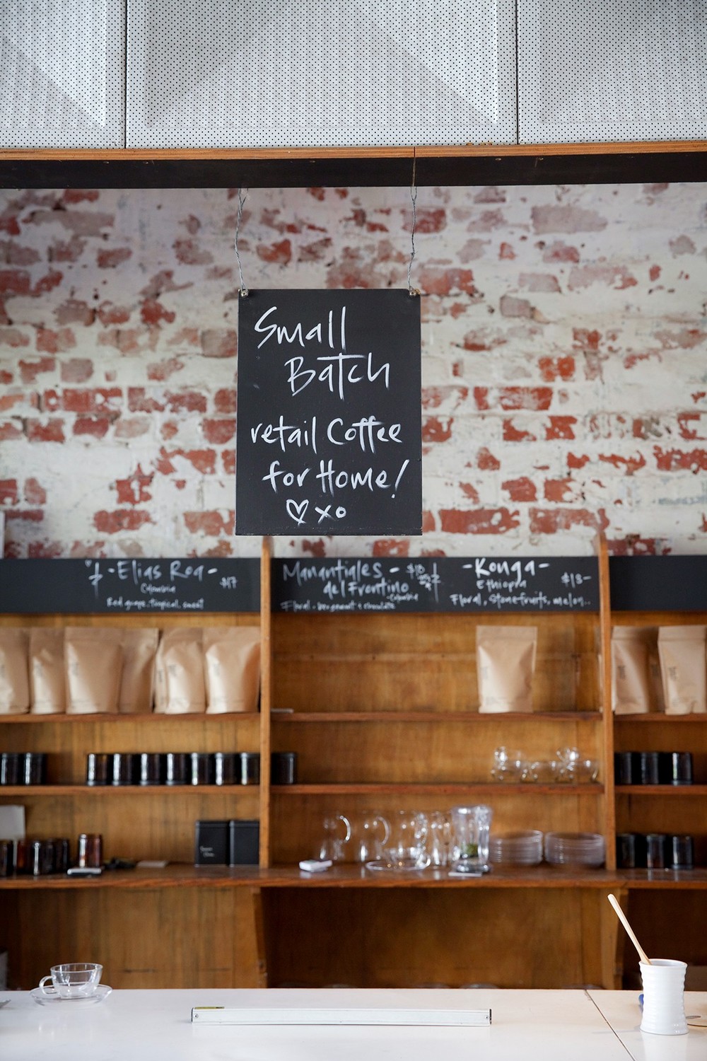
It's always a good day when I get to click through recent images captured by Erika Hildegard. Auction Rooms Cafe is a specialty coffee roaster and cafe located in the former WB Ellis Auction House. With exposed brick, lofty ceilings, and wood supports the architecture sets a pretty great stage.


Given the original space, I find that the reclaimed and reused feel of  fixtures inside to be appropriate and welcoming. 


The vintage and reclaimed touches contrast well with the urban and industrial space while the use of architectural beams help divide the space. These allow the light filled space to remain airy and open. 


Oli & Levi

Name: Oli & Levi
Location: Melbourne, Australia
Design: Unkown
Photography: Erika Hildegard Photography


With the long, dark winter most of the states are currently experiencing, it's always a welcomed sight to have the beautiful work of my favorite Aussie/American photographer pop up in my inbox. Oli & Levi is a cafe in Melbourne that offers a bright and cheerful escape. 


** I just heard Erika will be back in the States this fall. If you are looking for wedding, engagement, family, or interior photos- reach out now before she fills up!**


I love the vibrancy of the space. Filled with bold patterns and a punch of yellow the space feels bright and welcoming.


Built in shelving and displays allows for the small space to utilize every square inch and allows them ample room for storage and retail.


Wallace & Ed


Name: Wallace & Ed
Location: Melbourne, Australia
Architecture: Woods Bagot


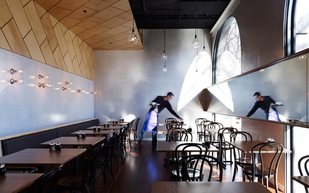
Trends have funny way of always coming back. Wallace & Ed, located in a former Hard Rock Cafe, showcases this phenomenon perfectly with the updated use of wood panels, wrought iron, and simplicity.


Keeping the material palate simple and lines clean allows the play of geometric pattern to take center stage. 


By limiting the use of the panels and incorporating exposed concrete and warm wood floors, the space remains industrial and modern.


All images © The MP Report

Saint Frank Coffe

Name: Saint Frank Coffee
Location: San Francisco, CA
Design: Unkown

Saint Frank Coffee has given me another reason to get back to San Francisco. Located in the Russian Hill neighborhood, with a pop-up cafe at the Public Bike shop in South Park, the cafe is modern, warm, and thoughtful. 


I love the simplicity of the space and cohesion of wood tones and materials. Creating a perfect transition from the dark wood trends currently, and the light wood trends that are slowly creeping their way back in, it balances warmth with light. 
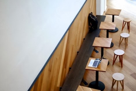

Integrating the technology and brewing into the main bar allows for minimal separations between the customer and barista while also adding to the clean lines of the space.


And how could we not mention those hex tiles- perfection.


A Look Back: Top Posts from 2013

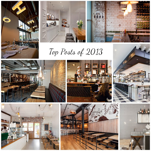
Here is a look back on some of our top posts from 2013!

Thank you to all of our readers for making this year such a great year. We can't wait to share even more great restaurant design in 2014.


Clockwise from top left;

The Whale Wins, Seattle
Hardware Society, Melbourne
Mikkeller Bar, San Francisco
Wee Jeanie, Melbourne
Dryhop Brewers, Chicago
Chez Dré, Melbourne


Are there spaces you would like to see or a photographer looking to collaborate? Send us a message, we'd love to chat!

Earl Canteen

Name: Earl Canteen
Location: Melbourne, Australia
Design: Unknown


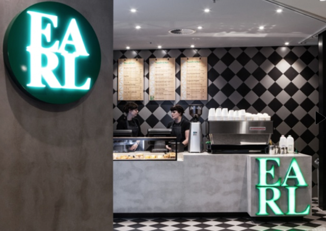
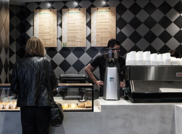
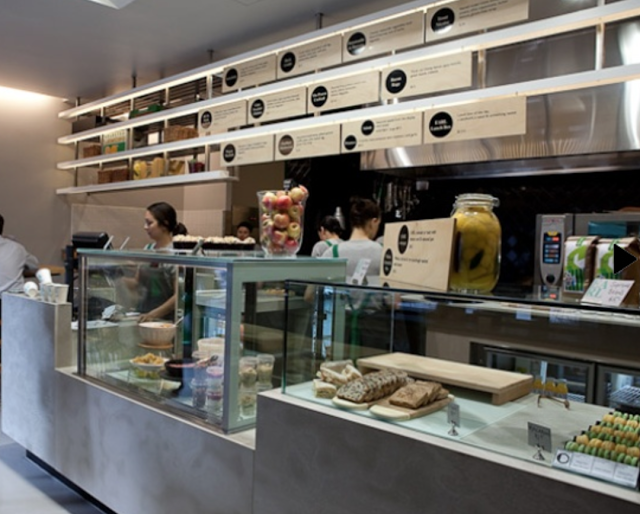
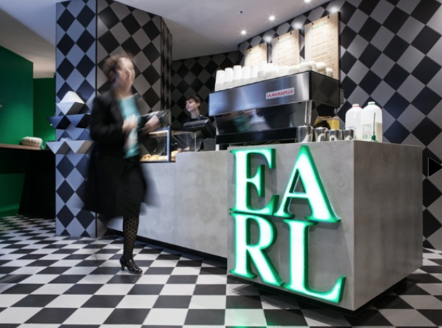
With it's second location now open in Collin's Place, Earl Canteen is proving to be a new direction for grab and go eateries. Their newest location uses their existing color and material palate but introduces  their graphic pattern on a larger scale. 


Utilizing the minimalist color palate with pops of emerald allows the space to remain harmonious while adding excitement. The modern and geometric pattern used liberally throughout helps distinguish the location and brand. 


All images © Broadsheet