Top Paddock Cafe


Name: Top Paddock Cafe
Location: Richmond, Melbourne
Design: Unkown


Light filled and welcoming, Top Paddock uses it's industrial home in Richmond's warehouse district to create multiple spaces and experience.  With a large open kitchen and two bars, one specifically for to-go orders, the space feels thoughtful and exciting. 


White on white geometric moulding, subway tile, and beautiful lights fill the space with warmth and character. The interior also features multiple seating groups splashed throughout the space guaranteeing everyone is likely to find their favorite spot.


Images 1, 2, 4 © Melbourne is Design
Images 3, 5 © Breakfast Out

Wexler's Deli

Name: Wexler's Deli
Location: Grand Central Market, LA
Design: J. Marx


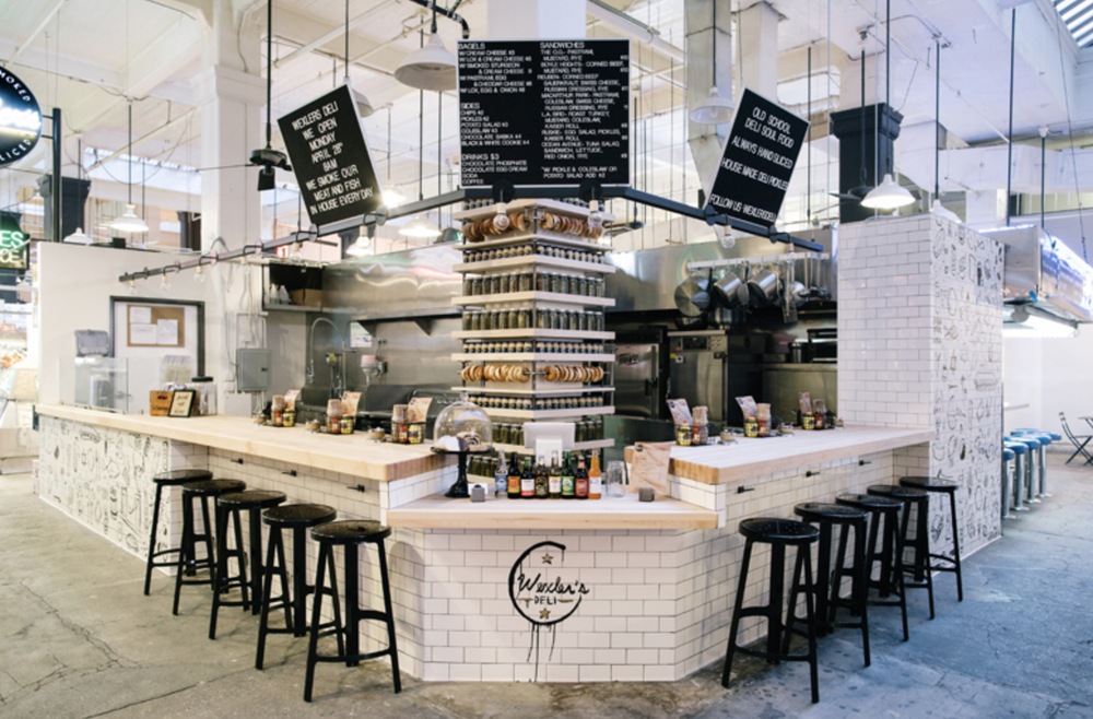
There is something so wonderfully unpretentious and warm about the classic deli feel. Clean, white subway tiles accentuated by the stainless steel equipment and butcher block counters seem to create the perfect backdrop for vibrant ingredients. 

Read on for more images-


Located in LA's Grand Central Market, Wexler's stands out with it's bold sense of style; effortlessly mixing classic New York deli with hip LA culture. We love the graphic illustrations applied to the subway tile and the display of bagels and pickles lining the otherwise impeding structural column. 


All images © Wexler's Deli

Zito's Sandwich Shoppe

Name: Zito's Sandwich Shoppe
Location: Brooklyn, NY
Design & Identity: Tag Collective


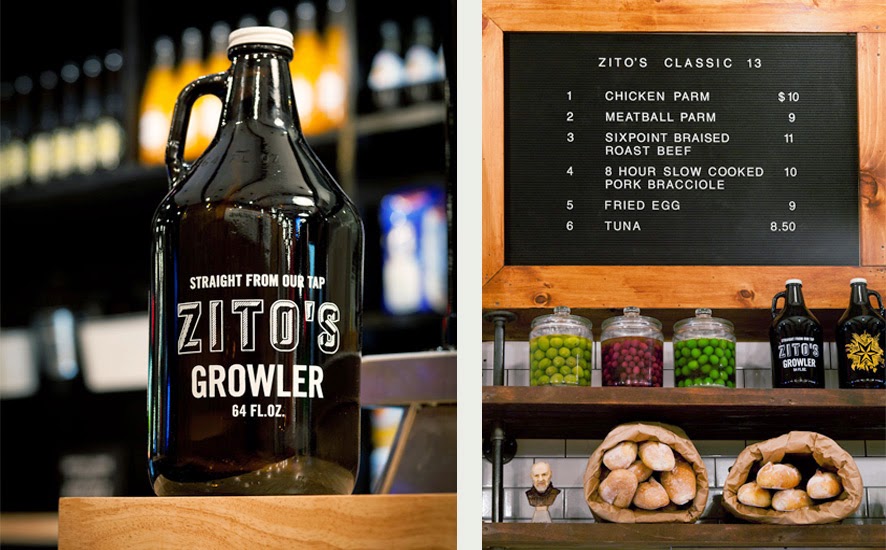
Located in Park Slope, Zitto's modern-industrial space features the perfect amount of Italian heritage.


Classic white subway tile, mercantile shelving, and pipe shelving all cement Zitto's as a modern Italian deli while the hung bulbs of garlic and salumi keep the authenticity alive and pay tribute to the classic Italian delis of New York's past. 


All Images @ Tag Collective

Nordburger

Name: Nordburger
Location: Adelaide, South Australia
Design:Peter Jay Deering


Nordburger takes America's favorite concept of burgers and fries, and combines it with a clean aesthetic fitting of the quality food being served. 


 Gone are the primary colors and plastic seats so commonly found in quick service spaces. Utilizing a minimal aesthetic and simple materials keeps the space bright, inviting, and warm. Limited seating encourages quick bites and a grab and go mentality. The use of concrete bases insures the seats they do have stay in place ensuring room for guests to pass. 


All images © Vogue Living AU

The Riding House Cafe

Name: The Riding House Cafe
Location: London
Architect: Lou Davis


Classic style lovingly pairs with vintage wares at The Riding House Cafe. Repurposed theater chairs, industrial accents, and rich wood layer together to create a warm and welcoming space.


The pop of blue found on the barstools and tile border add a refreshing contrast to the warm wood and industrial accents.


Industrial open shelving located at the kitchen pass and behind the bar add enough weight to provide visual separation while still allowing light and sight lines into the spaces.


Curated chotchkies; one of the very few examples of this done well within a restaurant space due to it's restricted nature.


Wee Jeanie

Name: Wee Jeanie
Location: Melbourne, Australia
Photos: Erika Hildegard Photography


Located close to the Yarraville train station, Wee Jeanie is a great spot to grab your morning coffee. 


The interior is bright and classic with minimal details and allows you to feel as if you are sitting in your own kitchen, sunshine streaming through the windows. 


The exposed, worn brick adds a touch of warmth to the otherwise white space while the stacked bond tile add a slight modern touch.


I love the bright back patio and how they bridged the interior and exterior with a leaning edge on both sides. The acrylic table top and wood truss base also point the subtle modern/rustic mix happening throughout the space.


Mighty Quinn's

Name: Mighty Quinn's
Location: New York, NY


Mighty Quinn's has taken barbecue into a new realm in NYC; allowing great products in a great atmosphere while still keeping quick service. The monochromatic palate and limited material usage allows for a cohesive and simple space that still feels on trend.


The reclaimed wood tables were created from salvaged wood from The Puck building in downtown NYC and add a level of warmth to the space. Balancing the wood with metal and gray keeps the space relevant and timeless. 


All images © Eater NY

Havens Kitchen

Name: Havens Kitchen
Location: NY, New York


As a cafe, retail, and kitchen space, Havens Kitchen did a great job creating cohesion to three sets of very different functional needs. 


Using the entry for seating and retail with the cafe acting as a buffer between, each space is clearly defined while still remaining harmonious. 

The mix of industrial details, worn woods, and vintage pieces creates a layered and warm space that can appeal to a wide demographic.

Images 1-4 © The Scout Mag

Town Mouse

Name: The Town Mouse
Location: Melbourne, Australia
Graphic Design: A friend of mine


Once again, a great example of typography and identity going hand in hand with restaurant design. The Town Mouse, located in Melbourne, took a simple color palate and created an interior that was relevant, fun, and modern.


The central bar allows for a multitude of activities while also providing a great amount of seating.


I love the square, gloss tiles that were used throughout the space. They create cohesion and deliver a great backdrop for the typography.


Images 1,4-7 © Broadstreet
Images 2,3 © A friend of mine

Kiosk

Name: Kiosk
Location: Strasbourg, France


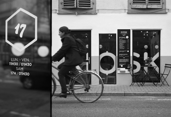
Kiosk was created based on the idea that everyone has a favorite little diner. One that is small and comfortable and makes you want to return time after time. 
With touches of mid century modern, Kiosk puts a fresh spin on the classic concept.


The use of butcher block and blond wood helps balance the small space While the globe pendants and curved lines evoke the classic mid century modern appeal.


All photos © behance