At The Chapel

Name: At The Chapel
Location: Burton, UK
Design: Ahmed Sidki & Catherine Butler


A former 17th century congregation church found new life as a cafe, bakery, wine shop, and restaurant.  Keeping the original architectural details intact, the minimalist and warm interior showcases the goods and space perfectly.


Utilizing natural materials and a minimal color palate, the almost Scandinavian interior, allows multiple functions to flow together while maintaining a cohesive feel.


I love that the architectural details of this stunning building are offset and balanced perfectly by the minimalist and warm interior. 


All images © Dee Purdy

The General Muir

Name: The General Muir
Location: Atlanta, GA
Design: Square Feet Studio; http://www.squarefeetstudio.com


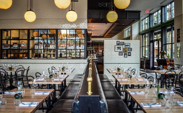
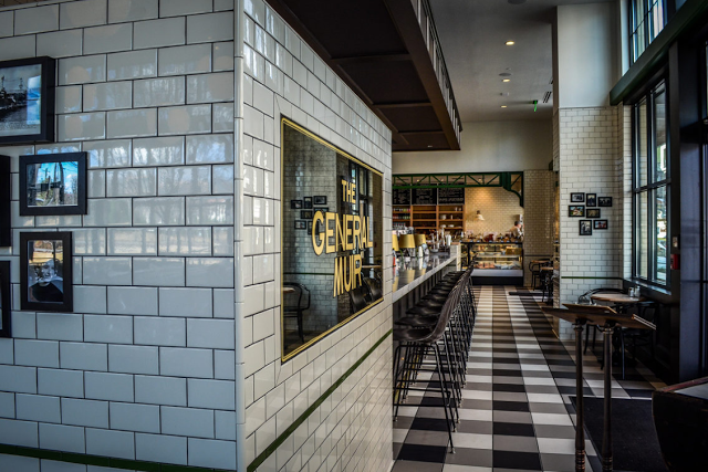
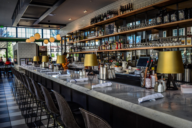
As a modern take on a Jewish deli, the interior of The General Muir looks just as appetizing as the food. With classic details like subway tiles and checkerboard floors, the space feels rooted in tradition while still keeping a firm grasp on the dining pulse.


Keeping the color palate restricted helps keep the interior feeling modern while the bronze details help add a classically aged note. The marble toped bar, vintage inspired bar stools, and globe lights all work together to create layers within the space. 


All images © Eater Atlanta

Lady M Confections

Name: Lady M Confections
Location: New York, NY
Design: Sam Trimble


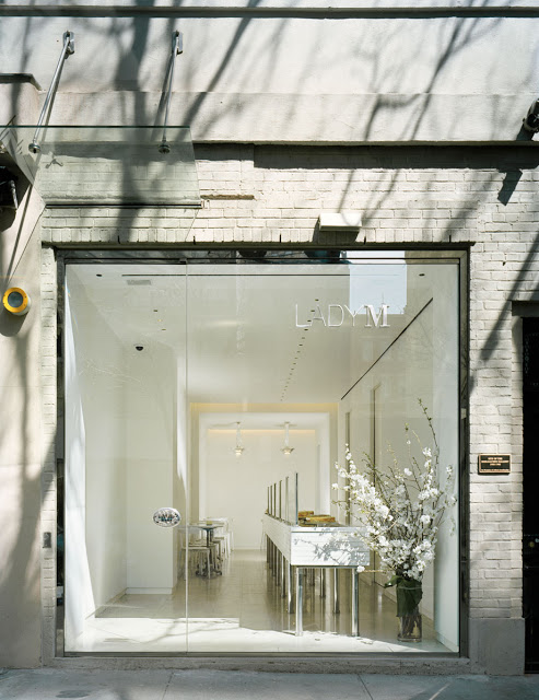
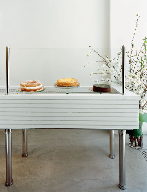
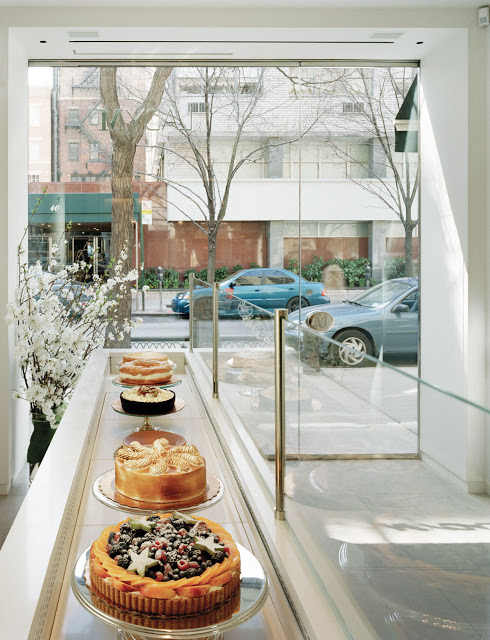
Lady M Confections signature space treats their cakes and pastures, very appropriately, as the star of the show. 
With clean lines, a neural color palate and minimalist details, all eyes are directed towards the 20+ foot refrigerated display case where the colors and textures of the beautiful pastries is on full display. 


Using clean and simple sneeze guards paired with the open leg base and stone front, there is very little to distract the eye and treats the items within as jewelry on display for passing admirers. 


Photos 1-4 © Lady M Confections

Local Favorite; Little Goat Bread

Name: Little Goat Bread
Location: Chicago, IL


The newest venture from local favorite, Stephanie Izard, is a diner meets bakery located just across the street from her acclaimed restaurant Girl & the Goat. 


While the diner is not quite open, the bread and coffee spot is and it definitely did not disappoint. 


Using classic elements like Carrera marble and subway tiles, the small space is balanced by barn wood, industrial fixtures, and vintage displays.


It's the little details that truly make the interior shine. From framing the coffee board menu in tile to the textured and undercounter-lit bar front, the space remains classic while still a bit unexpected.


Photos 2,7 © Eater Chicago
Photos 1, 3-6 © The Chicago Tribune

Outsider Tart

Name: Outsider Tart
Location: London


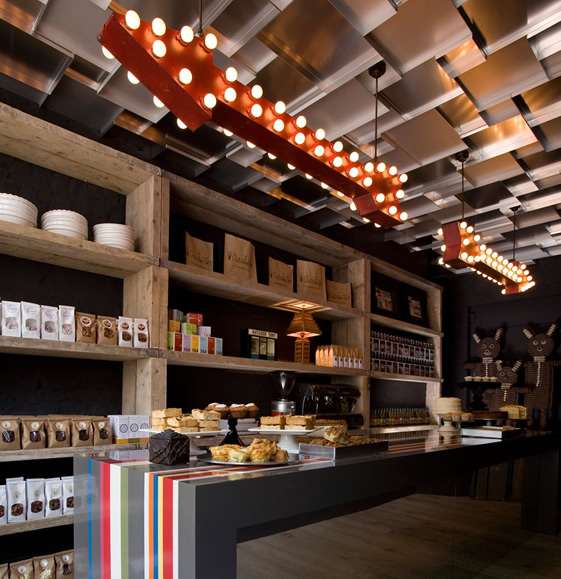
Located in London, Outsider Tart is a bakery & cafe that perfectly juxtaposes rustic and whimsy.


Utilizing vintage and found items and contrasting them with rustic displays and bright colors creates a perfectly balanced interior.


With limited space, every detail had to be thought through to make sure it made just the right impact. Maximizing space using the long display table in the middle creates flow while also breaking up the space. 

One of my favorite elements in the space is the ceiling that was created with sheet pans. Utilizing ordinary materials in unexpected ways also helps drive home the whimsy aspect of the cafe. 


Image 1-3 © We Heart

Craftsman & Wolves

Name: Craftsman & Wolves
Location: San Francisco, CA


Craftsman & Wolves is a speciality bakery located in San Francisco. What I love about this concept is simply how much they managed to elevate the experience of a typical bakery. Clean lines, simple materials, and a bit of rustic/ industrialall contrast the jewel-like qualities of the pastry displays.


The horizontal, varying height tiles help keep your eye moving in the linear space while the library ladder system allows the menu to change as needed throughout the day. 


The minimalist seating area, outfitted with exposed brick, white walls, and filled with natural light  allow the pastries to shine.


All photos © Aubrie Pick


Death Valley's Little Brother

Name: Death Valley's Little Brother Espresso Bar
Location: Ontario, Canada


I love the concept behind DVLB, located in Ontario. Part espresso, whisky and bread cafe, they focus on craft versions of all three.


Their space feels authentic and handcrafted which perfectly fits the handcrafted nature of their products. There are some fun details throughout the space, such as the recycled crate and pipe shelving and the hand drawn chalk art on the wall.


With exposed brick walls, tin ceilings and reclaimed wood furniture the space is overflowing with warmth.


Photos 1 & 4 © Andrewdfrazer
Photo 3 © DVLB Pinterest
Photo 2 & 5© ClickPhotography 


Pan Pan Atelier

Name: Pan Pan Atelier
Location: Valencia, Spain

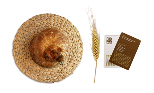
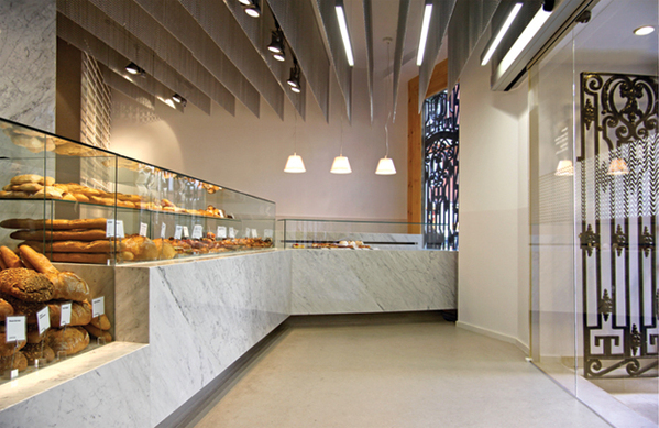
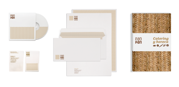
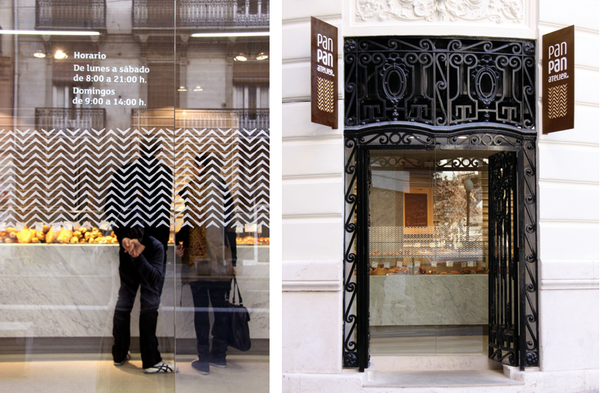
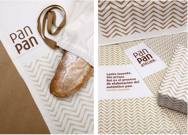
Pan Pan Atelier was designed based around a 'modern interpretation of the traditional ear of wheat'. Everything from the colors to the herringbone texture & pattern all directly tie back to that original idea. I enjoy that Pan Pan took this concept and idea and translated it not only into their branding and identity but into their cafe space as well. 


Carrying on the golden and white hues and the pattern throughout the space unifies the concept and
carries the message throughout the guests full experience.


All photos © Behance


Catalina Fernández

Name: Catalina Fernández
Location: San Pedro, Mexico


There is something so compelling about a simple, well though out concept. Branding and design truly go hand-in-hand and Catalina Fernandez Pastry boutique is a great example of this.


With a bold, yet simple color story and modern details, the entire space carries an urban and modern aesthetic. 


The repetition of items, in this case painted white, is a strong visual and adds to the overall texture of the space.


By keeping the interior simple and clean, it allows their brand and pastries to be on center stage. 

All photos © Yatzer 

Standard Baking Co.

Name: Standard Baking Co.
Location: Portland, ME

One of the simplest pleasures in life is a great baked good. The perfect croissant is hard to find and although many try, most fail. The standard Baking Co. located below Fore Street restaurant in Portland Maine, has succeeded in this endeavor. To add to the beauty of finding another perfect croissant (That last was to be seen in San Francisco, over two years ago!) is that the interior, while small, perfectly fit the goods they were serving. Rustic and warm with displays of fresh baked goods lining shelves and filling baskets, the smells and charm welcomes you. The service counter is located between the baking ovens and prep area allowing you to watch the entire baking process unfold. If you are in the area, you should certainly stop in. (and should stop in early, they sell out quick!)


All images © Kaper Design