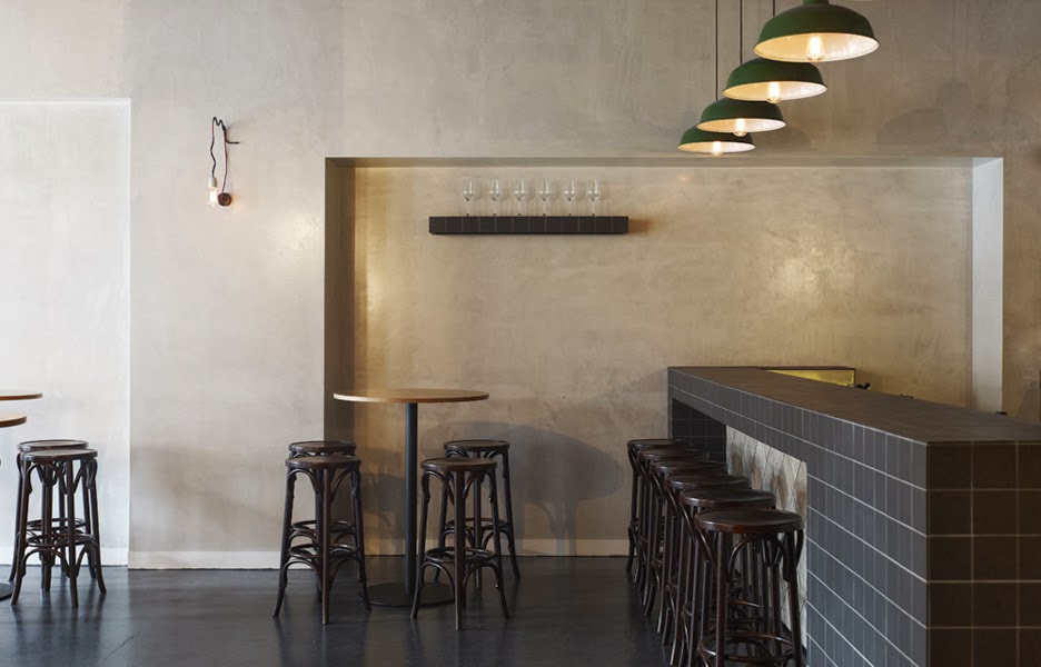
Nordburger

Name: Nordburger
Location: Adelaide, South Australia
Design:Peter Jay Deering


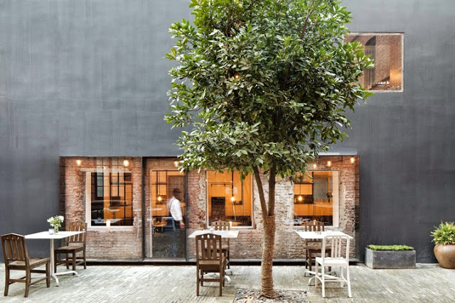
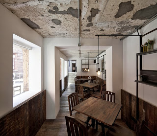
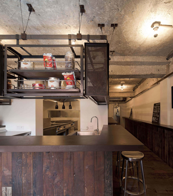
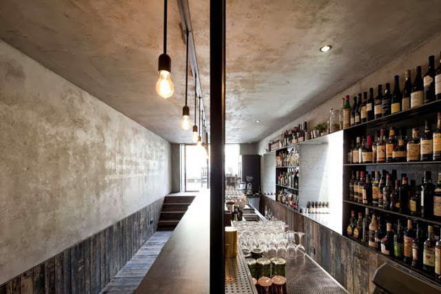
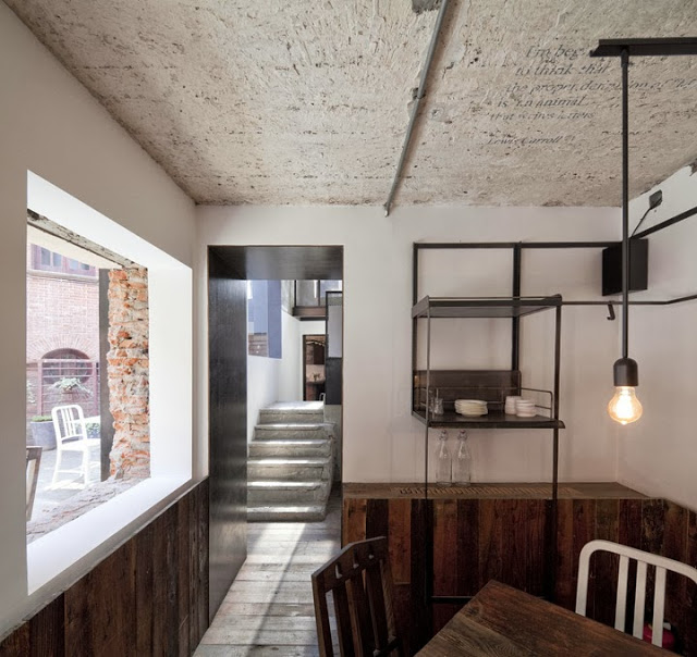
Nordburger takes America's favorite concept of burgers and fries, and combines it with a clean aesthetic fitting of the quality food being served. 


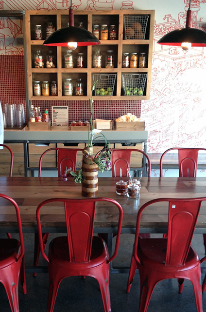
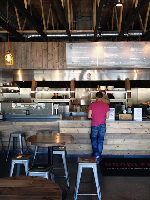
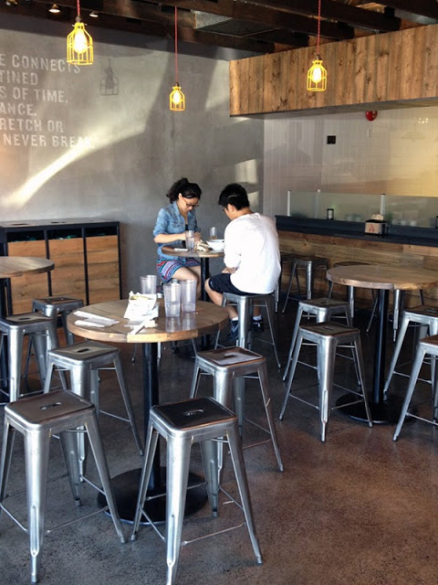
 Gone are the primary colors and plastic seats so commonly found in quick service spaces. Utilizing a minimal aesthetic and simple materials keeps the space bright, inviting, and warm. Limited seating encourages quick bites and a grab and go mentality. The use of concrete bases insures the seats they do have stay in place ensuring room for guests to pass. 


All images © Vogue Living AU

Wallace & Ed


Name: Wallace & Ed
Location: Melbourne, Australia
Architecture: Woods Bagot


Trends have funny way of always coming back. Wallace & Ed, located in a former Hard Rock Cafe, showcases this phenomenon perfectly with the updated use of wood panels, wrought iron, and simplicity.


Keeping the material palate simple and lines clean allows the play of geometric pattern to take center stage. 


By limiting the use of the panels and incorporating exposed concrete and warm wood floors, the space remains industrial and modern.


All images © The MP Report

ilili Box

Name: Ilili Box
Location: New York, NY
Design: Unkown


Every once in a while a concept will come along that is all together refreshing. ilili Box's take on modular construction and pop-up shop lunches is just the breath of fresh air their trends needed. 


I love the updated and refined twist on the shipping container as well as the mixed material use that breaks up the structure.  Keeping the color palate simple keeps the concept fresh and modern while simultaneously playing with current trend and classic lines. 


Image 1 c Old Brand New
Image 2 c New York Times

Bar Sajor

Name: Bar Sajor
Location: Seattle, Wa
Design:

Matt Dillon, 2012 James Beard Award Winner and chef/restauranteur behind Sitka and Spruce, opened up Bar Sajor early this year in Pioneer square.  With a similar open kitchen layout and earthy lightness, the interior feels like a more 'dressed up' version of Sitka & Spruce in all the right ways.


Using blonde woods, white bead board, and cool grays keeps the space chic and polished while remaining warm. The exposed rotisserie oven and exposed wood beams add a rustic touch that help keep the interior tied to the buildings historic roots. 


Images 1 & 2 © Architectural Digest
Image 3 © Eater Seattle
Image 4 © Bon Appetite

TanakaSan

Name: TanakaSan
Location: Seattle, WA
Designer: Graham Baba Architects.


Warm, urban, and inviting TanakaSan, located in Assembly Hall, has it all going for it. As one of a handful of dining spaces among the Assembly Hall collection, TanakaSan faced some interesting special challenges.


With the kitchen separated from the dining space, a small bar was added which allows breakfast to be served in the morning and adds extra seating for casual drinks or overflow diners. 

The space is open, light, and industrial but remains comfortable and warm. The constant movement of the space and doors that open onto the patio add energy to the space and allow it to keep a constant connection to everyone coming and going through the building.


All of the tables are clean lined and light with airy black slat seating. Proving the restaurant is anything but traditional, each table is outfitted with a plastic animal (typically a dinasour of some sort) adorned with a metal chain and/or plant situated in its back.


All images via Via6 Facebook, Suzie Pratt Flickr , & Unknown

Clive Burger

Name: Clive Burger
Location: Calgary, Canada
Design: Unknown

Clive Burger is a wonderful example of a fast casual space with a modern and fun interior. Utilizing cartoon-esq graphics paired with a restrained material and color palate, allows the space to feel whimsy while establishing a clean and modern space. 


The use of custom furnishings allowed the seating and space to be maximized while keeping a harmonious overall feel.


Images © Scout Flickr

The Commune Social

Name: The Commune Social
Location:Neri&Hu Design and Research Office
Design: Shanghai, China


The Commune Social is a great example of a well balanced, rustic meets modern, space. With small, compartmentalized interior spaces, each area is minimal and well defined.


The rough wood and raw ceiling contrast the minimalist furnishings and clean-lined steel fixtures. 


I enjoy that while raw and industrial, each seating area still feels warm and inviting; a great balance.


All images © Archdaily

Elbow Room

Name: Elbow Room
Location: Brooklyn, NY
Graphic Design: mgmt. design
Interior: Greg Yang Design


I love it when the graphic design, identity, and interior all come together to form a cohesive space and presentation. The Elbow Room restaurants are a great example of this cohesive and thought through design. 


Using simple materials, the very trendy pixilated graphics, and typography that ties back to the noodles being served, the entire space comes together to create a minimalist but warm space. 


Once again, using a restricted color palate; this time yellow, black, and white, creates instant cohesion while tying into the iconic cheesy color so many of us recognize and love. 


All images © Behance

Méjico

Name: Méjico Restaurant & Bar
Location: Sydney, Australia
Design: Juicy Design


While Beasleys may have forgotten the design, Méjico is a great example of a space with a fully thought through design.  Using the menu as their starting point, Méjico emphasizes tradition, ingredients, and differentiates itself from the influx of Mexican restaurants popping up throughout Australia. 


The use of bold color and pattern grabs your attention the moment you walk in and sets the tone for an urban, and slightly unexpected experience.


What I enjoy the most about the design is that all of the details were thought of and addressed. The empty space under the banquette seating is filled with alcohol boxes. It's a subtle detail that most might not notice but addressing it elevates the space and adds an additional moment to drive their message home. 


The hand crafted and raw aspect of the space is also a great contrast to the pattern and color and ties back into the raw and hand crafted nature of the cocktails and food being served. All aspects play together to create a cohesive feel and experience for their space. 


All images © Contemporist

Noodlebox

Name: Noodlebox
Location: Shelbourne Victoria, BC
Design: Evoke


For a large chain, Noodlebox has done a great job re-imagining their brand. Using a limited color palate, custom fixtures, and a heavy hand of wood, the space is a balance of rustic and modern.


Whether their intention or not, keeping the material and color palate limited allows them to replicate the design easily no matter the location or space size. 
I love that they exposed the ceilings and created harmony throughout by carrying through wood as the main material. The contrast of concrete and steel adds a modern touch and keeps the space hip and on trend. 


All photos © Evoke