Wallace & Ed


Name: Wallace & Ed
Location: Melbourne, Australia
Architecture: Woods Bagot


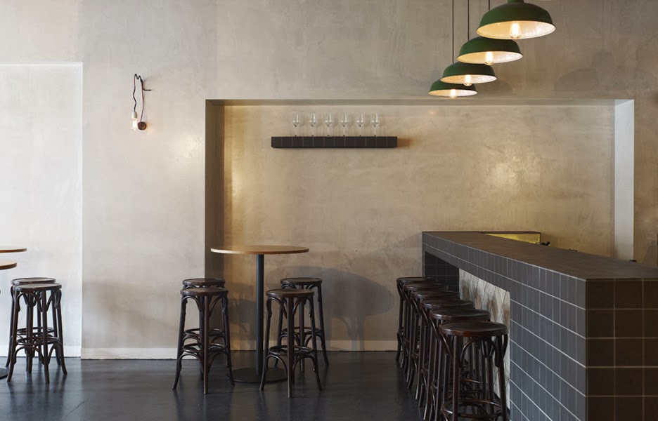
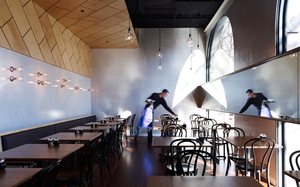
Trends have funny way of always coming back. Wallace & Ed, located in a former Hard Rock Cafe, showcases this phenomenon perfectly with the updated use of wood panels, wrought iron, and simplicity.


Keeping the material palate simple and lines clean allows the play of geometric pattern to take center stage. 


By limiting the use of the panels and incorporating exposed concrete and warm wood floors, the space remains industrial and modern.


All images © The MP Report

Picnic

Name: Picnic
Location: Paris (Concept; Not Built)
Design: Studio Ko

Picnic, a concept restaurant created in Paris showcases how minimalist design, paired with bold pattern, can create a vibrant and fun experience. 


Using worn wood and unadorned walls allows the patterns to be the star. By keeping the patterns all geometric in nature, ties the multiple elements together create a bit of harmony within the space.


All images © Studio Ko

Local Favorite; Parson's Chicken & Fish

Name: Parson's Chicken & Fish
Location: Chicago, IL
Design: Land & Sea Dept


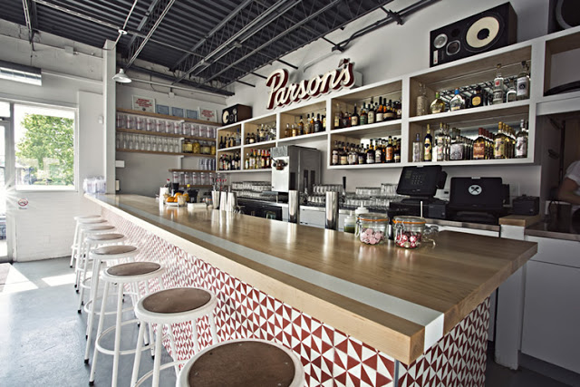
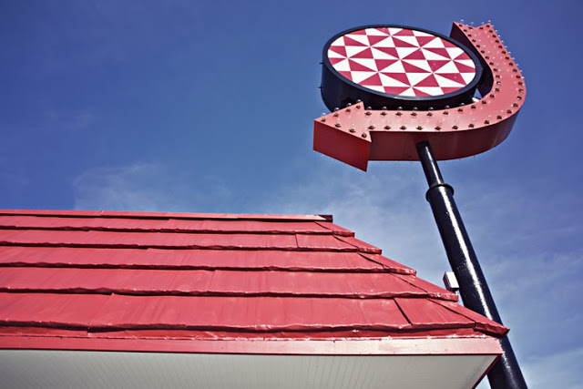
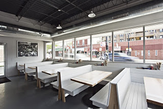
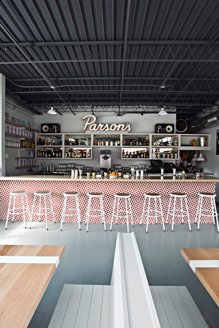
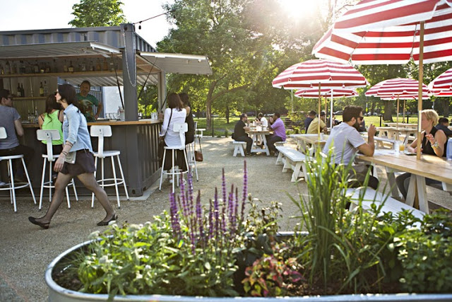
As a modern take on the classic neighborhood joint, Parson's created a vibrant and fun space that utilizes color, geometric shapes, and clean lines. 


Located in a classic 70's era building, Parson's plays up the vintage vibe using a minimalist color palate of red, white, and blonde wood. Utilizing the red geometric pattern throughout the space (from the warfront to the packaging) crates cohesion within the space. Both color and pattern create a big visual impact for a small investment. 


The 283 person patio is outfitted with picnic tables and striped umbrellas and easily makes up for the large U-shaped community booths inside which while maximizing seating, minimize options for the smaller sized groups. 

Head over and experience the patio and fried chicken on the next warm summer day in Chicago.


All photos © Clayton Hauck via Weheart

Fonda

Name: Fonda Mexican
Location: Melbourne, Australia
Design: Techne Architects


Fonda Mexican's second location showcases a great example of a modern, vibrant interior utilizing texture and a minimalist color palate.


The modern and clean lines of the existing structure translate well to the the rest of the space and add an element of vibrancy and excitement. Juxtaposed with just a few rustic touches throughout *wood countertops and bar front primarily) adds just enough balance to warm up the primarily white space. 

All images © Weheart

Tørst Beer Bar

Name: Tørst Beer Bar
Design: hOme

Tørst's interior should be able to get just about anyone excited about beer. With a mix of Scandinavian simplicity, geometric woodwork, and a touch of glam the space is a home for beer nerds and design nerd alike.


Keeping the material palate simple allowed for the design team to go over the top with the details. Different patterns on reclaimed wood table tops occupy each different table type while unique medallions and ceiling moldings make sure no surface is overlooked. 


I love the ombre detail and simplicity they achieved with the beers pulls as it echoes the rest of space keeping everything coherent. 


If you are a beer nerd, I highly encourage you to read more about their 'flux capacitor' that is installed under their taps. It allows them to have four different temperatures for serving and controls the nitrogen and carbon dioxide for each individual tap; ensuring the perfect pour.


All images © retaildesignblog

Delaunay


Name: Delaunay
Location: London


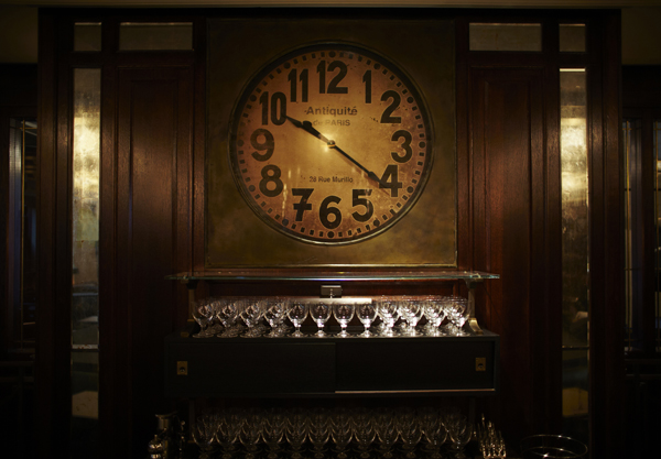
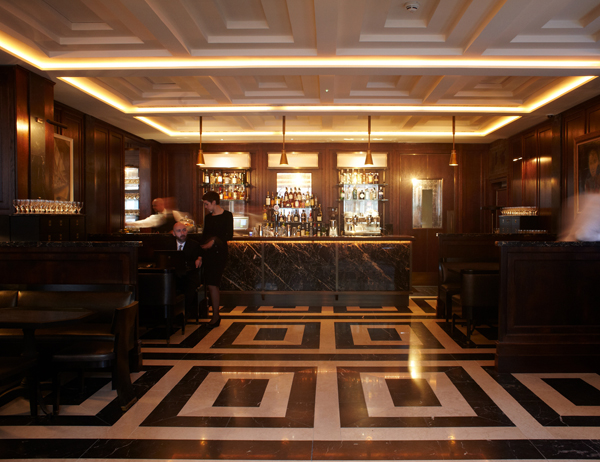
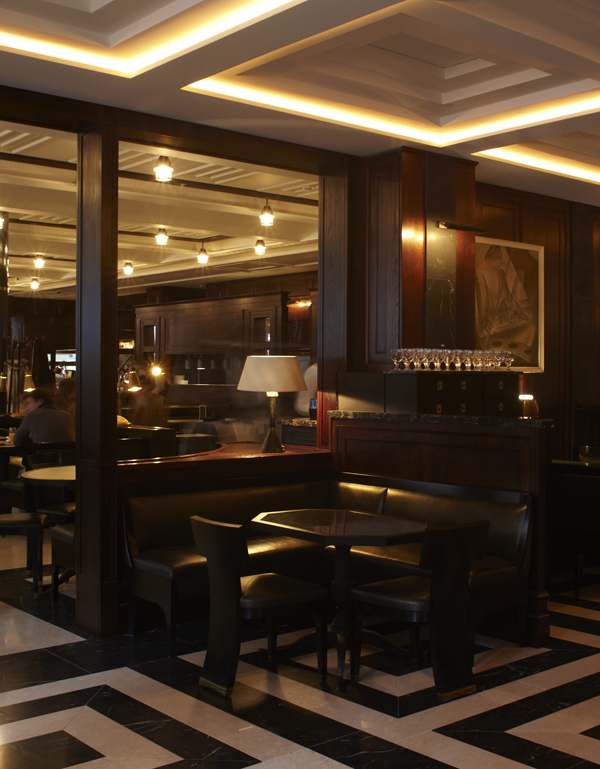
Reminiscent of a mens club in all its grandeur of the 1920/30's, Delaunay seems to transport you back in time. The rich woods, leather and accents of gold & brass, all add a richness and depth to this elegant space. What I love most about this design is that it actually feels as if it could be an institution, a place your grandfather may have gone for a drink. What one might not expect is that Delaunay is only a few months old. The styling, material use, and even menu all speak of another era perfectly.


intimate seating, booth seating, low-level lighting, paintings

delaunay counter, take-away, green bicycle with basket of bread


Image 1-3 © Travel Modus
Image 4-5 © Remodelista