SLA

Name: SLA
Location: Amsterdam, Netherlands
Design: Nicemakers


With the world taking a deeper look at it's food, how we eat, and the care of our ingredients, it's always fun to see how these ideas translate into built environments. While the US is focusing on farm to table, warm woods, raw materials, and an overall emphasis on the rustic and farm-like feel, SLA has gone in an equal, but opposite direction, focusing on the greenhouse.  


The main focus in the lofted interior is the greenhouse-like structure over the counter. This large focal point directs guest to the heart of their space and to their overall concept and direction. 


Simple furniture, and a neutral palate adds freshness to the space while drawing attention to the greenery that surrounds. 


The walls showcase plants and other greenery, vintage gardening tools, and service utensils in a minimalist manner while the honey wood chairs and simple metal stools harken back to traditional greenhouse and exterior furnishings. It's always great to see how different regions interpret and showcase the similar idea of fresh, healthy eating. 


Mart 130

Name: Mart 130
Location: Melbourne, Australia
Photography: Erika Hildegard Photography (If you are in Australia, I encourage you to check out her amazing range of work.)


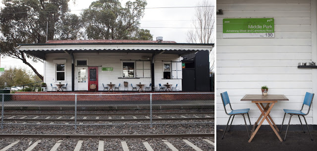
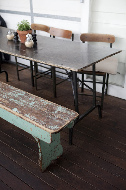
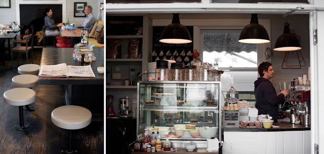
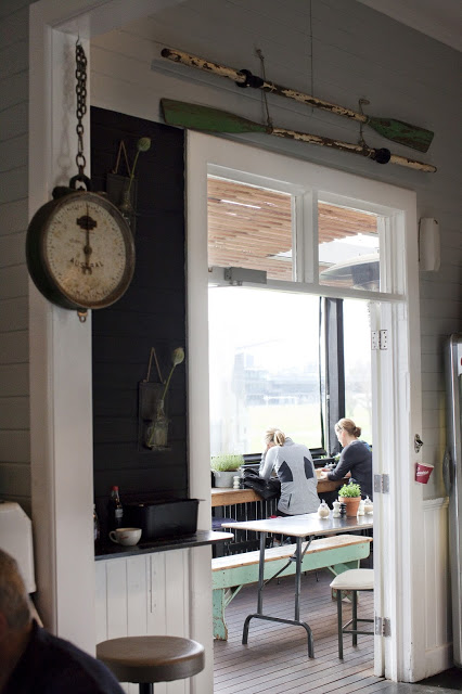
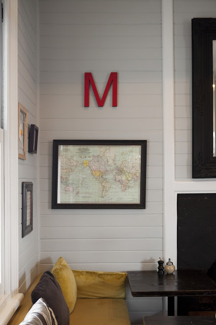
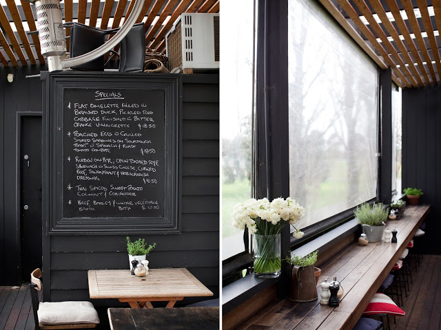
Mart 130 has to be one of the best examples I've seen recently of a comfortable and established cafe maintaining a well curated interior. When Erika's images landed in my inbox I couldn't help but get excited. Rarely do you find the blend of well loved antiques that is also still pulled together and edited. 


Using vintage and antique pieces, paired with a nautical and industrial undercurrent, Mart 130 creates a cohesive blend of worn comfort and bright openness. 


Utilizing red, aqua, black, and blue throughout the multiple seating areas ties the entire space together without needing to match everything. This allows the space to remain cohesive while each room still maintains it's own identity. 


I love the bright back patio featuring painted, dark wood and slat ceiling, you could easily sit for hours.


Clarks Oyster Bar

Name: Clark's Oyster Bar
Location: Austin, TX
Design: McGuire Moorman


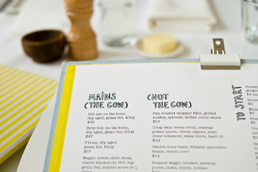
Bright, preppy, and nautical are all thoughts that come to mind when stepping inside Clark's Oyster Bar in Austin, Texas. Being the little brother to Perla's, both spaces are clearly connected but both maintain their own identity and personality. 


The navy, yellow, and mint color scheme are broth through to every detail creating a cohesive and fun atmosphere. The nautical details used on the menus, table ware, and interior materials all transport you to a seaside, East coast local. 


 Image 4© Statesman
Images 2, 3, 5 © Remodelista

Wee Jeanie

Name: Wee Jeanie
Location: Melbourne, Australia
Photos: Erika Hildegard Photography


Located close to the Yarraville train station, Wee Jeanie is a great spot to grab your morning coffee. 


The interior is bright and classic with minimal details and allows you to feel as if you are sitting in your own kitchen, sunshine streaming through the windows. 


The exposed, worn brick adds a touch of warmth to the otherwise white space while the stacked bond tile add a slight modern touch.


I love the bright back patio and how they bridged the interior and exterior with a leaning edge on both sides. The acrylic table top and wood truss base also point the subtle modern/rustic mix happening throughout the space.


The Hardware Society

Name: The Hardware Society
Location: Melbourne, Australia
Photo Credits: Erika Hildegard Johnson


The Hardware Society is located along a nondescript alley with only a single small sign, letting you know you've arrived. Once inside though, you are greeted with an open and bright space with a modern meets rustic aesthetic.


Though they used a wide material palate, the space remains streamlined and consistent through the controlled color palate of grey, black, white and yellow. 


The use of the large scale brocade wall paper contrasts and balances the rustic wood and open displays of goods.


The accent lighting and displays within the space balance out the modern components by adding a touch of fun and whimsy.


Homa

Name: Homa
Location: London


Homa is a Mediterranean Brasserie with a clean, curated interior. 


Using local architects, designers, and sources for furniture, the space remains rooted in the community.


The mismatch of chairs and tables corresponds well with the bright interior and is curated just enough to still create a consistent feel without getting too busy or cluttered.


Images 1, 3 & 5 @ Homa
Image 2, 4 © Editor


Brooklyn Girl

Name: Brooklyn Girl
Location: San Diego


Located in San Diego, Brooklyn Girl is a great example of two regional styles coming together to create a great mix. 


Using a monochromatic color palate of grey and white, they keep the space rooted in California by keeping it cool and bright. The addition of industrial furniture, rough wood, and rust tables bases all adds bits of Brooklyn without creating a dark and warm effect. 


All photos © Brooklyn Girl

Sportello

Name: Sportello
Location: Boston, MA


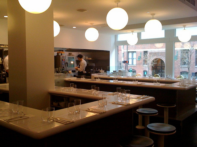
Designed as a modern diner concept, this counter service restaurant serves up fresh italian dishes in a modern and vibrant interior. 


The restaurant features a minimalist design and color palate. The single long bar that wraps through the space allows guests to view and focus on the food being created in front of them.
What's even better than this simple and sleek space is it's sister space, located just downstairs. Check back Monday to see the differences between the two spaces!


Image 1 © Travel & Leisure
Image 2,4 © Visual Dialogue
Image 3© LMGoBlue Flickr

Mad Cow

Name: Mad Cow at the Ivy
Location: Australia


Located in Sydney, Mad Cow is a bright and cheerful addition to The Ivy. With a color palate of white, yellow and green the interior feel fresh and energetic. The wicker furniture, over scaled drum fixtures and slivers of faux grass give the space a Palm Springs vibe without feeling too kitschy.

Image 3 © Eat Show and Tell