Al Tun Tún

Name: Al Tun Tún
Location: Valencia, Spain
Design: Sandra Tarruella


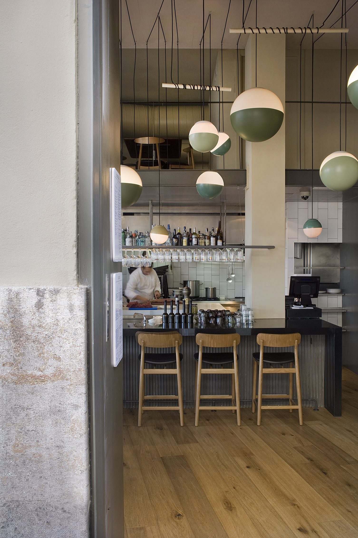
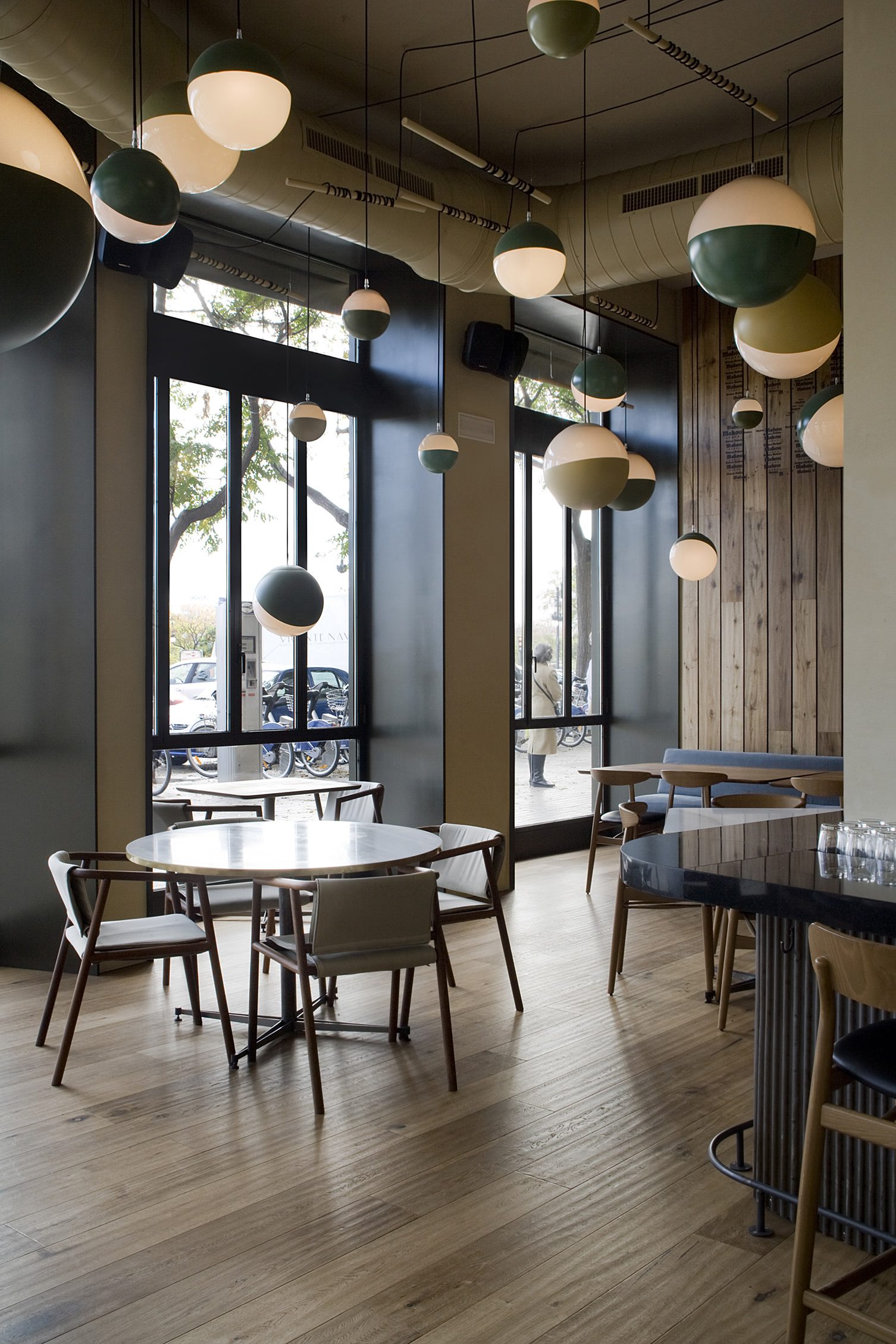
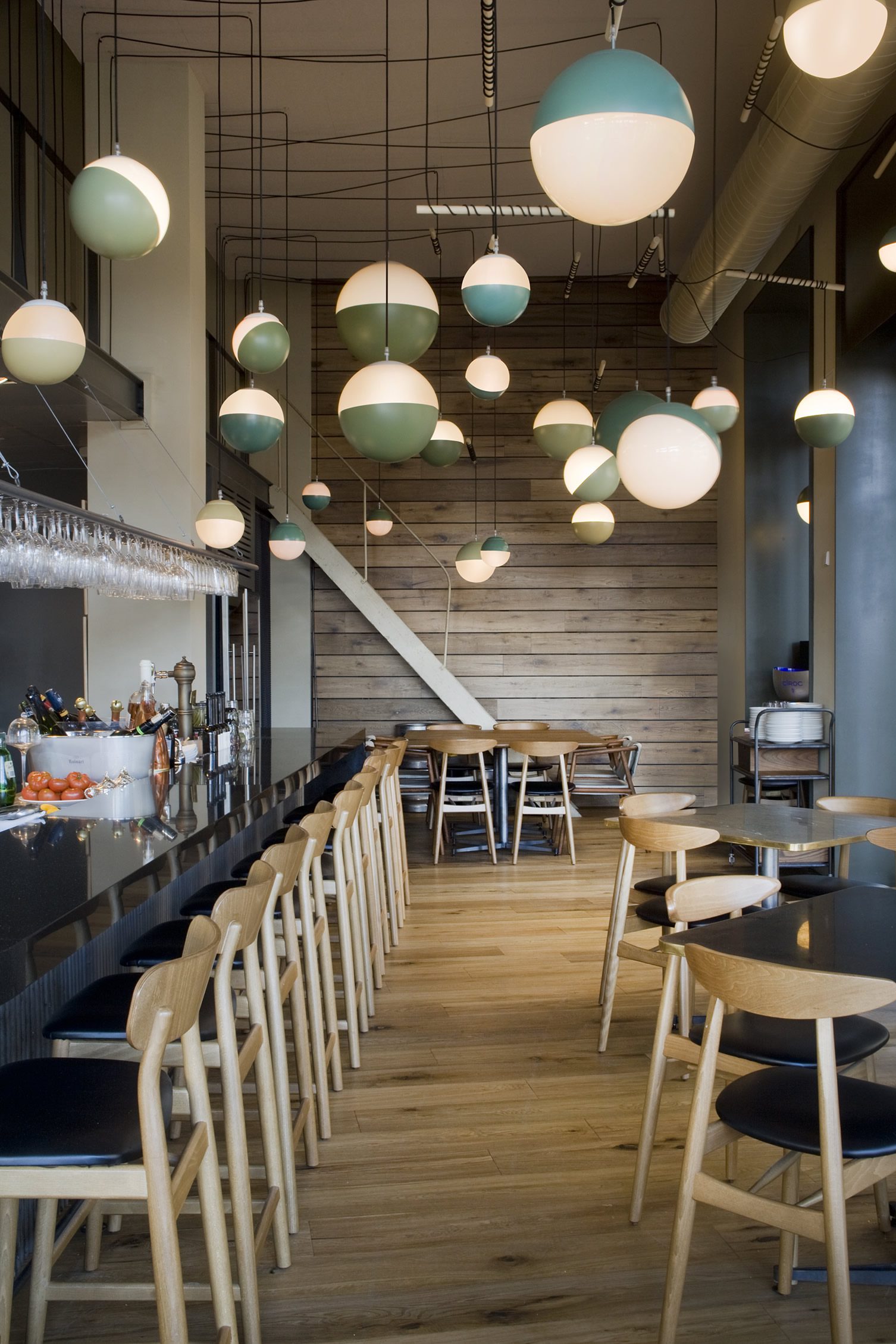
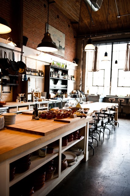
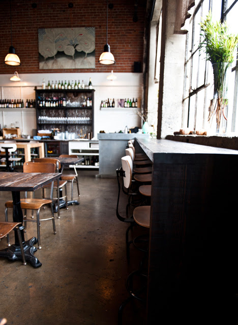
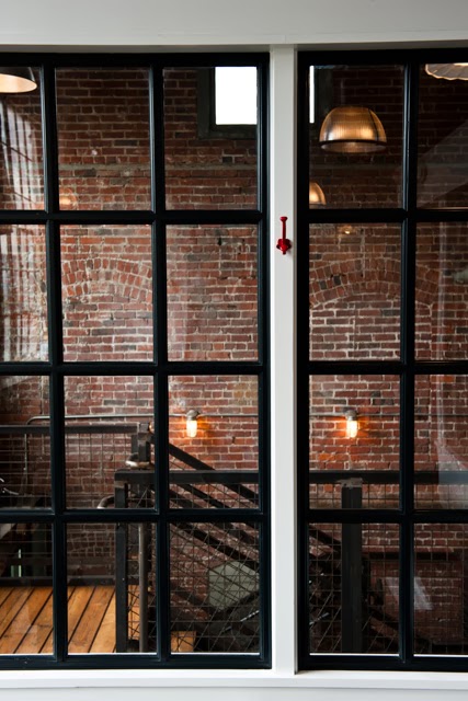
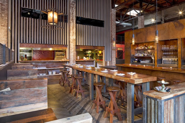
A controlled material palate and great amount of natural light help make Al Tun Tún a warm, beckoning space. 


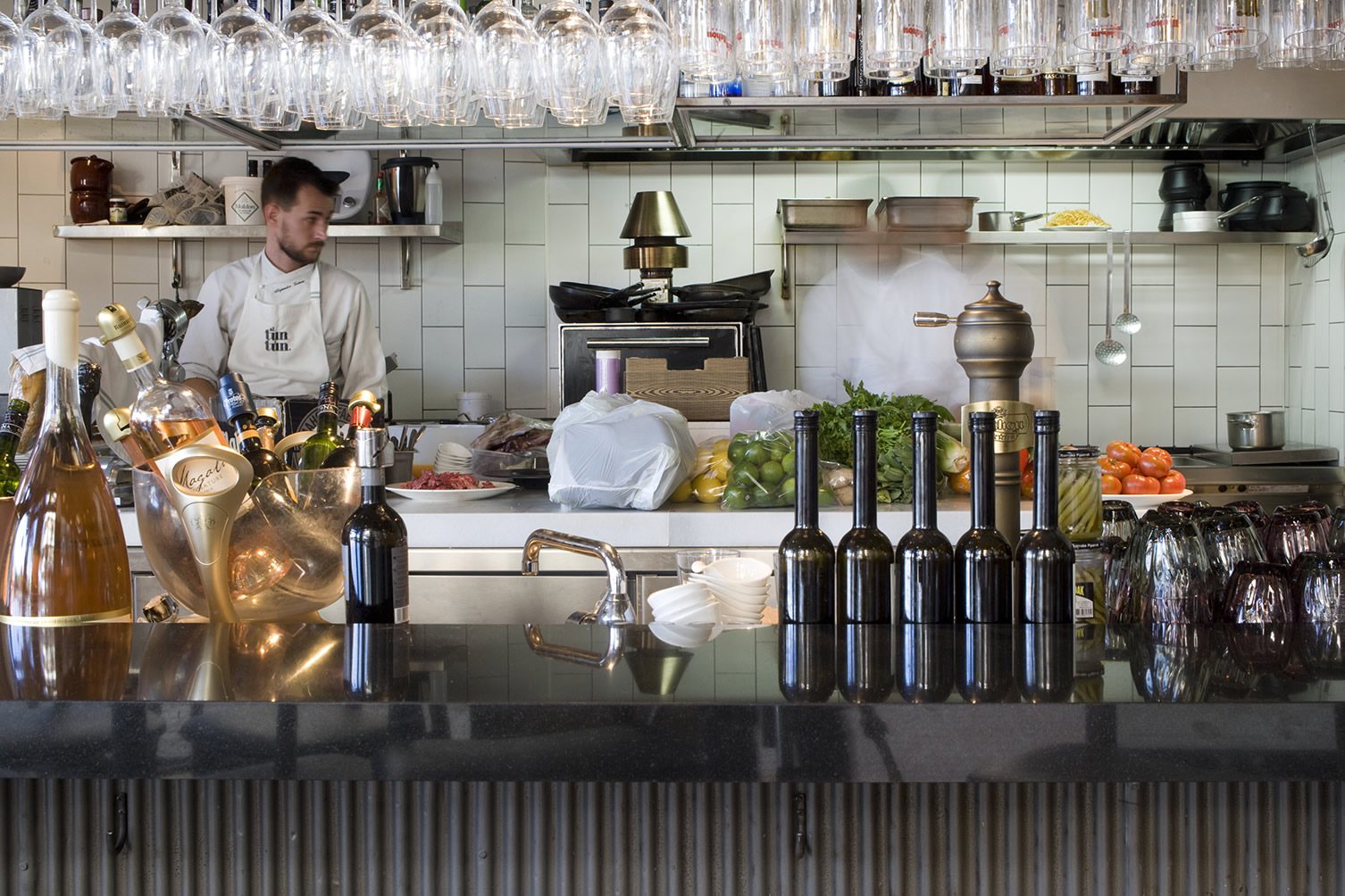
The beautiful open kitchen puts the cooking at center stage. Simple lines and a beautiful lighting installation add just enough to support the theater and help with the overall scale of the two story space.


All images © We Heart


Holy Fox Cafe

Name: Holy Fox Cafe
Location: Kitay-Gorod, Moskva, Russia   
Design: WowHaus


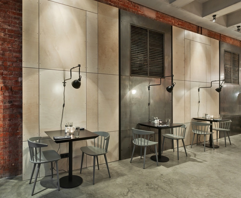
Using common materials and a great pop of color and pattern, Holy Fox creates a harmonious space that feel industrial, hip, and cohesive. 


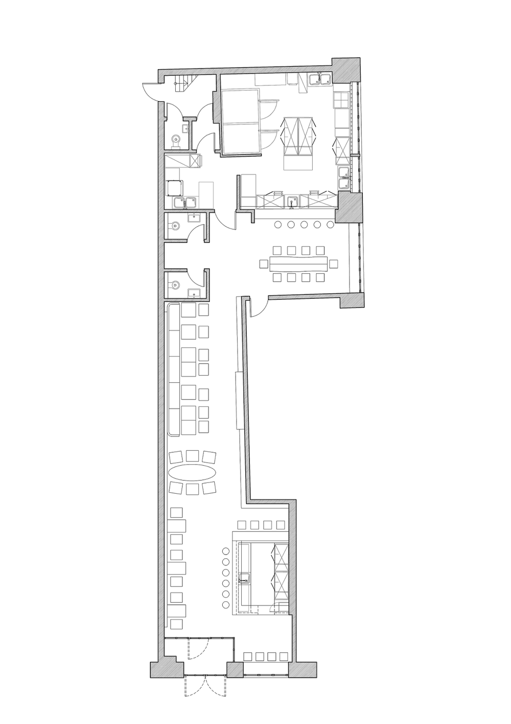
Though a relatively narrow space, the interior feels anything but. Keeping the furniture and casework light distinguishes zones within the space. Keeping the material palate limited also helps keep the interior harmonious.
 One of our favorite moments within the space is the CMU divider and bright pop the fox wall covering brings; perfectly contrasting the rougher materials located adjacent.


 All photos Arch Daily via Frank Herfort

Homer Street Cafe

Name:  Homer Street Cafe
Location:Vancouver, Canada
Designer:Ste. marie


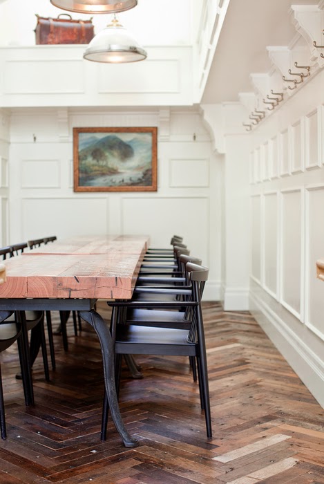
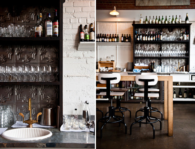
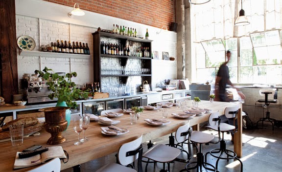
Hitting a perfect balance between transitional and industrial, Home Street Cafe creates an inviting and warm space with just enough punch to keep it on trend.


I love the amount of detail work that can be found though out the space. While some details don't fit in perfectly, they all help balance the pristine white adding to the layers of the space and ultimately creating warmth and wit. 


Garage Project

Name: Garage Project
Location:Wellington, New Zealand  
Design: Matt Smith, Common Goods


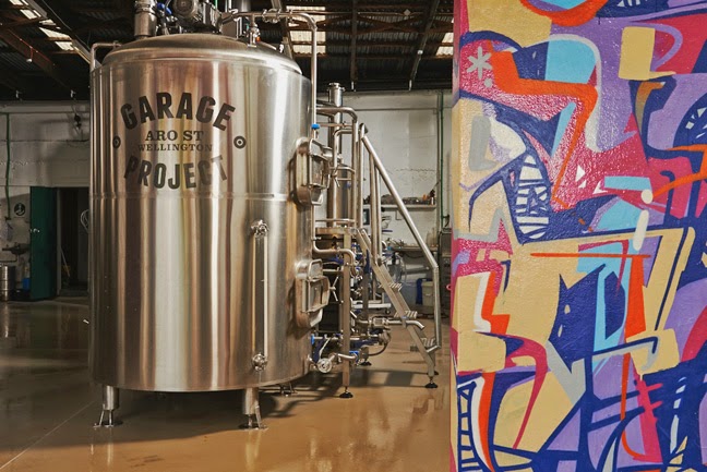
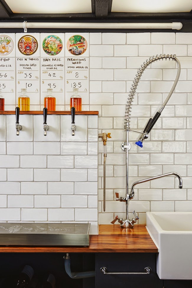
We love a good brewery and Garage Project, located in New Zealand, has recently grabbed our attention for its bold use of color, urban exterior, and simple tasting bar. 


Using a limited material palate, polished subway tiles contrast the warm wood bar and allow the beer on tap to shine.


With industrial and midcentury nods, the overall space compliments the polish and industrial nature of the brewing equipment adjacent. 


All images © Fancy!

Journeyman Distillery

Name: Journeyman Distillery
Location: Three Oaks, MI
Design: DkGr Architects


One of my favorite stops when driving from Chicago up to Michigan is Journeyman Distillery. Located in the historic Featherbone factory,  Journeyman keeps the history of their space front and center. 


The barrel room shines behind large plate of glass and contrasts the raw space, easily drawing your eye toward it.

The use of wood throughout the space helps warm up the industrial and urban interior. I enjoy that the bones and history of the building where allowed to shine with minimal and industrial furniture added in to accent. 


All images © Archinect

Truth Coffee Shop

Name: Truth Coffee Shop
Location: Cape Town, South Africa
Design: Haldane Martin


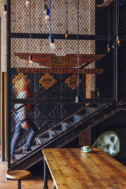
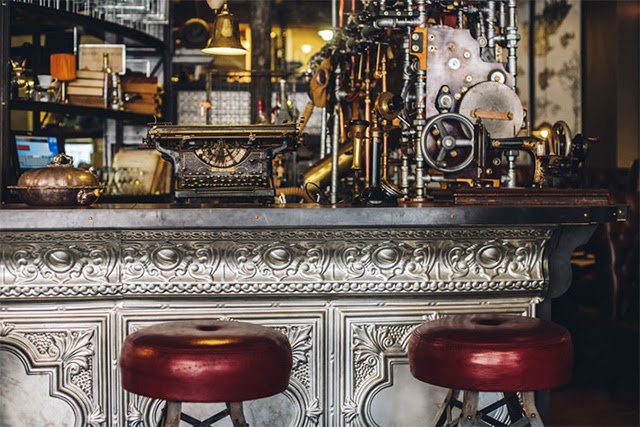
One of the most noticeable trends throughout the world currently is the influx of industrial. With a raw nature, truth of materials, and authenticity it is easy to see how so many have grown to love this aesthetic. As with any trend, there grows the group of people who yearn to be different and to expand past what is 'trendy'. One of the most common trends I see coming into favor is Steampunk. While I can see direct link from industrial to steampunk, I feel the need to stress that these two styles are by no means the same. Truth Coffee Shop is a great example of what steampunk represents and showcases the differences between the two styles flawlessly. 


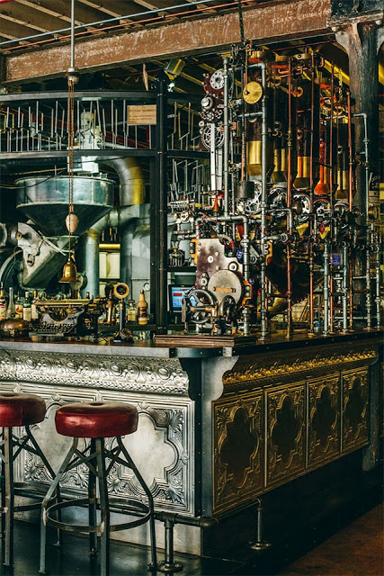
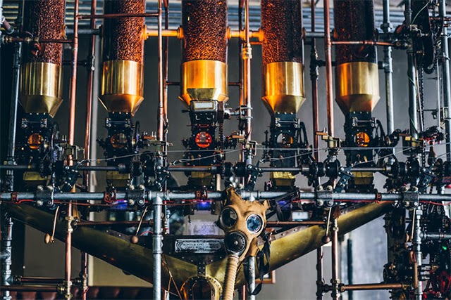
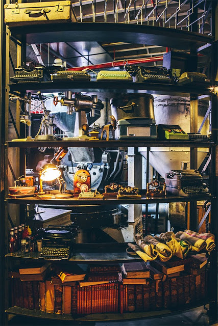
The steampunk style relies heavily on the mixture science fiction and steam powered machinery. Blurring the line between industry and decoration, steampunk can incorporate a varying degree of components and characteristics. 


While both styles showcase natural woods and metals, steampunk does so in a mechanical way. Touches of Victorian and Art Nouveau can be witnessed through the rich hues, ornate details, and elaborate curves. 


What I love about the Truth Coffee space is that they took the machinery and components of coffee roasting and brewing and used them as inspiration for their steampunk interior. By imagining these machines as both form and function, they crafted a space that perfectly blends the machinery with the art of coffee. 


All images © This is colossal

Damson & Co

Name: Damson & Co
Location: London
Design: Central Design Studio


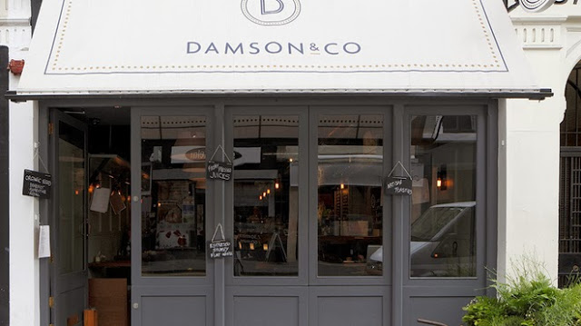
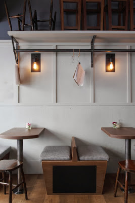
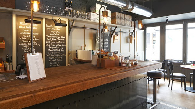
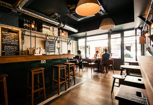
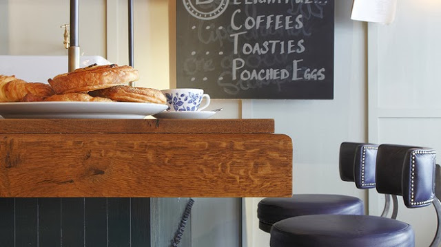
Damson & Co has done a great job layering multiple styles together to create a warm and classic space. 
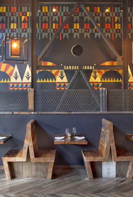
Industrial and classic touches add depth and visual interest to the otherwise utilitarian interior.


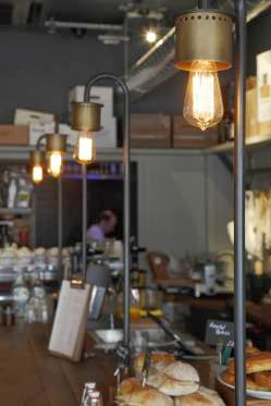
The millwork details located at the bar are one of my favorite parts of this space. They are traditional in most aspects but make a slight nod towards industrial. Paired with the custom light fixtures at the bar top you get a space that feels familiar but on trend. 


The tile detail located at the foot of the bar adds definition to the space while remaining simple and clean lined, much like the remainder of the utilitarian interior. 


Images 1-4,6 © Timeout Magazine
Image 5 © Indigo Memoirs
Images 3, 5,7 © Central Design Studio

Duende

Name: Duende
Location: Oakland, CA
Design: Arcsine Architecture in collaboration with multiple local artisans.


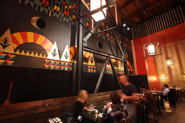
With today's highly competitive restaurant scene, restaurant owners know that the need to offer more than just a great plate of food in order to attract and keep guests. Duende, located in Oakland, California was crated with this in mind and offers a bit for everyone. 


Located in a historic Art Deco building, the interior utilizes graphics and patterns to bridge the deco exterior and industrial nature of the space. 

The large interior utilizes large amounts of worn wood and exposed brick to balance out the saturated and geometric murals.

I love that while the space is large in scale, the warmth and amount of detail keep it warm and unimposing.

All Images via Weheart

Gusto

Name: Gusto
Location: Toronto, Canada
Design & Photography: Munge Leung


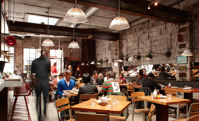
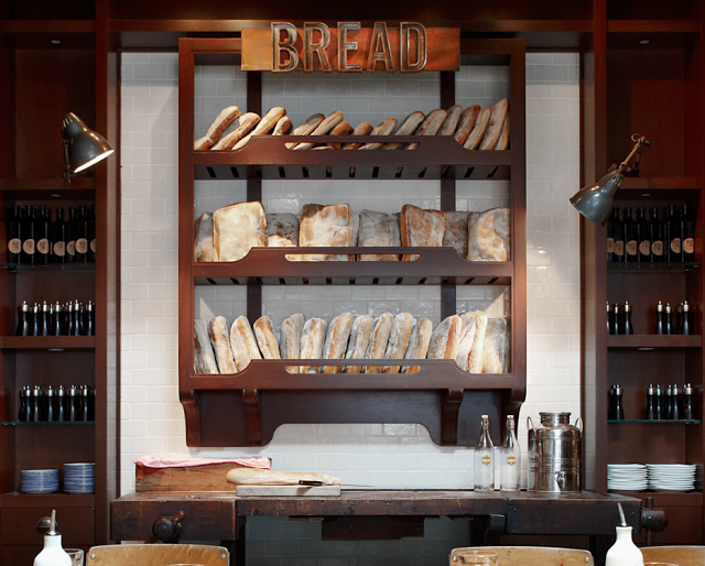
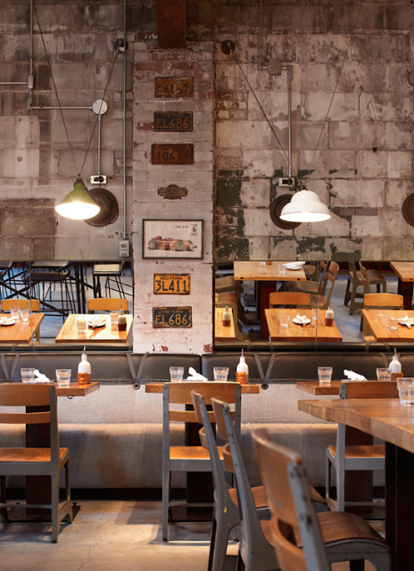
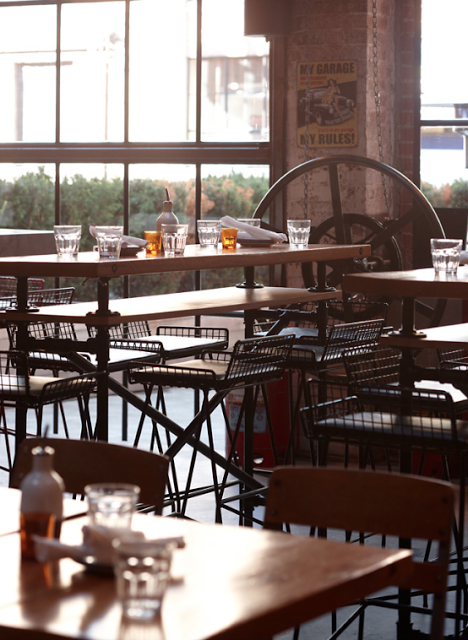
Revitalizing a former auto body shop, Gusto 101 crafted an industrial and intimate Italian trattoria.


The use of vintage furnishings paired with the raw, industrial space creates an industrial interior that remains warm and authentic. 


I enjoy that though they used multiple finishes and fixtures, the entire space feel cohesive and complete. By leaving the existing space relatively untouched and adding a level of finish to the food preparation areas, allows the space to remain pulled together and thought through. 


Sitka & Spruce

Name: Sitka & Spruce
Location: Seattle, WA
Design: Unkown


Located in Melrose Market, a vintage auto garage dating back to 1919 and 1928 respectively, Sitka & Spruce has quickly climbed to the top of my Seattle restaurant list. With an over the top open concept and location amongst exceptional vendors, it's easy to see why. 


The converted garage spaces feature cement columns, exposed brick, and beautiful industrial windows. With the dining and kitchen sharing a singular space, you easily feel as if you are eating in someone's kitchen. 


The industrial structure paired with classic paneling, industrial and vintage furnishings create a perfect mix of relaxed style. 


Photo 2© Seattle Mag
Photos 1, 3-5 © Kimberly Taylor Images