Nordburger

Name: Nordburger
Location: Adelaide, South Australia
Design:Peter Jay Deering


Nordburger takes America's favorite concept of burgers and fries, and combines it with a clean aesthetic fitting of the quality food being served. 


 Gone are the primary colors and plastic seats so commonly found in quick service spaces. Utilizing a minimal aesthetic and simple materials keeps the space bright, inviting, and warm. Limited seating encourages quick bites and a grab and go mentality. The use of concrete bases insures the seats they do have stay in place ensuring room for guests to pass. 


All images © Vogue Living AU

Saint Frank Coffe

Name: Saint Frank Coffee
Location: San Francisco, CA
Design: Unkown

Saint Frank Coffee has given me another reason to get back to San Francisco. Located in the Russian Hill neighborhood, with a pop-up cafe at the Public Bike shop in South Park, the cafe is modern, warm, and thoughtful. 


I love the simplicity of the space and cohesion of wood tones and materials. Creating a perfect transition from the dark wood trends currently, and the light wood trends that are slowly creeping their way back in, it balances warmth with light. 


Integrating the technology and brewing into the main bar allows for minimal separations between the customer and barista while also adding to the clean lines of the space.


And how could we not mention those hex tiles- perfection.


Truth Coffee Shop

Name: Truth Coffee Shop
Location: Cape Town, South Africa
Design: Haldane Martin


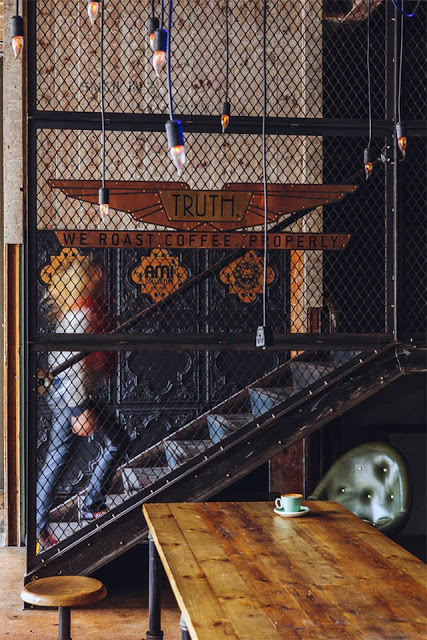
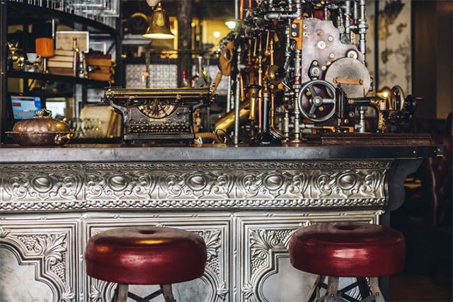
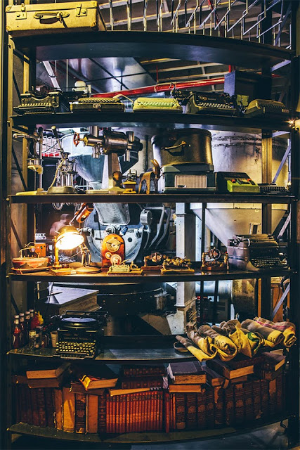
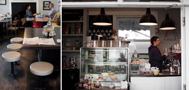
One of the most noticeable trends throughout the world currently is the influx of industrial. With a raw nature, truth of materials, and authenticity it is easy to see how so many have grown to love this aesthetic. As with any trend, there grows the group of people who yearn to be different and to expand past what is 'trendy'. One of the most common trends I see coming into favor is Steampunk. While I can see direct link from industrial to steampunk, I feel the need to stress that these two styles are by no means the same. Truth Coffee Shop is a great example of what steampunk represents and showcases the differences between the two styles flawlessly. 


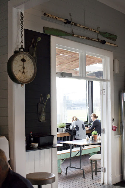
The steampunk style relies heavily on the mixture science fiction and steam powered machinery. Blurring the line between industry and decoration, steampunk can incorporate a varying degree of components and characteristics. 


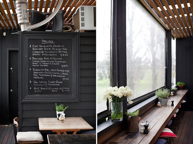
While both styles showcase natural woods and metals, steampunk does so in a mechanical way. Touches of Victorian and Art Nouveau can be witnessed through the rich hues, ornate details, and elaborate curves. 


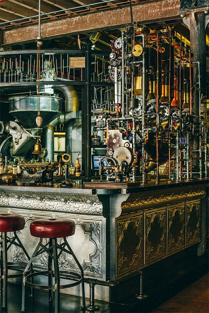
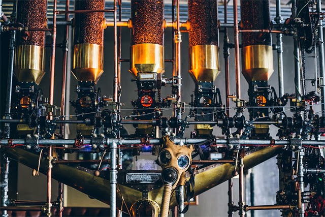
What I love about the Truth Coffee space is that they took the machinery and components of coffee roasting and brewing and used them as inspiration for their steampunk interior. By imagining these machines as both form and function, they crafted a space that perfectly blends the machinery with the art of coffee. 


All images © This is colossal

Damson & Co

Name: Damson & Co
Location: London
Design: Central Design Studio


Damson & Co has done a great job layering multiple styles together to create a warm and classic space. 
Industrial and classic touches add depth and visual interest to the otherwise utilitarian interior.


The millwork details located at the bar are one of my favorite parts of this space. They are traditional in most aspects but make a slight nod towards industrial. Paired with the custom light fixtures at the bar top you get a space that feels familiar but on trend. 


The tile detail located at the foot of the bar adds definition to the space while remaining simple and clean lined, much like the remainder of the utilitarian interior. 


Images 1-4,6 © Timeout Magazine
Image 5 © Indigo Memoirs
Images 3, 5,7 © Central Design Studio

Sitka & Spruce

Name: Sitka & Spruce
Location: Seattle, WA
Design: Unkown


Located in Melrose Market, a vintage auto garage dating back to 1919 and 1928 respectively, Sitka & Spruce has quickly climbed to the top of my Seattle restaurant list. With an over the top open concept and location amongst exceptional vendors, it's easy to see why. 


The converted garage spaces feature cement columns, exposed brick, and beautiful industrial windows. With the dining and kitchen sharing a singular space, you easily feel as if you are eating in someone's kitchen. 


The industrial structure paired with classic paneling, industrial and vintage furnishings create a perfect mix of relaxed style. 


Photo 2© Seattle Mag
Photos 1, 3-5 © Kimberly Taylor Images

Vinatería

Name: Vinatería
Location: Harlem, NYC
Design Jonsara Ruth


Vinatería is a great example of vintage made new again; but in a pulled together and thought through manner. 


More often than not, reclaimed and repurposed can typically mean it looks like you are walking into a flea market. With Vinatería, a little color helped provide cohesion between the elements and furniture and gave it a cohesive feel. 


With the chairs getting half dipped (some on top, others on bottom), metal screens providing both entry doors and pattern play, and warm woods providing a warm, lived in feel, the space is comfortable but curated. 


All images © Nytimes

Noodlebox

Name: Noodlebox
Location: Shelbourne Victoria, BC
Design: Evoke


For a large chain, Noodlebox has done a great job re-imagining their brand. Using a limited color palate, custom fixtures, and a heavy hand of wood, the space is a balance of rustic and modern.


Whether their intention or not, keeping the material and color palate limited allows them to replicate the design easily no matter the location or space size. 
I love that they exposed the ceilings and created harmony throughout by carrying through wood as the main material. The contrast of concrete and steel adds a modern touch and keeps the space hip and on trend. 


All photos © Evoke


Abattoir

Name: Abattoir
Location: Atlanta, GA
Design: Unknown


With a name French for 'slaughterhouse', Abattoir did a great job providing an interior that contrasts it's name while simultaneously providing nods to the spaces meat packing past. 


Warm and industrial, the interior kept it's existing brick structure relatively intact, hiding it only by a neutral coat of paint. Within the space, the bar is defined by worn wood partitions, curtains, and colorful barstools. 


The relatively raw main dining space beckons back to its meat packing days while it's neutral and industrial palate to allow the space to firmly establish itself in the present. 


Photos 1,3,5 © Sarah Dorio
Photos 2,4,6 @ Thrillist

Mart 130

Name: Mart 130
Location: Melbourne, Australia
Photography: Erika Hildegard Photography (If you are in Australia, I encourage you to check out her amazing range of work.)


Mart 130 has to be one of the best examples I've seen recently of a comfortable and established cafe maintaining a well curated interior. When Erika's images landed in my inbox I couldn't help but get excited. Rarely do you find the blend of well loved antiques that is also still pulled together and edited. 


Using vintage and antique pieces, paired with a nautical and industrial undercurrent, Mart 130 creates a cohesive blend of worn comfort and bright openness. 


Utilizing red, aqua, black, and blue throughout the multiple seating areas ties the entire space together without needing to match everything. This allows the space to remain cohesive while each room still maintains it's own identity. 


I love the bright back patio featuring painted, dark wood and slat ceiling, you could easily sit for hours.


Local 360

Name: Local 360
Location: Seattle, WA
Graphic Design: Sleep Op


Another great spot in Seattle is Local 360. Located in the Belltown neighborhood, it focus on locally sourced, sustainable fare. The interior follows creating a rustic and warm interior using barn wood,  vintage style pendants, and intimate spaces for diners.


The use of multiple wood types creates a warm, rustic, and trendy interior while the marble counters and tolex-esq chairs add balance by adding polished, industrial touches.


 Photos ©  Local 360 & Sleep Op