Duende

Name: Duende
Location: Oakland, CA
Design: Arcsine Architecture in collaboration with multiple local artisans.


With today's highly competitive restaurant scene, restaurant owners know that the need to offer more than just a great plate of food in order to attract and keep guests. Duende, located in Oakland, California was crated with this in mind and offers a bit for everyone. 


Located in a historic Art Deco building, the interior utilizes graphics and patterns to bridge the deco exterior and industrial nature of the space. 

The large interior utilizes large amounts of worn wood and exposed brick to balance out the saturated and geometric murals.

I love that while the space is large in scale, the warmth and amount of detail keep it warm and unimposing.

All Images via Weheart

Clive Burger

Name: Clive Burger
Location: Calgary, Canada
Design: Unknown

Clive Burger is a wonderful example of a fast casual space with a modern and fun interior. Utilizing cartoon-esq graphics paired with a restrained material and color palate, allows the space to feel whimsy while establishing a clean and modern space. 


The use of custom furnishings allowed the seating and space to be maximized while keeping a harmonious overall feel.


Images © Scout Flickr

Elbow Room

Name: Elbow Room
Location: Brooklyn, NY
Graphic Design: mgmt. design
Interior: Greg Yang Design


I love it when the graphic design, identity, and interior all come together to form a cohesive space and presentation. The Elbow Room restaurants are a great example of this cohesive and thought through design. 


Using simple materials, the very trendy pixilated graphics, and typography that ties back to the noodles being served, the entire space comes together to create a minimalist but warm space. 


Once again, using a restricted color palate; this time yellow, black, and white, creates instant cohesion while tying into the iconic cheesy color so many of us recognize and love. 


All images © Behance

Beasley's Chicken + Honey

Name: Beasley's Chicken + Honey
Location: Raleigh, NC
Design: Unknown
Graphic Design: Joshua Gajownik


When looking for restaurants to feature on the blog, I am more often than not scouring through ten to twenty spaces before finding one that is inspiration worthy. Usually, I get so excited when I find something beautifully designed and worth sharing, that I often forget the others that sadly fell short. 

Beasley's is an example of a space I am finding all too common in the industry today. It is a space that forces me to ask myself, "Where is the design?"


Let me explain after the jump.


 Ask any successful restaurant owner or restauranteur and they are likely to agree that what makes a guest return is an overall positive experience. This experience is usually the culmination of architecture, graphic design, interior design, menu/food execution, service, and atmosphere. 


Think about the guest experience for a moment. More often than not, the guest experience either starts online (whether it be on your website, yelp, or other review site/web feature) or just outside your front door. (Again whether from walking by, arriving via car, etc.) 
This is the restaurant's first impression; A moment to grab guest's attention and draw them inside. How do you grab that attention? Easy, this is where the architecture and graphic design work come in. Great graphic design work and the architecture of the building or exterior space, gives the guest the first impression as to what the space and concept is all about. It's your elevator pitch, so to speak. 
This opportunity typically only lasts for a minute or two.


Once a guest has made it into your space, they now take in the environment and begin to look over the menu. Once again, graphic design is key. The other component that now comes into play is interior design. What is the overall concept and is it known within moments of walking in the door? Also, does it coincide with what the exterior said? These initial moments inside usually last no
more than ten minutes before orders are placed and menu's are taken away. 

Now is the crucial moment, guests are waiting for food and drinks and eyes begin to wander. The discerning guest is taking in everything, whether they realize it initially or not.  Considering a guest can spend upwards of an hour and half in a sit down restaurant, why on earth would you forget the interior design?!


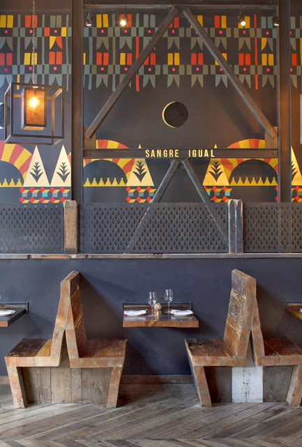
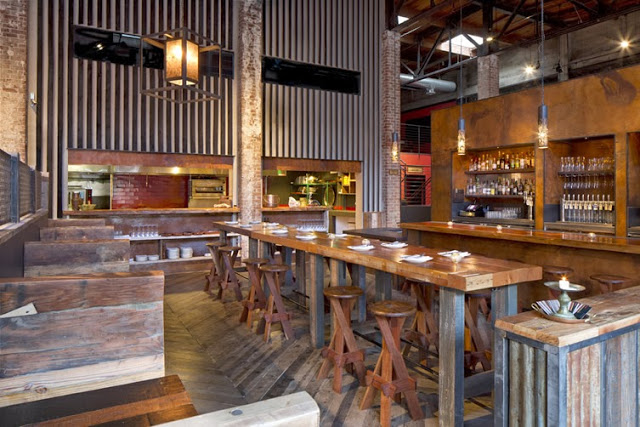
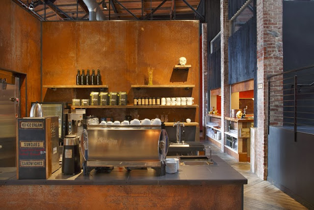
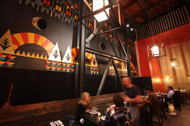
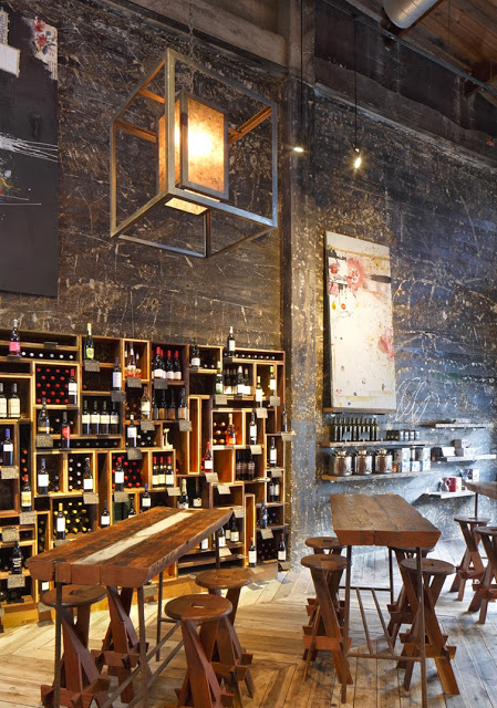
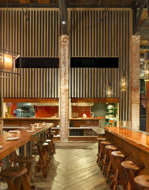
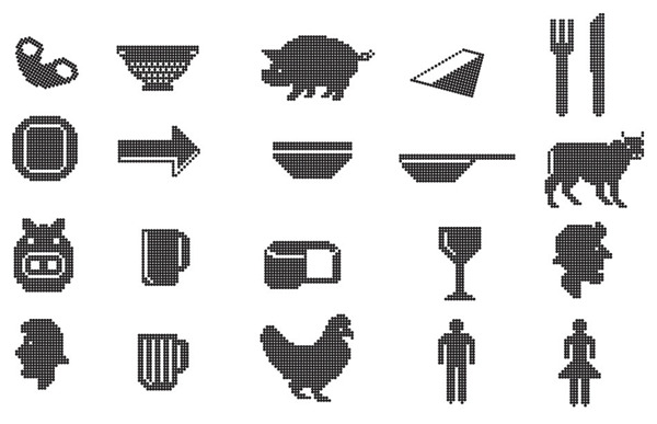
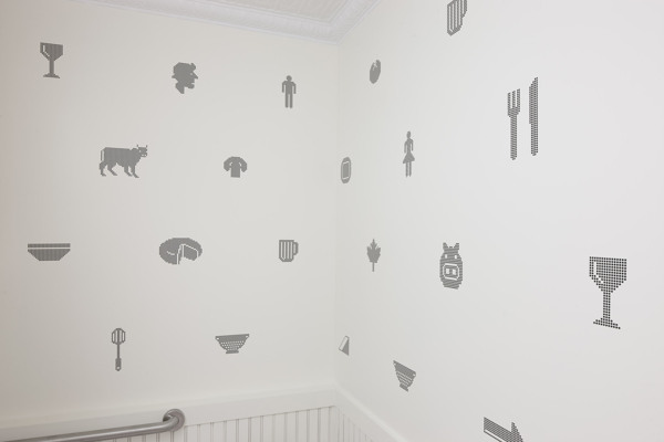
This is ultimately the problem I have with Beasley's Chicken + Honey. You can tell that the graphic design work was taken seriously and that a graphic designer was ultimately hired and briefed on the concept and desire for the space. An architect was also on board, as is apparent from the exterior of the space corresponding to the graphic design work and concept. Unfortunately it ends there. The interior, while urban, is an assembly of off the shelf solutions from big box stores. While not entirely or always a bad thing, it does leave plenty to be desired in terms of details and layout. I enjoyed that the paper menu corresponded to the chalkboard menu and that they made it large enough to add some visual punch but it is clear that so many small elements where forgotten. It is often important to remember that an architect, while skilled, typically views buildings and construction from a macro scale. An interior designer is key to viewing your space from the micro level. Does the layout increase table turn over and profits? Are there enough server and bus stations at well placed and traffic free areas? How far do servers need to travel to deliver food and assist guests? All of these are questions that need to be thought of and answered by the chef, owner, and designer in order to create a successful space and experience. Forgetting these seemingly small elements can easily end a positive guest experience. 

I was so excited when I stumbled upon the AC Restaurant website and even more excited when researching the logo and graphic design work. I had high hopes that the entire experience and concept would carry this level of attention and care throughout. Unfortunately I found this not to be the case. 


The time spent inside your space, and the overall experience a guest has, is the key to creating a returning customer. In today's highly competitive restaurant market, it is crucial that all components of the experience are considered. 


Lowbrau Bierhalle

Name: Lowbrau Bierhalle
Location: Sacramento, CA
Graphic Design: Band

Lowbrau bierhalle is a modern interpretation of the traditional German Beer Hall. I love that they took a traditional concept, reinterpreted it for their local, and created a space that refreshingly different while still playing homage to the original. 


The rustic interior features hits of reflective gold, elevating the rustic and causal interior. Utilizing graphic design and their pig and crown logo helps tie in the gold accents while still paying tribute to the traditional concept. 


By understanding the importance of the interior and branding within their space, Lowbrau was able to create a upbeat and fun execution of a historical concept. 


All photos © Band


Get 10% Off sitewide when you shop at "http://www.thelashop.com/">TheLAShop.com
Valid until December 2013.


Riffle NW

Name: Riffle NW
Location: Portland, OR


A well thought through concept is one where the restaurant owners consider all components of a guests' meal. From entry and exterior vantages, graphic design, and interior design, all the way to tableware, servers outfits, and take away, all components add up to create a cohesive concept. Riffle NW is a great example of a restaurant thinking through executing each of these components extremely well, providing a completely cohesive dining experience.


The nautical nature of Riffle's space blends perfectly with the raw bar and seafood heavy menu being served. 


The light wood, sail cloth seating and dividers, and numerical table graphics all play off each other to create a comfortable and bright space that reflects the nautical nature but doesn't overdo it.


Sticking to the turquoise and orange color scheme in their graphic and identity design tie into the colors used with the space once again adding another level of cohesion to the dining experience.


The drink menus are cleverly hidden away and remind me of pulling up a trap to discover what you've caught. 


Image 2-3, 5 © Eater Portland
Image 1, 4, 6-8  @ Behance

Top Hops

Name: Top Hops
Location: NYC, NY
Design: Helm Workshop- Identity


Top Hops is a craft beer goldmine in the heart of NYC. With great identity and branding, along with a functional and well laid out interior, the concept is cohesive and fun.


Brand Identity
I love the structured yet informal nature of the chalkboard menu and enjoy that it provides a great backdrop to the tasting bar and retail. 

Brand Identity
Image 1 © Edible Manhattan
Image 2© lucyeatsveggies
Image 3- 4 ©Helm Workshop

Town Mouse

Name: The Town Mouse
Location: Melbourne, Australia
Graphic Design: A friend of mine


Once again, a great example of typography and identity going hand in hand with restaurant design. The Town Mouse, located in Melbourne, took a simple color palate and created an interior that was relevant, fun, and modern.


The central bar allows for a multitude of activities while also providing a great amount of seating.


I love the square, gloss tiles that were used throughout the space. They create cohesion and deliver a great backdrop for the typography.


Images 1,4-7 © Broadstreet
Images 2,3 © A friend of mine

Mexout

Name: Mexout
Location: Singapore
Graphic Design: Bravo Company

Mexout goes against the grain to create an urban interior paired perfectly with a purposefully imperfect branding scheme. 


Creating an industrial and urban space, Mexout is casual while still remaining tailored and thoughtful. The team behind the graphics created 20 different logos that all work in conjunction, or separately, which continue the urban and young feel of the interior and concept.


Keeping the color and material palate limited and selective, balances the multiple logos and branding efforts taking place. The interior does a great job crafting a space that feels hip and laid back, but also tailored and thought through.