Zito's Sandwich Shoppe

Name: Zito's Sandwich Shoppe
Location: Brooklyn, NY
Design & Identity: Tag Collective


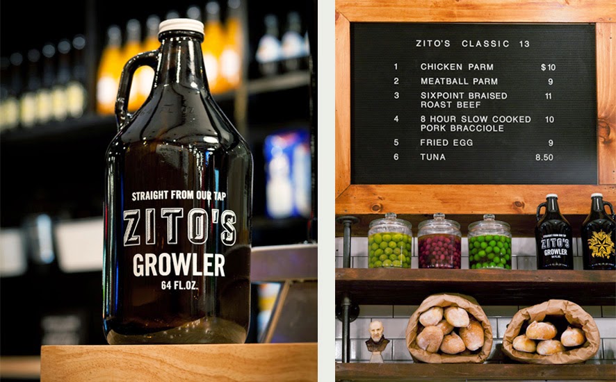
Located in Park Slope, Zitto's modern-industrial space features the perfect amount of Italian heritage.


Classic white subway tile, mercantile shelving, and pipe shelving all cement Zitto's as a modern Italian deli while the hung bulbs of garlic and salumi keep the authenticity alive and pay tribute to the classic Italian delis of New York's past. 


All Images @ Tag Collective

Elbow Room

Name: Elbow Room
Location: Brooklyn, NY
Graphic Design: mgmt. design
Interior: Greg Yang Design


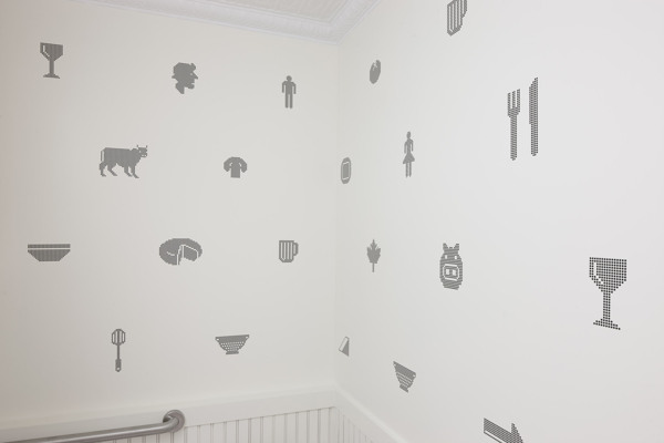
I love it when the graphic design, identity, and interior all come together to form a cohesive space and presentation. The Elbow Room restaurants are a great example of this cohesive and thought through design. 


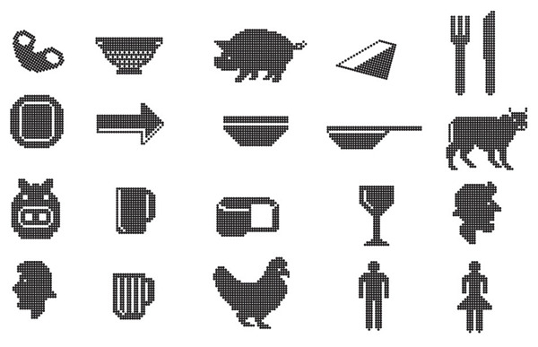
Using simple materials, the very trendy pixilated graphics, and typography that ties back to the noodles being served, the entire space comes together to create a minimalist but warm space. 


Once again, using a restricted color palate; this time yellow, black, and white, creates instant cohesion while tying into the iconic cheesy color so many of us recognize and love. 


All images © Behance

Nights and Weekends

Name: Nights and Weekends
Location: Brooklyn, NY

 Nights and Weekends is a small cuban spot with the classic 'Brooklyn' feel. Warm, inviting, and comfortable are all words that come to mind when thinking about this local spot. 


I love the patina and texture on the walls as it gives the entire space a vintage/ lived in atmosphere.  The industrial back bar allows for ample storage while enhancing the casual atmosphere. 


The simple, industrial furnishings give it just a touch of attitude, establishing the perfect laid back and welcoming atmosphere. 


The triangular footprint of the space means most of the seating can be found along the walls, leaving the interior largely open; a great benefit for late night bar crowds. The space also features large windows opening up to the outside. Vintage stools attached to the exterior allow guests to sit outside while minting the connection to the interior and bar. 


Littleneck

Name: Littleneck
Location: Brooklyn


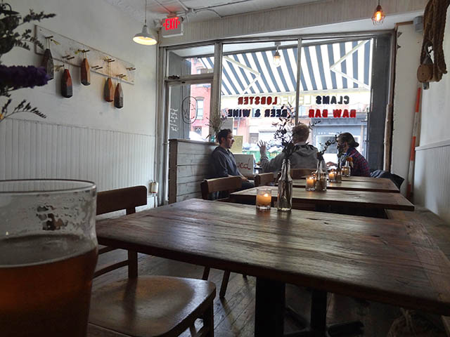
Littleneck has created the perfect roadside seafood shack in the middle of Brookyln, that could cure any quick craving for the East Coast you may be having. 


 02 Littleneck Brooklyn

White washed, half paneled walls, dark worn wood furniture, ropes, bouts, and cage lights keep the space minimal with just enough touches of East Coast roadside charm. This space is successful simply because they stayed true to their concept. There is nothing over done and there was enough thought put into the space to appear intentional and cohesive with the food being served and original concept.


Photos 1, 3 @ Eater
Photo 2 @ Me So Hungry

Toby's Estate

Name: Toby's Estate
Location: Williamsburg, Brooklyn
Design: Nema


As the American flagship for Australian coffee, Toby's Estate is a comfortable and curated space.


I enjoy that the shelving and retail space was treated as if it could be in your home, rather than a cafe. 


Toby's Estate hopes to be a location for coffee and coffee education and features a long marble toped bar with pour-over and espresso making on display. It also features a separate room designed for classes and exploring the world of coffee further.


 Using primarily off the shelf solutions, they managed to curate a space that feels cohesive and welcoming.

All images © Dwell

Brooklyn Girl

Name: Brooklyn Girl
Location: San Diego


Located in San Diego, Brooklyn Girl is a great example of two regional styles coming together to create a great mix. 


Using a monochromatic color palate of grey and white, they keep the space rooted in California by keeping it cool and bright. The addition of industrial furniture, rough wood, and rust tables bases all adds bits of Brooklyn without creating a dark and warm effect. 


All photos © Brooklyn Girl

Lulu & Po

Name: Lulu & Po
Location: Brooklyn, NY


Lulu & Po is a great example of a space that is completely Brooklyn. Warm, rustic, a bit edgy with a casual coolness. 


I love the exposed concrete floors with the multiple layers of years showing through. The light table and shaker chairs do a great job of keeping the space pulled together & contrast the organic nature of the large scale artwork and menu board.


The bar does a great job maintaining contrast with the warm wood wall and clean white subway tiles. Changing the seat and bar stool colors helps break up the space and gives the eye a break as it takes in the space. 


Images 1, 4-5 © Brownstowner
Image 2-3,6 © Lingered Upon

Walden

Name: Walden
Location: Brooklyn

I love the simplicity of Walden, located in Williamsburg. The neutral color palate of black, white, brown, and gold gives off a touch of Scandinavian style, while the wood floors and tin ceiling are pure brooklyn. I also enjoy the light fixtures used throughout the space; simple, pure in form and just enough to add a warm sparkle at night.


Image 1-3 © WaldenNYC


Isa

Name: Isa
Location: Brooklyn
Designer: Taavo Sommer


Taking cues from Buckminster Fullers' Geodesic dome, isa features geometric shapes with a rustic touch to balance it all out. With a rooftop garden that produces some of the restaurants veggies and herbs, the natural and organic element is continued inside with a wood burning stove, stacked logs, exposed wood beams and herbs drying from the ceiling. Isa could easily be described as a modern lumberjack, combining the rustic, earthy qualities with modern lines and sensibilities. It feels perfectly suited with Brooklyn.


All images © Gothamist


Fette Sau

Name: Fette Sau
Location: Brooklyn

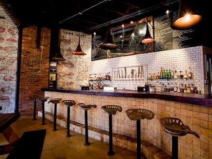
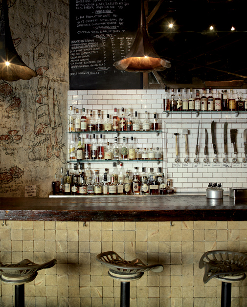
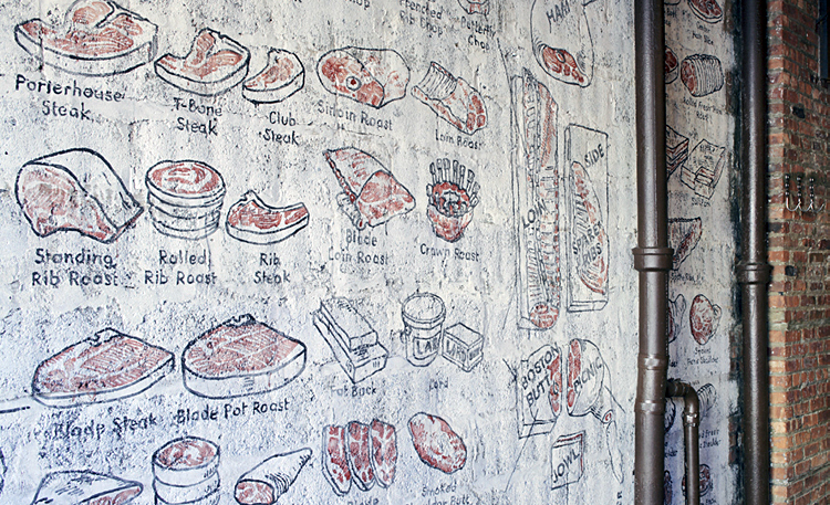
What I enjoy the most about Fette Sau, is that they addressed the butchery side of the meal. While we often see the rustic/industrial ideas coming into play with BBQ joints, you commonly don't seen the butchery side come out at all. Fette Sau managed to incorporate this element, without making it overbearing or overly graphic. Instead, it has elements of the classic butcher shop which also having the rustic aspects such as tractor seat bar stools, wood topped tables and exposed structure.

Eater Review - Fette Sau


The meat illustrations drawn on the wall and knife pulls, drive home the butcher feel and create a fun visual element to the space.


Image 1 © Will work for food
Image 2-3 © Fast Company
Image 4 © franimal flickr