Bowery to Williamsburg

Name: Bowery to Williamsburg
Location: Melbourne, Australia
Design: Di & Will Keser (Owners)


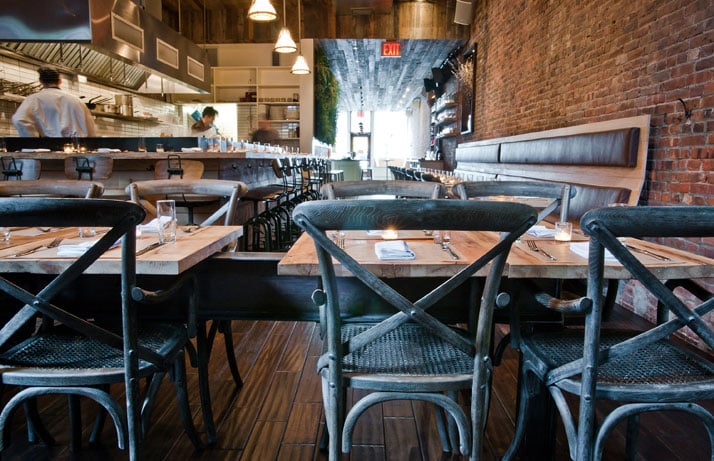
With the opening of its second location, Bowery to Williamsburg brings even more Bowery subway station-inspired, Americana sandwich shop goodness to Melbourne. This second location found its home directly across the street from their other spot, Hardware Society, in the original Beetroot space.


I love the initiate, shotgun style space. Given the space restrictions, it make sense Bowery to Williamsburg is reusing the communal layout used with previous tenant Brothl. The working kitchen and prep space interact with the dining space and encourage an engaged and interactive dining experience. 

 All images via Broadsheet.com

ilili Box

Name: Ilili Box
Location: New York, NY
Design: Unkown


Every once in a while a concept will come along that is all together refreshing. ilili Box's take on modular construction and pop-up shop lunches is just the breath of fresh air their trends needed. 


I love the updated and refined twist on the shipping container as well as the mixed material use that breaks up the structure.  Keeping the color palate simple keeps the concept fresh and modern while simultaneously playing with current trend and classic lines. 


Image 1 c Old Brand New
Image 2 c New York Times

At The Chapel

Name: At The Chapel
Location: Burton, UK
Design: Ahmed Sidki & Catherine Butler


A former 17th century congregation church found new life as a cafe, bakery, wine shop, and restaurant.  Keeping the original architectural details intact, the minimalist and warm interior showcases the goods and space perfectly.


Utilizing natural materials and a minimal color palate, the almost Scandinavian interior, allows multiple functions to flow together while maintaining a cohesive feel.


I love that the architectural details of this stunning building are offset and balanced perfectly by the minimalist and warm interior. 


All images © Dee Purdy

Duckfat


Name:  Duckfat
Location: Portland, ME

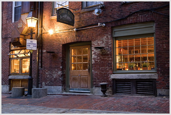
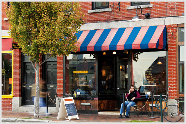
With a name like 'Duck Fat' you really can't go wrong.  This was the second time I've been here and will easily be back again. The food is great but the real star is the duck fat fries and multiple dipping sauces you can choose to accompany them. The space itself is located on a cobblestone street with large front facing windows. An outdoor ledge allows you to dine or drink outside on warmer days without protruding into the sidewalk. What I love the most about the space is how inclusive and local it feels, the interior remains simple and warm which works well within the small space.


Image 1 © Maine Boats
Image 3-4 © Ducat

Portland, Maine


As a self-declared foodie (Lucky for me it's also part of my job description!), one of my favorite things to do is explore restaurants and local food. One of the most overlooked and underrated, in my opinion, foodie location is Portland, Maine. It's hard not to be when you are located inches away from multiple harbors where fresh seafood flows in hourly.

Add to that the cobblestone streets, brick buildings and down-to-earth vibe and you have an area overflowing with great places to eat. The charm of most of the places in Portland is the we've been here forever, hole-in-the-wall feel. 

Rob Evans, the local celebrity chef has recently brought some light to the area when he won a James Beard Award in 2009 for his restaurant, Hugo's (Another JBA was won in 2002 for Fore Street & it's chef). Yet, even with this recent addition of a JBA, Portland is still overlooked. With that, I want to present you with a few local food favorites from this amazing city.

Street and; Co.


Five Fifty-five


Duck Fat


The Porthole Restaurant


Sebago Brewing Company

Colonie


Name: Colonie
Location: Brooklyn Heights, NY
Designer: Architect Alex Meyers of Mad design

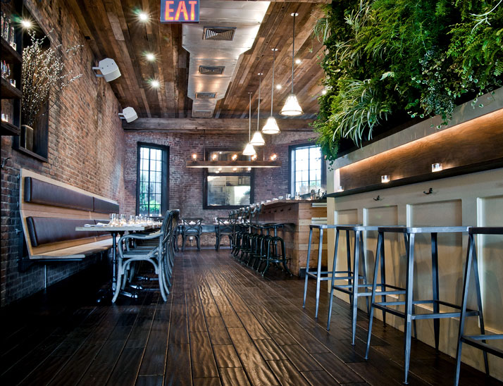
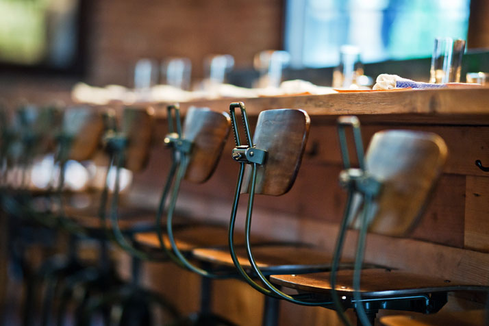
We love the urban farmhouse feel of this space. The interior was created using found and reclaimed materials and has a warm, industrial feel to it. The greatest part of the design was that it was funded by members of the brooklyn heights community, friends and family. The owners of the space created a Kickstart Campaign asking for funding for the design. This allowed the community to actively get involved and excited about the project, adding to the value the restaurant gives back to the community.


The open kitchen and ability for community seating, at both the banquette and tables situated on a recycled steel beam, gives you the warmth and memory of sitting in your family kitchen. I really enjoy that they were able to create a space entirely of reclaimed and recycled materials that still feels fresh, new and warm.

All Photos © Yatzer via Colonienyc.com
The Crosby Street Hotel


Name: The Crosby Street Hotel
Location: New York, NY

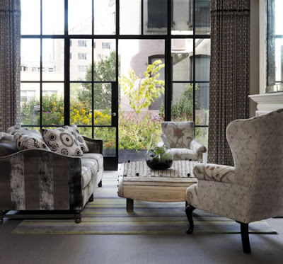
We love this Soho getaway because it fits. It responds to the area and the history of soho and creates a space that is at once modern and fun but also artistic and sophisticated. Every room boasts a different design and features unique, interesting pieces that always manage to capture our attention. The public spaces manage to feel like an artist gallery, greenhouse, and chic social spot all at once. Firmdale did a great job making the entire space feel like it has been in Soho for year, rather than a new construction, corporate hospitality job. Did we mention the terrace?, we could spend hours socializing with a beautiful space like that. And to think, before the Crosby Street Hotel, the site was nothing more than a quickly deteriorating car park.


All images © Firmdale Hotels

Goat Town

Image © The Feast


Name: Goat Town
Location: Alphabet City, NYC
Designer: Owner Nicholas Morgenstern

While we find the design fairly cookie cutter in terms of current design trends; Reclaimed materials, Edison bulbs, tin ceilings, and subway tiles; What we do love is the unexpected use of subway tiles on the booths! This fairly mainstream interpretation of the American Gastro-Pub is popping up quite often and we find it refreshing and a bit heart-warming when typical materials get turned on head and re-purposed for ways you never would have thought. We cannot comment on the comfort of the booths but this kitschy touch is definitely worth a stop in.

Image © Popsugar NYC

Image © Eater NY

Scala Vinoteca

Name: Scala Vinoteca
Location: Athens, Greece
Designer:Andreas Kurkulas & Maria Kokkinou

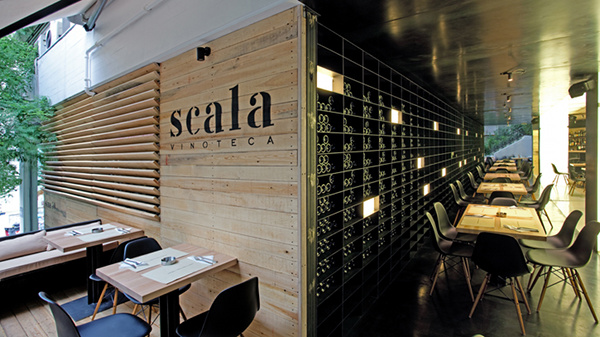
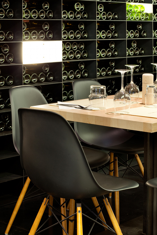
We love this space because of its minimalist, modern vibe and strong character. A nod to the vineyard and wine-making process is apparent through the tractor seat bar stools, use of metal throughout the space and the amount of natural wood. It feels like a space you could easily spend hours with friends at.


All images © George Fakaros via Yatzer

The Blue Monkey Fumoir

Location: Zurich Old Town, Switzerland

We are loving the vintage feel or this space mixed with the modern accents. Ultimately the concept is truly what roped us in. A smoking room, like you would have had back in the 20's in Switzerland, updated for modern times. ( Think English pubs meets modern gentleman's club) Despite the smoking bans in Zurich, the Blue Monkey wanted to offer its guests a place to smoke and what they accomplished with the interior, we picture, will easily accommodate the men in suits that head in for a drink after work.


All images © dyersmith-frey.com