Bar Sajor

Name: Bar Sajor
Location: Seattle, Wa
Design:

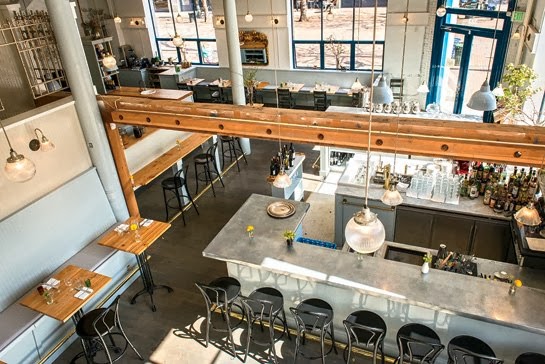
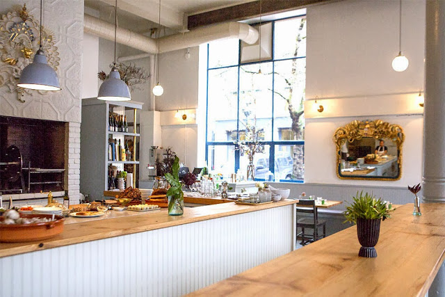
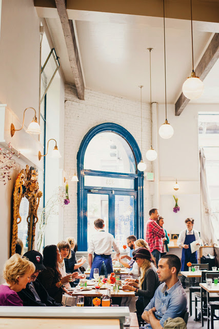
Matt Dillon, 2012 James Beard Award Winner and chef/restauranteur behind Sitka and Spruce, opened up Bar Sajor early this year in Pioneer square.  With a similar open kitchen layout and earthy lightness, the interior feels like a more 'dressed up' version of Sitka & Spruce in all the right ways.


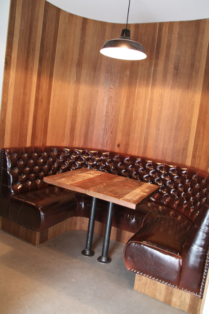
Using blonde woods, white bead board, and cool grays keeps the space chic and polished while remaining warm. The exposed rotisserie oven and exposed wood beams add a rustic touch that help keep the interior tied to the buildings historic roots. 


Images 1 & 2 © Architectural Digest
Image 3 © Eater Seattle
Image 4 © Bon Appetite

Restaurant Communion

Name: Restaurant Communion
Location: Montreal, Canada
Design: Blazys Gerard


The intimate space of Restaurant Communion is a great example of utilizing the architecture you are given. The exposed, rough beams and stacked stones become a wonderful backdrop to a handcrafted and slightly rough interior. 


What I love the most about this space is the authenticity it presents. Nothing is completely pulled together and yet there is just enough cohesion to make it work.


 Utilizing popular and inexpensive materials such as subway tiles and bead-board allow the space a timeless and collected nature while the Navy chairs and exposed builds add a touch of industrial to balance things out. 


All photos © Blazys Gerard via Jean Sébastien Senécal

The Abbot's Cellar

Name: The Abbott's Cellar
Location: San Francisco, CA
Design: Lundberg Design


The Abbot's Cellar is a well crafted and warm restaurant located in San Francisco. The design stays streamlined and clean, and gives new light to some mainstream trends.


The voluminous interior is kept warm through the use of large rough hew timbers, and a natural color palate. The warmth of wood balances the cool nature of concrete and stainless and creates a harmonious color scheme that feel relaxed yet pulled together. 


The use of horizontal run wood slats emphasizes the length of the space and keeps your eye moving through the space as you enter. These slats also help break up the tall walls giving the space a human scale aspect.