ilili Box

Name: Ilili Box
Location: New York, NY
Design: Unkown


Every once in a while a concept will come along that is all together refreshing. ilili Box's take on modular construction and pop-up shop lunches is just the breath of fresh air their trends needed. 


I love the updated and refined twist on the shipping container as well as the mixed material use that breaks up the structure.  Keeping the color palate simple keeps the concept fresh and modern while simultaneously playing with current trend and classic lines. 


Image 1 c Old Brand New
Image 2 c New York Times

Urban Coffee Farm & Brew Bar

Name: Urban Coffee farm & Brew Bar
Location: Melbourne, Australia
Design: Hassell


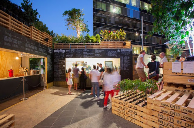
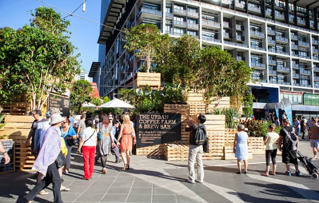
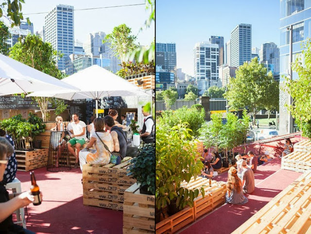
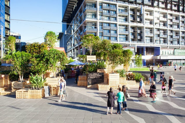
Designed for Melbourne's Food and Wine festival, the Urban Coffee Farm & Brew Bar dissects the coffee beans travel. Utilizing the materials used for transportation, the pop up allows guests to interact and engage with the coffee making process. 


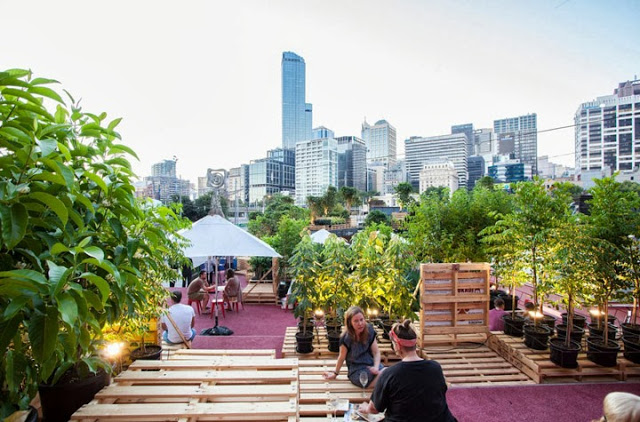
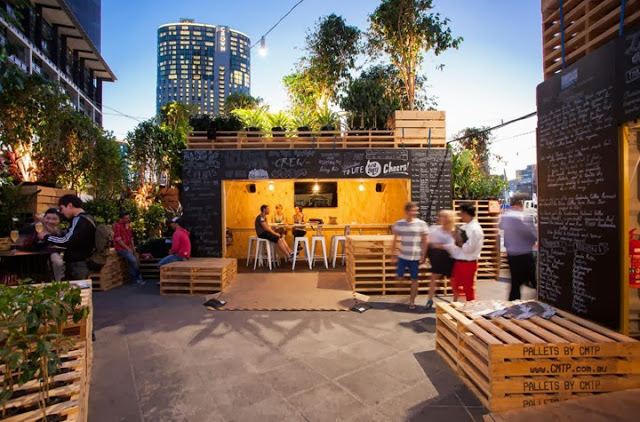
Utilizing shipping containers and pallets; two items used continuously in the shipping of coffee, along with approximately 120 coffee trees transformed the public plaza into an urban jungle.


By stacking the pallets and utilizing the existing red steps, they were able to create an oasis in the middle of the city. Thinking of the pallets as both furniture and architectural components allows visitors to define their own needs and use the space accordingly. Pallets can be sat on, used as tables, items to lean against, etc.


I love that they showcased what is possible with limited materials and creative thinking. They were able to open up a discussion and engage visitors on the entire process of growing coffee beans, showcasing the process it takes to get the bean to your cup.  


All photos  © Retail Design Blog

Bukowski Grill

Name: Bukowski Grill
Location: London, UK


Located in a retrofitted shipping container, Bukowski Grill is a pop-up burger shop with some great details.


The main material used throughout the small space is varying tones and species of wood, which contrasts well to the metal exterior. The interior manages a slight diner feel with hints of industrial thrown throughout. 


While small, the linear layout and perpendicular booths utilize space well to maintain an intimate and warm interior.


Nomiya

Name: Nomiya
Location: Paris
Design:Pascal Grasso, Laurent Grasso 


GRASSOrestoextNUIT2_093

Designed as an alternating, 'pop-up' style restaurant located on the top of the Le Palais de Tokyo museum is a stunning gem. With full views of the Eiffle Tower and seating for 12-14, the space is intimate and relaxed with the majority of the surfaces designed to draw your eye out, rather than in. 

GRASSOrestoEXTtoitjour069 GRASSOrestoEXTtoitjour069


GRASSOrestoIntjour073 GRASSOrestoIntjour073

Blonde wood floors, clear glass surrounds, and clean white surface keep the space minimal and modern and allow the guests eye to be draw outside.

GRASSOrestoIntjour078A GRASSOrestoIntjour078A

GRASSOrestoIntjour098b GRASSOrestoIntjour098b

All images © Arch Daily