Elbow Room

Name: Elbow Room
Location: Brooklyn, NY
Graphic Design: mgmt. design
Interior: Greg Yang Design


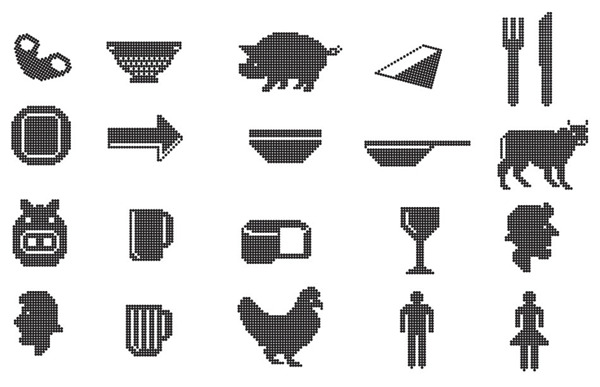
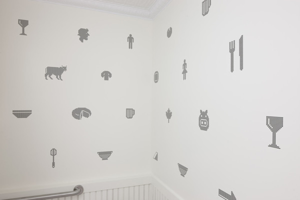
I love it when the graphic design, identity, and interior all come together to form a cohesive space and presentation. The Elbow Room restaurants are a great example of this cohesive and thought through design. 


Using simple materials, the very trendy pixilated graphics, and typography that ties back to the noodles being served, the entire space comes together to create a minimalist but warm space. 


Once again, using a restricted color palate; this time yellow, black, and white, creates instant cohesion while tying into the iconic cheesy color so many of us recognize and love. 


All images © Behance

Clarks Oyster Bar

Name: Clark's Oyster Bar
Location: Austin, TX
Design: McGuire Moorman


Bright, preppy, and nautical are all thoughts that come to mind when stepping inside Clark's Oyster Bar in Austin, Texas. Being the little brother to Perla's, both spaces are clearly connected but both maintain their own identity and personality. 


The navy, yellow, and mint color scheme are broth through to every detail creating a cohesive and fun atmosphere. The nautical details used on the menus, table ware, and interior materials all transport you to a seaside, East coast local. 


 Image 4© Statesman
Images 2, 3, 5 © Remodelista

Top Hops

Name: Top Hops
Location: NYC, NY
Design: Helm Workshop- Identity


Top Hops is a craft beer goldmine in the heart of NYC. With great identity and branding, along with a functional and well laid out interior, the concept is cohesive and fun.


Brand Identity
I love the structured yet informal nature of the chalkboard menu and enjoy that it provides a great backdrop to the tasting bar and retail. 

Brand Identity
Image 1 © Edible Manhattan
Image 2© lucyeatsveggies
Image 3- 4 ©Helm Workshop

Town Mouse

Name: The Town Mouse
Location: Melbourne, Australia
Graphic Design: A friend of mine


Once again, a great example of typography and identity going hand in hand with restaurant design. The Town Mouse, located in Melbourne, took a simple color palate and created an interior that was relevant, fun, and modern.


The central bar allows for a multitude of activities while also providing a great amount of seating.


I love the square, gloss tiles that were used throughout the space. They create cohesion and deliver a great backdrop for the typography.


Images 1,4-7 © Broadstreet
Images 2,3 © A friend of mine

Mexout

Name: Mexout
Location: Singapore
Graphic Design: Bravo Company

Mexout goes against the grain to create an urban interior paired perfectly with a purposefully imperfect branding scheme. 


Creating an industrial and urban space, Mexout is casual while still remaining tailored and thoughtful. The team behind the graphics created 20 different logos that all work in conjunction, or separately, which continue the urban and young feel of the interior and concept.


Keeping the color and material palate limited and selective, balances the multiple logos and branding efforts taking place. The interior does a great job crafting a space that feels hip and laid back, but also tailored and thought through.


Pan Pan Atelier

Name: Pan Pan Atelier
Location: Valencia, Spain

Pan Pan Atelier was designed based around a 'modern interpretation of the traditional ear of wheat'. Everything from the colors to the herringbone texture & pattern all directly tie back to that original idea. I enjoy that Pan Pan took this concept and idea and translated it not only into their branding and identity but into their cafe space as well. 


Carrying on the golden and white hues and the pattern throughout the space unifies the concept and
carries the message throughout the guests full experience.


All photos © Behance


Cocotte

Name: Cocotte
Location: Singapor
Design: Branding by Foreign Policy Design

Located in Singapore, Cocotte serves up rustic, French cuisine in a setting fitting of the food. The space feels comfortable and rustic and showcases a mix of industrial furnishings and antique french accessories. Foreign Policy Design created the graphic design and identity for the space and did a great job mixing the comfortable, rustic aesthetic with an urban, modern edge. One of my favorite elements of the space is the brightly painted Tolix chairs and Mooi pendant hanging overhead. It perfectly encapsulates the overall feel of the restaurant.

Cocotte - Restaurant

Pendant fixture design by Ron Gilads for Mooi

Cocotte Restaurant

Cocotte Restaurant

Cocotte - Design

 Cocotte - Menu

All Images © Whitezine via Cocotte