Auction Rooms Cafe

Name: Auction Rooms Cafe
Location: North Melbourne, Australia
Photography: Erika Hildegard Photography


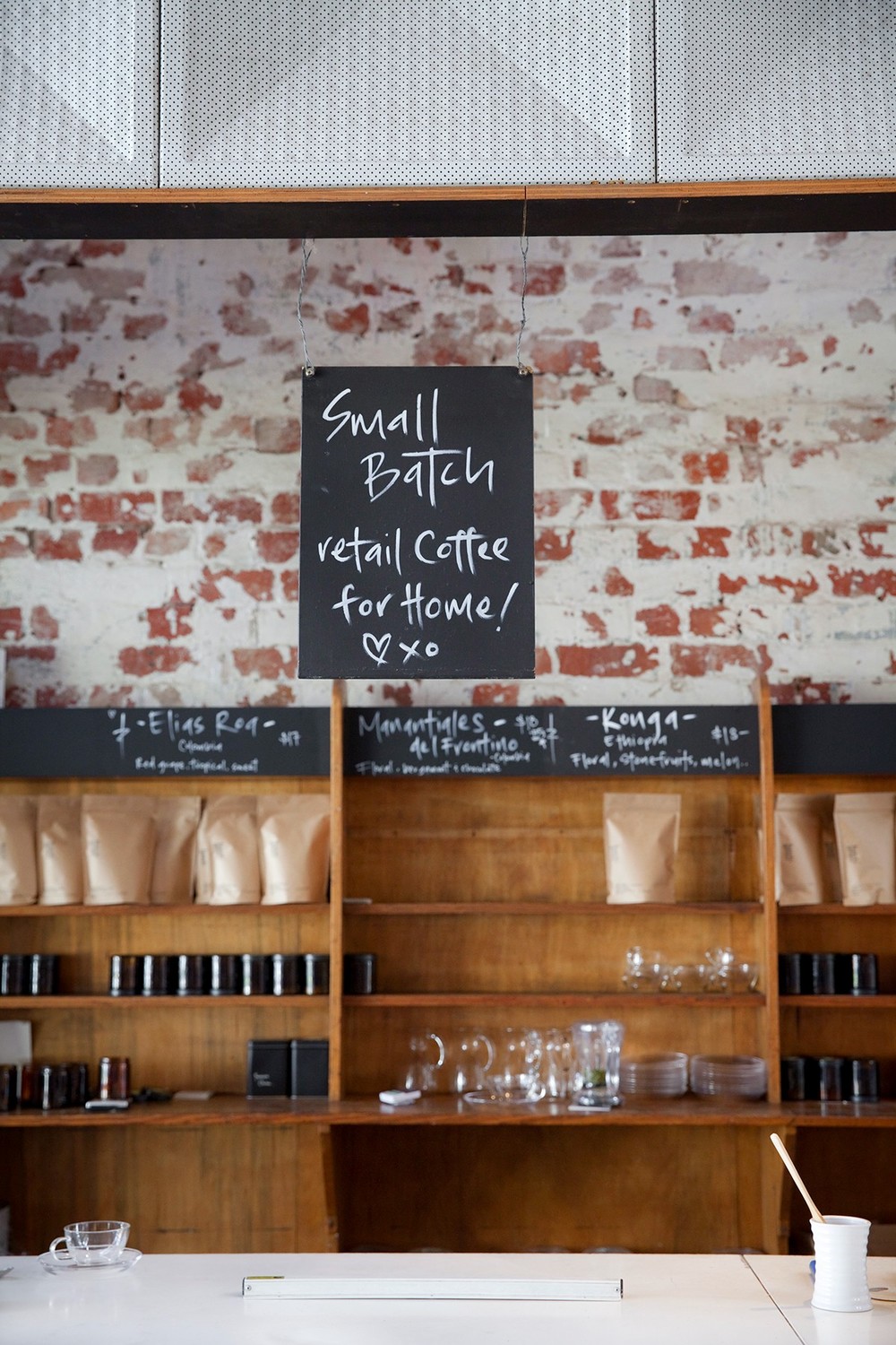
It's always a good day when I get to click through recent images captured by Erika Hildegard. Auction Rooms Cafe is a specialty coffee roaster and cafe located in the former WB Ellis Auction House. With exposed brick, lofty ceilings, and wood supports the architecture sets a pretty great stage.


Given the original space, I find that the reclaimed and reused feel of  fixtures inside to be appropriate and welcoming. 


The vintage and reclaimed touches contrast well with the urban and industrial space while the use of architectural beams help divide the space. These allow the light filled space to remain airy and open. 


Journeyman Distillery

Name: Journeyman Distillery
Location: Three Oaks, MI
Design: DkGr Architects


One of my favorite stops when driving from Chicago up to Michigan is Journeyman Distillery. Located in the historic Featherbone factory,  Journeyman keeps the history of their space front and center. 


The barrel room shines behind large plate of glass and contrasts the raw space, easily drawing your eye toward it.

The use of wood throughout the space helps warm up the industrial and urban interior. I enjoy that the bones and history of the building where allowed to shine with minimal and industrial furniture added in to accent. 


All images © Archinect

IMIG's

Name: IMIG's
Location: San Diego, CA
Design: All the bells & whistles


Located within the Lafayette Hotel in San Diego, IMIG's has it's own distinctive style making it a great dining experience even for locals. 


I love the reclaimed and salvaged window partition that divides the space. Using tone on tone woods and the moulding below helps it feel more like a built-in and architectural detail that a divider. The simple color palate and Thonet-esq lines to the chairs adds a historical touch while remaining updated and slightly trendy. 


Gusto

Name: Gusto
Location: Toronto, Canada
Design & Photography: Munge Leung


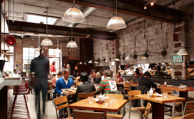
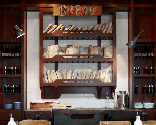
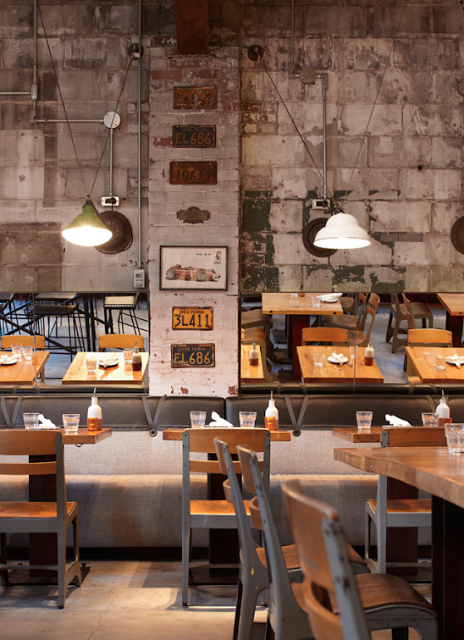
Revitalizing a former auto body shop, Gusto 101 crafted an industrial and intimate Italian trattoria.


The use of vintage furnishings paired with the raw, industrial space creates an industrial interior that remains warm and authentic. 


I enjoy that though they used multiple finishes and fixtures, the entire space feel cohesive and complete. By leaving the existing space relatively untouched and adding a level of finish to the food preparation areas, allows the space to remain pulled together and thought through. 


Vinatería

Name: Vinatería
Location: Harlem, NYC
Design Jonsara Ruth


Vinatería is a great example of vintage made new again; but in a pulled together and thought through manner. 


More often than not, reclaimed and repurposed can typically mean it looks like you are walking into a flea market. With Vinatería, a little color helped provide cohesion between the elements and furniture and gave it a cohesive feel. 


With the chairs getting half dipped (some on top, others on bottom), metal screens providing both entry doors and pattern play, and warm woods providing a warm, lived in feel, the space is comfortable but curated. 


All images © Nytimes

Noodlebox

Name: Noodlebox
Location: Shelbourne Victoria, BC
Design: Evoke


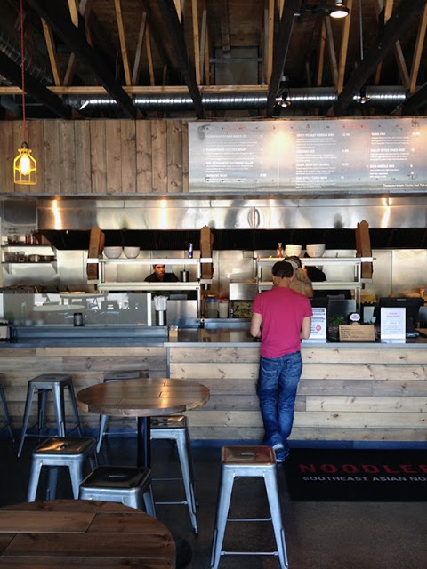
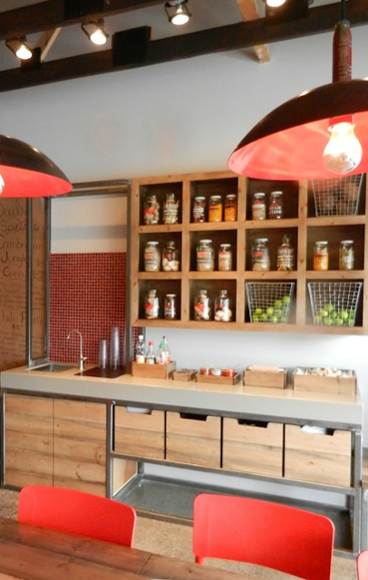
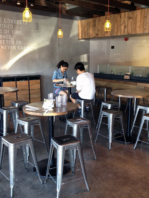
For a large chain, Noodlebox has done a great job re-imagining their brand. Using a limited color palate, custom fixtures, and a heavy hand of wood, the space is a balance of rustic and modern.


Whether their intention or not, keeping the material and color palate limited allows them to replicate the design easily no matter the location or space size. 
I love that they exposed the ceilings and created harmony throughout by carrying through wood as the main material. The contrast of concrete and steel adds a modern touch and keeps the space hip and on trend. 


All photos © Evoke


Abattoir

Name: Abattoir
Location: Atlanta, GA
Design: Unknown


With a name French for 'slaughterhouse', Abattoir did a great job providing an interior that contrasts it's name while simultaneously providing nods to the spaces meat packing past. 


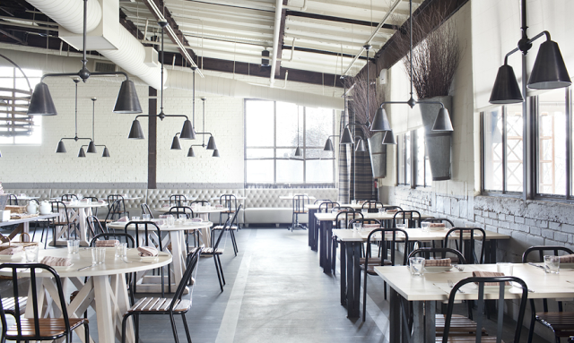
Warm and industrial, the interior kept it's existing brick structure relatively intact, hiding it only by a neutral coat of paint. Within the space, the bar is defined by worn wood partitions, curtains, and colorful barstools. 


The relatively raw main dining space beckons back to its meat packing days while it's neutral and industrial palate to allow the space to firmly establish itself in the present. 


Photos 1,3,5 © Sarah Dorio
Photos 2,4,6 @ Thrillist

Maison

Name: Maison
Location: South Africa
Design:


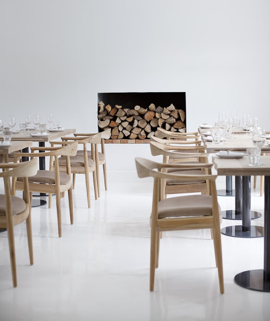
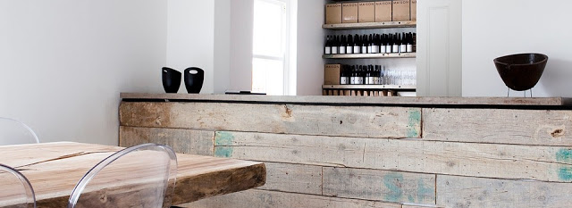
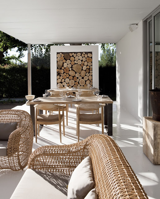
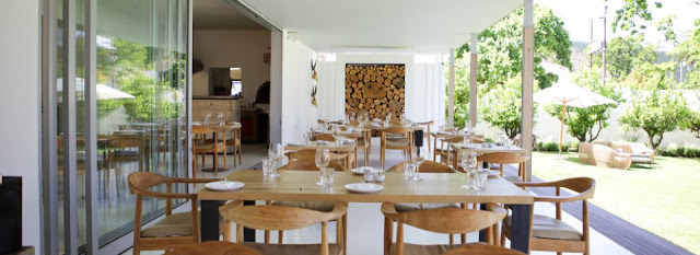
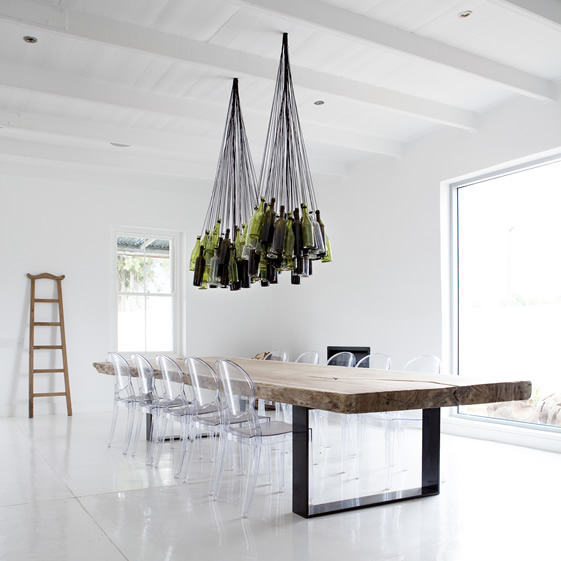
I love the simplicity and openness that is shown throughout Maison. A winery with a tasting room, deli, and restaurant; all spaces work in harmony but still give a large graphic punch. 


The use of blonde wood, stark acrylic chairs, and polished white creates an airiness throughout the space. Paired with the worn barn wood, stacked logs, and wine bottle chandelier, each spaces still exuded warmth and remains inviting. 


The use of furniture and fixtures that are also light and airy in appearance helps extend the open feeling of the space. 


 Images © Weheartco & Maison


The Riding House Cafe

Name: The Riding House Cafe
Location: London
Architect: Lou Davis


Classic style lovingly pairs with vintage wares at The Riding House Cafe. Repurposed theater chairs, industrial accents, and rich wood layer together to create a warm and welcoming space.


The pop of blue found on the barstools and tile border add a refreshing contrast to the warm wood and industrial accents.


Industrial open shelving located at the kitchen pass and behind the bar add enough weight to provide visual separation while still allowing light and sight lines into the spaces.


Curated chotchkies; one of the very few examples of this done well within a restaurant space due to it's restricted nature.


Spuntino

Name: Spuntino
Location: London


I love the warm, grittiness of Spuntino and enjoy the small scale and intimacy.


Working with the exposed brick, worn subway tiles, and raw nature of the space allows the furnishings and fixtures to be kept simple and unassuming while maintaining the character and rustic nature of the interior.


Image 1 © Pursuitist
Image 2- 4 © Google Image