TanakaSan

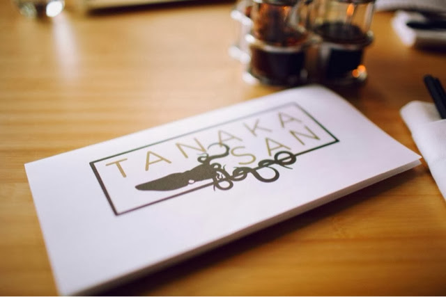
Name: TanakaSan
Location: Seattle, WA
Designer: Graham Baba Architects.


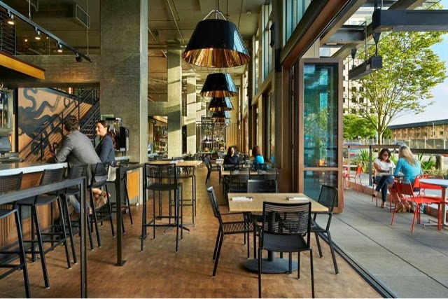
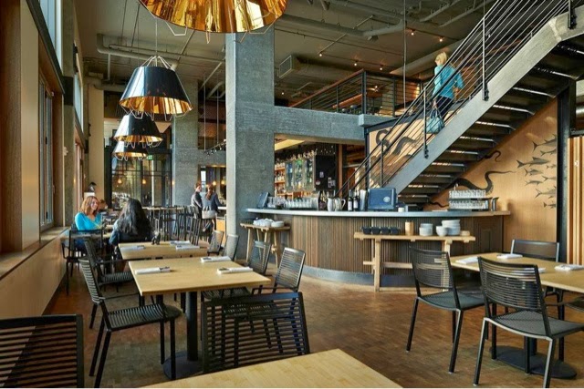
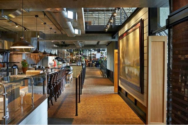
Warm, urban, and inviting TanakaSan, located in Assembly Hall, has it all going for it. As one of a handful of dining spaces among the Assembly Hall collection, TanakaSan faced some interesting special challenges.


With the kitchen separated from the dining space, a small bar was added which allows breakfast to be served in the morning and adds extra seating for casual drinks or overflow diners. 

The space is open, light, and industrial but remains comfortable and warm. The constant movement of the space and doors that open onto the patio add energy to the space and allow it to keep a constant connection to everyone coming and going through the building.


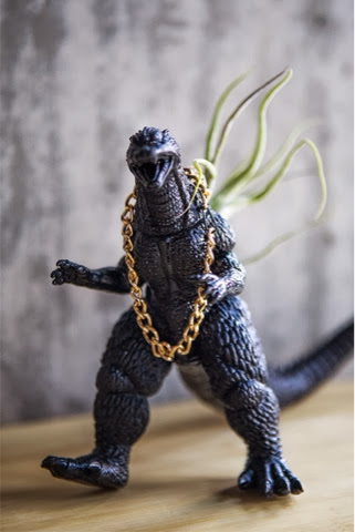
All of the tables are clean lined and light with airy black slat seating. Proving the restaurant is anything but traditional, each table is outfitted with a plastic animal (typically a dinasour of some sort) adorned with a metal chain and/or plant situated in its back.


All images via Via6 Facebook, Suzie Pratt Flickr , & Unknown

The Pass & Provisions

Name: The Pass & Provisions
Location: Houston, TX


Located in the heart of Houston, almost in the center of the loop, lies The Pass & Provisions. One part fine dining and the other side a more casual lunch and dinner spot, the space comes together with it's industrial accents.


The communal restroom style (individual toilets with a shared main sink space) is increasingly trendy at the moment. The wood counter, pipe frames for the mirrors and classic subway tiles add to the industrial and urban style.


The Provisions more casual side adds color to the industrial palate to create an approachable space that feels warm and showcases the food being prepared.


Lulu & Po

Name: Lulu & Po
Location: Brooklyn, NY


Lulu & Po is a great example of a space that is completely Brooklyn. Warm, rustic, a bit edgy with a casual coolness. 


I love the exposed concrete floors with the multiple layers of years showing through. The light table and shaker chairs do a great job of keeping the space pulled together & contrast the organic nature of the large scale artwork and menu board.


The bar does a great job maintaining contrast with the warm wood wall and clean white subway tiles. Changing the seat and bar stool colors helps break up the space and gives the eye a break as it takes in the space. 


Images 1, 4-5 © Brownstowner
Image 2-3,6 © Lingered Upon

Local Favorite; Embeya

Name: Embeya
Location: Chicago, IL


One of the newest spots on Randolph Street is the highly regarded Embeya. Focusing on modern Asian cuisine with french technique, the interior corresponds well with the food presented.


Using large geometric screens and different seating groups divides up the rather large space making it more manageable to take in.
The center of the space is flanked with a large, upholstered banquette flanked by large wood community tables. 


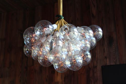
Lighting within the space also plays homage to the sea inspired cuisine and contrasts the oak floors. The entry into the space features sea urchin inspired pendants while the community table near the rear features custom glass chandeliers with a very organic and sea like quality.

All photos © Embeya

West Bridge

Name: West Bridge
Location: Cambridge, MA
Design: Creme Design


The newest spot to open up in the Boston area, West Bridge, fuses modern simplicity with industrial charm. 
More images and information after the jump!


Located in a converted hose factory, the materials were kept simple and allow the space to feel bright and open.  The space features custom light fixtures created by Atelier 688, reclaimed bowling alley table tops, and a slight nod to the french cuisine through the bistro chairs & stools.


All images © Designskool

Cocotte

Name: Cocotte
Location: Singapor
Design: Branding by Foreign Policy Design

Located in Singapore, Cocotte serves up rustic, French cuisine in a setting fitting of the food. The space feels comfortable and rustic and showcases a mix of industrial furnishings and antique french accessories. Foreign Policy Design created the graphic design and identity for the space and did a great job mixing the comfortable, rustic aesthetic with an urban, modern edge. One of my favorite elements of the space is the brightly painted Tolix chairs and Mooi pendant hanging overhead. It perfectly encapsulates the overall feel of the restaurant.

Cocotte - Restaurant

Pendant fixture design by Ron Gilads for Mooi

Cocotte Restaurant

Cocotte Restaurant

Cocotte - Design

 Cocotte - Menu

All Images © Whitezine via Cocotte

Busaba Eathai

Name: Busaba Eathai
Location: London
Designer: David Archer Architects & lighting by Firefly Lighting

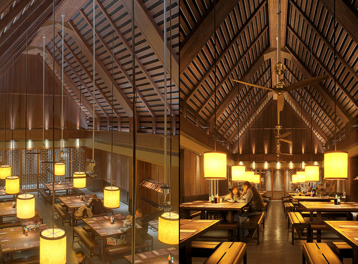
A stunning use of scale and wood. I love the monotone palate with warm lighting flooding over each large table.  I also enjoy that despite the grand scale of architecture, the interior feels intimate and warm. Proof that simplicity and attention to details can go far to create a much grander experience.


Busaba Eathai by David Archer Architects Bicester Busaba Eathai by David Archer Architects, Bicester

Busaba Eathai by David Archer Architects Bicester 02 Busaba Eathai by David Archer Architects, Bicester

Busaba Eathai by David Archer Architects Bicester 05 Busaba Eathai by David Archer Architects, Bicester
Busaba Eathai by David Archer Architects Bicester 07 Busaba Eathai by David Archer Architects, Bicester