Elbow Room

Name: Elbow Room
Location: Brooklyn, NY
Graphic Design: mgmt. design
Interior: Greg Yang Design


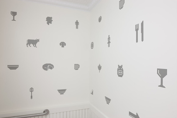
I love it when the graphic design, identity, and interior all come together to form a cohesive space and presentation. The Elbow Room restaurants are a great example of this cohesive and thought through design. 


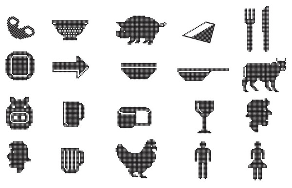
Using simple materials, the very trendy pixilated graphics, and typography that ties back to the noodles being served, the entire space comes together to create a minimalist but warm space. 


Once again, using a restricted color palate; this time yellow, black, and white, creates instant cohesion while tying into the iconic cheesy color so many of us recognize and love. 


All images © Behance

Noodlebox

Name: Noodlebox
Location: Shelbourne Victoria, BC
Design: Evoke


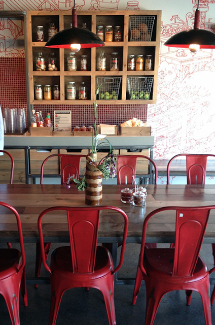
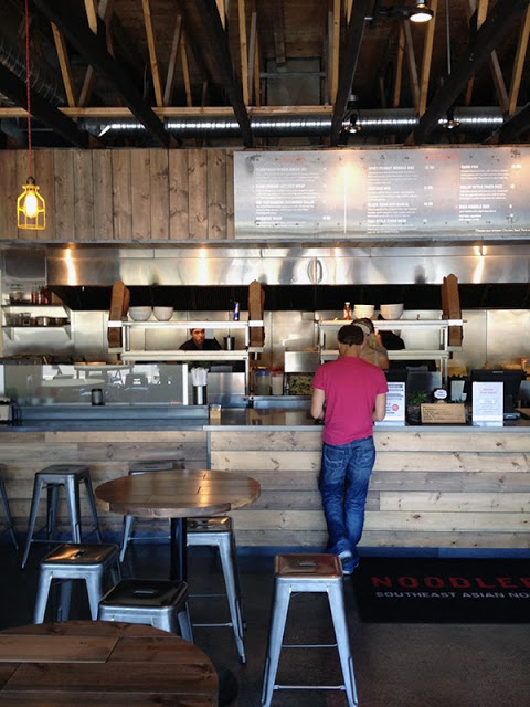
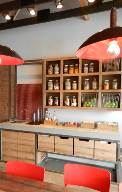
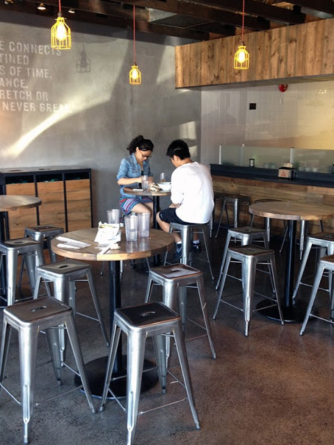
For a large chain, Noodlebox has done a great job re-imagining their brand. Using a limited color palate, custom fixtures, and a heavy hand of wood, the space is a balance of rustic and modern.


Whether their intention or not, keeping the material and color palate limited allows them to replicate the design easily no matter the location or space size. 
I love that they exposed the ceilings and created harmony throughout by carrying through wood as the main material. The contrast of concrete and steel adds a modern touch and keeps the space hip and on trend. 


All photos © Evoke


Terroni

Name: Terroni
Location: Toronto & LA


Terroni does a great job carry a style and vision throughout multiple locations. With two locations in Toronto and one in LA, they let their defining element; the wine, shine through.


The use of mixed materials adds a funky, unstuffy vibe to the space which is refreshing knowing their focus on wine.

The built-in shelving behind the bars at each location are simple enough to showcase the vast collection but also play to the original details of the space.


LA:


I love that the LA location took a traditional library setup and flipped it on its head by infusing an urban aesthetic paired with the modern and simple shelving.


 Toronto:


Each locations interior perfectly compliments it's structure while also providing a good dash of contrast. The intricate tray ceiling is juxtaposed by the modern light, urban art, and clean wooden booths.


All photos © Terroni

Nando's

Name: Nando's
Location: Kent, England (Originally started in South Africa)
Designer: Blacksheep

Chain restaurants typically don't do much for me on the design front. However, it seems more and more brands are starting to realize the importance design makes in a successful business, chain or not.
With brands like McDonalds and Starbucks hiring design firms and rebranding their store experiences, it seems our interactions with chain restaurants could drastically change over the next few years. One chain that clearly recognizes the importance of design on brand recognition is Nando's. Originally of South Africa, they have expanded globally. The space below, located in England was designed by Blacksheep is tastefully done. Utilizing natural materials and playing with color, they have managed to achieve a space that feels original and unique while also remaining warm and inviting.


All images © Design Milk