Barchetta

Name: Barchetta
Location: NYC
Design: LDV Hospitality


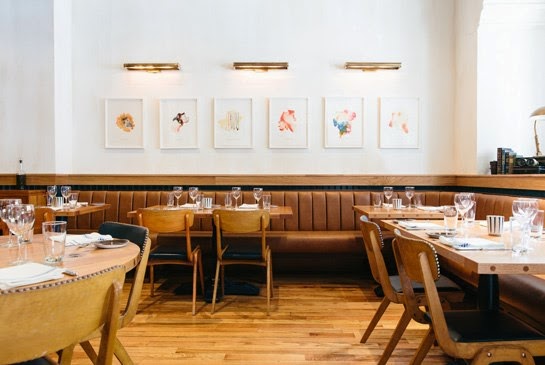
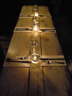
One of the newest openings in NYC is Barchetta, an intimate italian seafood spot. Vintage and nautical touches fill the main dining space and mezzanine exuding a casual warmth throughout the space. 


Danish chairs and custom tables made from found ceiling trusses live alongside abstract impressionist art and vintage light fixtures. The overall space is intimate and casual while maintaining a level of refinement through a natural color scheme and abundance of texture.


 All images © Architectural Digest


Riffle NW

Name: Riffle NW
Location: Portland, OR


A well thought through concept is one where the restaurant owners consider all components of a guests' meal. From entry and exterior vantages, graphic design, and interior design, all the way to tableware, servers outfits, and take away, all components add up to create a cohesive concept. Riffle NW is a great example of a restaurant thinking through executing each of these components extremely well, providing a completely cohesive dining experience.


The nautical nature of Riffle's space blends perfectly with the raw bar and seafood heavy menu being served. 


The light wood, sail cloth seating and dividers, and numerical table graphics all play off each other to create a comfortable and bright space that reflects the nautical nature but doesn't overdo it.


Sticking to the turquoise and orange color scheme in their graphic and identity design tie into the colors used with the space once again adding another level of cohesion to the dining experience.


The drink menus are cleverly hidden away and remind me of pulling up a trap to discover what you've caught. 


Image 2-3, 5 © Eater Portland
Image 1, 4, 6-8  @ Behance

Fish Shack

Name: Fish Shack
Location: Vancouver, BC


Fish Shack is a great example of common materials used in unexpected and uncommon way to create something completely unique.


Using traditional materials associated with the fishing industry; ropes, wood crates and palates and industrial, galvanized fixtures plays homage to the overall concept.


Keeping the color palate simple allows the focus to remain on the palate installations and large chalkboard menu.


Image 2-5 © Food Vancouver

A Look Back; Our Work

It's been a busy year for us and couldn't be more excited about the projects we've gotten to work on and the clients we've gotten to work with. Here is a quick look back at what kept us busy during 2012.


Name: The Salsa Truck
Status: In progress
Location: Chicago, IL


Name: The Garage
Status: In Progress
Location: Chicago, IL


Name: Dryhop Brewers 
Status: In Progress
Location: Chicago, IL

Name: Shady's Burgers & Brewhaha
Status: In Progress
Location: Dallas, TX
Name: Cogdal Vineyards
Status: Design Completed
Location: South Haven, MI


Name: The Savoy (Previously named, The Odyssey)
Status: Completed
Location: Chicago, IL


Name: Bang Bang Pie Shop
Status: Completed
Location: Chicago, IL

Status: Completed & Aired
Location: Chicago, IL


A huge thank-you goes out to all of our amazing clients and fans for making 2012 such a great year. With The Garage, The Salsa Truck, Dryhop, and Shady's all opening in 2013, we can't wait for all that 2013 has in store. 

Our Work; The Savoy (Odyssey)

Name: The Savoy
Location: Chicago, IL


A project we had the pleasure of working on this past spring recently opened it's doors in the Wicker Park neighborhood, right here in Chicago. For this project, we were involved in the schematic & design development phases and helped the client layout the space, design the initial concept, as well as specify the initial FF&E items for within the space. 


The concept behind the space began with the original name for the space; Odyssey. Taking Homer's Epic and applying it to the space allowed us to play with a dark nautical concept. Using this as our starting base, we refined our concept down into natural and classic materials (woods, ropes, subway tile, mirrors) with warm earth tones for colors. To keep the space from going too nautical in feeling, we specified & envisioned industrial lighting, worn antiques and warm brass shelving mixed with pieces already owned. The space was ultimately renamed before opening but the initial concept remained.


The shotgun space was fragmented into multiple seating areas which were reworked in order to accommodate a raw bar, main dining space, bar seating, and a private room. The design throughout the space was created to darken as you continue through the space. The entry and raw bar were designed to be light & airy while the private room, the farthest room in the space, was designed to be dark, moody, & intimate. The dining and bar space in-between tie the spaces together and create a seamless transition for the guest. 

Conceptual FF&E specifications and ideas for The Savoy (Odyssey)
Below are interior and exterior 3D views that were created to show the progression throughout the space. They also show multiple ideas that we worked with while refining the layout and seating options. 


Below are some finished shots of the now open space. While some ideas evolved slightly, the overall concept, idea, and FF&E selections were carried through. 


Photos 2-7 © Kaper Design
Photos 1, 8-9 © Eater Chicago


Local Favorite; GT Fish & Oyster

Name: GT Fish & Oyster
Location: Chicago, IL
Design: Karen Herold/555


GT Fish & Oyster opened up in the Near North area of Chicago over a year ago and I'm not sure how I've not posted about it yet. The space is extremely well designed and found it's inspiration from luxury yachts. With a bright and open entry and bar area featuring a boomerang shaped table, the space seamlessly evolves into a darker, more intimate dining space tucked in the back.


The space features details like gold plating with the restaurants name and logo, custom chandeliers looking as though they have just been pulled from the sea, and small silver fishing weights' at every place setting. 


Image 1-4 © Fine Design Dine
Image 5-6 © GTOyster

B.A.R.

Name: B.A.R.
Location: Stockholm, Sweden

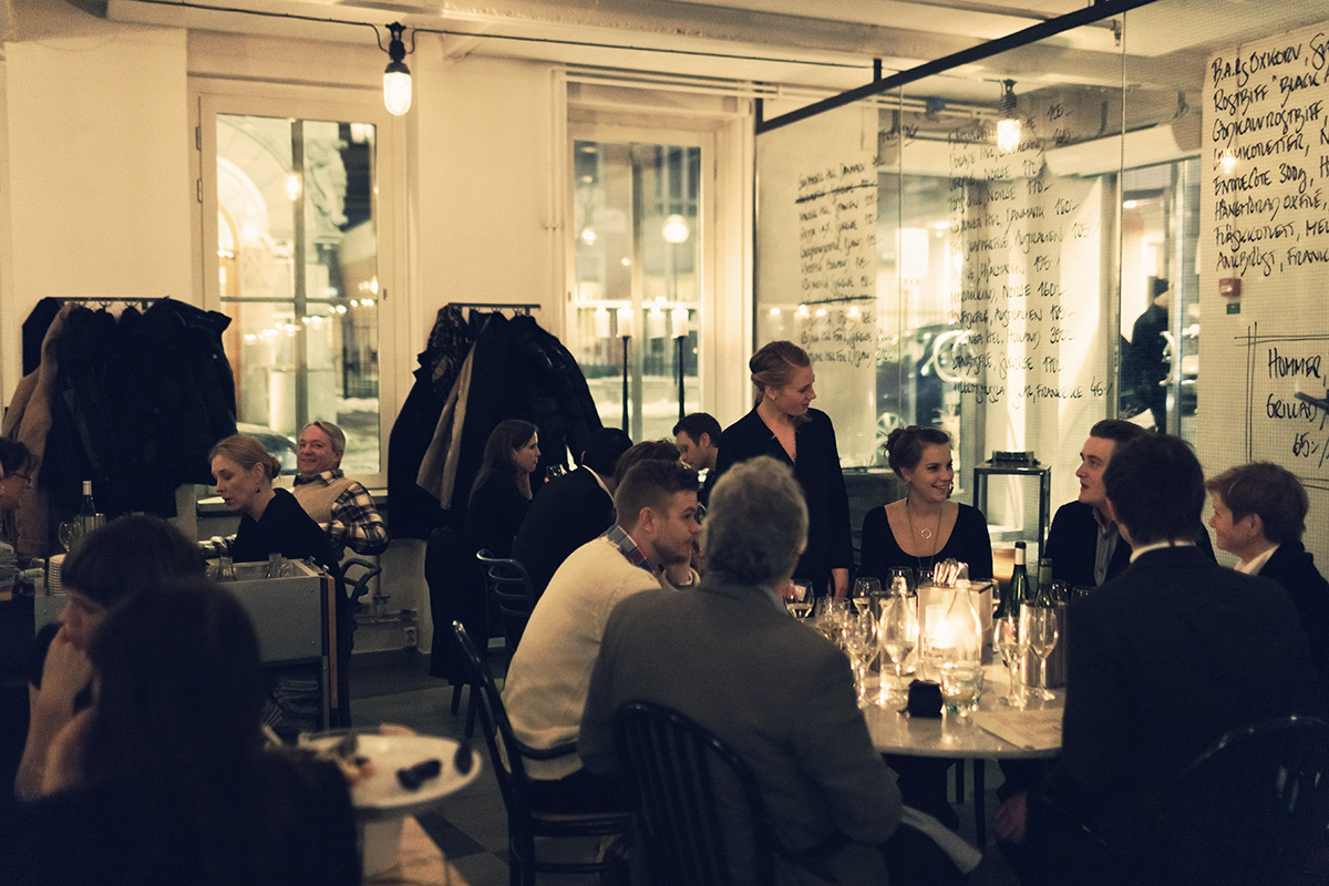
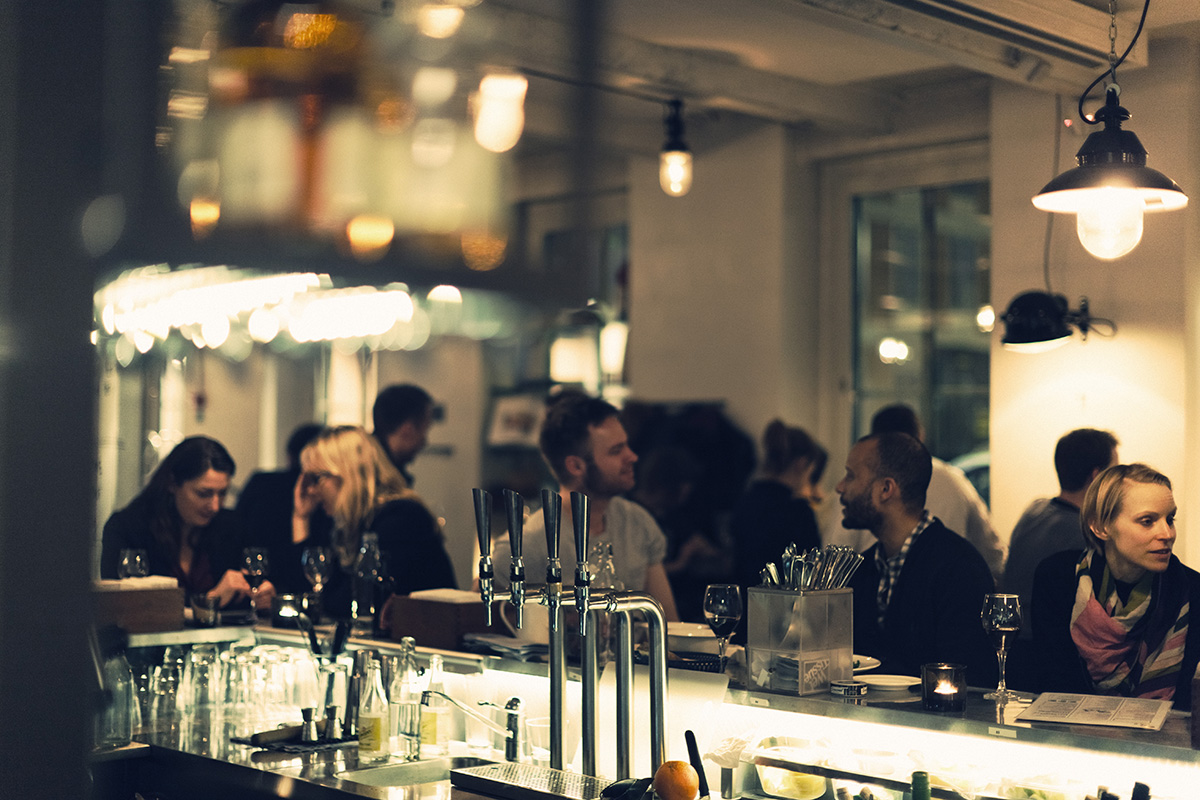
B.A.R. (Blasieholmens Akvarium Restaurang) is an approachable and timeless restaurant located in the heart of Stockholm. With a goal of serving 'uncomplicated, delicious fresh food' they have also managed to create a space fitting of the beautiful food being put out. With classic scandinavian details; neutral and bright color palate, natural materials, and simple yet beautiful displays and execution, B.A.R has given us a space that is bright, airy and yet approachable and comfortable. The almost handcrafted aesthetic to the space drives home the simple, handcrafted nature of the food which creates a perfect marriage of interior and food. This symbiotic relationship is what I believe to be necessary for a successful restaurant.


Image 1,6 © kikki-k
Image 2,6 © Koncept Stockholm
Image 3-5 © B.A.R.


Super Bowl Sunday; Boston vs NY

Happy Super Bowl Sunday!


Around here, battles and rivalries between cities are everywhere. We thought it would be fun to give you all an inside peak into how we decide who wins.

First, the contenders;

Location: Boston, MA

VS

Location: New York, NY

For this showdown, we will be judging on four separate criteria.  All of these are key components to a successful restaurant and are far more intertwined than many realize.

1. Creativity of Materials
2. Use of Space
3. Total Concept with Menu
4. Graphic Design & Website


Go To Island Creek Oyster Bar

Go To Island Creek Oyster BarGo To Island Creek Oyster Bar

Images 1-4 © Thrillist
Image 5 © The eaten path
Image 6-8 © Design Shack


Image 1 © TLC Mag
Image 2,4 © A Hungry Girl
Image 6-8 ©On the inside mag via Claudio Papapietro
Image 7 © Paper Pastries

________________________________________________________

How they stack up:
1. Creativity of Materials- Island creek Oyster Bar (The creative use of oyster shells as a wall treatment blew us away. Beautiful, textural and understated.)

2. Use of Space- Marlow & Sons (The fact that you walk into a grocer before being led into the dark, intimate dining space was a great way to create an intimate dining experience.)

3. Total Concept with Menu- Island Creek Oyster Bar (The concept and execution of this space like one complete thought, Marlow & son's felt a bit scattered and less pulled together in concept.)

4. Graphic Design & Website- Island Creek Oyster Bar (While both restaurants had great graphic design, Island Creek nudged ahead with its use of unexpected bright color and web layout.)
_________________________________________

WINNER: ISLAND CREEK OYSTER BAR 


The Walrus and the Carpenter

Name: The Walrus and the Carpenter
Location: Seattle, WA

Seattle is one of those places that I've wanted to get to forever. For whatever reason though, I just never make it up there, no matter how close I am. After seeing images from The walrus and the Carpenter, a new oyster bar, I may need to make a point of getting over there sooner rather than later.

The restaurants name came from the Lewis Carroll poem and much like the poem, the space evokes a sense of happiness, warmth and light-heartedness. The distressed wood floors and reclaimed materials add to the casual warmth of the space, while the painted metal stools, light fixture and custom zinc bar add a bit of whimsy and fun into the space. Set beautiful and plentiful oysters in this settings and you have the perfect neighborhood spot.