The East Pole

Name: The East Pole
Location: New York, NY
Design: Phil Winser

Intimate and warm, the interior of The East Pole is both industrial and nautical in a way that is neither themed or blatantly apparent. 


The low ceilings add to the intimate nature of the space giving it an almost vessel-like feeling that works well with the nautical touches. 


Using walnut, marble and black iron gives the space a classic feel allowing it to be polished with subtle industrial and nautical notes. 


All photos © The East Pole


Mart 130

Name: Mart 130
Location: Melbourne, Australia
Photography: Erika Hildegard Photography (If you are in Australia, I encourage you to check out her amazing range of work.)


Mart 130 has to be one of the best examples I've seen recently of a comfortable and established cafe maintaining a well curated interior. When Erika's images landed in my inbox I couldn't help but get excited. Rarely do you find the blend of well loved antiques that is also still pulled together and edited. 


Using vintage and antique pieces, paired with a nautical and industrial undercurrent, Mart 130 creates a cohesive blend of worn comfort and bright openness. 


Utilizing red, aqua, black, and blue throughout the multiple seating areas ties the entire space together without needing to match everything. This allows the space to remain cohesive while each room still maintains it's own identity. 


I love the bright back patio featuring painted, dark wood and slat ceiling, you could easily sit for hours.


The Whale Wins

Name: The Whale Wins
Location: Seattle, WA
Design/Arch: Heliotrope Architects


Most commercial and hospitality designers I've had the pleasure of talking with all mention the same thing; It's hard to design for yourself. As a designer, you typically find interest, beauty, and inspiration in multiple styles. This allows us to design spaces across the board for whatever our clients are looking for, or need, to make their space a success. This is a great skill to have as a designer but it usually means your own space is a bit of a mash up of styles and explorations. I myself am included in this generalization and am constantly on the look out for a style that might perfectly suit my family and current space. The Whale Wins is the closest I've found to anything I could call my own personal style. 


The space is the perfect balance of coastal charm, scandinavian lightness, and industrial warmth.  
An inviting trio in any book. 


Keeping the space bright and white allows for a space with a simplistic, feminine quality while the the stacked lumber, and exposed beams add a touch of warmth.


The simplistic light fixtures add a touch of humor and fun to the space creating the warm and welcoming atmosphere. 


Clarks Oyster Bar

Name: Clark's Oyster Bar
Location: Austin, TX
Design: McGuire Moorman


Bright, preppy, and nautical are all thoughts that come to mind when stepping inside Clark's Oyster Bar in Austin, Texas. Being the little brother to Perla's, both spaces are clearly connected but both maintain their own identity and personality. 


The navy, yellow, and mint color scheme are broth through to every detail creating a cohesive and fun atmosphere. The nautical details used on the menus, table ware, and interior materials all transport you to a seaside, East coast local. 


 Image 4© Statesman
Images 2, 3, 5 © Remodelista

Riffle NW

Name: Riffle NW
Location: Portland, OR


A well thought through concept is one where the restaurant owners consider all components of a guests' meal. From entry and exterior vantages, graphic design, and interior design, all the way to tableware, servers outfits, and take away, all components add up to create a cohesive concept. Riffle NW is a great example of a restaurant thinking through executing each of these components extremely well, providing a completely cohesive dining experience.


The nautical nature of Riffle's space blends perfectly with the raw bar and seafood heavy menu being served. 


The light wood, sail cloth seating and dividers, and numerical table graphics all play off each other to create a comfortable and bright space that reflects the nautical nature but doesn't overdo it.


Sticking to the turquoise and orange color scheme in their graphic and identity design tie into the colors used with the space once again adding another level of cohesion to the dining experience.


The drink menus are cleverly hidden away and remind me of pulling up a trap to discover what you've caught. 


Image 2-3, 5 © Eater Portland
Image 1, 4, 6-8  @ Behance

Littleneck

Name: Littleneck
Location: Brooklyn


Littleneck has created the perfect roadside seafood shack in the middle of Brookyln, that could cure any quick craving for the East Coast you may be having. 


 02 Littleneck Brooklyn

White washed, half paneled walls, dark worn wood furniture, ropes, bouts, and cage lights keep the space minimal with just enough touches of East Coast roadside charm. This space is successful simply because they stayed true to their concept. There is nothing over done and there was enough thought put into the space to appear intentional and cohesive with the food being served and original concept.


Photos 1, 3 @ Eater
Photo 2 @ Me So Hungry

Oyster House

Name: Oyster House
Location: Philadelphia, PA

,
Oyster House, located in Philadelphia, is a great example of a small space that doesn't sacrifice on style.
Blending nautical, traditional, and industrial design components they have created a balanced and inviting local spot.

I love that the oyster bar is on full display and allows for enough room to properly display the beautiful catch, and craft of preparation.


The classic white subway tile creates a texture to the walls that contrasts the rich table and Thonet-style barstools.


The industrial pendants and light fixtures are balanced by the intricate moldings and traditional furnishings.


All photos © Oyster House


The Optimist

Name: The Optimist
Location: Atlanta, GA
The Optimist is bringing quality and fresh seafood seafood to landlocked Atlantans with their space continuing their story.


Working with the original, industrial structure, The Optimist manages to transport diners into a seaside destination through nautical touches, rustic wood, and blue & white color scheme.


What i enjoy most about the space is their thorough execution of a concept without going overboard or too picky. The same remains relaxed, casual and rustic and pays homage to it's nautical menu.


All photos © The Optimist


Our Work; The Savoy (Odyssey)

Name: The Savoy
Location: Chicago, IL


A project we had the pleasure of working on this past spring recently opened it's doors in the Wicker Park neighborhood, right here in Chicago. For this project, we were involved in the schematic & design development phases and helped the client layout the space, design the initial concept, as well as specify the initial FF&E items for within the space. 


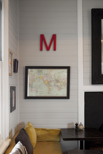
The concept behind the space began with the original name for the space; Odyssey. Taking Homer's Epic and applying it to the space allowed us to play with a dark nautical concept. Using this as our starting base, we refined our concept down into natural and classic materials (woods, ropes, subway tile, mirrors) with warm earth tones for colors. To keep the space from going too nautical in feeling, we specified & envisioned industrial lighting, worn antiques and warm brass shelving mixed with pieces already owned. The space was ultimately renamed before opening but the initial concept remained.


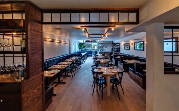
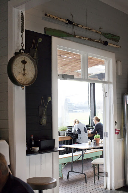
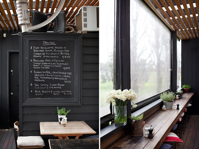
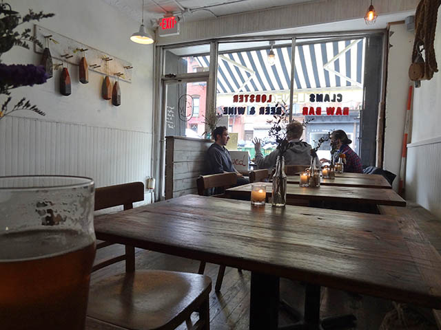
The shotgun space was fragmented into multiple seating areas which were reworked in order to accommodate a raw bar, main dining space, bar seating, and a private room. The design throughout the space was created to darken as you continue through the space. The entry and raw bar were designed to be light & airy while the private room, the farthest room in the space, was designed to be dark, moody, & intimate. The dining and bar space in-between tie the spaces together and create a seamless transition for the guest. 

Conceptual FF&E specifications and ideas for The Savoy (Odyssey)
Below are interior and exterior 3D views that were created to show the progression throughout the space. They also show multiple ideas that we worked with while refining the layout and seating options. 


Below are some finished shots of the now open space. While some ideas evolved slightly, the overall concept, idea, and FF&E selections were carried through. 


Photos 2-7 © Kaper Design
Photos 1, 8-9 © Eater Chicago