The East Pole

Name: The East Pole
Location: New York, NY
Design: Phil Winser

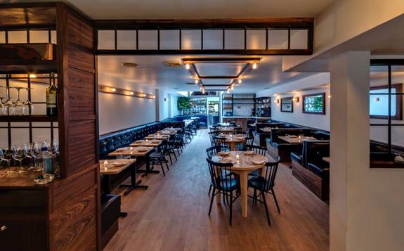
Intimate and warm, the interior of The East Pole is both industrial and nautical in a way that is neither themed or blatantly apparent. 


The low ceilings add to the intimate nature of the space giving it an almost vessel-like feeling that works well with the nautical touches. 


Using walnut, marble and black iron gives the space a classic feel allowing it to be polished with subtle industrial and nautical notes. 


All photos © The East Pole


Riffle NW

Name: Riffle NW
Location: Portland, OR


A well thought through concept is one where the restaurant owners consider all components of a guests' meal. From entry and exterior vantages, graphic design, and interior design, all the way to tableware, servers outfits, and take away, all components add up to create a cohesive concept. Riffle NW is a great example of a restaurant thinking through executing each of these components extremely well, providing a completely cohesive dining experience.


The nautical nature of Riffle's space blends perfectly with the raw bar and seafood heavy menu being served. 


The light wood, sail cloth seating and dividers, and numerical table graphics all play off each other to create a comfortable and bright space that reflects the nautical nature but doesn't overdo it.


Sticking to the turquoise and orange color scheme in their graphic and identity design tie into the colors used with the space once again adding another level of cohesion to the dining experience.


The drink menus are cleverly hidden away and remind me of pulling up a trap to discover what you've caught. 


Image 2-3, 5 © Eater Portland
Image 1, 4, 6-8  @ Behance