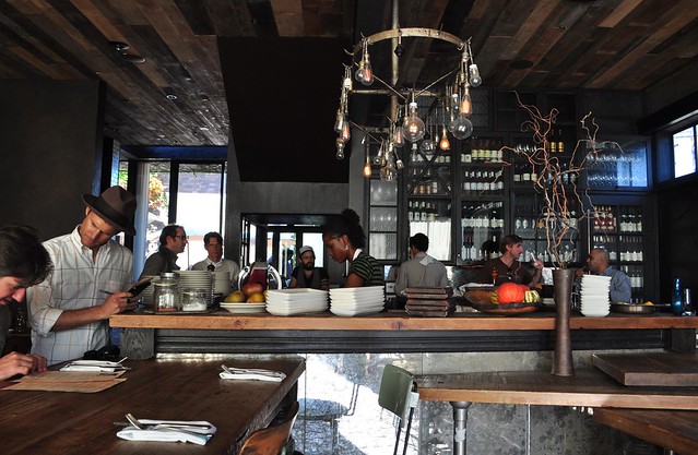
Hock Farms

Name: Hock Farms
Location: Sacremento, CA
Design: Beta Form Industries


Hock Farms is a bright & slightly modern space that still captures a bit of rustic warmth within it's walls.


The added brick gives the interior some texture while painting it white does a great job at brightening the space. 


I love the rustic details and texture of fabrics used as they layer multiple styles allowing the space to feel inviting and comfortable.


The pop of blue in the center of the space is a welcome break from the monochrome interior and adds a bit of definition among seating groups.


All photos © Kat Alves via Remodelista

Althaus

Name: Althaus
Location: Gdynia, Poland
Design: PB/Studio with Filip Kozarski


Althaus, a Bavarian restaurant located in Poland executes a rustic and modern interior seamlessly. 


Occupying two levels, the space features traditional materials and rustic touches offset by accent of copper.


The large graphic wood wall ties both upper and lower floors together allowing each to have it's own personality without contradicting the other. 


I love the simplicity of the space and the updated uses of materials. The paneling and banquette are a great example of traditional applications being updated and used to present a modern and fresh perspective. 


All photos © Yatzer

Top Hops

Name: Top Hops
Location: NYC, NY
Design: Helm Workshop- Identity


Top Hops is a craft beer goldmine in the heart of NYC. With great identity and branding, along with a functional and well laid out interior, the concept is cohesive and fun.


Brand Identity
I love the structured yet informal nature of the chalkboard menu and enjoy that it provides a great backdrop to the tasting bar and retail. 

Brand Identity
Image 1 © Edible Manhattan
Image 2© lucyeatsveggies
Image 3- 4 ©Helm Workshop

Mexout

Name: Mexout
Location: Singapore
Graphic Design: Bravo Company

Mexout goes against the grain to create an urban interior paired perfectly with a purposefully imperfect branding scheme. 


Creating an industrial and urban space, Mexout is casual while still remaining tailored and thoughtful. The team behind the graphics created 20 different logos that all work in conjunction, or separately, which continue the urban and young feel of the interior and concept.


Keeping the color and material palate limited and selective, balances the multiple logos and branding efforts taking place. The interior does a great job crafting a space that feels hip and laid back, but also tailored and thought through.


Gjelina

Name: Gjelina
Location: Venice, CA
Design: Modern Arc


Here is another great, industrial restaurant space. Located in Venice California, Gjelina mastered the rustic, glamourous,slightly modern, and industrial feeling. The interior is paired with some great branding and logo work which carries through the vintage, industrial, and modern feel.


I absolutely love their use of wood on the ceiling and brick floors and enjoy the mismatched door styles covering up the wine wall. The variation throughout the space allows it to feel casual and unpretentious while the low lighting at night creates a romantic and intimate feeling. 


Photos 1-4 © Modern Arc
Image 5 © Susiefoodie Flickr