Top Hops

Name: Top Hops
Location: NYC, NY
Design: Helm Workshop- Identity


Top Hops is a craft beer goldmine in the heart of NYC. With great identity and branding, along with a functional and well laid out interior, the concept is cohesive and fun.


Brand Identity
I love the structured yet informal nature of the chalkboard menu and enjoy that it provides a great backdrop to the tasting bar and retail. 

Brand Identity
Image 1 © Edible Manhattan
Image 2© lucyeatsveggies
Image 3- 4 ©Helm Workshop

Town Mouse

Name: The Town Mouse
Location: Melbourne, Australia
Graphic Design: A friend of mine


Once again, a great example of typography and identity going hand in hand with restaurant design. The Town Mouse, located in Melbourne, took a simple color palate and created an interior that was relevant, fun, and modern.


The central bar allows for a multitude of activities while also providing a great amount of seating.


I love the square, gloss tiles that were used throughout the space. They create cohesion and deliver a great backdrop for the typography.


Images 1,4-7 © Broadstreet
Images 2,3 © A friend of mine

Mexout

Name: Mexout
Location: Singapore
Graphic Design: Bravo Company

Mexout goes against the grain to create an urban interior paired perfectly with a purposefully imperfect branding scheme. 


Creating an industrial and urban space, Mexout is casual while still remaining tailored and thoughtful. The team behind the graphics created 20 different logos that all work in conjunction, or separately, which continue the urban and young feel of the interior and concept.


Keeping the color and material palate limited and selective, balances the multiple logos and branding efforts taking place. The interior does a great job crafting a space that feels hip and laid back, but also tailored and thought through.


Abi-Haus

Name: Abi-Haus
Location: Abilene, TX
Lettering: Tanamachi Studio


With the notion that 'everything is bigger in texas' I'd have to say that this pint sized space is pretty big on the details.


Opened by graphic designer and teacher and a friend from the local air force base, they brought a passion for good food and great design together to create a space atypical for the Texas area. 


Using a neutral material palate of multiple woods pair with white walls, the true design comes through from the custom typography evident on all of the walls. 

The custom graphics gives the space a handcrafted, authentic, and inviting atmosphere while keeping this cohesive and high styled.


Images 1,2 © Wade Griffith's Flickr
Image 3-5 © Tanamachi Studio

Brooklyn Girl

Name: Brooklyn Girl
Location: San Diego


Located in San Diego, Brooklyn Girl is a great example of two regional styles coming together to create a great mix. 


Using a monochromatic color palate of grey and white, they keep the space rooted in California by keeping it cool and bright. The addition of industrial furniture, rough wood, and rust tables bases all adds bits of Brooklyn without creating a dark and warm effect. 


All photos © Brooklyn Girl

Oddfellows

Name: Oddfellows
Location: Dallas, TX


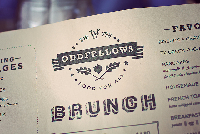
 I thought I'd show you a favorite from our recent whirlwind trip to Dallas. Oddfellows is a breakfast/brunch/and coffee spot located in the Bishop Arts District and has a great handcrafted feel.


The white boarded walls, cool color palate and slatted benches reminds me of a urban lake house or retreat. The coffee bar stand at the front of the space, welcoming guests inside and features operable windows that allow diners to sit either inside, or outside to enjoy their cup. 


With industrial and collected touched scattered throughout the space, it remains casual and easy going while still keeping a distinctive style and refinement of concept.


Photo 1 © Eater Dallas
Photo 2 © Wade Griffith
Photo 3 © Switch Creative
Photo 5 @ The Little Dish

Three Boars Eatery

Name: Three Boars Eatery
Location: Edmonton, AB, Canada


I love the simplicity behind Three Boars Eatery, located in Edmonton, Canada. From the wood-clad walls to the industrial stools and exposed pendants, the space feels warm, welcoming, and approachable.


Details like the built-in bar shelves, exposed ends, built-in bench, and chalkboard with drawn boar all make the space have a handmade feel. This handcrafted nature allows the guest to feel welcome and comfortable within the space.


All photos © Zachary Ayotte via Kinfolk

Schiller's Liquor Bar

Name: Schiller's Liquor Bar
Location: New York, NY


Schiller's is a mix of old-school, vintage charm and modern industrial. The classic field tiles covering the exterior paired with the large typographic signage makes the space feel as if it's been in the neighborhood forever. 


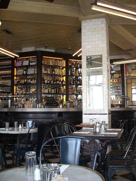
The classic details continue to the interior with metal bistro-styke chairs, mirror-backed bar, checkerboard floor and mismatched victorian-based marble tables. The black & white color palate continues the classic feel but also edges the space into a modern time.


Photos 1-4, 6-7 © Schillers Liquor Bar
Photos 5 © Coeurdesel


Bukowski Grill

Name: Bukowski Grill
Location: London, UK


Located in a retrofitted shipping container, Bukowski Grill is a pop-up burger shop with some great details.


The main material used throughout the small space is varying tones and species of wood, which contrasts well to the metal exterior. The interior manages a slight diner feel with hints of industrial thrown throughout. 


While small, the linear layout and perpendicular booths utilize space well to maintain an intimate and warm interior.


Graphic Bar

Name: Graphic Bar
Location: London


Located in the heart of London, the Graphic Bar created a merge of interior & graphic design. Using typeface and bold colors, the space feels urban, bright, and hip. One of my favorite components is the large letters blocked out on the garage door facades. Keeping the rest of the space neutral in color and using raw materials like wood, concrete and brick allow the graphics inside to tell the story. 

 See more after the jump.


All photos © Graphic Bar