Clarks Oyster Bar

Name: Clark's Oyster Bar
Location: Austin, TX
Design: McGuire Moorman


Bright, preppy, and nautical are all thoughts that come to mind when stepping inside Clark's Oyster Bar in Austin, Texas. Being the little brother to Perla's, both spaces are clearly connected but both maintain their own identity and personality. 


The navy, yellow, and mint color scheme are broth through to every detail creating a cohesive and fun atmosphere. The nautical details used on the menus, table ware, and interior materials all transport you to a seaside, East coast local. 


 Image 4© Statesman
Images 2, 3, 5 © Remodelista

Riffle NW

Name: Riffle NW
Location: Portland, OR


A well thought through concept is one where the restaurant owners consider all components of a guests' meal. From entry and exterior vantages, graphic design, and interior design, all the way to tableware, servers outfits, and take away, all components add up to create a cohesive concept. Riffle NW is a great example of a restaurant thinking through executing each of these components extremely well, providing a completely cohesive dining experience.


The nautical nature of Riffle's space blends perfectly with the raw bar and seafood heavy menu being served. 


The light wood, sail cloth seating and dividers, and numerical table graphics all play off each other to create a comfortable and bright space that reflects the nautical nature but doesn't overdo it.


Sticking to the turquoise and orange color scheme in their graphic and identity design tie into the colors used with the space once again adding another level of cohesion to the dining experience.


The drink menus are cleverly hidden away and remind me of pulling up a trap to discover what you've caught. 


Image 2-3, 5 © Eater Portland
Image 1, 4, 6-8  @ Behance

Oyster House

Name: Oyster House
Location: Philadelphia, PA

,
Oyster House, located in Philadelphia, is a great example of a small space that doesn't sacrifice on style.
Blending nautical, traditional, and industrial design components they have created a balanced and inviting local spot.

I love that the oyster bar is on full display and allows for enough room to properly display the beautiful catch, and craft of preparation.


The classic white subway tile creates a texture to the walls that contrasts the rich table and Thonet-style barstools.


The industrial pendants and light fixtures are balanced by the intricate moldings and traditional furnishings.


All photos © Oyster House


The Leadbelly

Name: The Leadbelly
Location: New York, NY


Located across from Fat Radish, The Leadbelly is a perfectly imperfect oyster bar.
We love the imperfectly plastered walls, great art, and kitschy feel to the space.


With vintage suitcases, vinyl, and games, the interior feels relaxed, well worn and inviting.


The large bar in the space adds a bit of polish which helps balance out the vintage goods and relaxed feel.


All photos © The Leadbelly


The Wright Brothers

Name: The Wright Brothers Soho Oyster House
Location: London


The Wright Brothers second location features classic details with a few unexpected twists. Located near London Bridge, Soho serves up oysters and other sea morsels from it's open raw bar. 


The raw bar, defined by worn subway tiles in a not-so-classic pattern and warm wood also features integrated spots to set oyster trays, keeping the bar space clear for diners. 


The large industrial pendants, exposed bulbs in cages, and metal staircase details all add a subtle industrial touch while remaining balanced by the classic cafe chairs and red tufted banquette.


The two story space utilizes it's height to display beautiful photos of the food being served and sources.


Images 2-9 © Editor

The Optimist

Name: The Optimist
Location: Atlanta, GA
The Optimist is bringing quality and fresh seafood seafood to landlocked Atlantans with their space continuing their story.


Working with the original, industrial structure, The Optimist manages to transport diners into a seaside destination through nautical touches, rustic wood, and blue & white color scheme.


What i enjoy most about the space is their thorough execution of a concept without going overboard or too picky. The same remains relaxed, casual and rustic and pays homage to it's nautical menu.


All photos © The Optimist


Neptune Oyster

Name: Neptune Oyster
Location: Boston, MA

neptune-oyster

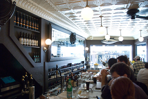
Located in Boston's North End, Neptune Oyster is a classically detailed oyster bar filled with character.


Tin ceilings, detailed wood moldings and trims, classic subway tile, and period fixtures create a welcoming and nautical feeling to this small space. 


Having the oyster bar, the central point of the restaurant, located at the front of the space catches guests attention as they walk by while also showcasing the fresh seafood selections being offered. 


Image 1 © Food in Mouth
Image 2-4 © Flickr
Image 5-6 © Cathydanh flickr

B.A.R.

Name: B.A.R.
Location: Stockholm, Sweden

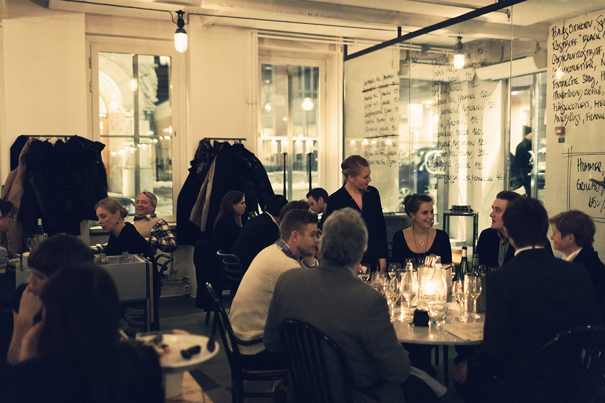
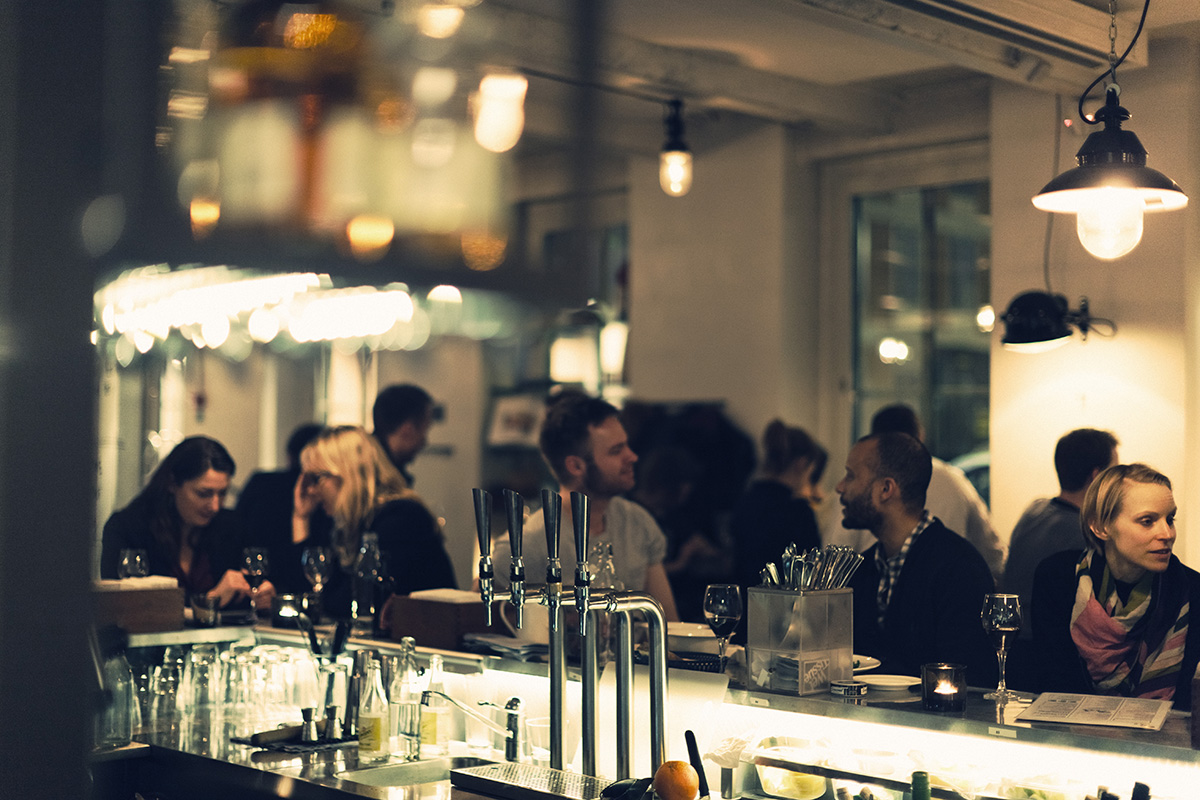
B.A.R. (Blasieholmens Akvarium Restaurang) is an approachable and timeless restaurant located in the heart of Stockholm. With a goal of serving 'uncomplicated, delicious fresh food' they have also managed to create a space fitting of the beautiful food being put out. With classic scandinavian details; neutral and bright color palate, natural materials, and simple yet beautiful displays and execution, B.A.R has given us a space that is bright, airy and yet approachable and comfortable. The almost handcrafted aesthetic to the space drives home the simple, handcrafted nature of the food which creates a perfect marriage of interior and food. This symbiotic relationship is what I believe to be necessary for a successful restaurant.


Image 1,6 © kikki-k
Image 2,6 © Koncept Stockholm
Image 3-5 © B.A.R.


Super Bowl Sunday; Boston vs NY

Happy Super Bowl Sunday!


Around here, battles and rivalries between cities are everywhere. We thought it would be fun to give you all an inside peak into how we decide who wins.

First, the contenders;

Location: Boston, MA

VS

Location: New York, NY

For this showdown, we will be judging on four separate criteria.  All of these are key components to a successful restaurant and are far more intertwined than many realize.

1. Creativity of Materials
2. Use of Space
3. Total Concept with Menu
4. Graphic Design & Website


Go To Island Creek Oyster Bar

Go To Island Creek Oyster BarGo To Island Creek Oyster Bar

Images 1-4 © Thrillist
Image 5 © The eaten path
Image 6-8 © Design Shack


Image 1 © TLC Mag
Image 2,4 © A Hungry Girl
Image 6-8 ©On the inside mag via Claudio Papapietro
Image 7 © Paper Pastries

________________________________________________________

How they stack up:
1. Creativity of Materials- Island creek Oyster Bar (The creative use of oyster shells as a wall treatment blew us away. Beautiful, textural and understated.)

2. Use of Space- Marlow & Sons (The fact that you walk into a grocer before being led into the dark, intimate dining space was a great way to create an intimate dining experience.)

3. Total Concept with Menu- Island Creek Oyster Bar (The concept and execution of this space like one complete thought, Marlow & son's felt a bit scattered and less pulled together in concept.)

4. Graphic Design & Website- Island Creek Oyster Bar (While both restaurants had great graphic design, Island Creek nudged ahead with its use of unexpected bright color and web layout.)
_________________________________________

WINNER: ISLAND CREEK OYSTER BAR