Name: Parson's Chicken & Fish
Location: Chicago, IL
Design: Land & Sea Dept
Location: Chicago, IL
Design: Land & Sea Dept
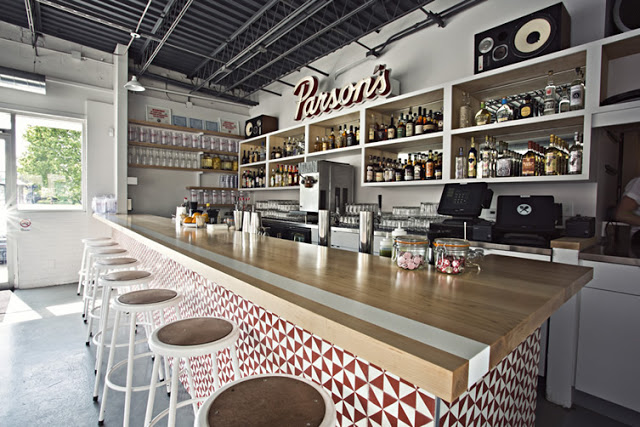
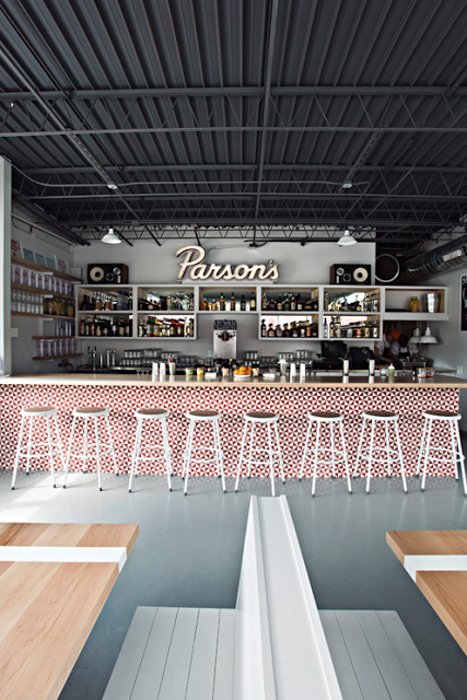
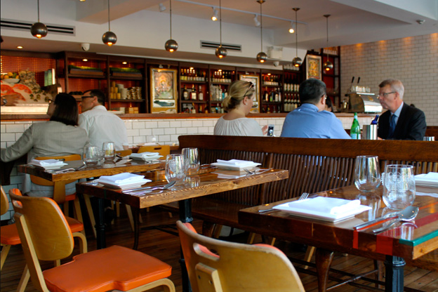
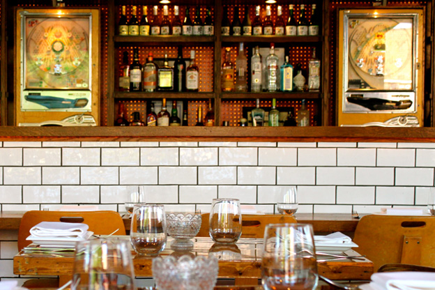
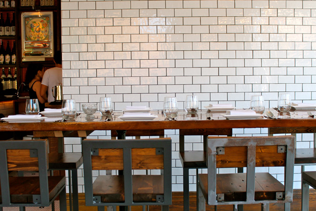
As a modern take on the classic neighborhood joint, Parson's created a vibrant and fun space that utilizes color, geometric shapes, and clean lines.
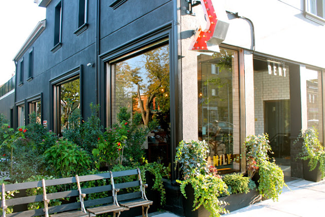
Located in a classic 70's era building, Parson's plays up the vintage vibe using a minimalist color palate of red, white, and blonde wood. Utilizing the red geometric pattern throughout the space (from the warfront to the packaging) crates cohesion within the space. Both color and pattern create a big visual impact for a small investment.
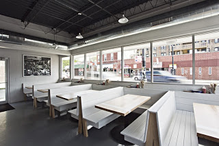
The 283 person patio is outfitted with picnic tables and striped umbrellas and easily makes up for the large U-shaped community booths inside which while maximizing seating, minimize options for the smaller sized groups.
Head over and experience the patio and fried chicken on the next warm summer day in Chicago.
All photos © Clayton Hauck via Weheart

