Mikkeller Bar

Name: Mikkeller Bar
Location: San Francisco, CA
Design: Martin heid design/build


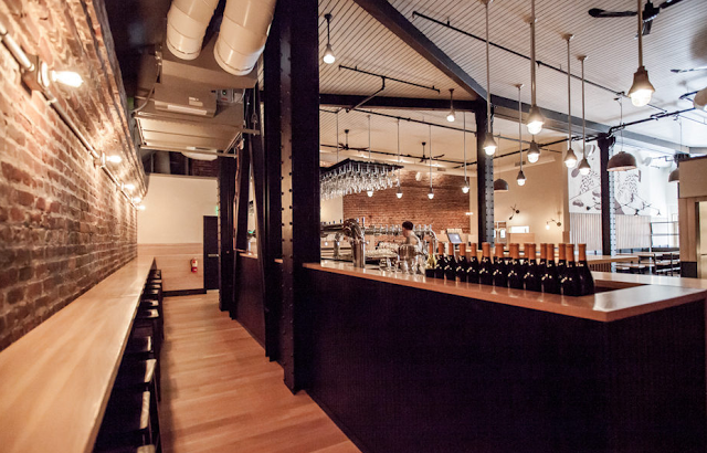
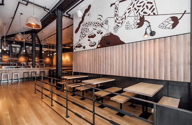
An American take on a Copenhagen brewery, Mikkeller is as much a standout for it's location as it is for the design. 


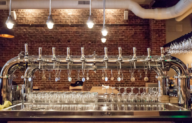
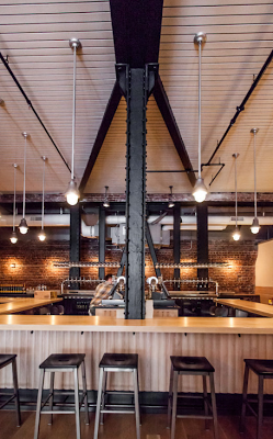
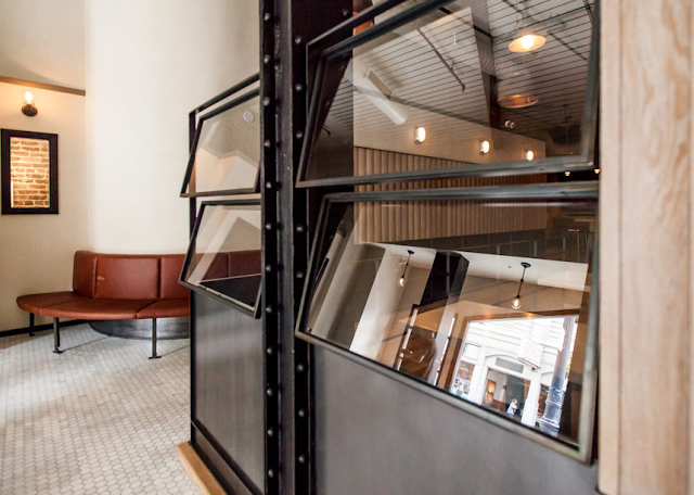
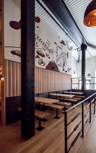
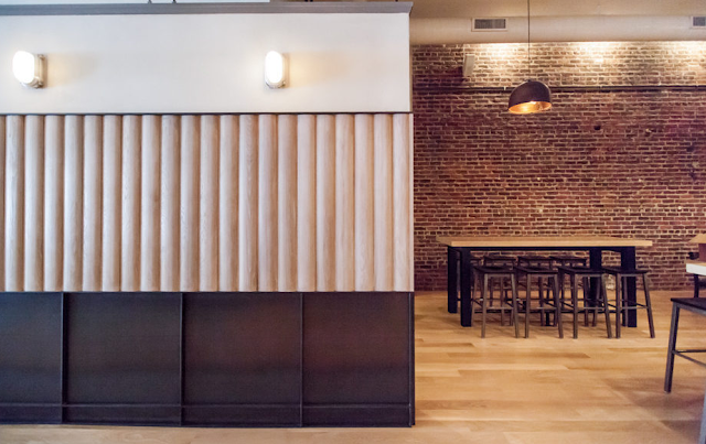
With blond woods, exposed brick, and industrial charm the space perfectly blends the Scandinavian lightness with the gritty and raw location.  Many of the design components remind me of Torst beer bar, located in Brooklyn.


 Teaming up with The Trappist of Oakland and Mikkel Borg, who opened the original Mikkeller Bar in  Copenhagen, the bar has high standards to be the best beer bar in the US.


The large scale of the two story space is accentuated with large scale graphics, heavy steel posts and an all encompassing bar surrounded by minimalist bar stools.


All images © Eater SF

The Abbot's Cellar

Name: The Abbott's Cellar
Location: San Francisco, CA
Design: Lundberg Design


The Abbot's Cellar is a well crafted and warm restaurant located in San Francisco. The design stays streamlined and clean, and gives new light to some mainstream trends.


The voluminous interior is kept warm through the use of large rough hew timbers, and a natural color palate. The warmth of wood balances the cool nature of concrete and stainless and creates a harmonious color scheme that feel relaxed yet pulled together. 


The use of horizontal run wood slats emphasizes the length of the space and keeps your eye moving through the space as you enter. These slats also help break up the tall walls giving the space a human scale aspect. 


James Beard Awards 2013


Just like many others in the food industry, May 6th was spent live streaming & refreshing every social media outlet to get the play by play of the annual James Beard Awards!

While many were awarded, we are always more interested in those that deliver the full package;  great chef, great food, and well designed spaces. Take a look at a few of our favorite winners, after the jump.


*For additional photos, click the photos below.

Best Restaurant Design- under 75 seats
Name: Isa
Location: New York
Design: Taavo Somer


Best Chef in America; Midwest
Name: Stephanie Izard
Restaurant: Girl & the Goat/ Little Goat Bread


Best New Restaurant
Name: State Bird Provisions
Location: San Francisco, CA


Outstanding Chef
Name: Paul Kahan
Restaurants: Blackbird/ Avec/ Publican/ PQM


Mosto Tequila + Botanas Bar

Name: Mosto Tequila + Botanas Bar
Location: San Francisco, CA


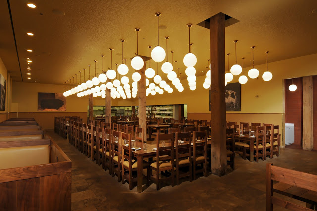
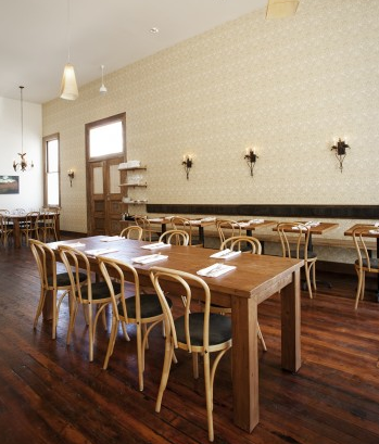
Tacolicious, a San Francisco favorite, created it's fourth locations recently in the Mission. Located at the back of the Tacolicious space is tequila bar, Mosto. The narrow bar maximized it's small footprint with minimal seating and eye catching details.


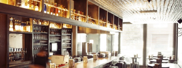
Using over 3,000 Mason jars, the bar created a texture and pattern along the ceiling, drawing your eye up towards their display of extensive Mexican liquors. 

Utilizing the bar height banquette and backless stools allows for minimal interruptions along the narrow space while maximizing seating.


Image 1 © Inside scoop SF
Image 2 © Bon Appetit
Image 3 © Sosh
Image 4 © Scout

Rich Table

Name: Rich Table
Location: San Francisco, CA


San Francisco's rich dining scene added another beauty with Rich Table. Rustic and warm, the space creates a neighborhood gathering spot.


With the reclaimed wood wall, painted half way, the space remains warm and rustic while bright and open.

The ladder back chairs create unity among the space and pay homage to the rustic environment.


All Photos © Aubrie Pick

Heirloom Café

Name: Heirloom Café
Location: San Francisco, CA


Heirloom Café is an authentic and rustic new restaurant located in the mission district of San Francisco.
What we love about this new interior in the warmth and familiarity that has been established.


With a relatively monochrome color palate, most of what makes this space comfortable and approachable is the warmth expressed within. Using creamy yellow and blond with touches of warm wood and vintage fixtures gives the space an broken in feeling of comfort and familiarity.


Photo 1 © Mission Local
Photos 2-4© Justin Lewis via Easter SF

Out The Door

Name: Out The Door
Location: San Francisco, CA


The sister to San Francisco acclaimed Slanted Door, Out The Door takes on a new approach to modern Vietnamese cooking in an incredibly stylish environment.


The space is clean and well thought through with a large counter, butcher block community table at the front of the store, and banquette seating flanking the wall. 


Using natural materials like slate and wood adds warmth to the space. This is contrasted by clean lines and organized seating which add structure and modernism.


Image 2 © Sunset
Image 3 © Aliceqfoodie
Image 1,4-5 © Indoarch

Craftsman & Wolves

Name: Craftsman & Wolves
Location: San Francisco, CA


Craftsman & Wolves is a speciality bakery located in San Francisco. What I love about this concept is simply how much they managed to elevate the experience of a typical bakery. Clean lines, simple materials, and a bit of rustic/ industrialall contrast the jewel-like qualities of the pastry displays.


The horizontal, varying height tiles help keep your eye moving in the linear space while the library ladder system allows the menu to change as needed throughout the day. 


The minimalist seating area, outfitted with exposed brick, white walls, and filled with natural light  allow the pastries to shine.


All photos © Aubrie Pick


Mission Cheese

Name: Mission Cheese
Location: San Francisco, CA


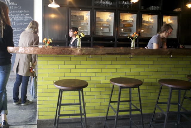
I love the modern simplicity of Mission Cheese. Using a clean palate with a bold colored subway tile, keeps the space simple and unfussy while remaining a pulled together and well thought through concept.


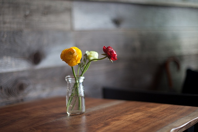
The use of reclaimed woods on the walls and tables contrasted with the concrete walls and floors and exposed lighting gives the space an industrial feeling.


The whimsy of the hand-drawn sheep with names of cheese for fur is a delicate, feminine touch within the space.


All photos © Mission Cheese


State Bird Provisions

Name: State Bird Provisions
Location: San Francisco


State Bird Provisions, located in the Western Addition neighborhood of San Francisco, has quickly climbed to the top of restaurant lists due to its innovative menu and serving technique. 


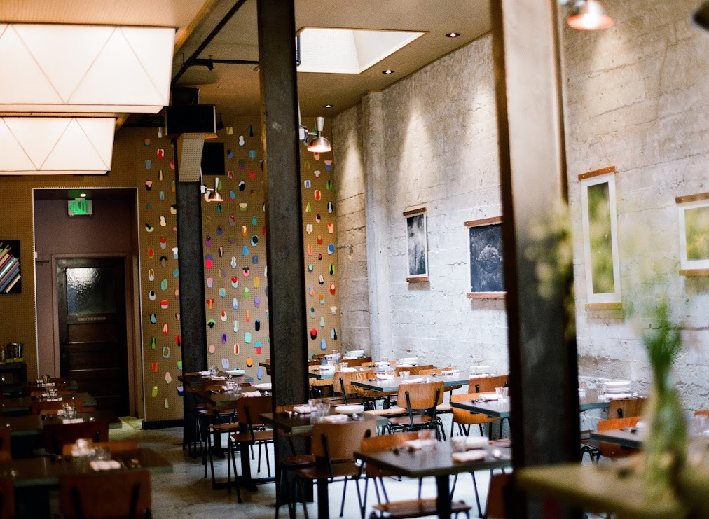
The space is sparsely simple with an emphasis and focus put into the key components of the space. The bar features six, center of the action spots while one wall features a peg board with changing art. The opposite concrete wall has been left exposed spare a few pieces of art. 
One of the greatest design elements of the space is easily their rolling bar carts. All food is served dim-sum style and brought out on these carts, to your table, with prices for each plate. This change in service style is the driving force behind the design intention, large isles and less obstructions for servers are crucial for easily serving food and allowing guest to focus their attention on the food being brought around. 


Photo 1 & 2 © State Bird Provisions
Image 3, 5 © SF Eater
Image 4 © Bon Appetit