Damson & Co

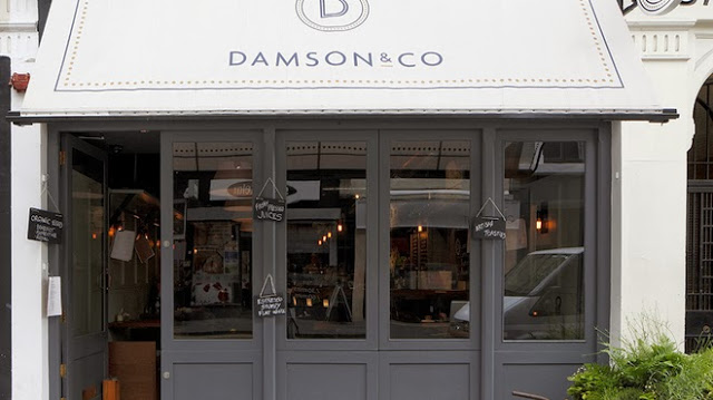
Name: Damson & Co
Location: London
Design: Central Design Studio


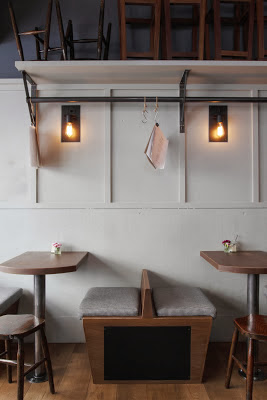
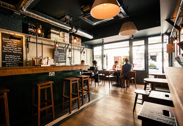
Damson & Co has done a great job layering multiple styles together to create a warm and classic space. 
Industrial and classic touches add depth and visual interest to the otherwise utilitarian interior.


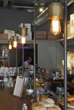
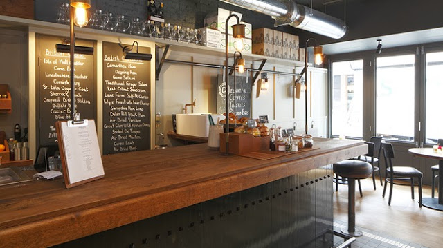
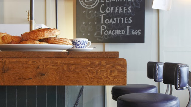
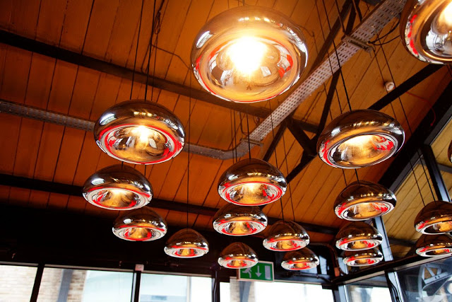
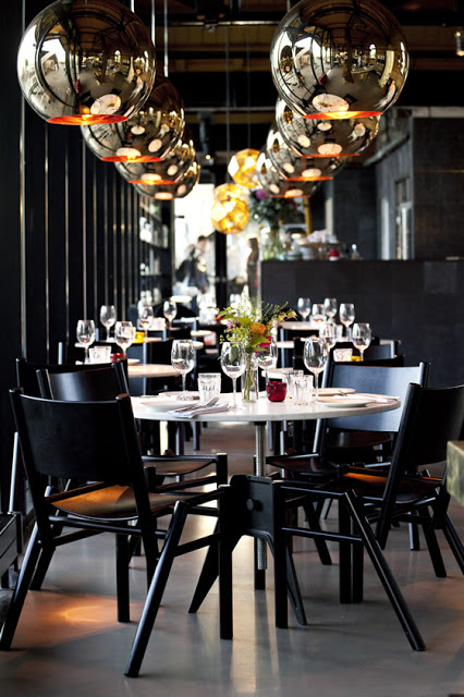
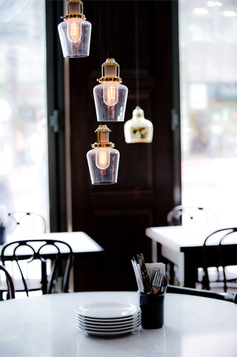
The millwork details located at the bar are one of my favorite parts of this space. They are traditional in most aspects but make a slight nod towards industrial. Paired with the custom light fixtures at the bar top you get a space that feels familiar but on trend. 


The tile detail located at the foot of the bar adds definition to the space while remaining simple and clean lined, much like the remainder of the utilitarian interior. 


Images 1-4,6 © Timeout Magazine
Image 5 © Indigo Memoirs
Images 3, 5,7 © Central Design Studio

Rawduck

Name: Rawduck
Location: Hackney, London
Design: Unknown

Rawduck, the sister restaurant to London's widely known Ducksoup, is delightfully raw and simple. The wonderful use of concrete and metal come together to create a space that is open and fresh.  


With a clean and fresh interior, Rawduck has created a slight spin on the very popular industrial interior. Simple materials, clean lines, and unpretentious execution all foster a fresh, raw space. 


I love the poured concrete bar and tables, as it is a material I believe too often overlooked. It's versatility  and rich texture add a wonderful feel to the space, while the scalloped/crimped edge along the bar is a great example of the level of detail you can easily achieve. 


Photos © We heart Co

The Riding House Cafe

Name: The Riding House Cafe
Location: London
Architect: Lou Davis


Classic style lovingly pairs with vintage wares at The Riding House Cafe. Repurposed theater chairs, industrial accents, and rich wood layer together to create a warm and welcoming space.


The pop of blue found on the barstools and tile border add a refreshing contrast to the warm wood and industrial accents.


Industrial open shelving located at the kitchen pass and behind the bar add enough weight to provide visual separation while still allowing light and sight lines into the spaces.


Curated chotchkies; one of the very few examples of this done well within a restaurant space due to it's restricted nature.


Spuntino

Name: Spuntino
Location: London


I love the warm, grittiness of Spuntino and enjoy the small scale and intimacy.


Working with the exposed brick, worn subway tiles, and raw nature of the space allows the furnishings and fixtures to be kept simple and unassuming while maintaining the character and rustic nature of the interior.


Image 1 © Pursuitist
Image 2- 4 © Google Image 

Dock Kitchen

Name: Dock Kitchen
Location: London


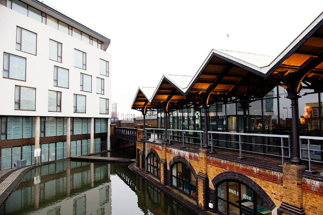
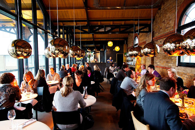
With a beautiful location and proximity to Tom Dixon's shop, Dock Kitchen was set up for success from the beginning. With exposed brick walls, a spectacular view, and attention to detail the space strikes a beautiful balance of refined rustic.


The truly welcoming open kitchen gives off the feeling of being in a friends kitchen. Balanced with the quality of materials used in the dining room and clean lines and polished details of the dining room, the space feels upscale and memorable while also feeling comfortable and welcoming.


I love the simplicity of the space and enjoy that the truss's, ceiling, and walls were all left exposed, highlighting the original structure and history of the space.


Image 1-3 © The Selby
Image 4- © Weheart

Homa

Name: Homa
Location: London


Homa is a Mediterranean Brasserie with a clean, curated interior. 


Using local architects, designers, and sources for furniture, the space remains rooted in the community.


The mismatch of chairs and tables corresponds well with the bright interior and is curated just enough to still create a consistent feel without getting too busy or cluttered.


Images 1, 3 & 5 @ Homa
Image 2, 4 © Editor


The Wright Brothers

Name: The Wright Brothers Soho Oyster House
Location: London


The Wright Brothers second location features classic details with a few unexpected twists. Located near London Bridge, Soho serves up oysters and other sea morsels from it's open raw bar. 


The raw bar, defined by worn subway tiles in a not-so-classic pattern and warm wood also features integrated spots to set oyster trays, keeping the bar space clear for diners. 


The large industrial pendants, exposed bulbs in cages, and metal staircase details all add a subtle industrial touch while remaining balanced by the classic cafe chairs and red tufted banquette.


The two story space utilizes it's height to display beautiful photos of the food being served and sources.


Images 2-9 © Editor

Dishoom

Name: Dishoom
Location: London
Design: AfroditiKrassa


Dishoom was designed to revitalize and pay tribute to the traditional cafes of Bombay. Concentrating on telling the story of these cafes, as well as keeping true to the architectural and design tradition, the space reflects old traditions and values while remaining firmly planted in the now.


A modern, monochromatic color palate and bold geometric shapes help bridge the gap between the history represented by Dishoom and the modern London where is currently resides. 


Family portraits hung on the walls were standard in Bombay cafe's and the tradition has been carried through to the new space. 

Mismatched chairs with marble-topped bistro tables give a casual feel to the otherwise modern and geometric space. 


Photos 1-3 © Sim Canetty via Dishoom
Photos 4-7 © Yatzer

Graphic Bar

Name: Graphic Bar
Location: London


Located in the heart of London, the Graphic Bar created a merge of interior & graphic design. Using typeface and bold colors, the space feels urban, bright, and hip. One of my favorite components is the large letters blocked out on the garage door facades. Keeping the rest of the space neutral in color and using raw materials like wood, concrete and brick allow the graphics inside to tell the story. 

 See more after the jump.


All photos © Graphic Bar

Booking Office Restaurant & Bar

Name: Booking Office Restaurant & Bar
Location: London

Closed in 1935, The St Pancras Rail Station recently underwent a large restoration. The booking office bar & restaurant now showcases a beautiful mix of history, heritage, and prestige. With large, gothic arched windows, marble, dark wood, and high ceilings, the space feels historic and important while maintaining a level of classic warmth. Fitting with it's travel centric past, the space and design feel  stately and otherworldly, a destination in of itself but also a space that gives a nod to an era of luxury travel. The architecture in this space is breathtaking and I can only imagine the level of time, care, and money it took to restore this striking building to its former glory.


The Booking Office Bar and Restaurant, London


All images © Pursuitist