Journeyman Distillery

Name: Journeyman Distillery
Location: Three Oaks, MI
Design: DkGr Architects


One of my favorite stops when driving from Chicago up to Michigan is Journeyman Distillery. Located in the historic Featherbone factory,  Journeyman keeps the history of their space front and center. 


The barrel room shines behind large plate of glass and contrasts the raw space, easily drawing your eye toward it.

The use of wood throughout the space helps warm up the industrial and urban interior. I enjoy that the bones and history of the building where allowed to shine with minimal and industrial furniture added in to accent. 


All images © Archinect

Local Favorite; Parson's Chicken & Fish

Name: Parson's Chicken & Fish
Location: Chicago, IL
Design: Land & Sea Dept


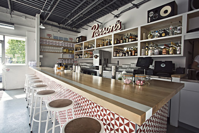
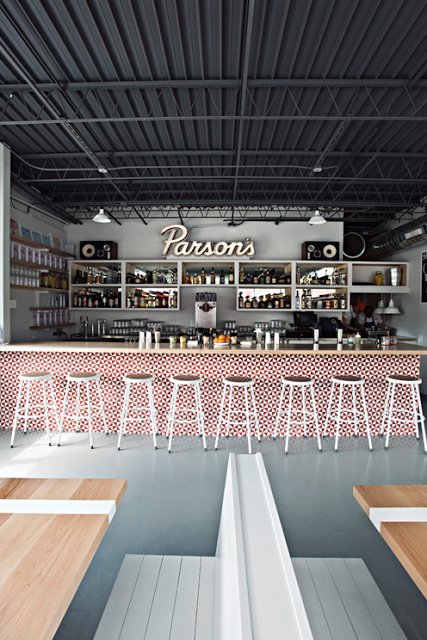
As a modern take on the classic neighborhood joint, Parson's created a vibrant and fun space that utilizes color, geometric shapes, and clean lines. 


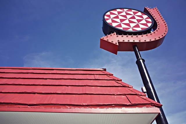
Located in a classic 70's era building, Parson's plays up the vintage vibe using a minimalist color palate of red, white, and blonde wood. Utilizing the red geometric pattern throughout the space (from the warfront to the packaging) crates cohesion within the space. Both color and pattern create a big visual impact for a small investment. 

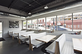
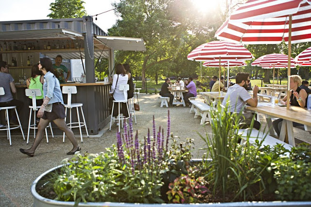
The 283 person patio is outfitted with picnic tables and striped umbrellas and easily makes up for the large U-shaped community booths inside which while maximizing seating, minimize options for the smaller sized groups. 

Head over and experience the patio and fried chicken on the next warm summer day in Chicago.


All photos © Clayton Hauck via Weheart

Local favorite; The Purple Pig

Name: The Purple Pig
Location: Chicago, IL


The Purple Pig is easily one of my favorite dining spots in the city. With an intimate and warm space, great wine list, and fun menu it easily fits the bill for just about any occasion. Even with an hour average wait time (every day, all year long…), The Purple Pig is the restaurant we frequent the most often and the place we are most likely to take visitors.


With an extremely small space, seating was maximized by using long community table in the middle of the space. Paired with a few two and four tops (and the outdoor patio in the summer.) allows them to accommodate almost any size group and helps turn over tables relatively quickly and efficiently.  

The spanish tiles add a bit of playfulness to the space while the wine barrels and art work all play on the literal side of their motto 'Cheese, Wine, & Swine'.


Local Favorite: Bow Truss

Name: Bow Truss
Location: Chicago, IL


With NeoCon just around the corner, I wanted to give all those headed into town a look at one of my favorite coffee shops near the Mart.

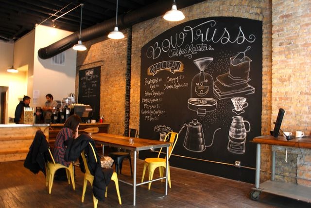
Bow Truss is a local, small batch roaster with two locations in Chicago. While both serve amazing coffee, their newest location in River North is the stand out in terms of design. 


A smaller space than their original, the River North location still maintains the rustic, reclaimed, and hip nature the original East Lakeview location is known for but does it a more thoughtful and concentrated manor. 


Images © Zagat, Doejo

Our Work; The Salsa Truck

Local Chicagoans and food truck fanatics alike have probably already heard the great news. Chicago has officially given out its very first mobile food preparers license which allows chicago food trucks to now cook on-board. This historic moment for the restaurant and dining scene was added to by the fact that we had the pleasure of working with owner, Dan Salls on the first first food truck to ever cook on board, The Salsa Truck.

Kaper Design was responsible for the branding, logo, truck design, packaging, and all other printed goods. Here are a few images of our work;


Local Favorite; Little Goat Bread

Name: Little Goat Bread
Location: Chicago, IL


The newest venture from local favorite, Stephanie Izard, is a diner meets bakery located just across the street from her acclaimed restaurant Girl & the Goat. 


While the diner is not quite open, the bread and coffee spot is and it definitely did not disappoint. 


Using classic elements like Carrera marble and subway tiles, the small space is balanced by barn wood, industrial fixtures, and vintage displays.


It's the little details that truly make the interior shine. From framing the coffee board menu in tile to the textured and undercounter-lit bar front, the space remains classic while still a bit unexpected.


Photos 2,7 © Eater Chicago
Photos 1, 3-6 © The Chicago Tribune

Local Favorite; Embeya

Name: Embeya
Location: Chicago, IL


One of the newest spots on Randolph Street is the highly regarded Embeya. Focusing on modern Asian cuisine with french technique, the interior corresponds well with the food presented.


Using large geometric screens and different seating groups divides up the rather large space making it more manageable to take in.
The center of the space is flanked with a large, upholstered banquette flanked by large wood community tables. 


Lighting within the space also plays homage to the sea inspired cuisine and contrasts the oak floors. The entry into the space features sea urchin inspired pendants while the community table near the rear features custom glass chandeliers with a very organic and sea like quality.

All photos © Embeya

Local Favorite; Big Shoulders Coffee

Name: Big Shoulders Coffee
Location: Chicago, IL


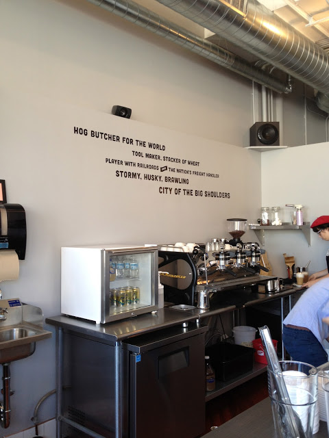
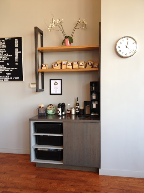
Big Shoulders takes cues from it's Chicago location with both the name, and interior.
The interior is kept simple with nods to Chicago's industrial & manufacturing background throughout.


The black subway tile with matching grout is streamlined and clean while still maintaining the timelessness of the material.


 The use of caged bulbs, exposed duct work, and strong metal fixtures are reminders of Chicago's manufacturing, industrial, and blue collar past.


Image 1,3 © Yelp
Image 2,4-5@ Kaper Design

Local Favorite: BellyQ

Name: BellyQ
Location: Chicago, IL


BellyQ, chef Bill Kim's newest restaurant has brought yet another interesting spot to the bustling West Loop food scene.


With a focus on the materials, the interior is relatively sparse and features a clean palate of grays, browns and copper. The main dining space features grill table along with four-tops and while cohesive in idea, seam to do little to delineate the space and account for sound absorption. 


The wingback chairs were custom upholstered with rich leather and feature the BellyQ logo stitched on the arm. 


While the space didn't succeed on all aspects, we are excited to see the continued emphasis on restaurant design on the Randolph St corridor. 

Image 1-3 © Behance
Image 4,5 © Eater Chi