Local 360

Name: Local 360
Location: Seattle, WA
Graphic Design: Sleep Op


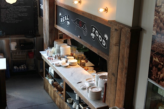
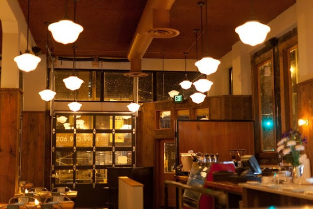
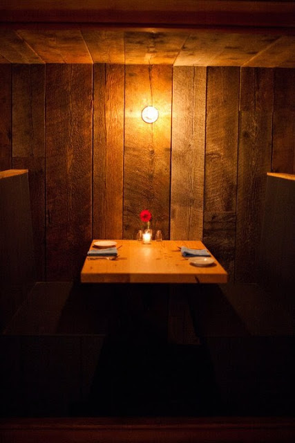
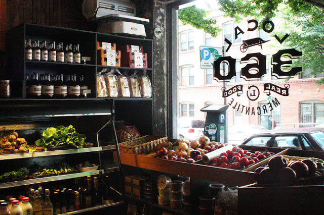
Another great spot in Seattle is Local 360. Located in the Belltown neighborhood, it focus on locally sourced, sustainable fare. The interior follows creating a rustic and warm interior using barn wood,  vintage style pendants, and intimate spaces for diners.


The use of multiple wood types creates a warm, rustic, and trendy interior while the marble counters and tolex-esq chairs add balance by adding polished, industrial touches.

 Photos ©  Local 360 & Sleep Op

Tørst Beer Bar

Name: Tørst Beer Bar
Design: hOme

Tørst's interior should be able to get just about anyone excited about beer. With a mix of Scandinavian simplicity, geometric woodwork, and a touch of glam the space is a home for beer nerds and design nerd alike.


Keeping the material palate simple allowed for the design team to go over the top with the details. Different patterns on reclaimed wood table tops occupy each different table type while unique medallions and ceiling moldings make sure no surface is overlooked. 


I love the ombre detail and simplicity they achieved with the beers pulls as it echoes the rest of space keeping everything coherent. 


If you are a beer nerd, I highly encourage you to read more about their 'flux capacitor' that is installed under their taps. It allows them to have four different temperatures for serving and controls the nitrogen and carbon dioxide for each individual tap; ensuring the perfect pour.


All images © retaildesignblog

Althaus

Name: Althaus
Location: Gdynia, Poland
Design: PB/Studio with Filip Kozarski


Althaus, a Bavarian restaurant located in Poland executes a rustic and modern interior seamlessly. 


Occupying two levels, the space features traditional materials and rustic touches offset by accent of copper.


The large graphic wood wall ties both upper and lower floors together allowing each to have it's own personality without contradicting the other. 


I love the simplicity of the space and the updated uses of materials. The paneling and banquette are a great example of traditional applications being updated and used to present a modern and fresh perspective. 


All photos © Yatzer

Messhall

Name: Mess Hall
Location: Los Angeles, CA
Design: StudioUnltd


With a mix of mid century modern and rustic, Messhall creates a space that fits well within it's historic dome roofed structure. 


 Industrial stools, wood clad walls, and a color palate reminiscent of days at camp all come together to form a space much more pulled together than I remember my camp mess hall being!


I love that they used a common, everyday object- the divided dining tray, and created a a great visual that ties into the concept. 


All Images © StudioUnltd


Rich Table

Name: Rich Table
Location: San Francisco, CA


San Francisco's rich dining scene added another beauty with Rich Table. Rustic and warm, the space creates a neighborhood gathering spot.


With the reclaimed wood wall, painted half way, the space remains warm and rustic while bright and open.

The ladder back chairs create unity among the space and pay homage to the rustic environment.


All Photos © Aubrie Pick

Puritan & Company

Name: Puritan & Company
Location: Boston, MA
Design: Ask Design/Build


One of the newest spots in Boston is Puritan & Company. With an 'urban farmhouse' aesthetic, the space is rich with worn woods, bright light, and classic details.


The simplicity of the space is offset by the rustic nature of the antique pieces and worn wood. 


The addition of traditional blue and white details in updated patterns helps evoke the farmhouse feel while allowing the space to reside peacefully in the city.


All photos © Rachel Leah Blumenthal via Eater

Faviken

Name: Faviken
Location: Järpen, Sweden


In a rural town in Sweden sits one of the top restaurants in the world. With only twelve seats in the restaurant, you are guaranteed an intimate experience. 


Faviken takes local cuisine and ingredients to a higher level by growing and raising all of their own food. In the winter, they use food from their root seller and dried, cured meats. 


With rough beams, worn wood floors and walls, and herbs drying on the walls, the interior of Faviken allows function to come first. Using quality materials that that age well intrinsically adds warmth and allows the space to envelope the diners. This happens while still maintaining its connection with the natural beauty that surrounds it.


The Gallows

 Name: The Gallows
Location: Boston, MA
Design: Sousa Design


While exploring Boston, we happened to pass The Gallows in the South End and couldn't help but stop and peak in. The narrow space was rich with details and laid out well, providing multiple seating groups in two distinct zones, one for dining and one for the bar. Considering the restaurant is located in the area of Boston where hangings took place, the Gallows creates a nod to this haunted past while keeping the space polished and open. With a material palate of wood, brick, and metal, the design is truly in the details. The slat ceiling, industrial metal-made pendants, and wall lights peering out from what appears as peeling wood, the design achieves a historical and aged feel while keeping true to the polished and emerging dining scene.

The Gallows


             Gallows_001


Images 2,3,5 © Creative soul in motion
Image 5 © Sousa Design

Architectural Digest's Best New Restaurant Design

Recently, Architectural Digest released their top 12 list of innovative restaurant interiors. Here is a recap of our top three favorites off their list. Follow the links for even more information and photos about the design and spaces.


Name: Tori Tori 


Name: Isa


Name: Radio Restaurant


Check back next week for a few that didn't make the list, but probably should have.

Barcelona Atlanta

Name: Barcelona Wine Bar & Restaurant
Location: Atlanta, GA
Designer: Square Feet Studio


Barcelona, located in Atlanta is easily one of my favorite  examples of modern and rustic mixed. With floor to ceiling wood-clad walls, graphic artwork, industrial fixtures and metal details, you simply cannot go wrong. Sticking to a minimal color palate of browns, blacks and whites allows for the space to feel harmonious and allows the materials to shine. I can't wait to make a stop in the next time i'm in Atlanta.


barcelona wine bar tapas inman park atlanta georgia

barcelona wine bar tapas inman park atlanta georgia

barcelona wine bar tapas inman park atlanta georgia

barcelona wine bar tapas inman park atlanta georgia

barcelona wine bar tapas inman park atlanta georgia

barcelona wine bar tapas inman park atlanta georgia