Name: Mart 130
Location: Melbourne, Australia
Photography: Erika Hildegard Photography (If you are in Australia, I encourage you to check out her amazing range of work.)
Location: Melbourne, Australia
Photography: Erika Hildegard Photography (If you are in Australia, I encourage you to check out her amazing range of work.)
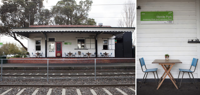
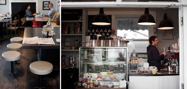
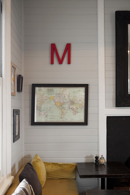
Mart 130 has to be one of the best examples I've seen recently of a comfortable and established cafe maintaining a well curated interior. When Erika's images landed in my inbox I couldn't help but get excited. Rarely do you find the blend of well loved antiques that is also still pulled together and edited.
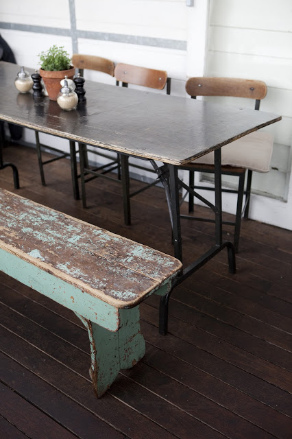
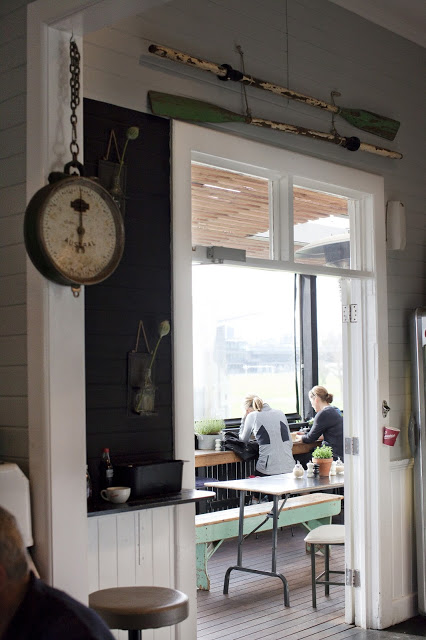
Using vintage and antique pieces, paired with a nautical and industrial undercurrent, Mart 130 creates a cohesive blend of worn comfort and bright openness.
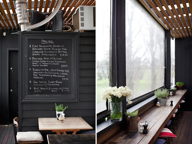
Utilizing red, aqua, black, and blue throughout the multiple seating areas ties the entire space together without needing to match everything. This allows the space to remain cohesive while each room still maintains it's own identity.
I love the bright back patio featuring painted, dark wood and slat ceiling, you could easily sit for hours.
All photos © Erika Hildegard Photography


