Wexler's Deli

Name: Wexler's Deli
Location: Grand Central Market, LA
Design: J. Marx


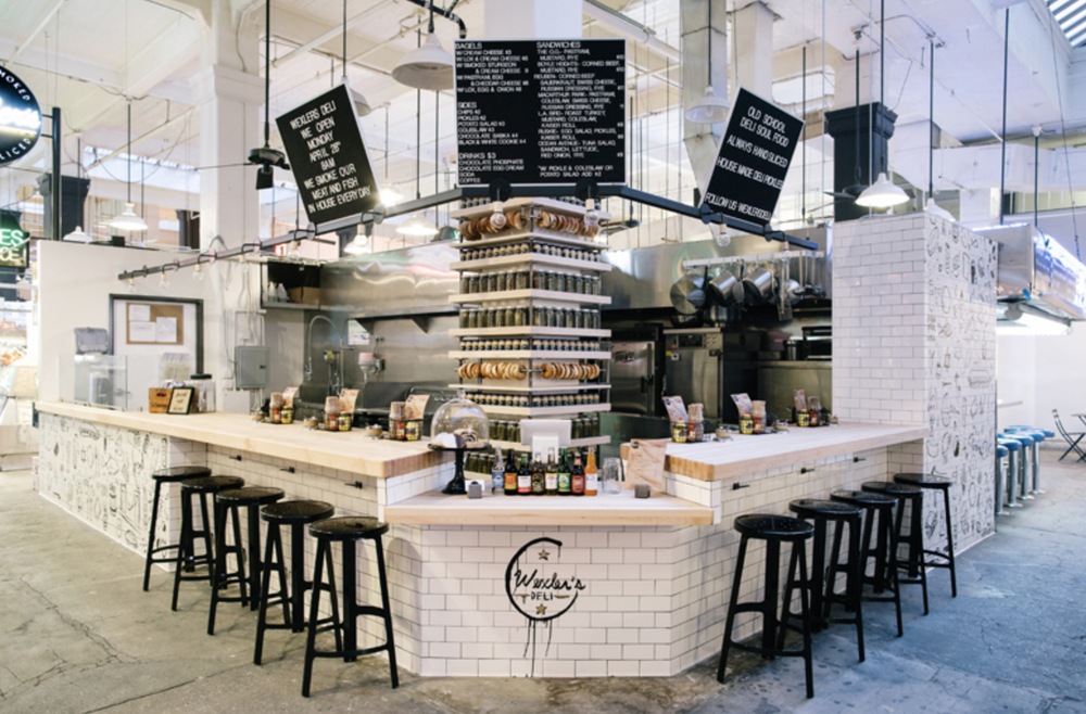
There is something so wonderfully unpretentious and warm about the classic deli feel. Clean, white subway tiles accentuated by the stainless steel equipment and butcher block counters seem to create the perfect backdrop for vibrant ingredients. 

Read on for more images-


Located in LA's Grand Central Market, Wexler's stands out with it's bold sense of style; effortlessly mixing classic New York deli with hip LA culture. We love the graphic illustrations applied to the subway tile and the display of bagels and pickles lining the otherwise impeding structural column. 


All images © Wexler's Deli

Zito's Sandwich Shoppe

Name: Zito's Sandwich Shoppe
Location: Brooklyn, NY
Design & Identity: Tag Collective


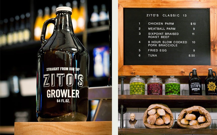
Located in Park Slope, Zitto's modern-industrial space features the perfect amount of Italian heritage.


Classic white subway tile, mercantile shelving, and pipe shelving all cement Zitto's as a modern Italian deli while the hung bulbs of garlic and salumi keep the authenticity alive and pay tribute to the classic Italian delis of New York's past. 


All Images @ Tag Collective

The General Muir

Name: The General Muir
Location: Atlanta, GA
Design: Square Feet Studio; http://www.squarefeetstudio.com


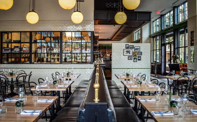
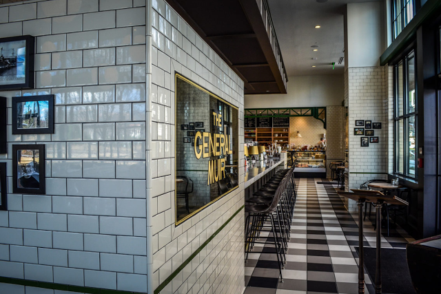
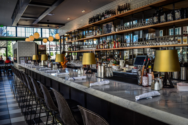
As a modern take on a Jewish deli, the interior of The General Muir looks just as appetizing as the food. With classic details like subway tiles and checkerboard floors, the space feels rooted in tradition while still keeping a firm grasp on the dining pulse.


Keeping the color palate restricted helps keep the interior feeling modern while the bronze details help add a classically aged note. The marble toped bar, vintage inspired bar stools, and globe lights all work together to create layers within the space. 


All images © Eater Atlanta

Kiosk

Name: Kiosk
Location: Strasbourg, France


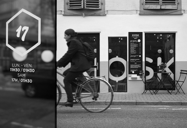
Kiosk was created based on the idea that everyone has a favorite little diner. One that is small and comfortable and makes you want to return time after time. 
With touches of mid century modern, Kiosk puts a fresh spin on the classic concept.


The use of butcher block and blond wood helps balance the small space While the globe pendants and curved lines evoke the classic mid century modern appeal.


All photos © behance

Mile End Sandwich & Delicatessen

Name: Mile End Sandwich & Delicatessen
Location: New York

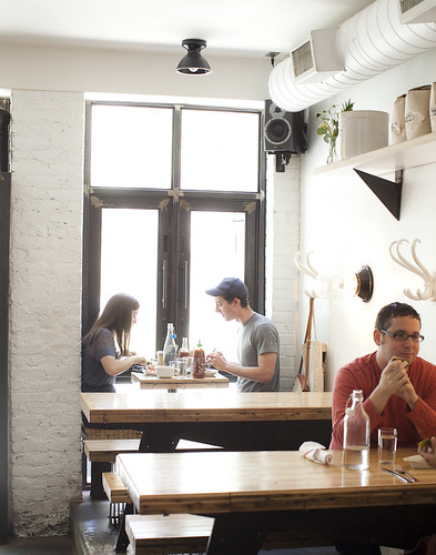
Mile End started out as a local Jewish Deli but has recently added on a sandwich shop crafted with quality design. Playing on the materials already used in the original deli; white tile, blonde wood, and a minimal color palate, the Sandwich Shop incorporates and reimagines them. Giving the spaces a similar and harmonious feel while maintaining separate identities for each. The geometric bling wood table running through the center of the Sandwich shop creates visual interest and traffic flow, while also maximizing seating. Let's take a look;

First, the Sandwich Shop.


And, the Delicatessen.

Mile End Delicatessen - Brooklyn, NY

Mile End Delicatessen - Brooklyn, NY

Mile End Delicatessen - Brooklyn, NY


Image 1-3© Eater NY
Image 4- 6© Eric Isaac via Snapfo

Il Buco Alimentari e Vineria

Name: Il Buco Alimentari e Vineria
Location: New York, NY

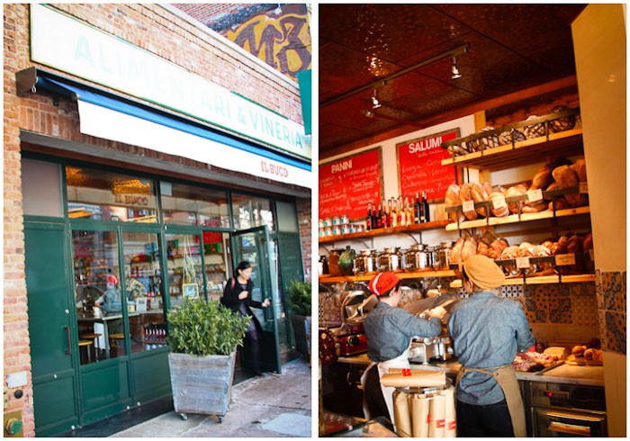
Formerly a lumber warehouse in the heart of NOHO, this urban space has been transformed into an italian restaurant and deli. serving sandwiches towards the front and breakfast, lunch, and dinner at the rear, the space is raw, romantic, and full of texture.


Image 1-4 © Tasting Table
Image 5-6 © Hither and thither