Kook Restaurant & Pizzeria

Name: Kook Restaurant & pizzeria
Location: Rome
Design: Noses Architects


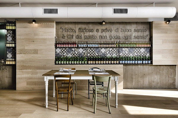
Upon first look at Kook, you'd have a difficult time determining if the space was a restaurant or just a great home.


Using concrete, steel and glass as the main design materials the space has an urban, industrial feel which is surprising for the classic space it is housed in. 


Using wood and reclaimed pieces, the added warmth into the space and balanced the raw materials.


One of my favorite features in the space is their use of traditional concrete tiles as both backslashes and flooring to break up the space, add warmth and pattern and add a small splash of color.


All images © Fresh Home

Craftsman & Wolves

Name: Craftsman & Wolves
Location: San Francisco, CA


Craftsman & Wolves is a speciality bakery located in San Francisco. What I love about this concept is simply how much they managed to elevate the experience of a typical bakery. Clean lines, simple materials, and a bit of rustic/ industrialall contrast the jewel-like qualities of the pastry displays.


The horizontal, varying height tiles help keep your eye moving in the linear space while the library ladder system allows the menu to change as needed throughout the day. 


The minimalist seating area, outfitted with exposed brick, white walls, and filled with natural light  allow the pastries to shine.


All photos © Aubrie Pick


Pio Pio

Name: Pio Pio
Location: New York
Designer: Sebastian Mariscal

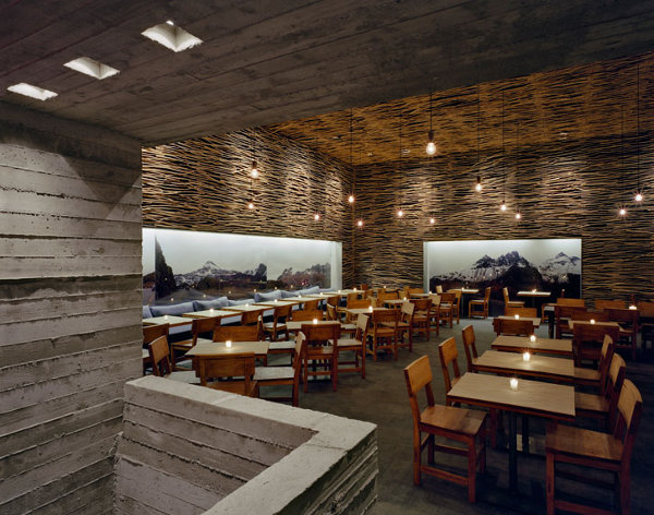
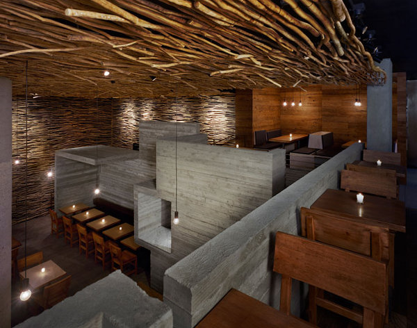
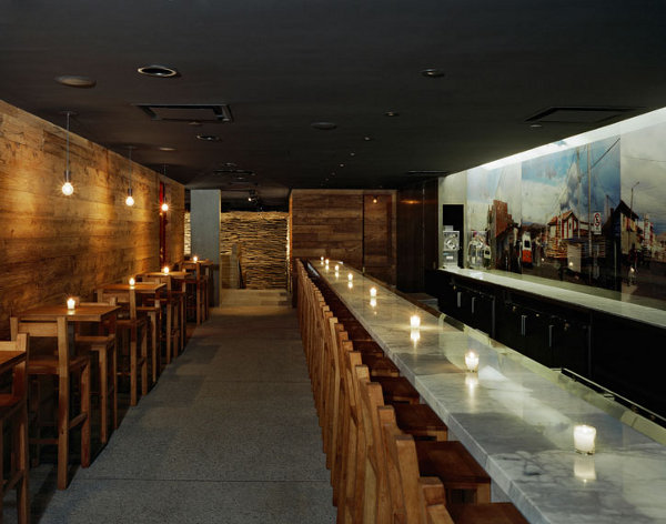
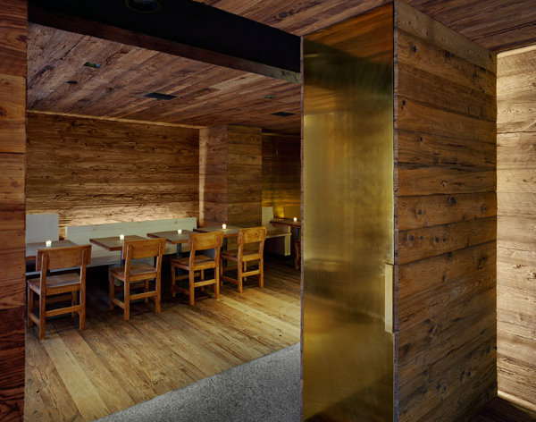
Pio Pio is a great example of materiality in a space. The space features three predominant materials; concrete, wood & stone. By showcasing these materials and using large quantities, it creates a wonderful visual and warm tone. The addition of the large graphics adds a nice punch of contrast to the overall space.

Pio Pio Restaurant by Sebastian Marsical

Pio Pio Restaurant by Sebastian Marsical

Pio Pio Restaurant by Sebastian Marsical


All images © The Coolist