Nomad Coffee

Name:

Nomad Coffee

Location: Barcelona

Design: Unknown

There is something great about the simplicity and unfussy nature of Nomad Coffee. Located in Barcelona, Nomad started out as a small cart and has since transitioned to a brick and mortar space, their name speaking to their roots. 

The unimposing and warm facade welcomes you into a communal space with a utilitarian aesthetic that emphasizes the craft and connection.

Image 1, 2 ©

Fuet Magazine

Image 3 ©

The Soup Spoon

Schiller's Liquor Bar

Name: Schiller's Liquor Bar
Location: New York, NY


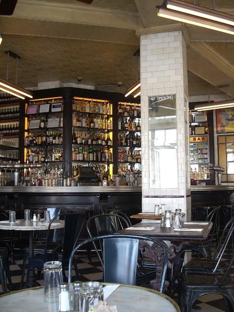
Schiller's is a mix of old-school, vintage charm and modern industrial. The classic field tiles covering the exterior paired with the large typographic signage makes the space feel as if it's been in the neighborhood forever. 


The classic details continue to the interior with metal bistro-styke chairs, mirror-backed bar, checkerboard floor and mismatched victorian-based marble tables. The black & white color palate continues the classic feel but also edges the space into a modern time.


Photos 1-4, 6-7 © Schillers Liquor Bar
Photos 5 © Coeurdesel


Scarpetta Dining Pavilion

Name: Scarpetta Dining Pavilion
Location: Toronto, Canada
Design: gh3, II by IV Design

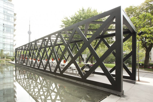
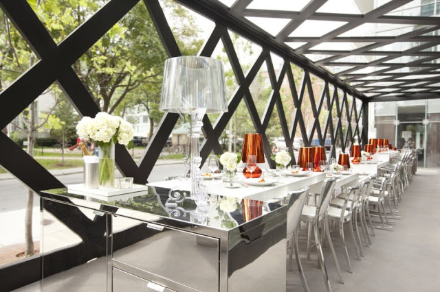
New York based restaurant, Scarpetta, recently completed it's first international expansion into the city of Toronto. Wishing to create a new dining concept where guests can 'see and be seen', the dining pavilion surely accomplishes it's directives.


New York based restaurant, Scarpetta, recently completed it's first international expansion into the city of Toronto. Wishing to create a new dining concept where guests can 'see and be seen', the dining pavilion surely accomplishes it's directives.


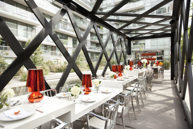
Set alongside a park and parallel to a linear reflecting pool, the angular and narrow pergola has one central community table dominating the space. 
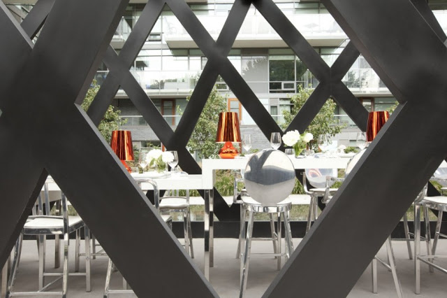
The long table was designed to include seating ranging from standard dining, counter, and bar height spots by raising or lowering the Corian surface.


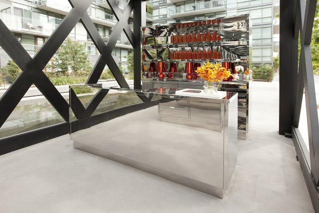
The reflective nature of the inside finishes brings the natural qualities found outside, inside and allows a harmonious space throughout. Placing the bar stations perpendicular to the direction of the space, creates a natural break and defines the spaces boundaries.


All photos © Dan couto via Contemporist


Architectural Digest's Best New Restaurant Design

Recently, Architectural Digest released their top 12 list of innovative restaurant interiors. Here is a recap of our top three favorites off their list. Follow the links for even more information and photos about the design and spaces.


Name: Tori Tori 


Name: Isa


Name: Radio Restaurant


Check back next week for a few that didn't make the list, but probably should have.

Tori-Tori

Name: Tori-Tori
Location: Mexico City
Design/Architecture: Rojkind Arquitectos & ESRAWE Studio

This spectacular building is  home to what is considered, one of the best Japanese restaurants in Mexico City. The organic and semi-transparent double walled facade, acts to create a natural extension from inside to outside. The interior of the space features dining spaces set amongst plush foliage and were designed in collaboration with the buildings facade and openings. The texture and filtration of natural light, along with the creation of shadows and views, allows diners a different experience depending on the area they are dining in and the time of day. I can only image the experience diners receive as they approach and enter the space. This is truly a great example of an organic connection between inside and outside.


Tori Tori Restaurant / Rojkind Arquitectos + ESRAWE Studio © Paúl Rivera


Tori Tori Restaurant / Rojkind Arquitectos + ESRAWE Studio © Paúl Rivera


Tori-Tori Restaurant by Rojkind Arquitectos + Esrawe Studio (3)

Tori-Tori Restaurant by Rojkind Arquitectos + Esrawe Studio (2)


All photos via © Paúl Rivera via Archdaily