Terroni

Name: Terroni
Location: Toronto & LA


Terroni does a great job carry a style and vision throughout multiple locations. With two locations in Toronto and one in LA, they let their defining element; the wine, shine through.


The use of mixed materials adds a funky, unstuffy vibe to the space which is refreshing knowing their focus on wine.

The built-in shelving behind the bars at each location are simple enough to showcase the vast collection but also play to the original details of the space.


LA:


I love that the LA location took a traditional library setup and flipped it on its head by infusing an urban aesthetic paired with the modern and simple shelving.


 Toronto:


Each locations interior perfectly compliments it's structure while also providing a good dash of contrast. The intricate tray ceiling is juxtaposed by the modern light, urban art, and clean wooden booths.


All photos © Terroni

Outsider Tart

Name: Outsider Tart
Location: London


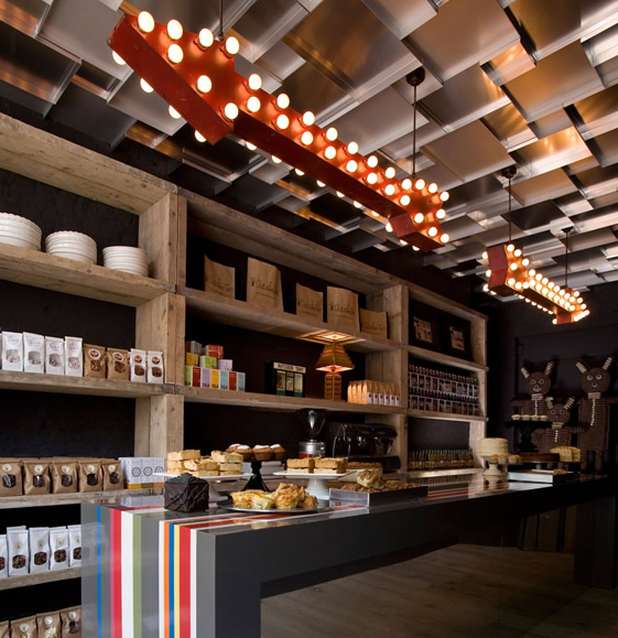
Located in London, Outsider Tart is a bakery & cafe that perfectly juxtaposes rustic and whimsy.


Utilizing vintage and found items and contrasting them with rustic displays and bright colors creates a perfectly balanced interior.


With limited space, every detail had to be thought through to make sure it made just the right impact. Maximizing space using the long display table in the middle creates flow while also breaking up the space. 

One of my favorite elements in the space is the ceiling that was created with sheet pans. Utilizing ordinary materials in unexpected ways also helps drive home the whimsy aspect of the cafe. 


Image 1-3 © We Heart

Restaurant Radio

Name: Restaurant Radio
Location: Copenhagen
Design: HolmbäckNordentoft

Created by the team also responsible for Noma, Restaurant Radio maintains the same simple sensibility. Warm, open, modern, and fresh can all describe this beautiful space that serves up new nordic cuisine. All food comes from Radio's own organic garden, local fishermen, and farmers and is beautifully served against a backdrop of worn, warm wood in a space filled with contrast and light.

Located in Frederiksberg, close to Copenhagen's scenic lakes, Restaurant Radio derives its name from the city's old Radio House. Photo by Anders Hviid.

The dining room is outfitted with Slab Chairs by Tom Dixon. The floor is Douglas fir, treated with white soap and lye, from Danish company Dinesen. Photograph by Anders Hviid.

The restaurant flatware is from the design firm Normann Copenhagen. Photo by Anders Schønnemann.

A Moooi Chandelier hangs above two large photographic images of produce from the farms. Photo by Anders Schønnemann.

Photos 1-4 © Remodelista via Anders Hviid

Jane


Name: Jane
Location: San Francisco
Designer: Ken Fulk, Inc.

With the unseasonably warm temperatures currently sneaking into Chicago, my mind has been craving a bit of inspiration that is bright, clean, and cheerful. Jane, located in the Pacific Heights neighborhood of SF is just that and more. Bright, clean, inviting, and a hint of playful quirk easily make this place stand apart from the crowd.

2123 Fillmore Street


Cozy banquette seating
Photos 1-6 © Jane

Clarke's Bar & Dining Room

Name: Clarke's Bar & Dining Room
Location: Cape Town, South Africa


Clarke's is on of those places that I wish was located in the US. The minimalist exterior, simple and clear signage, use of natural materials and execution of contrast are perfect. The entire place feels cohesive, seamless, comfortable, and carefree. Clarke's is a perfect example of well done simplicity and a reminder to us all that we don't need more for the space to feel special.


all photos © Guy With Camera