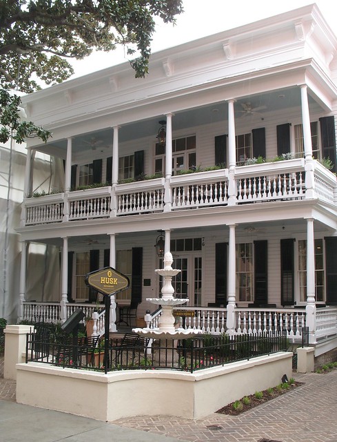
Our Work; The Depot

Name: The Depot
Location: Reno, NV
Design: Kaper Design


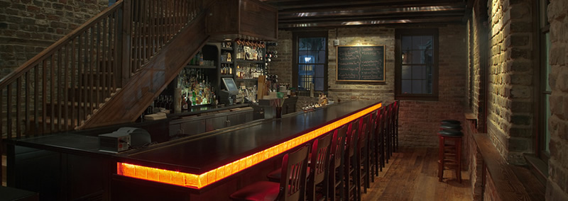
We are excited to share with you the recently opened spot we completed in Reno, NV.   The Depot was named after the buildings' 1910 origin as the depot for the the Nevada- California- Oregon railway. The design of the space plays tribute to it's rich history while firmly planting itself in the present.


The large space features three floors; the first floor showcases the brewing and distilling that takes place behind the bar and includes bar seating, a dining room, host stand, and restrooms. The kitchen, additional bar, dining space, private lounge, and additional restrooms are located on the second. On the third floor there are offices and the barrel room.


Barrister bookcases and custom millwork great you as you enter. Ceiling details call back to the beautiful slat benches once present and common within train depots throughout the country. 

We wanted to keep the palate warm and understated to allow for the architecture of the space, and the brewing equipment behind the bar, to shine. 


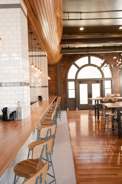
The second floor bar features beautiful concrete tiles and and industrial seating while the first floor dining space, shown below, features a large-scale map showing The Depot's location and old rail lines that we had created as a wall covering.


All Photos © Calvert Photography via The Depot 


Hotel Fontevraud

Name: Hotel Fontevraud
Location: Loire Valley
Design: Patrick Jouin


To say that Hotel Fontevraud has a rich history would be an understatement. Constructed between 1101 and 1119 as an Fontevraud Abbey, hosting both Monks and Nuns. The order was dissolved during the French Revolution(1792) and was habituated again in 1804 as a prison. Serving as a prison for 159 years, the Abbey was handed over in 1963 and restoration work began to return it to it's former self. The current vision for Hotel Fontevraud is a 'Cité Idéal' or the intersection of intellect and culture by providing hospitality for guests.  

With this new chapter comes a new restaurant that celebrates its past while firmly establishing it's future. 


What makes this new revitalization a success, in my opinion, is the juxtaposition of old and new. The contemporary furnishings compliment the architectural beauty surrounding you while also allowing you to remain firmly planted our digital and quickly evolving age. Nothing feels permanent and yet doesn't feel light enough to be unintentional. 


All photos © knstrct


At The Chapel

Name: At The Chapel
Location: Burton, UK
Design: Ahmed Sidki & Catherine Butler


A former 17th century congregation church found new life as a cafe, bakery, wine shop, and restaurant.  Keeping the original architectural details intact, the minimalist and warm interior showcases the goods and space perfectly.


Utilizing natural materials and a minimal color palate, the almost Scandinavian interior, allows multiple functions to flow together while maintaining a cohesive feel.


I love that the architectural details of this stunning building are offset and balanced perfectly by the minimalist and warm interior. 


All images © Dee Purdy

Messhall

Name: Mess Hall
Location: Los Angeles, CA
Design: StudioUnltd


With a mix of mid century modern and rustic, Messhall creates a space that fits well within it's historic dome roofed structure. 


 Industrial stools, wood clad walls, and a color palate reminiscent of days at camp all come together to form a space much more pulled together than I remember my camp mess hall being!


I love that they used a common, everyday object- the divided dining tray, and created a a great visual that ties into the concept. 


All Images © StudioUnltd


Husk


Name: Husk
Location: Charleston, SC

Husk is another Bon Appetit Magazine top restaurant for 2011. The first image truly expresses the feeling of the space, "Historic Roots Modern Disposition". Located in a very classic, plantation style Charleston structure, the restaurant focuses heavily on local farms and sustainability. (I highly encourage everyone to take a look at their website, it is highly interactive and showcases the seasonal products they are using and the farms they are getting them from.) I adore the logo and branding of Husk and love that it continues the idea of fork to fork from the moment you walk through the doors.


Husk Logo


Press Archive


Image 1,3-5@ Husk
Image 2@ Flickr