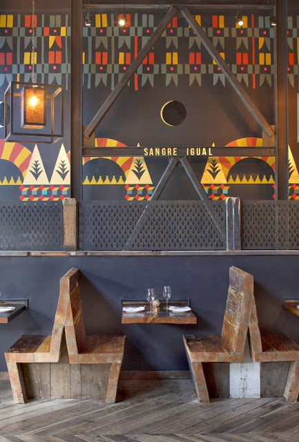
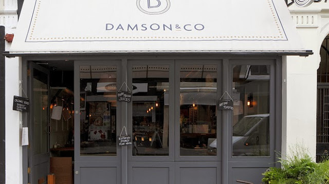
Damson & Co

Name: Damson & Co
Location: London
Design: Central Design Studio


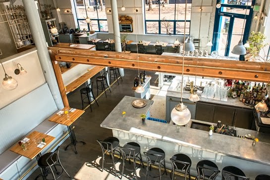
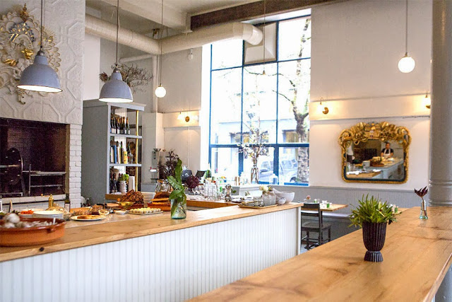
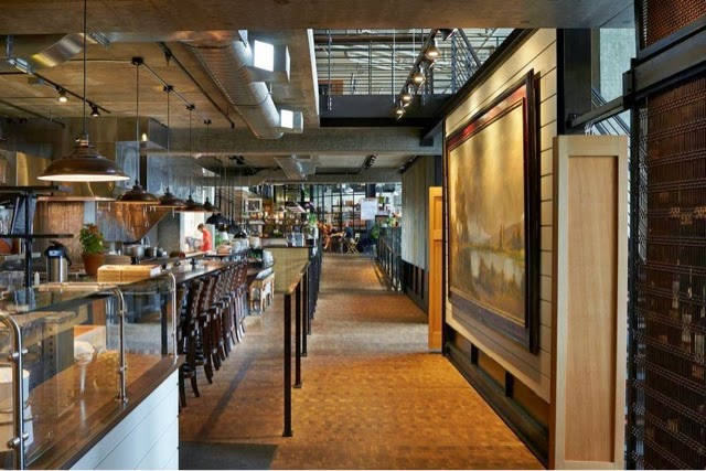
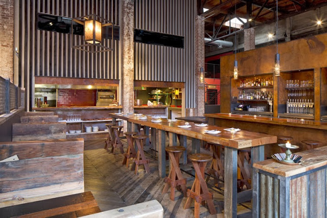
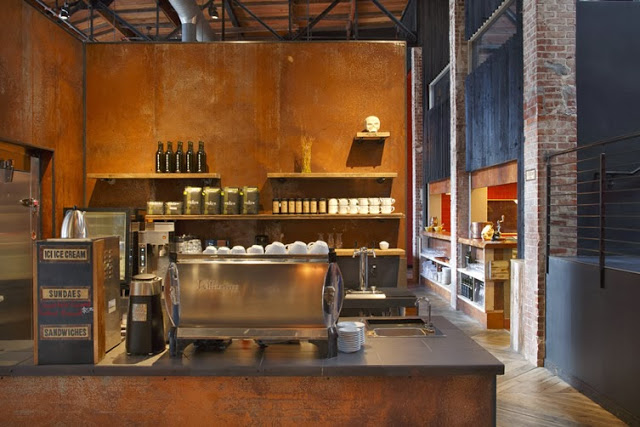
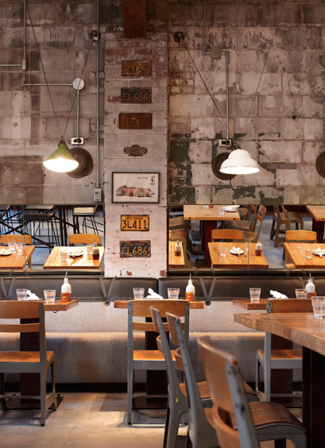
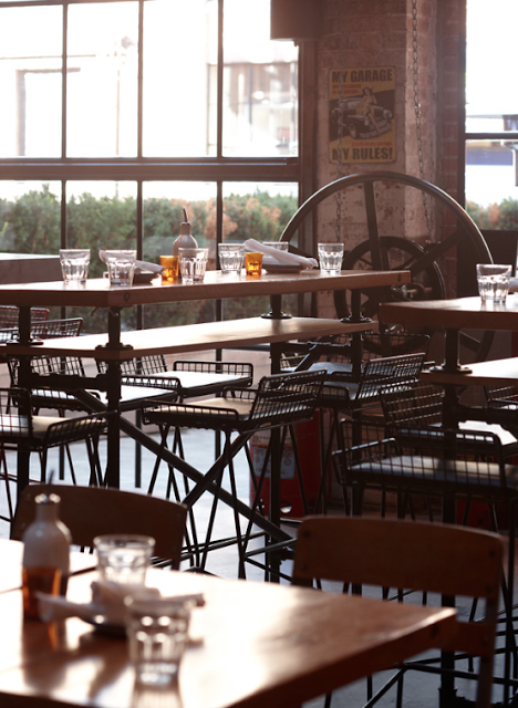
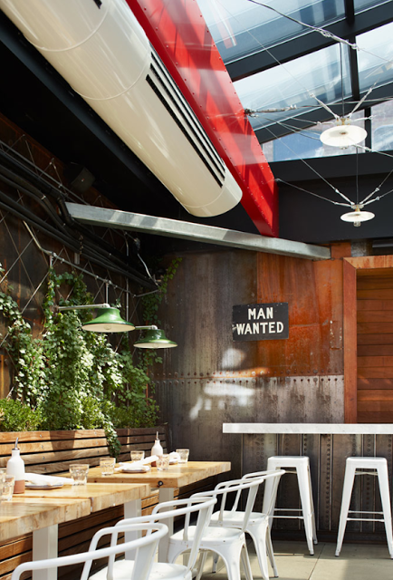
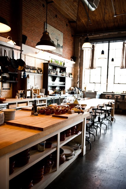
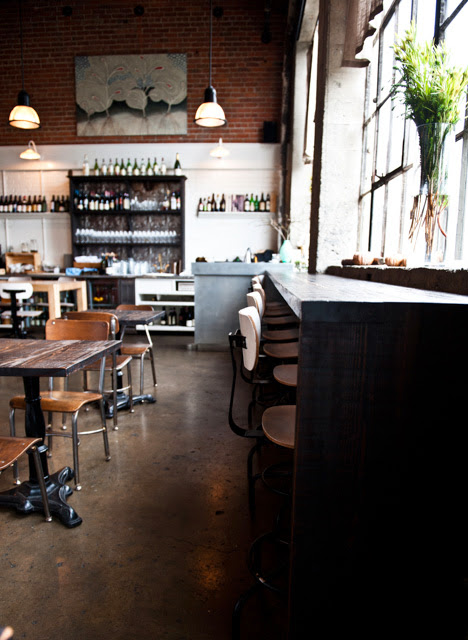
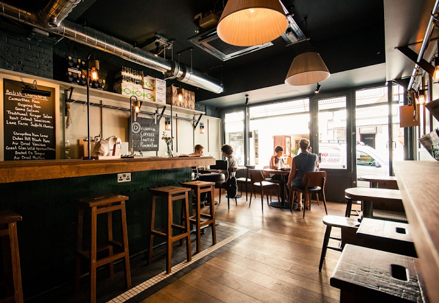
Damson & Co has done a great job layering multiple styles together to create a warm and classic space. 
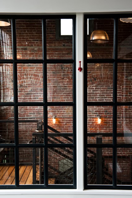
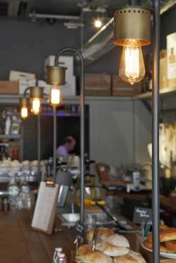
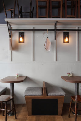
Industrial and classic touches add depth and visual interest to the otherwise utilitarian interior.


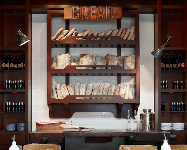
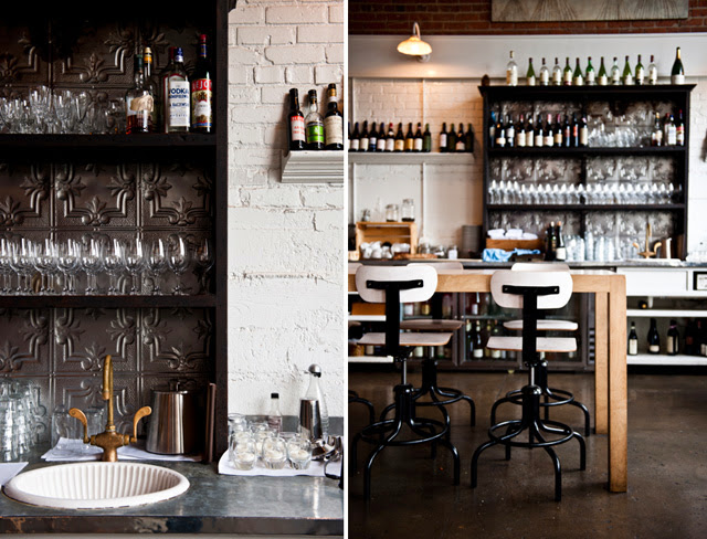
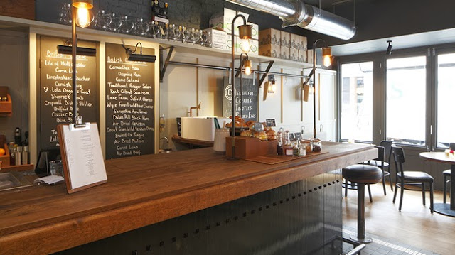
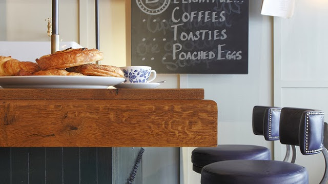
The millwork details located at the bar are one of my favorite parts of this space. They are traditional in most aspects but make a slight nod towards industrial. Paired with the custom light fixtures at the bar top you get a space that feels familiar but on trend. 


The tile detail located at the foot of the bar adds definition to the space while remaining simple and clean lined, much like the remainder of the utilitarian interior. 


Images 1-4,6 © Timeout Magazine
Image 5 © Indigo Memoirs
Images 3, 5,7 © Central Design Studio

Our Work: Foursided

Name: Foursided
Location: Chicago, IL
Design: Kaper Design, LLC
Photography: Kyle McKenna


Kaper Design is excited to share our latest work in Chicago! Located in the heart of East Lakeview (Just a few blocks down from Dryhop, too.), Foursided is a neighborhood staple for those looking to get the best framing or unique gift. Being the original location, it came time for a facelift and we were happy to jump on board. Follow the jump below for a look at their new space.


In order to bridge functionality with aesthetic, we created zones and divided the space into a private back workroom and public front of space retail section. Dividing the two areas allows works to spread out and get creative while creating a determined area for customers to meander. Custom steel and metal shelving units were fabricated to add vertical storage. These pieces add warmth while remaining light, allowing your eye to focus on the good placed on them. 

On of my favorite components of the space is the large, sliding panels which now display the extensive frame sample collection. Utilizing a custom designed steel track system (Similar to a school house blackboard), allows us to minimize the amount of square footage needed to display the frames while still keeping them easily accessible for employees and guests.


Custom designed and built shelving in the center of the space adds display and retail space while also keeping customer traffic flowing through the space. The counters were custom designed and fabricated by Fourth lake Carpentry Inc. and grant us lots of extra storage space for frame samples and prints. 


The front of the store received a brand new facade, tile entry way, and raised displays. Paired with the removal of the awnings the space is now clearly visible to all passing by.


Bar Sajor

Name: Bar Sajor
Location: Seattle, Wa
Design:

Matt Dillon, 2012 James Beard Award Winner and chef/restauranteur behind Sitka and Spruce, opened up Bar Sajor early this year in Pioneer square.  With a similar open kitchen layout and earthy lightness, the interior feels like a more 'dressed up' version of Sitka & Spruce in all the right ways.


Using blonde woods, white bead board, and cool grays keeps the space chic and polished while remaining warm. The exposed rotisserie oven and exposed wood beams add a rustic touch that help keep the interior tied to the buildings historic roots. 


Images 1 & 2 © Architectural Digest
Image 3 © Eater Seattle
Image 4 © Bon Appetite

LA Condesa

Name: La Condesa
Location: Austin, TX
Design: Joel Mozersky & Michael Hsu 


Colorful and retro with a touch of eclectic works perfectly for Tex Mex restaurant, La Condesa. Layering industrial materials with soft leathers and bright colors creates a warm and vibrant space fitting of the food. 


The bright colors and modern architecture work well to create an energetic interior. Old Mexican billboards found new life as they were broken down and reassembled into a  large, can't be missed, mural on the far wall. 

The vintage vibe and playful lines also help keep the space upbeat, bright and inviting. We love the layering of materials and the texture and comfort level it brings to the interior. 


Picnic

Name: Picnic
Location: Paris (Concept; Not Built)
Design: Studio Ko

Picnic, a concept restaurant created in Paris showcases how minimalist design, paired with bold pattern, can create a vibrant and fun experience. 


Using worn wood and unadorned walls allows the patterns to be the star. By keeping the patterns all geometric in nature, ties the multiple elements together create a bit of harmony within the space.


All images © Studio Ko

TanakaSan

Name: TanakaSan
Location: Seattle, WA
Designer: Graham Baba Architects.


Warm, urban, and inviting TanakaSan, located in Assembly Hall, has it all going for it. As one of a handful of dining spaces among the Assembly Hall collection, TanakaSan faced some interesting special challenges.


With the kitchen separated from the dining space, a small bar was added which allows breakfast to be served in the morning and adds extra seating for casual drinks or overflow diners. 

The space is open, light, and industrial but remains comfortable and warm. The constant movement of the space and doors that open onto the patio add energy to the space and allow it to keep a constant connection to everyone coming and going through the building.


All of the tables are clean lined and light with airy black slat seating. Proving the restaurant is anything but traditional, each table is outfitted with a plastic animal (typically a dinasour of some sort) adorned with a metal chain and/or plant situated in its back.


All images via Via6 Facebook, Suzie Pratt Flickr , & Unknown

Duende

Name: Duende
Location: Oakland, CA
Design: Arcsine Architecture in collaboration with multiple local artisans.


With today's highly competitive restaurant scene, restaurant owners know that the need to offer more than just a great plate of food in order to attract and keep guests. Duende, located in Oakland, California was crated with this in mind and offers a bit for everyone. 


Located in a historic Art Deco building, the interior utilizes graphics and patterns to bridge the deco exterior and industrial nature of the space. 

The large interior utilizes large amounts of worn wood and exposed brick to balance out the saturated and geometric murals.

I love that while the space is large in scale, the warmth and amount of detail keep it warm and unimposing.

All Images via Weheart

Gusto

Name: Gusto
Location: Toronto, Canada
Design & Photography: Munge Leung


Revitalizing a former auto body shop, Gusto 101 crafted an industrial and intimate Italian trattoria.


The use of vintage furnishings paired with the raw, industrial space creates an industrial interior that remains warm and authentic. 


I enjoy that though they used multiple finishes and fixtures, the entire space feel cohesive and complete. By leaving the existing space relatively untouched and adding a level of finish to the food preparation areas, allows the space to remain pulled together and thought through. 


Sitka & Spruce

Name: Sitka & Spruce
Location: Seattle, WA
Design: Unkown


Located in Melrose Market, a vintage auto garage dating back to 1919 and 1928 respectively, Sitka & Spruce has quickly climbed to the top of my Seattle restaurant list. With an over the top open concept and location amongst exceptional vendors, it's easy to see why. 


The converted garage spaces feature cement columns, exposed brick, and beautiful industrial windows. With the dining and kitchen sharing a singular space, you easily feel as if you are eating in someone's kitchen. 


The industrial structure paired with classic paneling, industrial and vintage furnishings create a perfect mix of relaxed style. 


Photo 2© Seattle Mag
Photos 1, 3-5 © Kimberly Taylor Images

Clive Burger

Name: Clive Burger
Location: Calgary, Canada
Design: Unknown

Clive Burger is a wonderful example of a fast casual space with a modern and fun interior. Utilizing cartoon-esq graphics paired with a restrained material and color palate, allows the space to feel whimsy while establishing a clean and modern space. 


The use of custom furnishings allowed the seating and space to be maximized while keeping a harmonious overall feel.


Images © Scout Flickr