Picnic

Name: Picnic
Location: Paris (Concept; Not Built)
Design: Studio Ko

Picnic, a concept restaurant created in Paris showcases how minimalist design, paired with bold pattern, can create a vibrant and fun experience. 


Using worn wood and unadorned walls allows the patterns to be the star. By keeping the patterns all geometric in nature, ties the multiple elements together create a bit of harmony within the space.


All images © Studio Ko

Le Bal Café

Name: Le Bal Café
Location: Paris


With a mix of modern and industrial touches, Le Bal Café creates a clean and inviting space to enjoy familiar& honest cooking. 


The large chalkboard well acts as the menu board and also creates a bit of balance within the monochromatic and modern space. 


Using unique light fixtures adds an element of unexpected surprise and helps bring some attention towards the menu and wall mounted photography.
The industrial stools and open shelves adds a small industrial touch that also helps add a bit of warmth to the otherwise clean and modern interior.

All photos © Remodelista

Nomiya

Name: Nomiya
Location: Paris
Design:Pascal Grasso, Laurent Grasso 


GRASSOrestoextNUIT2_093

Designed as an alternating, 'pop-up' style restaurant located on the top of the Le Palais de Tokyo museum is a stunning gem. With full views of the Eiffle Tower and seating for 12-14, the space is intimate and relaxed with the majority of the surfaces designed to draw your eye out, rather than in. 

GRASSOrestoEXTtoitjour069 GRASSOrestoEXTtoitjour069


GRASSOrestoIntjour073 GRASSOrestoIntjour073

Blonde wood floors, clear glass surrounds, and clean white surface keep the space minimal and modern and allow the guests eye to be draw outside.

GRASSOrestoIntjour078A GRASSOrestoIntjour078A

GRASSOrestoIntjour098b GRASSOrestoIntjour098b

All images © Arch Daily

Mama Shelter


Name: Mama Shelter
Location: Paris
Designer: Philippe Stark

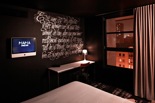
While stumbling through my daily design blogs I can across a wonderful giveaway currently being hosted by Oh Happy Day!. While I would love the chance to win a trip to Paris, what I found most intriguing was the hotel the winner would be laying their head at. Mama Shelter was designed by Philippe Stark and was created inside a former garage. The feeling is hip, slightly brash,clean, modern with a large technological aspect (think iMac tv's in each room and panels & tables displaying photos & messages you upload).


all photo © Mama Shelter