Shed 5

Name: Shed 5
Location: Melbourne, Australia
Design: Loopcreative


Shed 5, located in Melbourne is a great example of high impact design created through the use of scale.


With an industrial feel, the open space remains warm through the use of warm wood floors, rich colors, and warm lighting. 


Using tables and chairs that play off the industrial feeling and limiting the color palate to blue, white, and blonde helps keep the concept focused and the few visual elements strong.


The large tile graphic that was created on the wall helps the large space feel more intimate while also providing a large visual impact.


All photos © homedit

Puritan & Company

Name: Puritan & Company
Location: Boston, MA
Design: Ask Design/Build


One of the newest spots in Boston is Puritan & Company. With an 'urban farmhouse' aesthetic, the space is rich with worn woods, bright light, and classic details.


The simplicity of the space is offset by the rustic nature of the antique pieces and worn wood. 


The addition of traditional blue and white details in updated patterns helps evoke the farmhouse feel while allowing the space to reside peacefully in the city.


All photos © Rachel Leah Blumenthal via Eater

Tank.

Name: Tank.
Location: Australia
Design: Anna Drummond Design


Tank. is a modern fish & chippery designed to play on the traditional greek fish and chips. Keeping a simple color palate of blue and white, which furthers the concept of freshness and seafood while playing off the traditional Grecian colors, the space takes on a fun, clean atmosphere. 


The hits of neon typography and metal tolix style stools help continue the clean and modern feeling.


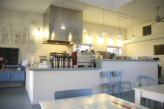
Little Building cafe

Name: Little Building Cafe
Location: Mississippi
Designer: Annie Coggan/ Coggan+Crawford

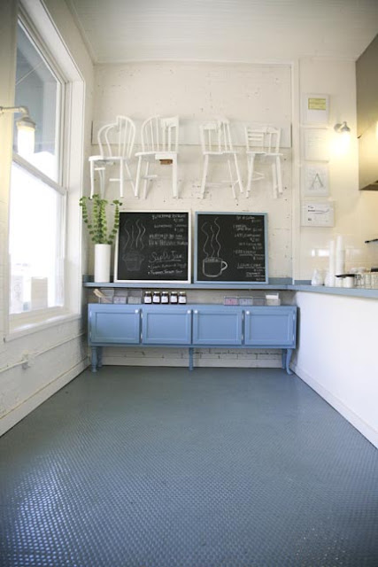
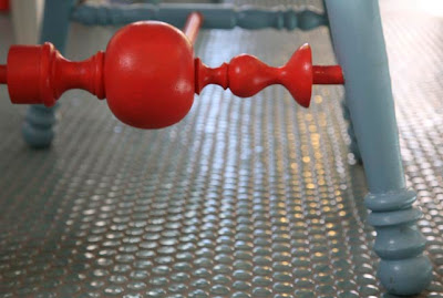
Little Building Cafe is the perfect example of not taking yourself too seriously. With a color palate of blue and white and a shot of color interspersed, the interior is playful and fun. The layout is straightforward with seating along a single wall and BOH space along the other and an added skylight opens up the small space. What I love most about the space is it's simplicity and overall feeling of relatability. It seems fittings of it's surroundings and not more or less than what is needed for it's demographics and area.


All photos © Yatzer via Annie Coggan