Sip Mobile Lodge

Name: Sip Mobile Lodge
Location: Portland, OR
Design: Von Tundra


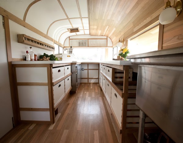
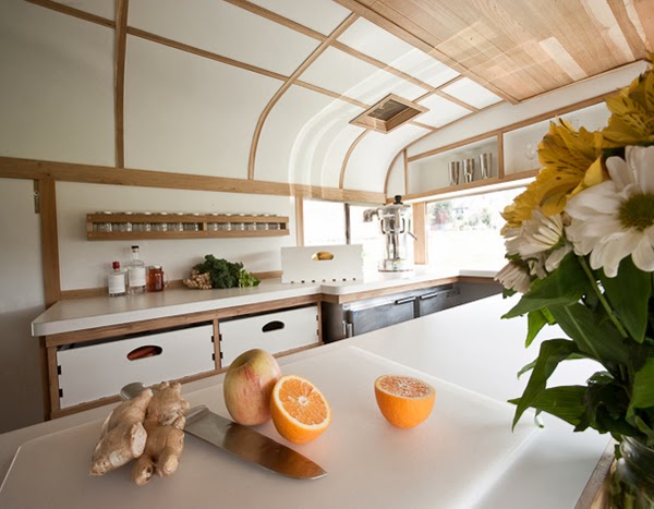
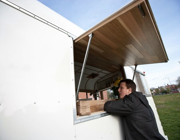
Sip mobile lodge is proof that simplicity and attention to detail can make even the tightest spaces feel light. The 1969 Dodge Chinook was crafted using nods to it's mid century modern roots and pacific northwest local. 


White cabinets and counters and blonde wood help create a simplified and clean space that plays up the natural air and modern sensibilities of the Portland food scene. 


I love that the drawers are fashioned like traditional crates and can be pulled out completely to access (or gather) supplies. 


All images © Von Tundra

Death & Taxes

Name: Death & Taxes
Location: Reno, NV
Design: Unknown


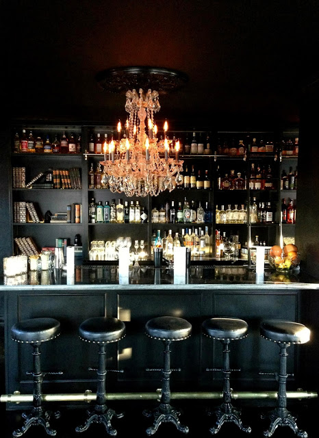
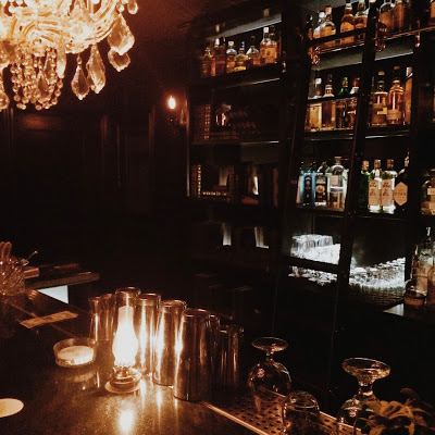
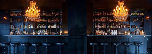
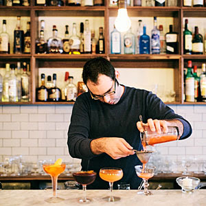
Death & Taxes is a craft cocktail bar, located in a converted bungalow, and was one of our favorite stops during a whirlwind trip to Reno this past weekend. 


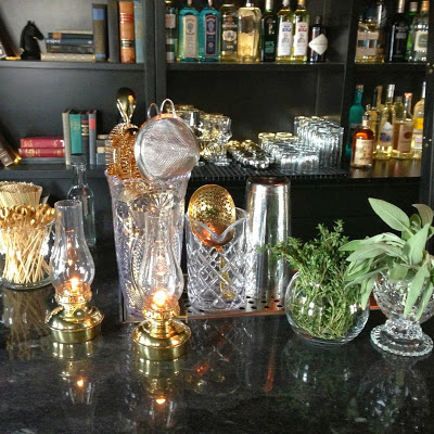
With an almost all black interior, attention was paid to the subtle details. These details; high gloss trim against matte walls, subtle pattern, and hidden storage are what make this space a cohesive space and a great experience. One of my favorite details within the space was the hidden passages to the back of house. These are hidden within the bookcase and are located behind the far bay of shelving on either end of the bar. Hidden hardware and the level of finish detail makes them invisible to the naked eye. 


All images © Death & Taxes Facebook, Kaper Design, LLC


Essex

Name: Essex
Location: Seattle, WA
Design: tbD


Essex, located near the Ballard area of Seattle, is a bright and inviting space that has quickly made it on my 'I need to get there' list. Playing with contrast to create balance created a welcoming space.


While utilitarian in nature, playing with geometrics and warm colors woods helps the interior come alive. 


The contrast between the warm woods and bright whites of the back bar and countertops helps to maintain the brightness within the space while also creating a balanced and cohesive interior. 


A Concept Divided; Origo

Name: Origo
Location: Bucharest, Romania
Design: Lama Architectura


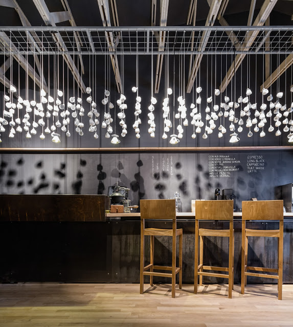
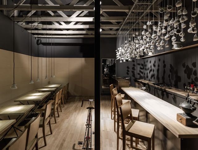
A trend I've been watching for a while now is duel-concepts under a single roof. If done well, they can offer the owner maximum ROI, attract a larger demographic, and merge interests. Origo, in Romania has done just this by splitting their space and concept by time; coffee shop in the morning, cocktail bar at night. 


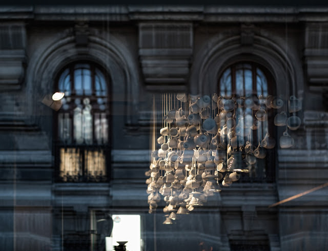
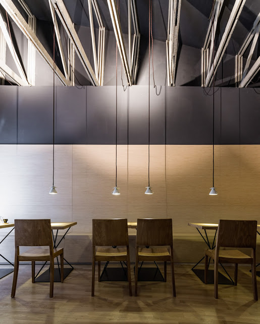
Keeping the space minimal allows for both concepts to operate within the space space, utilizing the same fixtures and furnishings. A heavy handed use of wood and raw metal are contrasted by cups and saucers artfully displayed from the ceiling. Once again proving the benefit of repetition with a everyday object.  By keeping all art limited to the cup/saucer installation, it allows the space to remain focused and draws the users eye up to the original beam ceiling uncovered during construction.


Maximizing seating using bar height and banquette styles also keeps the space open and draws the eye through the space, downplaying its lack of width and focusing on its exaggerated length.


All photos © We Heart


Palmer & Co

Name: Palmer & Co
Location: Sydney, Australia


Palmer & Co is an underground bar in Sydney that easily transports you to another era. Dimly lit and spilling over with warmth, the space beckons of eras gone by. 


With the exposed brick interior as a great raw base, period tiles were used on the floors and charcuterie areas adding another period appropriate material. 


Walking through the space you can easily see the nod to the 20's & 30's and era of prohibition. 


The hand painted mural on the wall uses typography to add to the story while the period sconces and old photos take you back to a roaring period of time. 

Image 1,3,5-6© Mecho
Image 2 © Boudist 
Image 4  © Concrete Playground