Hotel Fontevraud

Name: Hotel Fontevraud
Location: Loire Valley
Design: Patrick Jouin


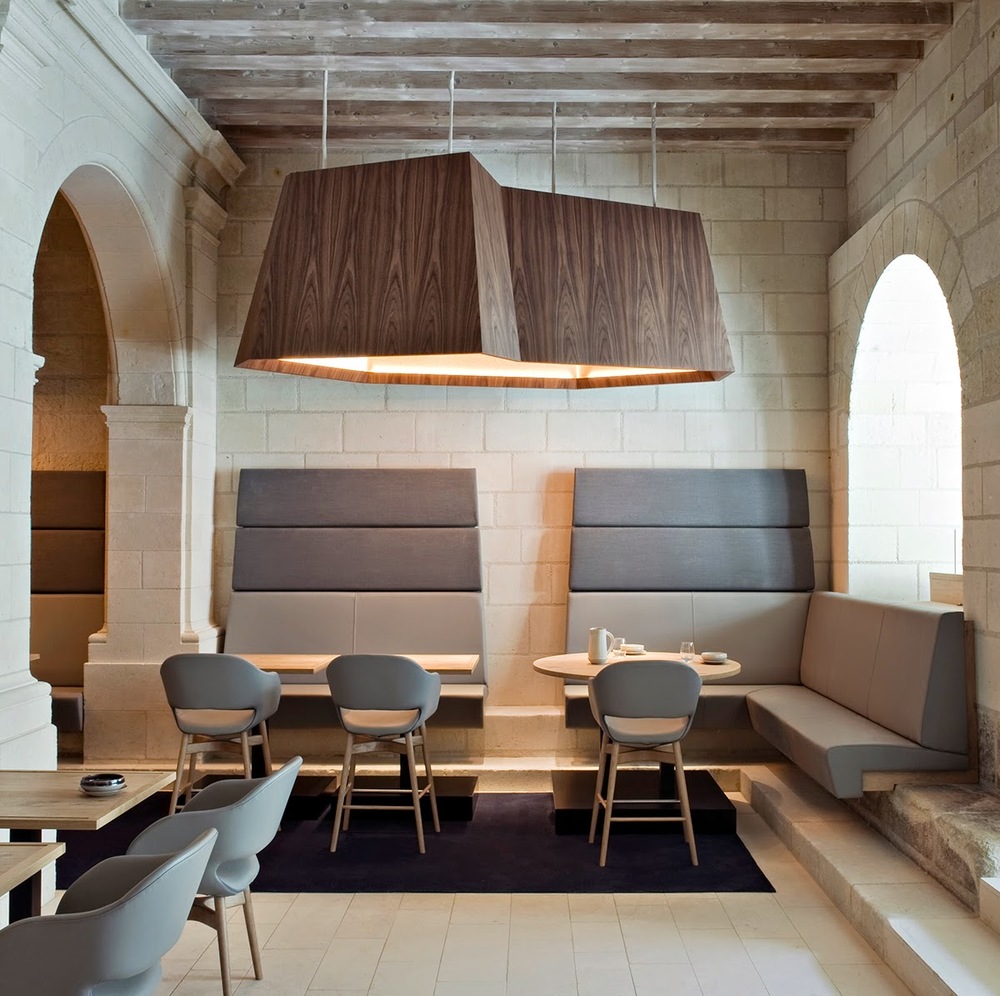
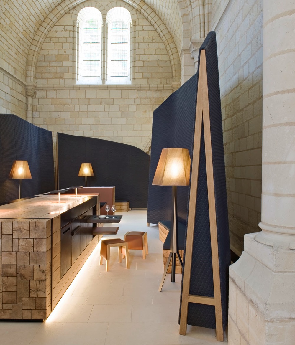
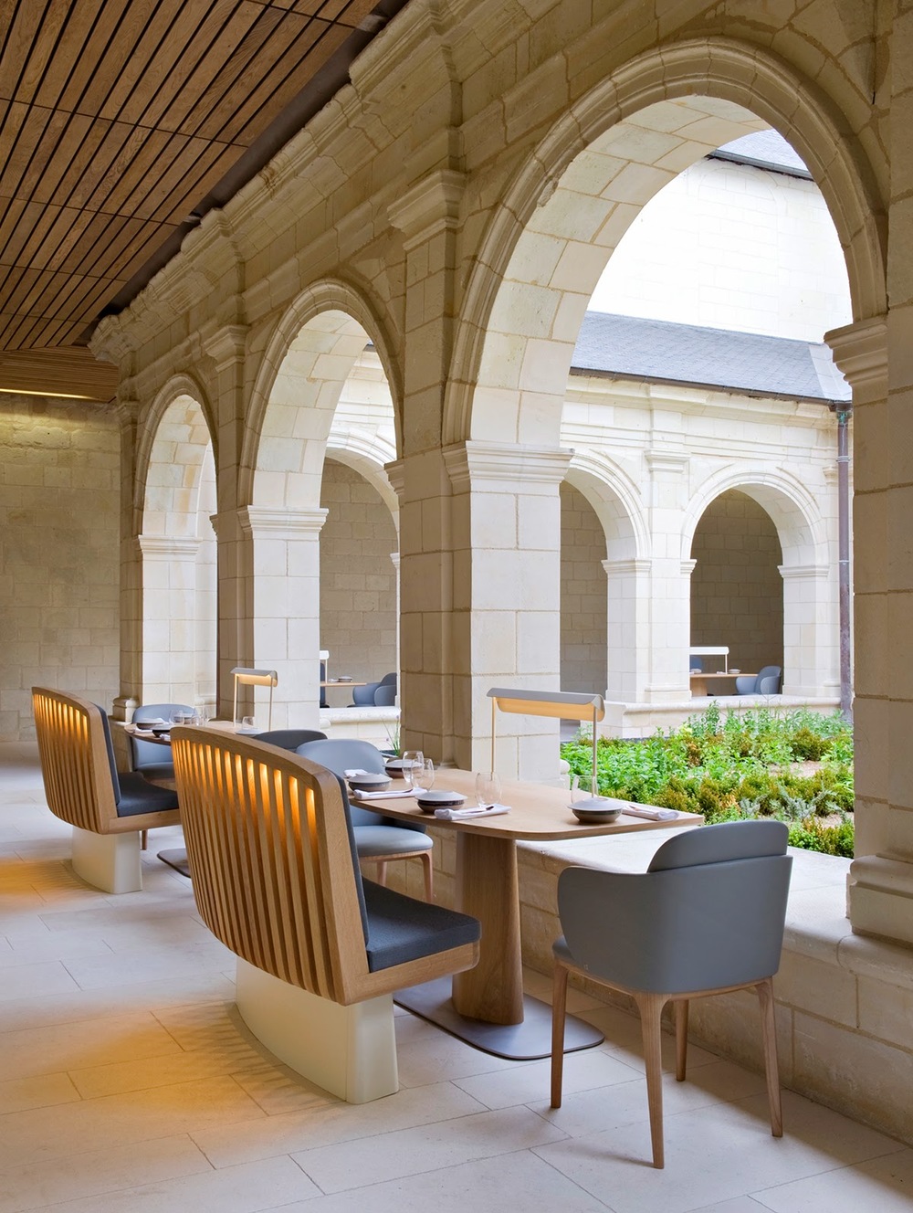
To say that Hotel Fontevraud has a rich history would be an understatement. Constructed between 1101 and 1119 as an Fontevraud Abbey, hosting both Monks and Nuns. The order was dissolved during the French Revolution(1792) and was habituated again in 1804 as a prison. Serving as a prison for 159 years, the Abbey was handed over in 1963 and restoration work began to return it to it's former self. The current vision for Hotel Fontevraud is a 'Cité Idéal' or the intersection of intellect and culture by providing hospitality for guests.  

With this new chapter comes a new restaurant that celebrates its past while firmly establishing it's future. 


What makes this new revitalization a success, in my opinion, is the juxtaposition of old and new. The contemporary furnishings compliment the architectural beauty surrounding you while also allowing you to remain firmly planted our digital and quickly evolving age. Nothing feels permanent and yet doesn't feel light enough to be unintentional. 


All photos © knstrct


Beasley's Chicken + Honey

Name: Beasley's Chicken + Honey
Location: Raleigh, NC
Design: Unknown
Graphic Design: Joshua Gajownik


When looking for restaurants to feature on the blog, I am more often than not scouring through ten to twenty spaces before finding one that is inspiration worthy. Usually, I get so excited when I find something beautifully designed and worth sharing, that I often forget the others that sadly fell short. 

Beasley's is an example of a space I am finding all too common in the industry today. It is a space that forces me to ask myself, "Where is the design?"


Let me explain after the jump.


 Ask any successful restaurant owner or restauranteur and they are likely to agree that what makes a guest return is an overall positive experience. This experience is usually the culmination of architecture, graphic design, interior design, menu/food execution, service, and atmosphere. 


Think about the guest experience for a moment. More often than not, the guest experience either starts online (whether it be on your website, yelp, or other review site/web feature) or just outside your front door. (Again whether from walking by, arriving via car, etc.) 
This is the restaurant's first impression; A moment to grab guest's attention and draw them inside. How do you grab that attention? Easy, this is where the architecture and graphic design work come in. Great graphic design work and the architecture of the building or exterior space, gives the guest the first impression as to what the space and concept is all about. It's your elevator pitch, so to speak. 
This opportunity typically only lasts for a minute or two.


Once a guest has made it into your space, they now take in the environment and begin to look over the menu. Once again, graphic design is key. The other component that now comes into play is interior design. What is the overall concept and is it known within moments of walking in the door? Also, does it coincide with what the exterior said? These initial moments inside usually last no
more than ten minutes before orders are placed and menu's are taken away. 

Now is the crucial moment, guests are waiting for food and drinks and eyes begin to wander. The discerning guest is taking in everything, whether they realize it initially or not.  Considering a guest can spend upwards of an hour and half in a sit down restaurant, why on earth would you forget the interior design?!


This is ultimately the problem I have with Beasley's Chicken + Honey. You can tell that the graphic design work was taken seriously and that a graphic designer was ultimately hired and briefed on the concept and desire for the space. An architect was also on board, as is apparent from the exterior of the space corresponding to the graphic design work and concept. Unfortunately it ends there. The interior, while urban, is an assembly of off the shelf solutions from big box stores. While not entirely or always a bad thing, it does leave plenty to be desired in terms of details and layout. I enjoyed that the paper menu corresponded to the chalkboard menu and that they made it large enough to add some visual punch but it is clear that so many small elements where forgotten. It is often important to remember that an architect, while skilled, typically views buildings and construction from a macro scale. An interior designer is key to viewing your space from the micro level. Does the layout increase table turn over and profits? Are there enough server and bus stations at well placed and traffic free areas? How far do servers need to travel to deliver food and assist guests? All of these are questions that need to be thought of and answered by the chef, owner, and designer in order to create a successful space and experience. Forgetting these seemingly small elements can easily end a positive guest experience. 

I was so excited when I stumbled upon the AC Restaurant website and even more excited when researching the logo and graphic design work. I had high hopes that the entire experience and concept would carry this level of attention and care throughout. Unfortunately I found this not to be the case. 


The time spent inside your space, and the overall experience a guest has, is the key to creating a returning customer. In today's highly competitive restaurant market, it is crucial that all components of the experience are considered. 


Scarpetta Dining Pavilion

Name: Scarpetta Dining Pavilion
Location: Toronto, Canada
Design: gh3, II by IV Design

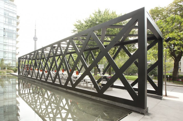
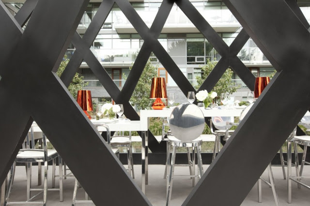
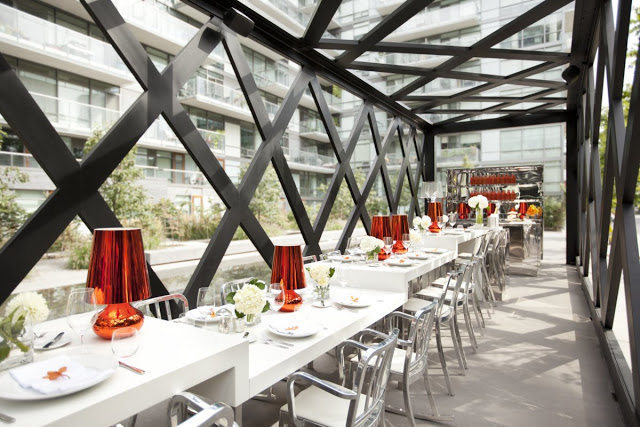
New York based restaurant, Scarpetta, recently completed it's first international expansion into the city of Toronto. Wishing to create a new dining concept where guests can 'see and be seen', the dining pavilion surely accomplishes it's directives.


New York based restaurant, Scarpetta, recently completed it's first international expansion into the city of Toronto. Wishing to create a new dining concept where guests can 'see and be seen', the dining pavilion surely accomplishes it's directives.


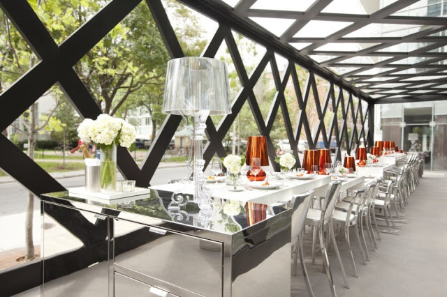
Set alongside a park and parallel to a linear reflecting pool, the angular and narrow pergola has one central community table dominating the space. 
The long table was designed to include seating ranging from standard dining, counter, and bar height spots by raising or lowering the Corian surface.


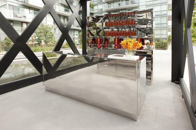
The reflective nature of the inside finishes brings the natural qualities found outside, inside and allows a harmonious space throughout. Placing the bar stations perpendicular to the direction of the space, creates a natural break and defines the spaces boundaries.


All photos © Dan couto via Contemporist


Baker D.Chirico

Name: Baker D. Chirico
Location: Australia
Design: March Studio
Branding/Logo: Fabio Ongarato Design

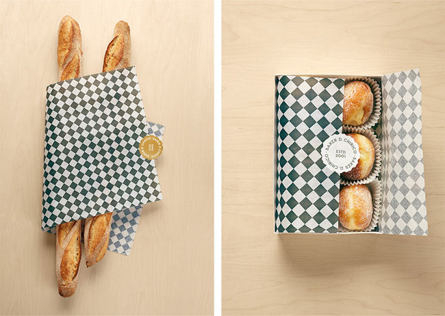
At the office, we swoon anytime we see a great, cohesive concept. Baker D. Chirico nailed it. Keeping the palate clean and limiting it's colors to black, white, and blonde keeps the interior space and branding fresh and allows for a juxtaposition between tradition and modern. Allowing the bread storage to be an architectural and sculptural fixture gives the space a feeling of the unexpected and keeps the concept unique.


Baker D. Chirico brand identity

Baker D. Chirico brand identity

Baker D. Chirico brand identity

All photos © ID via Peter Bernnetts

Firefly Grill

Name: Firefly Grill
Location: Effingham, IL

Styled after the traditional midwest barn, the Firefly Grill features a reclaimed wood facade with metal roof. Considered a modern roadhouse, Firefly has been creating local and organic food long before it was ever popular. The interior is outfitted with simple wood and metal furnishings and large vaulted ceilings in the main dining space. The space also features large walls of windows connecting the indoors and outdoors and has outdoor patio seating located on the dock to the lake. The homage payed to the traditional midwest barn is what truly excites me about the Firefly. With such a beautiful setting and wonderfully updated barn vernacular, how can you not enjoy your visit.


Photo 1-2 © Trip Advisor
Photos 3-5 © World Architects

Tori-Tori

Name: Tori-Tori
Location: Mexico City
Design/Architecture: Rojkind Arquitectos & ESRAWE Studio

This spectacular building is  home to what is considered, one of the best Japanese restaurants in Mexico City. The organic and semi-transparent double walled facade, acts to create a natural extension from inside to outside. The interior of the space features dining spaces set amongst plush foliage and were designed in collaboration with the buildings facade and openings. The texture and filtration of natural light, along with the creation of shadows and views, allows diners a different experience depending on the area they are dining in and the time of day. I can only image the experience diners receive as they approach and enter the space. This is truly a great example of an organic connection between inside and outside.


Tori Tori Restaurant / Rojkind Arquitectos + ESRAWE Studio © Paúl Rivera


Tori Tori Restaurant / Rojkind Arquitectos + ESRAWE Studio © Paúl Rivera


Tori-Tori Restaurant by Rojkind Arquitectos + Esrawe Studio (3)

Tori-Tori Restaurant by Rojkind Arquitectos + Esrawe Studio (2)


All photos via © Paúl Rivera via Archdaily

A new meaning for 'coffee to go'

Name: illy coffee
Location: almost anywhere
Designer: Adam Kalkin

I love when boundaries are shattered and limits are pushed in architecture and design. Back in 2007, Adam Kalkin created a mobile solution from recycled and over abundant materials, for a home unit that could be folded down in a mere 90seconds. To further the design (and fun!) he teamed up with illy to create a mobile coffee unit. Whether you personally like the shipping container craze or not, you can't deny that this quirky solution, is anything but wonderfully eccentric and unique. While the solution might not be perfect, the space planning and design that went into this concept are admirable.

illy cargocontainer 002 Push Button Coffee House

illy cargocontainer 001 Push Button Coffee House

illy cargocontainer 003 Push Button Coffee House

To see a video of the crate opening take a look at Architecture and Hygiene

All photos © G Living

Busaba Eathai

Name: Busaba Eathai
Location: London
Designer: David Archer Architects & lighting by Firefly Lighting

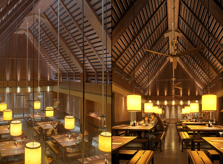
A stunning use of scale and wood. I love the monotone palate with warm lighting flooding over each large table.  I also enjoy that despite the grand scale of architecture, the interior feels intimate and warm. Proof that simplicity and attention to details can go far to create a much grander experience.


Busaba Eathai by David Archer Architects Bicester Busaba Eathai by David Archer Architects, Bicester

Busaba Eathai by David Archer Architects Bicester 02 Busaba Eathai by David Archer Architects, Bicester

Busaba Eathai by David Archer Architects Bicester 05 Busaba Eathai by David Archer Architects, Bicester
Busaba Eathai by David Archer Architects Bicester 07 Busaba Eathai by David Archer Architects, Bicester