Our Work: Foursided

Name: Foursided
Location: Chicago, IL
Design: Kaper Design, LLC
Photography: Kyle McKenna


Kaper Design is excited to share our latest work in Chicago! Located in the heart of East Lakeview (Just a few blocks down from Dryhop, too.), Foursided is a neighborhood staple for those looking to get the best framing or unique gift. Being the original location, it came time for a facelift and we were happy to jump on board. Follow the jump below for a look at their new space.


In order to bridge functionality with aesthetic, we created zones and divided the space into a private back workroom and public front of space retail section. Dividing the two areas allows works to spread out and get creative while creating a determined area for customers to meander. Custom steel and metal shelving units were fabricated to add vertical storage. These pieces add warmth while remaining light, allowing your eye to focus on the good placed on them. 

On of my favorite components of the space is the large, sliding panels which now display the extensive frame sample collection. Utilizing a custom designed steel track system (Similar to a school house blackboard), allows us to minimize the amount of square footage needed to display the frames while still keeping them easily accessible for employees and guests.


Custom designed and built shelving in the center of the space adds display and retail space while also keeping customer traffic flowing through the space. The counters were custom designed and fabricated by Fourth lake Carpentry Inc. and grant us lots of extra storage space for frame samples and prints. 


The front of the store received a brand new facade, tile entry way, and raised displays. Paired with the removal of the awnings the space is now clearly visible to all passing by.


Cafe Plenty

Name: Cafe Plenty
Location: Toronto, ON
Design: II BY IV DESIGN


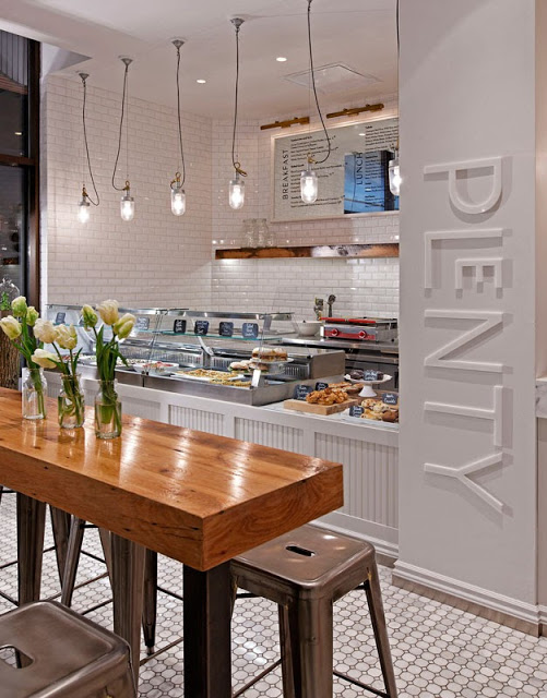
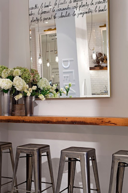
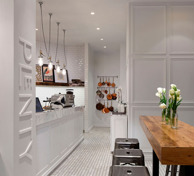
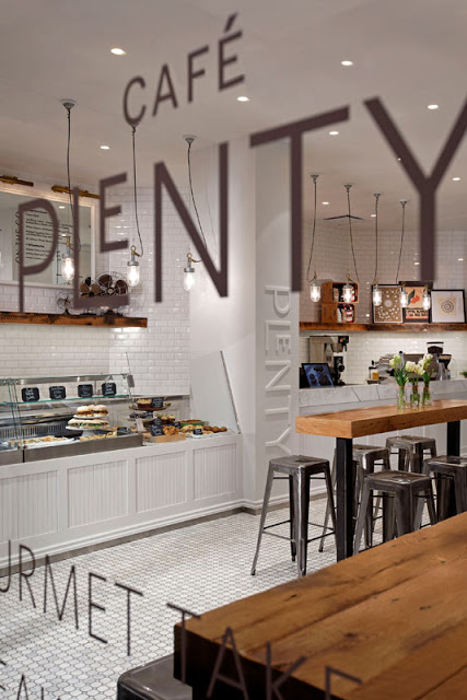
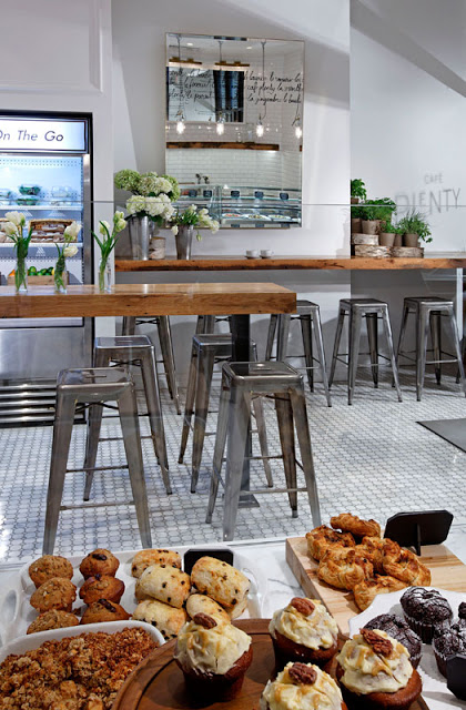
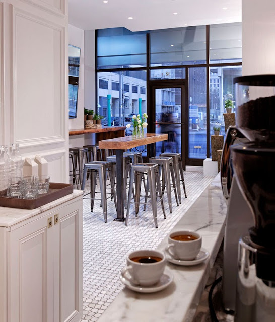
Cafe Plenty uses a neutral color palate, natural materials, and graphic design to create a memorable and fresh cafe interior. 


While limited in color, there are no shortage of rich details and textures that add warmth and depth to the interior. 


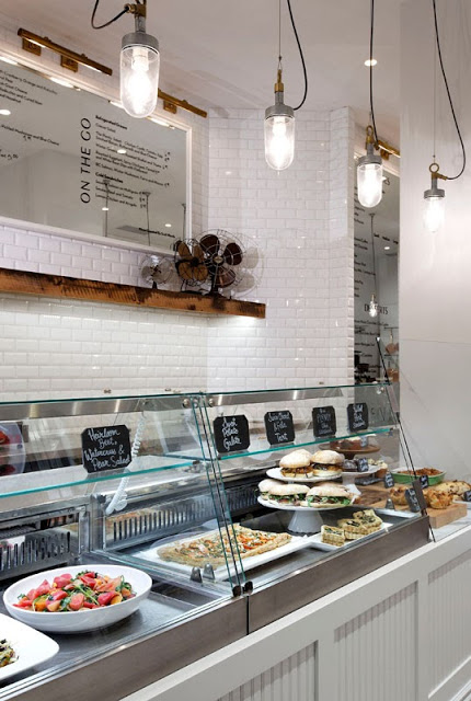
Layering beveled edge tile, breadboard, rustic wood, and metal creates a welcoming environment that remains fresh, open, and bright. 


Utilizing creative graphic design and signage, the windows keep views into the space open while clearly telling those passing what lies behind the glass. 


Utilizing natural materials highlights the natural food and beverage offerings while custom bar height counters keeps the narrow space open and traffic flowing through. 


All photos © A.R.E Design Awards


Havens Kitchen

Name: Havens Kitchen
Location: NY, New York


As a cafe, retail, and kitchen space, Havens Kitchen did a great job creating cohesion to three sets of very different functional needs. 


Using the entry for seating and retail with the cafe acting as a buffer between, each space is clearly defined while still remaining harmonious. 

The mix of industrial details, worn woods, and vintage pieces creates a layered and warm space that can appeal to a wide demographic.

Images 1-4 © The Scout Mag

Top Hops

Name: Top Hops
Location: NYC, NY
Design: Helm Workshop- Identity


Top Hops is a craft beer goldmine in the heart of NYC. With great identity and branding, along with a functional and well laid out interior, the concept is cohesive and fun.


Brand Identity
I love the structured yet informal nature of the chalkboard menu and enjoy that it provides a great backdrop to the tasting bar and retail. 

Brand Identity
Image 1 © Edible Manhattan
Image 2© lucyeatsveggies
Image 3- 4 ©Helm Workshop

Cotta Cafe

Name: Cotta Cafe
Location: Melbourne, Australia
Design: Mim Design


Located in the West End area of Melbourne, Cotta Cafe is an escape from the hustle and bustle of the area. Using a simple and clean color palate with modern lines allows for a tranquil yet warm space.


The cafe features multiple seating options to accommodate various visitors. It also does a great job dividing up the space using both architectural and non architectural details. 


All photos © Contemporist

Kitchen at Weylandts

Name: The Kitchen at Weylandts
Location: South Africa

A prominent home furnishings store in South Africa, Weylandts has taken on a fun twist to in-store-dining. Located on the top floor of their shop, they have set up a restaurant focused on fresh, seasonal, and local ingredients that come together to create simple, thoughtful dishes. The space itself is bursting with unique details and evokes warmth and creativity. The space's simple palate creates an almost Scandinavian feel with the Louis ghost chairs adding a layer of airiness to the bright space.


All images © Elle Decor SA

Baker D.Chirico

Name: Baker D. Chirico
Location: Australia
Design: March Studio
Branding/Logo: Fabio Ongarato Design

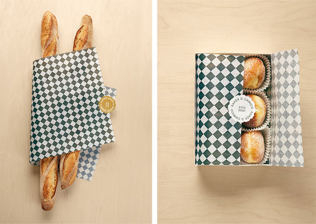
At the office, we swoon anytime we see a great, cohesive concept. Baker D. Chirico nailed it. Keeping the palate clean and limiting it's colors to black, white, and blonde keeps the interior space and branding fresh and allows for a juxtaposition between tradition and modern. Allowing the bread storage to be an architectural and sculptural fixture gives the space a feeling of the unexpected and keeps the concept unique.


Baker D. Chirico brand identity

Baker D. Chirico brand identity

Baker D. Chirico brand identity

All photos © ID via Peter Bernnetts

Theurel & Thomas Patisserie


Name: Theurel & Thomas Patisserie
Location: San Pedro, Mexico
Designer: Anagrama


This little gem was passed along to me by a friend and I am so glad he shared! Pure milky perfection, in my opinion. The amount of detail and remaining true to the all-white concept allows for the macaroons colors to burst throughout the space. What I love the most about this space is that is shows us that a monochrome platte doesn't have to be cold or stark. Too many time I hear that the all white interior will make the space feel cold and uninviting but, if done correctly, it can provide exactly the opposite. This space achieved the monochromatic design with its use of detailed furniture and fixtures. These items provide just enough contrast to keep the space inviting and exciting. I always enjoy experiencing interiors where you can see the trust between the designer and the client, it always provides the best design.
(did you notice the under-lit cabinet and storage? icing on the cake!)

All photos © Anagrama

Now I just need to take another trip to Meixco, who's coming with me?!