Nude Coffee & Wine Bar

Name: Nude Coffee & Wine Bar
Location: Moscow
Design: FORM Bureau

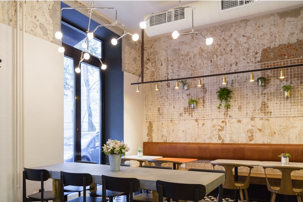
Located in the heart of Moscow, Nude Coffee & Wine Bar sits within a vintage residential building. Keeping the palate simple and understated with subtle pops of brass creates a balanced and cohesive interior fitting of its name. 


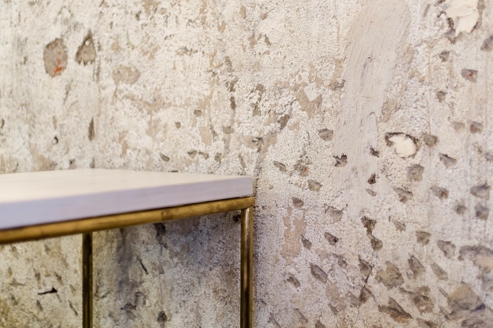
Layers of plaster were roughly stripped away to reveal the original brick beyond. The rough textures allows for a contrast to the more polished and clean fixtures and furnishings. 


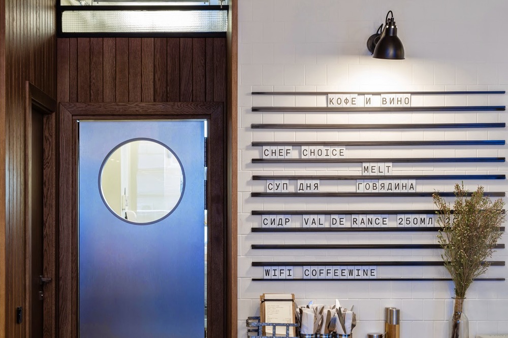
 Another great detail within the space is the linear menu board, allowing offerings to be slid in and out as needed. The scrabble-esq feeling adds a touch of playfulness and informalness.

All photos via Domusweb via FORM Bureau

Maison

Name: Maison
Location: South Africa
Design:


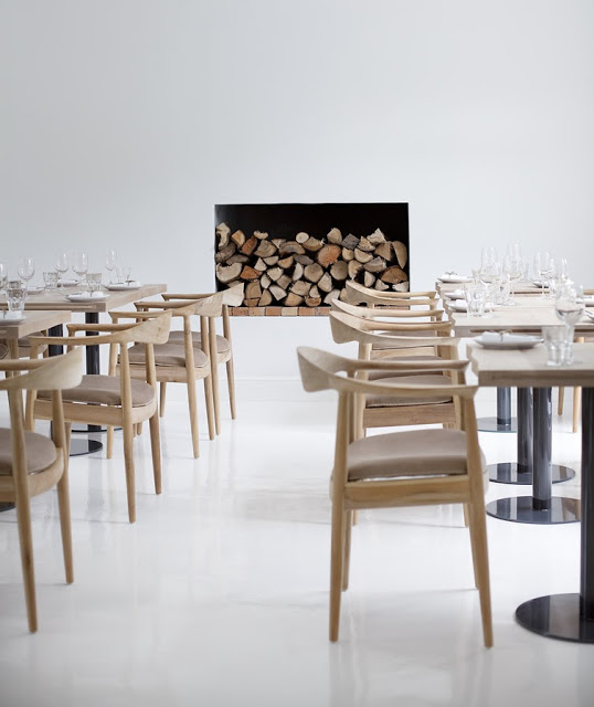
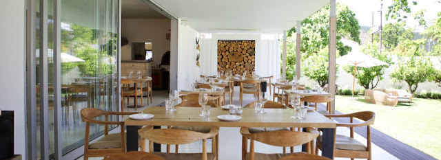
I love the simplicity and openness that is shown throughout Maison. A winery with a tasting room, deli, and restaurant; all spaces work in harmony but still give a large graphic punch. 


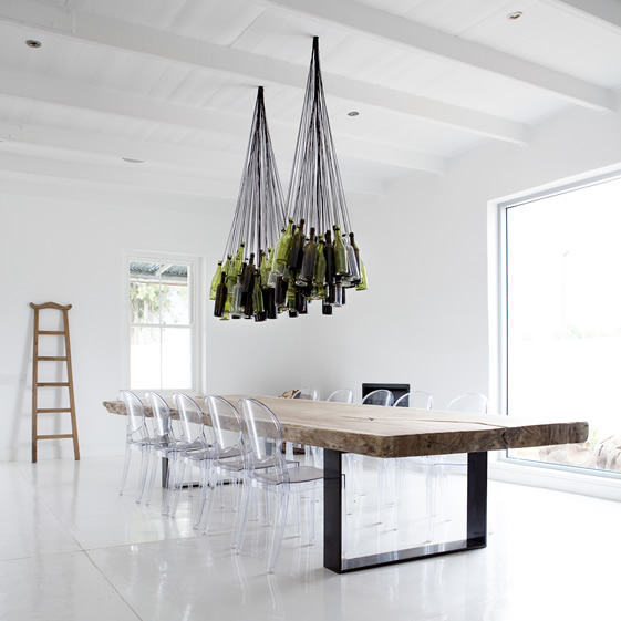
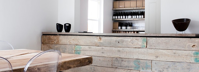
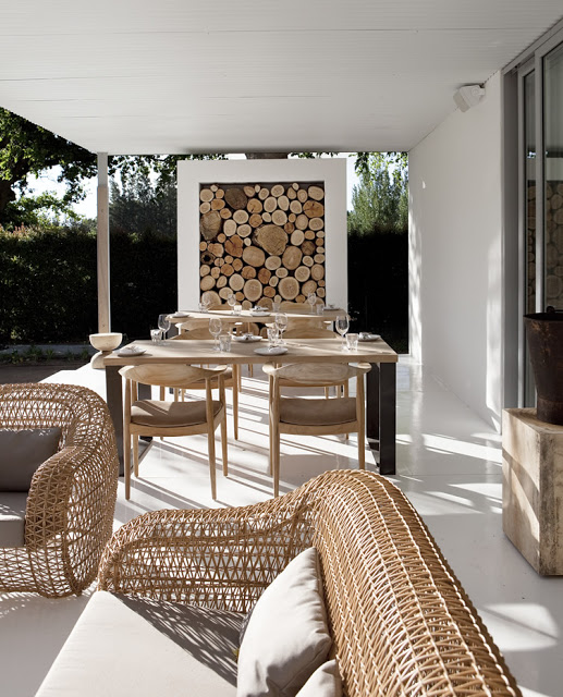
The use of blonde wood, stark acrylic chairs, and polished white creates an airiness throughout the space. Paired with the worn barn wood, stacked logs, and wine bottle chandelier, each spaces still exuded warmth and remains inviting. 


The use of furniture and fixtures that are also light and airy in appearance helps extend the open feeling of the space. 


 Images © Weheartco & Maison


Local favorite; The Purple Pig

Name: The Purple Pig
Location: Chicago, IL


The Purple Pig is easily one of my favorite dining spots in the city. With an intimate and warm space, great wine list, and fun menu it easily fits the bill for just about any occasion. Even with an hour average wait time (every day, all year long…), The Purple Pig is the restaurant we frequent the most often and the place we are most likely to take visitors.


With an extremely small space, seating was maximized by using long community table in the middle of the space. Paired with a few two and four tops (and the outdoor patio in the summer.) allows them to accommodate almost any size group and helps turn over tables relatively quickly and efficiently.  

The spanish tiles add a bit of playfulness to the space while the wine barrels and art work all play on the literal side of their motto 'Cheese, Wine, & Swine'.


Southeast Wine Collective


Location: Portland, OR


Southeast Wine Collective has created an urban tasting room, bringing together four local wineries.
The space is a blend of urban warehouse and warm tasting room and use the wine as both displays and focal points. 


The main tasting bar uses wine barrels as shelving and texture. Wine stored bottom out creates a great visual flanking each side. 


The space also created multiple seating types including banquette, bar, and community table seating. All of these allow the tasting room to offer multiple experiences and host different events.


All images © Eater PDX

Divino Wine Bar

Name: Davino Wine Bar
Location: Budapest
Design: Suto Interior Architects


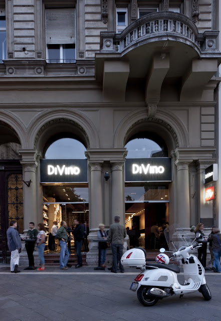
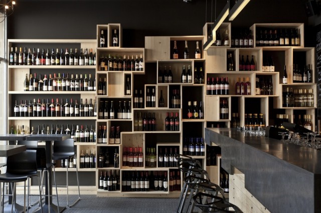
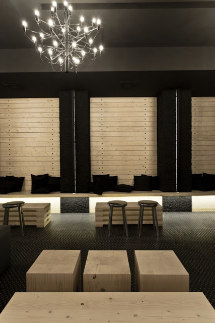
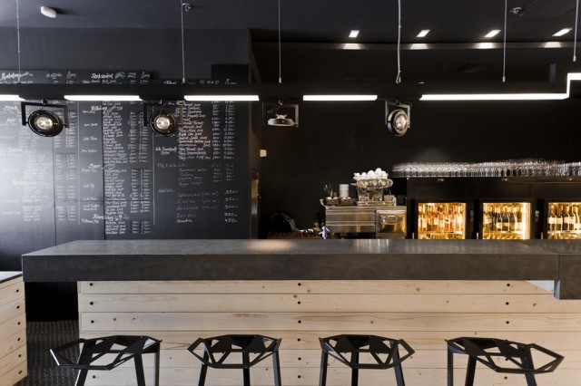
Davino Wine Bar created a modern and warm spot perfect for displaying wine and serving customers. Utilizing a neutral color palate and limiting the materials used helped keep them on budget and focused in the design.


Utilizing strong geometric shapes and the light pine creates a great backdrop for the restaurants wine display while also providing a feature wall and focal point.


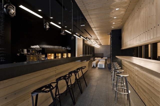
Concrete counters and diamond plating for floors helped establish the dark grey, black, and silver used to balance out the large quantity of pine.


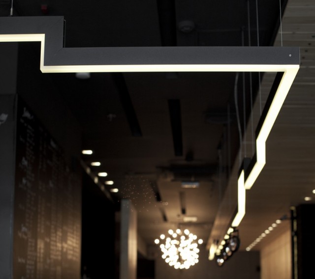
I enjoy that all components follow through with the simple yet strong geometric aesthetic. Having the lights mirror the shape of the bar and wine display tie the space together and give it a harmonious feel.


All images © Architectural


Local Favorite; Telegraph

Name: Telegraph
Location: Chicago

Telegraph could quickly become a new favorite destination for me here in the city. Located in Logan Square, the space is well designed and feature a great amount of craftsmanship throughout. From the unique, wood bar wrapping around both sides of the space to the rustic, dovetailed wood shelves the space creates a warm and inviting environment whether you come for a date or with a group of friends. Here are a few hits and misses;

Hits:
There wasn't a single low point in our entire meal. A rare but very welcomed situation!
-The food was rustic, simple but managed to surprise me with every dish. We had the Whipped Foie Gras, Roasted whole red snapper, blood sausage, and strawberry freddo sandwich with sunflower crunch. All were phenomenal, well executed, and a good portion size for two to split.
-The interior was well crafted and thoughtful.
-Attention to detail; throughout the meal, our table was cleared, wiped down, and re-set for every course. Silverware was brought to the table in a beautiful wooden box with just what was needed to replace what was removed. The wait staff retiring dishes to the kitchen placed a napkin over all bus tubs and dishes before walking through the space. It's the small, often overlooked by even the most popular restaurants, that truly made this experience amazing.

Misses:
-Two and four top table bases were a bit cumbersome and awkward. Wearing pants, it wasn't as big of a deal but had I worn a dress or skirt, it may have been quite awkward.
-The pendants in the front windows needed some help with their cord management. There were zip ties securing the cords and keeping them in place, but the zip ties were not cut and the long 'tail' could be seen. A small detail, but again extremely important.


Image © Telegraph
Image © Food Arts
Image © Kaper Design