St. Cecilia

Name: St. Cecilia
Location: Atlanta, GA
Design: Meyer Davis Studio

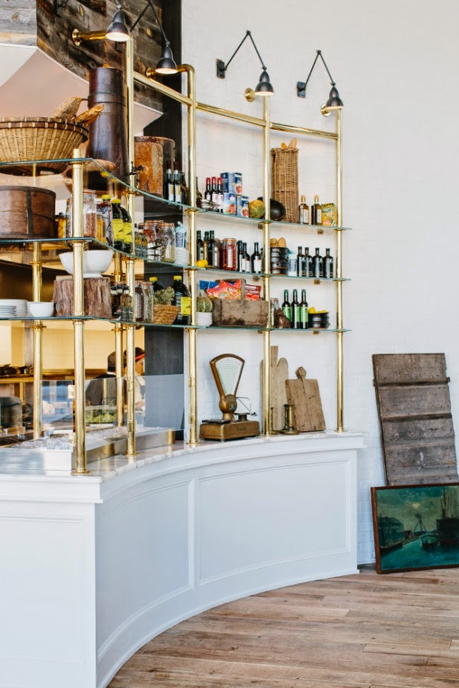
Located in Atlanta, St. Cecilia is a beautiful blend of traditional and contemporary. The layering of materials and attention to detail throughout help keep this large space grounded and comfortable.


We love all of the small details that Meyer Davis infused into the interior. Every area is thought through and considered.


Given the large scale of the space, using semi-circle booths to dot the space, helps create movement and a more intimate environment. This is a solution that commonly cannot be used within smaller scale spaces simply due to the room required for guest to enter and exit the booths but works extremely well in this application.


All photos via Meyer Davis


Nude Coffee & Wine Bar

Name: Nude Coffee & Wine Bar
Location: Moscow
Design: FORM Bureau

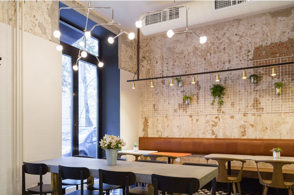
Located in the heart of Moscow, Nude Coffee & Wine Bar sits within a vintage residential building. Keeping the palate simple and understated with subtle pops of brass creates a balanced and cohesive interior fitting of its name. 


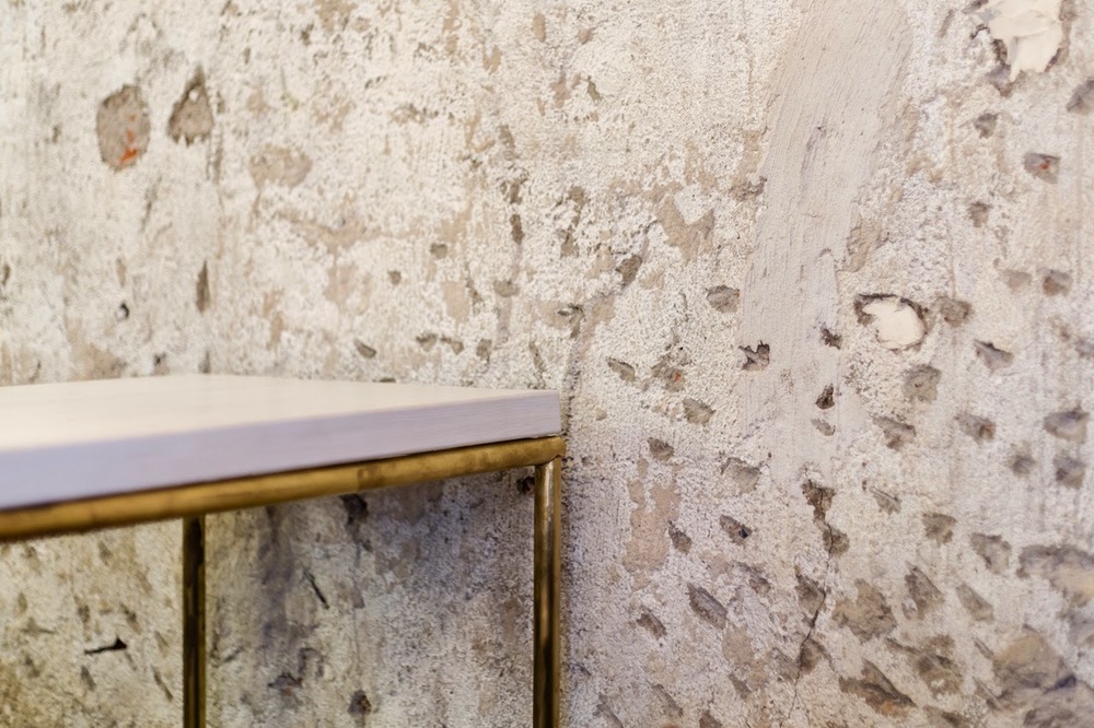
Layers of plaster were roughly stripped away to reveal the original brick beyond. The rough textures allows for a contrast to the more polished and clean fixtures and furnishings. 


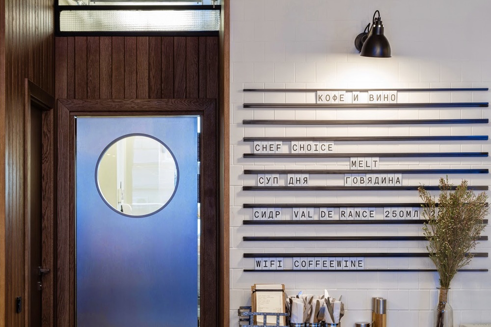
 Another great detail within the space is the linear menu board, allowing offerings to be slid in and out as needed. The scrabble-esq feeling adds a touch of playfulness and informalness.

All photos via Domusweb via FORM Bureau

Dock Kitchen

Name: Dock Kitchen
Location: London


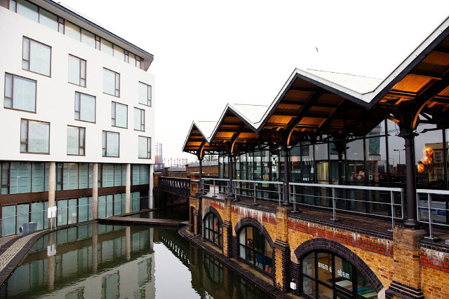
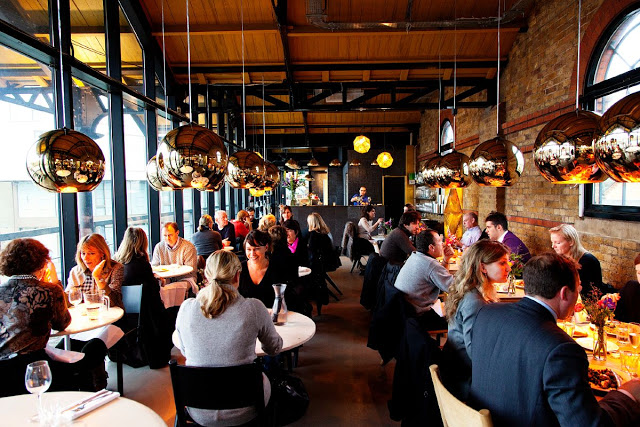
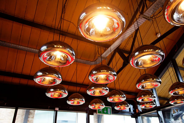
With a beautiful location and proximity to Tom Dixon's shop, Dock Kitchen was set up for success from the beginning. With exposed brick walls, a spectacular view, and attention to detail the space strikes a beautiful balance of refined rustic.


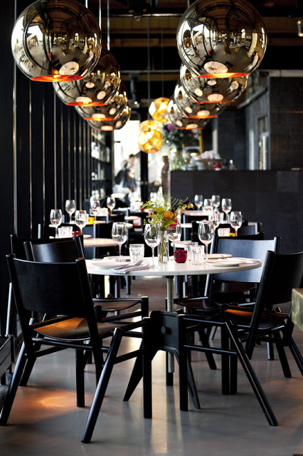
The truly welcoming open kitchen gives off the feeling of being in a friends kitchen. Balanced with the quality of materials used in the dining room and clean lines and polished details of the dining room, the space feels upscale and memorable while also feeling comfortable and welcoming.


I love the simplicity of the space and enjoy that the truss's, ceiling, and walls were all left exposed, highlighting the original structure and history of the space.


Image 1-3 © The Selby
Image 4- © Weheart

Nopi


Name: Nopi
Location: London
Designer: Alex Meitlis

What I love most about this space is the materials. Nopi considers itself a brasserie, but you might not see it right away. The traditional materials found in a brasserie; marble, wood & brass are introduced in a completely new way. This play is what makes the entire space successful. Although the materials have been used in a slightly more contemporary and upscale manner, the space retains a comfortable and familiar vibe.  The downstairs uses many of the same materials as the upstairs but feels as though you are eating right in the kitchen. Shelves filled with storage for the kitchen, line the dining room walls and traditional subway tile is intruded in a grander scale. Tables also change and help represent the more communal nature of the downstairs.

NOPI_1


NOPI_3


Downstairs:


All photos © Delood.com