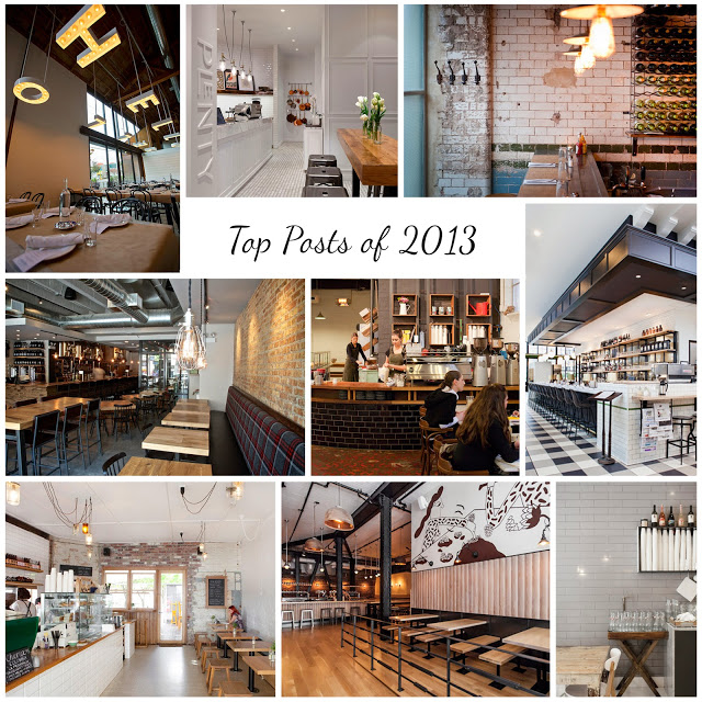
A Look Back: Top Posts from 2013

Here is a look back on some of our top posts from 2013!

Thank you to all of our readers for making this year such a great year. We can't wait to share even more great restaurant design in 2014.


Clockwise from top left;

The Whale Wins, Seattle
Hardware Society, Melbourne
Mikkeller Bar, San Francisco
Wee Jeanie, Melbourne
Dryhop Brewers, Chicago
Chez Dré, Melbourne


Are there spaces you would like to see or a photographer looking to collaborate? Send us a message, we'd love to chat!

Our Work: Foursided

Name: Foursided
Location: Chicago, IL
Design: Kaper Design, LLC
Photography: Kyle McKenna


Kaper Design is excited to share our latest work in Chicago! Located in the heart of East Lakeview (Just a few blocks down from Dryhop, too.), Foursided is a neighborhood staple for those looking to get the best framing or unique gift. Being the original location, it came time for a facelift and we were happy to jump on board. Follow the jump below for a look at their new space.


In order to bridge functionality with aesthetic, we created zones and divided the space into a private back workroom and public front of space retail section. Dividing the two areas allows works to spread out and get creative while creating a determined area for customers to meander. Custom steel and metal shelving units were fabricated to add vertical storage. These pieces add warmth while remaining light, allowing your eye to focus on the good placed on them. 

On of my favorite components of the space is the large, sliding panels which now display the extensive frame sample collection. Utilizing a custom designed steel track system (Similar to a school house blackboard), allows us to minimize the amount of square footage needed to display the frames while still keeping them easily accessible for employees and guests.


Custom designed and built shelving in the center of the space adds display and retail space while also keeping customer traffic flowing through the space. The counters were custom designed and fabricated by Fourth lake Carpentry Inc. and grant us lots of extra storage space for frame samples and prints. 


The front of the store received a brand new facade, tile entry way, and raised displays. Paired with the removal of the awnings the space is now clearly visible to all passing by.


Our Work; Dryhop Brewers

Name: Dryhop Brewers
Location; Chicago, IL
Designer: Kaper Design, LLC
Scope of Work: Schematic Design, Design Development, Feasibility studies, Contract Administration,  FF&E Sourcing


Kaper Design, LLC is proud to announce the opening of Dryhop Brewers. A warm and comfortable space, our design showcases the craft of creating. With an initial concept given by the owner of 'My father's workshop on a good day.', Kaper Design created a space that played homage to the craftsmen and their crafts. Highlighting the woodworking and beer making crafts simultaneously was an exciting challenge and allowed us to get creative with materials and applications. 


The 50 foot long bar was designed by local carpenter Kevin Hughes and was based off our drawings depicting a stack of lumber. On top of the bar lies a live-edged slab sourced from a single, lightening-struck tree which was urban forested from just miles outside of Chicago. 


The tables were crafted specifically for Dryhop and feature white oak butcher block tops and cold-welded steel bases designed by us to be simplistic and unobtrusive. While our bar height tables feature steel bases showcasing a modern interpretation of a saw horse. 


Dryhop Brewers space consists of multiple spaces designed to showcase the brewing process. With custom steel and glass partition walls and black subway tile, both the brewhouse and fermentation room showcase the equipment within and highlight the process behind their great beer.


Both mens and women's restrooms continue to highlight craftsmen and their craft. Creating a custom wall mural using historic and technical images of the brewing process, history of brewing, and woodworking allowed us to tie these rooms into the overall feel of the brewery and make the diners experience a complete visit. Bathrooms are rounded out with industrial light fixtures, wood framed mirrors and penny tile floors.


Stop by for a beer and some delicious food the next time you are in Chicago!

A Look Back; Our Work

It's been a busy year for us and couldn't be more excited about the projects we've gotten to work on and the clients we've gotten to work with. Here is a quick look back at what kept us busy during 2012.


Name: The Salsa Truck
Status: In progress
Location: Chicago, IL


Name: The Garage
Status: In Progress
Location: Chicago, IL


Name: Dryhop Brewers 
Status: In Progress
Location: Chicago, IL

Name: Shady's Burgers & Brewhaha
Status: In Progress
Location: Dallas, TX
Name: Cogdal Vineyards
Status: Design Completed
Location: South Haven, MI


Name: The Savoy (Previously named, The Odyssey)
Status: Completed
Location: Chicago, IL


Name: Bang Bang Pie Shop
Status: Completed
Location: Chicago, IL

Status: Completed & Aired
Location: Chicago, IL


A huge thank-you goes out to all of our amazing clients and fans for making 2012 such a great year. With The Garage, The Salsa Truck, Dryhop, and Shady's all opening in 2013, we can't wait for all that 2013 has in store. 

DIY Kitchen Crashers

At Kaper Design, 
We believe in the essence of the kitchen
We believe in the passion of the chef
We believe that a meal can be a celebration of, or escape from the everyday
We believe that gathering around a table unites and connects
We believe that the soul of any space is the kitchen, be it residential or commercial.


With this in mind, we'd like to announce that Kaper Design will be featured TONIGHT on the Season Premiere of DIY's Network show; Kitchen Crashers. 


(A little glimpse into the almost finished product. Read below for the inside scoop on our design.)


Here is a brief description of our client, our design, and what you can expect to see!

Client:
Our client was a Chicago family of four with two small children under the age of two

What they wanted:
They wanted a space that was better laid out with more storage. They also hoped to spend more time in the kitchen as a family.

The before:

Their kitchen was very small with little a growing family truly needs. Completely walled in, the space felt removed from the rest of the house and didn't allow the parents to spend much time in it.

Our Plan:
We wanted to make their kitchen a space they could enjoy for years. Our goals were;
- Open up the kitchen
- Provide more storage & counter space
- Provide needed amenities like a dishwasher and larger refrigerator
- Create an environment that could evolve with a growing family and their sure to be changing style.


Our Design: 
We opened up their kitchen by removing the wall separating the existing kitchen and dining spaces. We used materials that were durable, easily cleanable, and timeless and infused the space with neutral colors to add longevity to the space.
In the center of the space we added a large island to create a connection between the two spaces, add additional storage & work surfaces. In this island we included kick space drawers and refrigerator drawers which allow for the perfect 'snack spot' now and additional cold storage in the future. 


All photos © Kaper Design